If you’ve ever played around with typefaces or fonts, chances are you’ve asked yourself “What’s the difference between OTF and TTF?” when deciding to download fonts for your system. Why is something as simple as a few pixels on the screen so complicated?
Fear not, MakeUseOf has you covered. Today, it is time to sit down and analyze some of the key differences between OTF and TTF fonts. Read on to discover the differences, which font format is better, and when it’s appropriate to use one over the other.
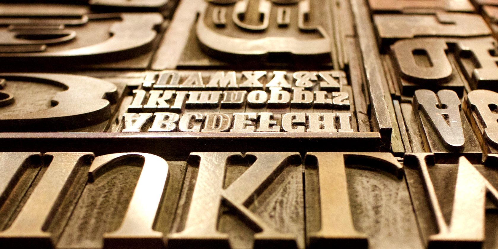
TrueType Fonts (TTF)
Let’s start with TTF because it came first. Well, that’s not entirely true. PostScript pre-dates TTF by several years, but it’s not incredibly common today, so we’re going to skip it for the sake of relevance.
TTF was a joint effort by Apple and Microsoft in the early 1980s. The purpose was simple: they needed a format that both Windows and Mac could use natively, as well as a format that could be read by default by most printers. TrueType Fonts fit the bill.
The package containing the font included both the screen and the printer font data in a single file. This made it easy to install new fonts and served as an early cross-platform font format that was usable by most consumer devices.
OpenType Fonts (OTF)
OTF was also a joint effort, except this time between Adobe and Microsoft. Much like TTF, OTF was cross-platform and included the display and printer font data in a single package, but that’s where the similarities end.
OTF extended TTF by offering many capabilities that the latter wasn’t capable of providing. For example, OTF featured a format that allowed for the storage of up to 65,000 characters.
Obviously, there are only 26 characters in the alphabet (A-Z), ten numbers (0-9) and a handful of extras, like punctuation, currency signs, and various others (@#%^&*, etc.). However, this was especially beneficial to font design and creation.
Since the format offered additional storage for characters that far exceeded the number of characters that the average user would ever need, designers had the ability to add extras like:
- Ligatures
- Glyphs
- Small caps
- Alternate characters
- Old-style figures
Previously, these additions had to be added as additional fonts using TTF. With OTF, they could reside in the same file as the default typeface and remain easily accessible to designers and the like.
The Differences Between OTF and TTF
For designers, both amateur and professional, the main useful difference between OTF and TTF is in the advanced typesetting features. OTF features embellishments like ligatures and alternate characters—also known as glyphs—that exist to give designers more options to work with. (25+ sites for amazing free fonts!)
For most of us non-designers, the additional options will likely go unused.
In other words, OTF is indeed the “better” of the two due to the additional features and options, but for the average computer user, those differences don’t really matter.
You can’t, for example, just decide to use a different version of an “F” in Facebook or embellish common connecting letters like “TH” to make them look like ornate typography. Those that use these will typically do so in the Adobe Creative Suite, and for the sole purpose of making subtle tweaks that make text look better for print or on the web.
Let’s flesh things out by looking at three of the most common additions to OTF packages
Glyphs
Glyphs are alternate characters that you can change to when you’re looking for something stylistically different from the default. Traditional characters might look something like this:

If you need a different “A,” for example, you could elect to use a glyph that displays an “A” with different stylistic qualities, or one that is used as the default in other alphabets and languages. For example:

Ligatures
Ligatures are strictly a stylistic addition. These are most common with script fonts, but they appear in nearly all high-end packages. Cheaper fonts, or those that you can find for free online, are less likely to have many glyphs, ligatures, or other extras.

Ligatures are typically combinations of two different letters that meld together to become a stylistic two-in-one entity. When letters are combined like this, they typically end up having embellished designs or adjusted spacing between the two.
Alternate Characters
Alternate characters are just what they sound like: alternatives to non-alphanumeric characters. Think of them as glyphs for the non-number and non-letter characters in a font set. They allow designers to select a stylistically different version of the characters they want to use.
Let’s look at some examples. A typical character might look something like this:

While the alternate version will look slightly different, like this:

For most of us, the difference is minimal, and we probably won’t care all that much which version to use. If you’re laying out text for a magazine, however, these small changes can be the difference between good and bad design.
Which Is Better: OTF or TTF Fonts?
OTF is undoubtedly the more robust of the two options. It has more features that are intended to allow typesetters and designers flexibility to provide incremental changes designed to improve the overall look of a piece.
That said, for typical end users like you and me who probably aren’t using these features anyway, it’s not going to make a bit of difference. If you have the option, OTF is always the better of the two, but if you’re in a pinch and can’t find the OTF version of a font, there’s nothing wrong with TTF.
Struggling to match up fonts for a new design or important document? Check out the best sites for finding perfect font pairings.
Read the full article: OTF vs. TTF Fonts: Which Is Better? What’s the Difference?
Read Full Article
No comments:
Post a Comment