20 August 2019

Turbo, An Improved Rainbow Colormap for Visualization


False color maps show up in many applications in computer vision and machine learning, from visualizing depth images to more abstract uses, such as image differencing. Colorizing images helps the human visual system pick out detail, estimate quantitative values, and notice patterns in data in a more intuitive fashion. However, the choice of color map can have a significant impact on a given task. For example, interpretation of “rainbow maps” have been linked to lower accuracy in mission critical applications, such as medical imaging. Still, in many applications, “rainbow maps” are preferred since they show more detail (at the expense of accuracy) and allow for quicker visual assessment.
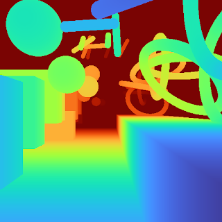
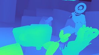
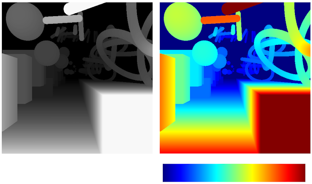
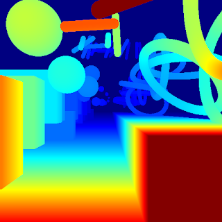
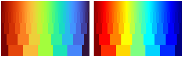
Left: Disparity image displayed as greyscale. Right: The commonly used Jet rainbow map being used to create a false color image.
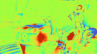
One of the most commonly used color mapping algorithms in computer vision applications is Jet, which is high contrast, making it useful for accentuating even weakly distinguished image features. However, if you look at the color map gradient, one can see distinct “bands” of color, most notably in the cyan and yellow regions. This causes sharp transitions when the map is applied to images, which are misleading when the underlying data is actually smoothly varying. Because the rate at which the color changes ‘perceptually’ is not constant, Jet is not perceptually uniform. These effects are even more pronounced for users that are color blind, to the point of making the map ambiguous:
The above image with simulated Protanopia
Today there are many modern alternatives that are uniform and color blind accessible, such as Viridis or Inferno from matplotlib. While these linear lightness maps solve many important issues with Jet, their constraints may make them suboptimal for day to day tasks where the requirements are not as stringent.
Viridis Inferno
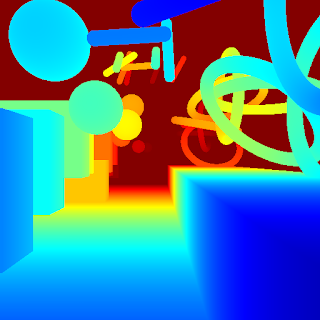
Today we are happy to introduce Turbo, a new colormap that has the desirable properties of Jet while also addressing some of its shortcomings, such as false detail, banding and color blindness ambiguity. Turbo was hand-crafted and fine-tuned to be effective for a variety of visualization tasks. You can find the color map data and usage instructions for Python here and C/C++ here, as well as a polynomial approximation here.

Development
To create the Turbo color map, we created a simple interface that allowed us to interactively adjust the sRGB curves using a 7-knot cubic spline, while comparing the result on a selection of sample images as well as other well known color maps.
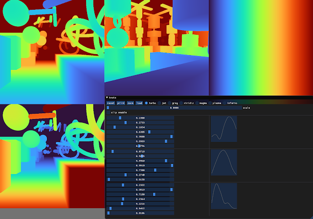
Screenshot of the interface used to create and tune Turbo.
This approach provides control while keeping the curve C2 continuous. The resulting color map is not “perceptually linear” in the quantitative sense, but it is more smooth than Jet, without introducing false detail.
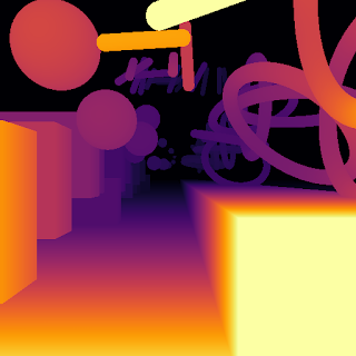
Turbo
Jet
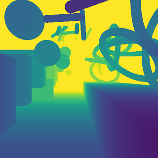
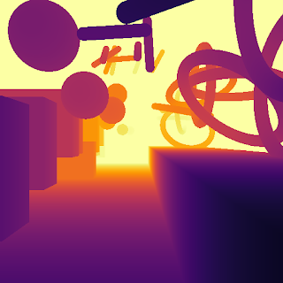
Comparison with Common Color Maps
Viridis is a linear color map that is generally recommended when false color is needed because it is pleasant to the eye and it fixes most issues with Jet. Inferno has the same linear properties of Viridis, but is higher contrast, making it better for picking out detail. However, some feel that it can be harsh on the eyes. While this isn’t a concern for publishing, it does affect people’s choice when they must spend extended periods examining visualizations.
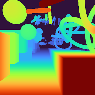
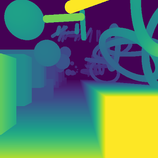
Turbo Jet
Viridis Inferno
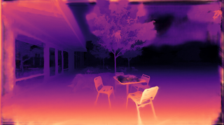
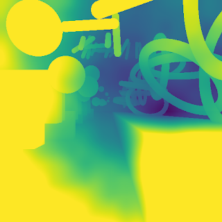
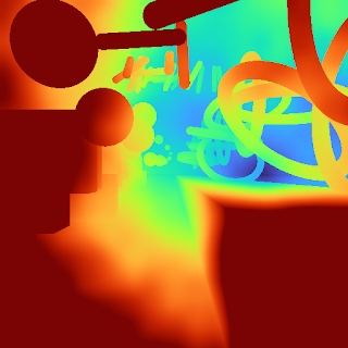
Because of rapid color and lightness changes, Jet accentuates detail in the background that is less apparent with Viridis and even Inferno. Depending on the data, some detail may be lost entirely to the naked eye. The background in the following images is barely distinguishable with Inferno (which is already punchier than Viridis), but clear with Turbo.
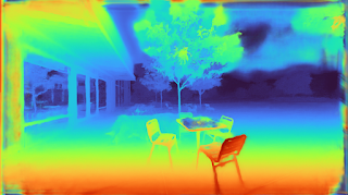
Inferno Turbo
Turbo mimics the lightness profile of Jet, going from low to high back down to low, without banding. As such, its lightness slope is generally double that of Viridis, allowing subtle changes to be more easily seen. This is a valuable feature, since it greatly enhances detail when color can be used to disambiguate the low and high ends.
Turbo Jet
Viridis Inferno
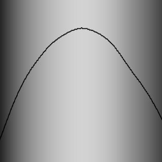
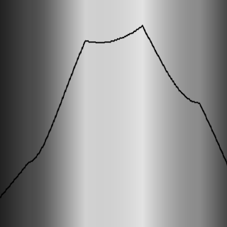
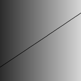
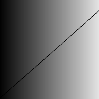
Lightness plots generated by converting the sRGB values to CIECAM02-UCS and displaying the lightness value (J) in greyscale. The black line traces the lightness value from the low end of the color map (left) to the high end (right).
The Viridis and Inferno plots are linear, with Inferno exhibiting a higher slope and over a broader range. Jet’s plot is erratic and peaky, and banding can be seen clearly even in the grayscale image. Turbo has a similar asymmetric profile to Jet with the lows darker than the highs.This is intentional, to make cases where low values appear next to high values more distinct. The curvature in the lower region is also different from the higher region, due to the way blues are perceived in comparison to reds.

Although this low-high-low curve increases detail, it comes at the cost of lightness ambiguity. When rendered in grayscale, the coloration will be ambiguous, since some of the lower values will look identical to higher values. Consequently, Turbo is inappropriate for grayscale printing and for people with the rare case of achromatopsia.

Semantic Layers
When examining disparity maps, it is often desirable to compare values on different sides of the image at a glance. This task is much easier when values can be mentally mapped to a distinct semantic color, such as red or blue. Thus, having more colors helps the estimation ease and accuracy.
Turbo Jet
Viridis Inferno
With Jet and Turbo, it’s easy to see which objects on the left of the frame are at the same depth as objects on the right, even though there is a visual gap in the middle. For example, you can easily spot which sphere on the left is at the same depth as the ring on the right. This is much harder to determine using Viridis or Inferno, which have far fewer distinct colors. Compared to Jet, Turbo is also much more smooth and has no “false layers” due to banding. You can see this improvement more clearly if the incoming values are quantized:
Left: Quantized Turbo colormap. Up to 33 quantized colors remain distinguishable and smooth in both lightness and hue change. Right: Quantized Jet color map. Many neighboring colors appear the same; Yellow and Cyan colors appear brighter than the rest.
Quick Judging
When doing a quick comparison of two images, it’s much easier to judge the differences in color than in lightness (because our attention system prioritizes hue). For example, imagine we have an output image from a depth estimation algorithm beside the ground truth. With Turbo it’s easy to discern whether or not the two are in agreement and which regions may disagree.
“Output” Viridis “Ground Truth” Viridis
“Output” Turbo “Ground Truth” Turbo
In addition, it is easy to estimate quantitative values, since they map to distinguishable and memorable colors.
Diverging Map Use Cases
Although the Turbo color map was designed for sequential use (i.e., values [0-1]), it can be used as a diverging colormap as well, as is needed in difference images, for example. When used this way, zero is green, negative values are shades of blue, and positive values are shades of red. Note, however, that the negative minimum is darker than the positive maximum, so it is not truly balanced.
"Ground Truth" disparity image Estimated disparity image
Difference Image (ground truth - estimated disparity image), visualized with Turbo
Accessibility for Color Blindness
We tested Turbo using a color blindness simulator and found that for all conditions except Achromatopsia (total color blindness), the map remains distinguishable and smooth. In the case of Achromatopsia, the low and high ends are ambiguous. Since the condition affects 1 in 30,000 individuals (or 0.00003%), Turbo should be usable by 99.997% of the population.
Test Image
Protanomaly Protanopia
Deuteranomaly Deuteranopia
Tritanomaly Tritanopia
Blue cone monochromacy Achromatopsia
Conclusion
Turbo is a slot-in replacement for Jet, and is intended for day-to-day tasks where perceptual uniformity is not critical, but one still wants a high contrast, smooth visualization of the underlying data. It can be used as a sequential as well as a diverging map, making it a good all-around map to have in the toolbox. You can find the color map data and usage instructions for Python here and for C/C++ here. There is also a polynomial approximation here, for cases where a look-up table may not be desirable.Our team uses it for visualizing disparity maps, error maps, and various other scalar quantities, and we hope you’ll find it useful as well.

Acknowledgements
Ambrus Csaszar stared at many color ramps with me in order to pick the right tradeoffs between uniformity and detail accentuation. Christian Haene integrated the map into our team’s tools, which caused wide usage and thus spurred further improvements. Matthias Kramm and Ruofei Du came up with closed form approximations.

‘This is Your Life in Silicon Valley’: The League founder and CEO Amanda Bradford on modern dating, and whether Bumble is a ‘real’ startup


Welcome to this week’s transcribed edition of This is Your Life in Silicon Valley. We’re running an experiment for Extra Crunch members that puts This is Your Life in Silicon Valley in words – so you can read from wherever you are.

This is your Life in Silicon Valley was originally started by Sunil Rajaraman and Jascha Kaykas-Wolff in 2018. Rajaraman is a serial entrepreneur and writer (Co-Founded Scripted.com, and is currently an EIR at Foundation Capital), Kaykas-Wolff is the current CMO at Mozilla and ran marketing at BitTorrent.

Rajaraman and Kaykas-Wolff started the podcast after a series of blog posts that Sunil wrote for The Bold Italic went viral. The goal of the podcast is to cover issues at the intersection of technology and culture – sharing a different perspective of life in the Bay Area. Their guests include entrepreneurs like Sam Lessin, journalists like Kara Swisher and Mike Isaac, politicians like Mayor Libby Schaaf and local business owners like David White of Flour + Water.

This week’s edition of This is Your Life in Silicon Valley features Amanda Bradford – Founder/CEO of The League. Amanda talks about modern dating, its limitations, its flaws, why ‘The League’ will win. Amanda provides her candid perspective on other dating startups in a can’t-miss portion of the podcast.

Amanda talks about her days at Salesforce and how it influenced her decision to build a dating tech product that focused on data, and funnels. Amanda walks through her own process of finding her current boyfriend on ‘The League’ and how it came down to meeting more people. And that the flaw with most online dating is that people do not meet enough people due to filter bubbles, and lack of open criteria.

Amanda goes in on all of the popular dating sites, including Bumble and others, providing her take on what’s wrong with them. She even dishes on Raya and Tinder – sharing what she believes are how they should be perceived by prospective daters. The fast-response portion of this podcast where we ask Amanda about the various dating sites really raised some eyebrows and got some attention.

We ask Amanda about the incentives of online dating sites, and how in a way they are created to keep members online as long as possible. Amanda provides her perspective on how she addresses this inherent conflict at The League, and how many marriages have been shared among League members to date.

We ask Amanda about AR/VR dating and what the future will look like. Will people actually meet in person in the future? Will it be more like online worlds where we wear headsets and don’t actually interact face to face anymore? The answers may surprise you. We learn how this influences The League’s product roadmap.

The podcast eventually goes into dating stories from audience members – including some pretty wild online dating stories from people who are not as they seem. We picked two audience members at random to talk about their entertaining online dating stories and where they led. The second story really raised eyebrows and got into the notion that people go at great lengths to hide their real identities.

Ultimately, we get at the heart of what online dating is, and what the future holds for it.   If you care about the future of relationships, online dating, data, and what it all means this episode is for you.

For access to the full transcription, become a member of Extra Crunch. Learn more and try it for free. 

Sunil Rajaraman: I just want to check, are we recording? Because that’s the most important question. We’re recording, so this is actually a podcast and not just three people talking randomly into microphones.

I’m Sunil Rajaraman, I’m co-host of this podcast, This is Your Life in Silicon Valley, and Jascha Kaykas-Wolff is my co-host, we’ve been doing this for about a year now, we’ve done 30 shows, and we’re pleased today to welcome a very special guest, Jascha.

Jascha Kaykas-Wolff: Amanda.

Amanda Bradford: Hello everyone.

GettyImages 981543806

Amanda Bradford. (Photo by Astrid Stawiarz/Getty Images)

Kaykas-Wolff: We’re just going to stare at you and make it uncomfortable.

Bradford: Like Madonna.

Kaykas-Wolff: Yeah, so the kind of backstory and what’s important for everybody that’s in the audience to know is that this podcast is not a pitch for a product, it’s not about a company, it’s about the Bay Area. And the Bay Area is kind of special, but it’s also a little bit fucked up. I think we all kind of understand that, being here.

So what we want to do in the podcast is talk to people who have a very special, unique relationship with the Bay Area, no matter creators that are company builders, that are awesome entrepreneurs, that are just really cool and interesting people, and today we are really, really lucky to have an absolutely amazing entrepreneur, and also pretty heavy hitter in the technology scene. In a very specific and very special category of technology that Sunil really, really likes. The world of dating.

Rajaraman: Yeah, so it’s funny, the backstory to this is, Jascha have both been married, what, long time-

Kaykas-Wolff: Long time.

Rajaraman: And we have this weird fascination with online dating because we see a lot of people going through it, and it’s a baffling world, and so I want to demystify it a bit with Amanda Bradford today, the founder CEO of The League.

Bradford: You guys are like all of the married people looking at the single people in the petri dishes.

Rajaraman: So, I’ve done the thing where we went through it with the single friends who have the app, swiping through on their behalf, so it’s sort of like a weird thing.

Bradford: I know, we’re like a different species, aren’t we?


Read Full Article

Google’s lightweight search app, Google Go, launches to Android users worldwide


Google Go, a lightweight version of Google’s search app, is today becoming available to all Android users worldwide. First launched in 2017 after months of beta testing, the app had been designed primarily for use in emerging markets where people are often accessing the internet for the first time on unstable connections by way of low-end Android devices.

Like many of the “Lite” versions of apps built for emerging markets, Google Go takes up less space on phones — now at just over 7MB — and it includes offline features to aid those with slow and intermittent internet connections. The app’s search results are optimized to save up to 40% data, Google also claims.

Beyond web search, Google Go includes other discovery features, as well — like the ability to tap through trending topics, voice search, image and GIF search, an easy way to switch between languages, and the ability to have web pages read aloud, powered by A.I.

At Google’s I/O developer conference this spring, the company announced it was also bringing Lens to Google Go.

global launch lens spanish to english

Lens allows users to point their smartphone camera at real-world objects in order to bring up relevant information. In Google Go, the Lens feature will help users who struggle to read. When the camera is pointed at text — like a bus schedule, sign or bank form, for example — Lens can read the text out loud, highlighting the words as they’re spoken. Users can also tap on a particular word to learn its definition or have the text translated.

While Lens was only a 100KB addition, according to Google, the updates to the Go app since launch have increased its size. Initially, it was a 5MB app and now it’s a little more than 7MB.

Previously, Google Go was only available in a few countries on Android Go edition devices. According to data from Sensor Tower, it has been installed approximately 17.5 million times globally, with the largest percentage of users in India (48%). Its next largest markets are Indonesia (16%), Brazil (14%), Nigeria (6%), and South Africa (4%), Sensor Tower says.

In total, it has been available to 29 countries on Android Go edition devices, including also: Angola, Benin, Botswana, Burkina Faso, Cameroon, Cape Verde, Cote d’Ivoire, Gabon, Guinea-Bissau, Kenya, Mali, Mauritius, Mozambique, Namibia, Niger, Nigeria, Philippines, Rwanda, Senegal, Tanzania, Togo, Uganda, Zambia, and Zimbabwe.

Google says the app now has “millions” of users.

Today, Google says it will be available to all users worldwide on the Play Store.

Google says it decided to launch the app globally, including in markets where bandwidth is not a concern, because it understands that everyone at times can struggle with problems like limited phone storage or spotty connections.

Plus, it’s a lightweight app for reading and translating text. At Google I/O, the company had noted there are over 800 million adults worldwide who struggle to read — and, of course, not all are located in emerging markets.

global launch karaoke

Google Go is one of many lightweight apps Google has built for emerging markets, along with YouTube Go, Files GoGmail Go, Google Maps Go, Gallery Go, and Google Assistant Go, for example.

The Google Go app will be available on the Play Store to global users running Android Lollipop or higher.


Read Full Article

This hand-tracking algorithm could lead to sign language recognition


Millions of people communicate using sign language, but so far projects to capture its complex gestures and translate them to verbal speech have had limited success. A new advance in real-time hand tracking from Google’s AI labs, however, could be the breakthrough some have been waiting for.

The new technique uses a few clever shortcuts and, of course, the increasing general efficiency of machine learning systems to produce, in real time, a highly accurate map of the hand and all its fingers, using nothing but a smartphone and its camera.

“Whereas current state-of-the-art approaches rely primarily on powerful desktop environments for inference, our method achieves real-time performance on a mobile phone, and even scales to multiple hands,” write Google researchers Valentin Bazarevsky and Fan Zhang in a blog post. “Robust real-time hand perception is a decidedly challenging computer vision task, as hands often occlude themselves or each other (e.g. finger/palm occlusions and hand shakes) and lack high contrast patterns.”

Not only that, but hand movements are often quick, subtle or both — not necessarily the kind of thing that computers are good at catching in real time. Basically it’s just super hard to do right, and doing it right is hard to do fast. Even with multi-camera, depth-sensing rigs like those used by SignAll have trouble tracking every movement. (But that isn’t stopping them.)

The researchers’ aim in this case, at least partly, was to cut down on the amount of data that the algorithms needed to sift through. Less data means quicker turnaround.

handgesturesFor one thing, they abandoned the idea of having a system detect the position and size of the whole hand. Instead, they only have the system find the palm, which is not only the most distinctive and reliably shaped part of the hand, but is square, to boot, meaning they didn’t have to worry about the system being able to handle tall rectangular images, short ones and so on.

Once the palm is recognized, of course, the fingers sprout out of one end of it and can be analyzed separately. A separate algorithm looks at the image and assigns 21 coordinates to it, roughly coordinating to knuckles and fingertips, including how far away they likely are (it can guess based on the size and angle of the palm, among other things).

To do this finger recognition part, they first had to manually add those 21 points to some 30,000 images of hands in various poses and lighting situations for the machine learning system to ingest and learn from. As usual, artificial intelligence relies on hard human work to get going.

Once the pose of the hand is determined, that pose is compared to a bunch of known gestures, from sign language symbols for letters and numbers to things like “peace” and “metal.”

The result is a hand-tracking algorithm that’s both fast and accurate, and runs on a normal smartphone rather than a tricked-out desktop or the cloud (i.e. someone else’s tricked-out desktop). It all runs within the MediaPipe framework, which multimedia tech people may already know something about.

With luck, other researchers will be able to take this and run with it, perhaps improving existing systems that needed beefier hardware to do the kind of hand recognition they needed to recognize gestures. It’s a long way from here to really understanding sign language, though, which uses both hands, facial expressions and other cues to produce a rich mode of communication unlike any other.

This isn’t being used in any Google products yet, so the researchers were able to give away their work for free. The source code is here for anyone to take and build on.

“We hope that providing this hand perception functionality to the wider research and development community will result in an emergence of creative use cases, stimulating new applications and new research avenues,” they write.


Read Full Article

Facebook unveils new tools to control how websites share your data for ad-targeting


Last year, Facebook CEO Mark Zuckerberg announced that the company would be creating a “Clear History” feature that deletes the data that third-party websites and apps share with Facebook. Today, the company is actually launching feature in select geographies.

It’s gotten a new name in the meantime: Off-Facebook Activity. David Baser, the director of product management leading Facebook’s privacy and data use team, told me that the name should make it clear to everyone “exactly what kind of data” is being revealed here.

In a demo video, Baser showed me how a user could bring up a list of everyone sending data to Facebook, and then tap on specific app or website to learn what data is being shared. If you decide that you don’t like this data-sharing, you can block it, either on a website and app level, or across-the-board.

Facebook has of course been facing greater scrutiny over data-sharing over the past couple years, thanks to the Cambridge Analytica scandal. This, along with concerns about misinformation spreading on the platform, has led the company to launch a number of new transparency tools around advertising and content.

In this case, Facebook isn’t deleting the data that a third party might have collected about your behavior. Instead, it’s removing the connection between that data and your personal information on Facebook (any old data associated with an account is deleted as well).

Baser said that disconnecting your off-Facebook activity will have the immediate effect of logging you out of any website or app where you used your Facebook login. More broadly, he argued that maintaining this connection benefits both consumers and businesses, because it leads to more relevant advertising — if you were looking at a specific type of shoe on a retailer’s website, Facebook could then show you ads for those shoes.

Still, Baser said, “We at Facebook want people to know this is happening.” So it’s not hiding these options away deep within a hidden menu, but making them accessible from the main settings page.

He also suggested that no other company has tried to create this kind of “comprehensive surface” for letting users control their data, so Facebook to figure out the right approach that wouldn’t overhwhelm or confuse users. For example, he said, “Every single aspect of this product follows the principle of progressive disclosure” — so you get with a high-level overview at first, but can see more information as you move deeper into the tools.

Facebook says it worked with privacy experts to develop this feature — and behind the scenes, it had to change the way it stores this data to make it viewable and controllable by users.

I asked about whether Facebook might eventually add tools to control certain types of data, like purchase history or location data, but Baser said the company found that “very few people understood the data enough” to want something like that.

“I agree with your instinct, but that’s not the feedback we got,” he said, adding that if there’s significant user demand, “Of course, we’d consider it.”

The Off-Facebook Activity tool is rolling out initially in Ireland, South Korea and Spain before expanding to additional countries.


Read Full Article

How craving attention makes you less creative | Joseph Gordon-Levitt

How craving attention makes you less creative | Joseph Gordon-Levitt

Joseph Gordon-Levitt has gotten more than his fair share of attention from his acting career. But as social media exploded over the past decade, he got addicted like the rest of us -- trying to gain followers and likes only to be left feeling inadequate and less creative. In a refreshingly honest talk, he explores how the attention-driven model of big tech companies impacts our creativity -- and shares a more powerful feeling than getting attention: paying attention.

Click the above link to download the TED talk.

Waymo self-driving cars head to Florida for rainy season


Waymo is taking some of its autonomous vehicles to Florida just in time for hurricane season to begin testing in heavy rain.

The move to Florida will focus on testing how its myriad of sensors hold up during the region’s rainy season as well as to collect data. All of the vehicles will be manually driven by trained drivers.

Waymo will bring both of its autonomous vehicles, the Chrysler Pacificas and a Jaguar I-Pace, to Naples and Miami, Florida for testing, according to a blog posted Tuesday. Miami is one of the wettest cities in the U.S., averaging 61.9 inches of rain annually.

The self-driving car company, which is a business under Alphabet, began testing its autonomous vehicles in and around Mountain View, Calif., before branching out to other cities and weather, including Novi, Michigan, Kirkland, Washington and San Francisco. But the bulk of the company’s activities have been in suburbs of Phoenix and around Mountain View — two places with lots of sun, and even blowing dust, in the case of Phoenix.

Waymo opened a technical center Chandler, Ariz. and started testing there in 2016. Since then the company has ramped up its testing and launched an early rider program in April 2017 as a step toward commercial deployment.

The company will spend the next several weeks driving on a closed course in Naples to test its sensor suite , which includes lidar, cameras and radar . Later in the month, Waymo plans to bring its vehicles to public roads in Miami. A few Waymo vehicles will be collecting data on highways between Orlando, Tampa, Fort Myers and Miami.

Waymo is hardly the only autonomous vehicle company to take advantage of Florida’s AV friendly regulations. Ford and Argo AI, the self-driving company it backs, have had a presence in the Miami since early 2018. Argo AI began collecting data and mapping and has since expanded to testing in autonomous mode last summer.

Last year, Ford partnered with Walmart and Postmates to test the business of delivering goods like groceries and pet food using self-driving vehicles. The pilot project is focused on Miami-Dade County.

Self-driving trucks startup Starsky Robotics also is testing in Florida.


Read Full Article