A few years ago, many people complained that mobile sites and mobile apps are too limited. They couldn't include all the features from their desktop counterparts and some thought that was a bad thing.
Fast forward today and you'll notice that Google's desktop sites look more and more like Google's mobile apps. Most Google redesigns are all about taking mobile interfaces and adding them to the desktop. That's one of the reasons why many Google services drop advanced features and opt for simplified interfaces. This way, everything looks consistent and users can quickly switch from the mobile apps to the desktop apps.
Here are some examples:
1. The
Google Maps redesign started with the
iPhone app, continued with the
desktop site and then the
Android app.
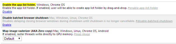
2. The
app launcher from the Google navigation bar was first available in the Google Search app for iOS.
3.
Google Play's desktop interface had a lot of advanced features that were removed when
Google updated the site to make it look more like the Android app.
4. The
Google+ photo editor and
Chrome Office editor are based on mobile apps that were ported to Native Client. You're now using the desktop to run mobile apps (only in Chrome).
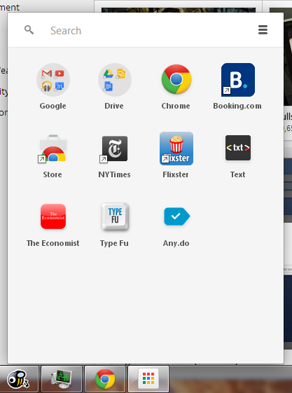
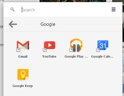
5.
Google Keep for Android has a lot
more features than Google Keep for desktop. For example, you can't reorder notes or add more than one image in Google Keep for desktop.
Somehow, the most innovative and most interesting apps are now in the mobile space. That's where the users are moving and where things are constantly changing. Mobile is a flourishing testbed for new ideas.