21 August 2019

Classic Hangouts will hang in there a bit longer


Earlier this year, Google said it would transition all Hangouts users on G Suite to Hangouts Chat and Meet by October 2019 and then retire the classic version of Hangouts. But a lot of G Suite users love their classic Hangouts, so Google has now revised Hangouts’ retirement date to “no sooner than June 2020.” That leaves the door open for a later date, too, and the company says it will provide a “more definitive date” at some point in the future.

It’s worth stressing that this new timline is about Hangouts for paying G Suite users, but it will also influence the consumer timeline. What exactly is happening to Hangouts for consumers remains a bit unclear, though, given that Google’s original consumer messaging strategy failed after the disappointment that was Allo.

But here is what we know: earlier this year, Google said that it wanted to transition consumers over to a free version of Hangouts Chat and Meet after the G Suite transition. A Google spokesperson told me that this plan remains in place and that it will start after the G Suite transition.

As for G Suite users, Google plans to make the transition for G Suite users easier as it looks to move them over to the new platform. Admins can already jump on an accelerated timeline and disable classic Hangouts right now (but they still need an invitation from Google to do so).


Read Full Article

Google denies reports of unannounced changes to Android app review process


Multiple reports this week claimed Google had quietly rolled out a more in-depth app review process to all developers — changes designed to keep the Play Store safer from spam, malware, and copycat apps. Those reports are inaccurate, Google tells TechCrunch. Instead, the company is giving itself more time to review apps from new, unestablished developers on the Play Store, as previously announced, but this hasn’t been extended to all developers.

Concerns about these so-called “unannounced changes” stemmed from a blog post by Choice of Games, which wrote that “all new apps” would be getting an additional review, slowing down app approvals. It claimed new apps would require at least three days for review, and this now included existing developers.

The post cited a conversation with Google Support as the source for its claims.

This led to a ton of confusion, as the development shop behind the post was well-established, having been on the Play Store since 2010 as would have been exempt from Google’s policy of increased reviews for new developers.

As it turns out, it appears there was miscommunication between Google Play Store developer support and the developer, according to the chat transcript that was published. The support person, “Liz,” was alerting the developer to the new policy Google announced in April, which detailed increased review times for Play Store newcomers. She didn’t appear to understand that she was speaking with a developer who had published on Google Play for nearly a decade.

Android Police also picked up the news, writing that it Google had “quietly instigated a more involved review process that impacts every app and update.”

Reddit and Hacker News also weighed in. In addition to the reported changes, developers were concerned there was now no way to schedule new app releases through the Timed Publishing feature. (That’s also not true — developers can publish to a closed testing track, then used Timed Publishing to go live to the public.)

A Google Developer Relations team member stepped in to clear things up on Reddit, and we’ve confirmed with Google that his responses were accurate.

Google’s updated app review process, first announced in April, hasn’t changed.

At the time, Google said:

“We will soon be taking more time (days, not weeks) to review apps by developers that don’t yet have a track record with us. This will allow us to do more thorough checks before approving apps to go live in the store and will help us make even fewer inaccurate decisions on developer accounts.”

Google began notifying developers directly in the Play Console in June that new apps by developers without a track record will take a couple of days longer to review. Google says that, since this change, it’s already seen a meaningful increase in the number of harmful apps blocked by Play even before they are published.

It’s not clear why the developer relations support person miscommunicated this information to the developer in question, but it points to a training issue on Google’s part.

It’s also unclear why the established developer’s app was held up in app review, beyond it just being a mistake on Google’s part.

Unfortunately for Google, Play Store developers have come to expect a speedy review process so any delays feel like unnecessary friction.

Unlike Apple, which employs a large team to carefully review app submissions and make hard calls on controversial apps, Google has more heavily relied on automation over the years. The company disclosed in the past how it uses software to pre-analyze apps for viruses, malware, and other content and copyright violations.

That process doesn’t always work, though. Only days ago, dozens of Android apps disguised as harmless photo editors and games were discovered to actually be adware. This follows similar news from January, where 85 apps were found to contain adware. And in May, where adware was discovered in some 200 apps totaling 150+ million installs. And, news from last November, where malware was found across over a dozen apps with half a million installs. And so on.

While it would make sense for Google to increase its review of all apps, given its inability to address this problem, that was not the case here.


Read Full Article

How Dropbox, Nike, Salesforce, MailChimp, Google and Pepsi welcome their new hires

Apple, Google and Mozilla block Kazakhstan’s browser spying tactics


Apple, Google and Mozilla have taken the rare step of blocking an untrusted certificate issued by the Kazakhstan government, which critics say it forced its citizens to install as part of an effort to monitor their internet traffic.

The browser makers said in a joint statement Wednesday it deployed “technical solutions” to block the government-issued certificate.

Citizens had been told to install the government-issued certificate on their computers and devices as part of a domestic surveillance program. In doing so it gave the government “root” access to the network traffic on those devices, allowing the government to intercept and snoop on citizens’ internet browsing activities.

Researchers found that only a few sites were being monitored, like Facebook, Twitter and Google.

Although the Kazakh government is said to have stopped what it called “system testing” and allowed citizens to delete the certificate, both Google and Mozilla said its measures would stop the data-intercepting certificate from working — even if it’s still installed.

“We don’t take actions like this lightly,” said Marshall Erwin, Mozilla’s senior director of trust and security. But Google browser chief Parisa Tabriz said the company would “never tolerate any attempt, by any organization — government or otherwise — to compromise Chrome users’ data.”

Apple said it had also taken action to “ensure the certificate is not trusted by Safari and our users are protected from this issue,” said a spokesperson.

The block went into effect invisibly and no action is needed by users.

Kazakhstan has a population of 18 million. Researchers said that the Kazakh government’s efforts to intercept the country’s internet traffic only hit a “fraction” of the connections passing through the country’s largest internet provider.

The Central Asian country currently ranks as one of the least free countries on the internet freedom score, based off data collected by watchdog Freedom House, trailing just behind Russia and Iran.

A spokesperson for the Kazakhstan consulate in New York did not respond to a request for comment.

Updated with comment from Apple.


Read Full Article

Family, hope and resilience on the migrant trail | Jon Lowenstein

Family, hope and resilience on the migrant trail | Jon Lowenstein

For the past 20 years, photographer and TED Fellow Jon Lowenstein has documented the migrant journey from Latin America to the United States, one of the largest transnational migrations in world history. Sharing photos from his decade-long project "Shadow Lives USA," Lowenstein takes us into the inner worlds of the families escaping poverty and violence in Central America -- and pieces together the complex reasons people leave their homes in search of a better life.

Click the above link to download the TED talk.

YouTube is closing its private messages feature…and many kids are outraged


People love to share YouTube videos among their friends, which is why in mid-2017 YouTube launched a new in-app messaging feature that would allow YouTube users to private send their friends videos and chat within a dedicated tab in the YouTube mobile app. That feature is now being shut down, the company says. After September 18, the ability to direct message friends on YouTube itself will be removed.

The change was first spotted by 9to5Google, which noted that YouTube Messages came to the web in May of last year.

YouTube, in its announcement about the closure, doesn’t offer much insight into its decision.

While the company says that its more recent work has been focused on public conversations with updates to comments, posts, and Stories, it doesn’t explain why Messages is no longer a priority.

A likely reason, of course, is that the feature was under-utilized. Most people today are heavily invested in their own preferred messaging apps — whether that’s Messenger, WhatsApp, WeChat, iMessage or others.

Google, meanwhile, can’t seem to stop itself from building messaging apps and experiences. When YouTube Messages launched, Google was also invested in Allo (RIP), Duo, Hangouts, Meet, Google Voice, Android Messages/RCS, and was poised to transition users from Gchat (aka Google Talk) in Gmail to Hangouts Chat.

However, based on the nearly 500 angry comments replying to Google’s post about the closure, it seems that YouTube Messages may have been preferred by many young users.

Young…as in children.


Screen Shot 2019 08 21 at 9.39.38 AMScreen Shot 2019 08 21 at 9.39.23 AM

A sizable number of commenters are complaining that YouTube was the “only place” they could message their friends because they didn’t have a phone or weren’t allowed to give out their phone number.

Some said they used the feature to “talk to their mom” or because they weren’t allowed to use social media.

Screen Shot 2019 08 21 at 10.02.56 AMScreen Shot 2019 08 21 at 9.41.12 AM

It appears that many children had been using YouTube Messages as a sort of workaround to their parents’ block on messaging apps on their own phones, or as a way to communicate from their tablets or via web, likely without parents’ knowledge.

That’s not a good look for YouTube at this time, given its issues around inappropriate videos aimed at children, child exploitation, child predators, and regulatory issues.

The video platform in February came under fire for putting kids at risk of child predators. The company had to shut off comments on videos featuring minors, after the discovery of a pedophile ring that had been communicating via YouTube’s comments section.

Notably, the FTC is also now following up on complaints about YouTube’s possible violations of COPPA, a U.S. Children’s Privacy law. Child advocacy and consumers groups complain that YouTube has lured children under 13 into its digital playground, where it collects their data and targets them with ads, without parental consent.

Though some people may have used YouTube Messages to promote their channel or to share videos with family members and friends, it’s clear this usage hadn’t gone mainstream. Otherwise, YouTube wouldn’t be walking away from a popular product.

The feature also had issues with spam — much like Google+ did —  as there were unwelcome requests from strangers, at times.

YouTube says users will still be able to share videos through the “Share” feature which connects to other social networks.


Read Full Article

YouTube is closing its private messages feature…and many kids are outraged


People love to share YouTube videos among their friends, which is why in mid-2017 YouTube launched a new in-app messaging feature that would allow YouTube users to private send their friends videos and chat within a dedicated tab in the YouTube mobile app. That feature is now being shut down, the company says. After September 18, the ability to direct message friends on YouTube itself will be removed.

The change was first spotted by 9to5Google, which noted that YouTube Messages came to the web in May of last year.

YouTube, in its announcement about the closure, doesn’t offer much insight into its decision.

While the company says that its more recent work has been focused on public conversations with updates to comments, posts, and Stories, it doesn’t explain why Messages is no longer a priority.

A likely reason, of course, is that the feature was under-utilized. Most people today are heavily invested in their own preferred messaging apps — whether that’s Messenger, WhatsApp, WeChat, iMessage or others.

Google, meanwhile, can’t seem to stop itself from building messaging apps and experiences. When YouTube Messages launched, Google was also invested in Allo (RIP), Duo, Hangouts, Meet, Google Voice, Android Messages/RCS, and was poised to transition users from Gchat (aka Google Talk) in Gmail to Hangouts Chat.

However, based on the nearly 500 angry comments replying to Google’s post about the closure, it seems that YouTube Messages may have been preferred by young users.

Younger…as in children.


Screen Shot 2019 08 21 at 9.39.38 AMScreen Shot 2019 08 21 at 9.39.23 AM

A sizable number of commenters are complaining that YouTube was the “only place” they could message their friends because they didn’t have a phone or weren’t allowed to give out their phone number.

Some said they used the feature to “talk to their mom” or because they weren’t allowed to use social media.

Screen Shot 2019 08 21 at 10.02.56 AMScreen Shot 2019 08 21 at 9.41.12 AM

It appears that many children had been using YouTube Messages as a sort of workaround to their parents’ block on messaging apps on their own phones, or as a way to communicate from their tablets or via web, likely without parents’ knowledge.

That’s not a good look for YouTube at this time, given its issues around inappropriate videos aimed at children, child exploitation, child predators, and regulatory issues.

The video platform in February came under fire for putting kids at risk of child predators. The company had to shut off comments on videos featuring minors, after the discovery of a pedophile ring that had been communicating via YouTube’s comments section.

Notably, the FTC is also now following up on complaints about YouTube’s possible violations of COPPA, a U.S. Children’s Privacy law. Child advocacy and consumers groups complain that YouTube has lured children under 13 into its digital playground, where it then collects their data and targets them with ads, without parental consent.

Though some people may have used YouTube Messages to promote their channel or to share videos with family members and friends, it’s clear this usage hadn’t gone mainstream. Otherwise, YouTube wouldn’t be walking away from a popular product.

The feature also had issues with spam — much like Google+ did —  as there were unwelcome requests from strangers, at times.

YouTube says users will still be able to share videos through the “Share” feature which connects to other social networks.


Read Full Article

Andrew Ng’s AI companies expand to Medellin, Colombia


After his tenure as Chief Scientist at Baidu, Andrew Ng, the founder of the Google Brain project and former CEO of Coursera, set up a number of different proejcts that all focus on making AI more approachable. These include the education startup Deeplearning.ai, the AI Fund startup studio for building AI companies and Landing.ai, which helps enterprises (and especially manufacturing companies) use AI. Today, Ng announced that he has opened a second office for these projects in Medellin, Colombia.

At first, Medellin may seem like an odd choice. But today’s Medellin is very different from the one you may have seen on Narcos (and a lot safer). It’s home to a number of universities and over the course of the last few years, it’s a hub for Colombia’s startup scene thanks to incubators like Ruta N and others.

Ng told me that he chose Medellin after looking at a wide range of cities in Europe, Asia and Latin America. Medellin, he believes, offers a strong talent pool, educational system and business ecosystem. it also helps that the Colombia government has made tech a focus in recent years.

Screen Shot 2019 08 20 at 4.29.37 PM 1

“I see early signs of momentum for Colombia being a talent magnet both regionally and globally,” he told me. Indeed, the company was able to hire team members from Poland, Bangladesh, Egypt and Chile for its offices in Medellin, which now has just under 50 people. Over the course of the next two years, Ng plans to expand this team to between 150 and 200 employees.

It’s important, Ng argues, that we set up AI hubs outside of Silicon Valley and China, in part, because they’ll provide a different perspective. “We are able to share our AI ecosystem and Silicon Valley know-how with Medellín,” he writes in today’s announcement. “We’re equally thrilled for our Silicon Valley team to be learning from the Medellín community. Local knowledge and innovation shared with a global community is what will catapult the technology forward.”

The teams in Medellin will work on all of Ng’s projects, including four unannounced stealth portfolio companies that are looking into using AI in sectors like healthcare, education and customer support. In total, the teams in Medellin are working on about a dozen projects right now. And that’s very much Ng’s approach to AI — and for Landing.ai in particular: build lots of specialized components for various verticals that can then be generalized. “AI isn’t some piece of SaaS software that everybody can just swipe their credit card and use,” he said.


Andrew Ng will also join us for our first TechCrunch Sessions: Enterprise event in San Francisco on September 5 to talk about Landing.ai and the future of AI in general. You can find more information about the event (and buy tickets) here.


Read Full Article

Waymo releases a self-driving open data set for free use by the research community


Waymo is opening up its significant stores of autonomous driving data with a new ‘Open Data Set’ it’s making available for the purposes of research. The data set isn’t for commercial use, but its definition of ‘research’ is fairly broad, and includes researchers at other companies as well as academics.

The data set is “one of the largest, riches and most diverse self-driving datasets ever released for research,” according to Waymo Principal Scientist and Head of Research at Waymo Drago Anguelov, who was at both Zoox and Google prior to joining Waymo last year. Anguelov said in a briefing that the reason he initiated the push to make this data available is that Waymo, along with several other companies working in the field are “currently hampered by the lack of suitable data sets.”

“We decided to contribute our part to make, ultimately, researchers in academia ask the right questions – and for that, they need the right data,” Anguelov said in a briefing. “And I think this will help everyone in the field, it is not an admission in any way that we have problems solving these issues. But there is always room for improvement in terms of efficiency, scaleability, amount of labels to need. It’s a developing field. I’s mostly we’re trying to get others into thinking about our problems and working with us, as opposed to doing work that’s potentially not so impactful, given the current state of things.”

labels 2d

The Waymo Open Data set tries to fill in some of these gaps for their research peers by providing data collected from 1,000 driving segments done by its autonomous vehicles on roads, with each segment representing 20 seconds of continuous driving. It includes driving done in Phoenix, AZ; Kirkland, WA; Mountain View, CA; and San Francisco, CA, and offering a range of different driving conditions including at night, during rain, at dusk and more. The segments include data collected from five of Waymo’s own proprietary lidars, as well as five standard cameras that face front and to the sides, providing a 360-degree view captured in high resolution, as well as synchronization Waymo uses to fuse lidar and imaging data together. Objects, including vehicles, pedestrians, cyclists and signage is all labelled.

Waymo has traditionally been among the more closed companies when it comes to its collected data, and it’s also the player that often touts its own long experience as a key competitive advantage (Waymo began life as Google’s Self-Driving Car project, which officially began work out of Google’s X Lab in 2009). The company has also had a high-profile legal spat over intellectual property with autonomous driving technology rival Uber, following the hiring by Uber of a former member of its own team. Naturally, then, some might be skeptical about how ‘open’ it actually is about ways this data can be used.

pasted image 0 2

Vijaysai Patnaik, a Product Lead at Waymo, explained that ‘research’ use actually covers a lot of ground. There’s a specific licensing agreement with the data set, as you would expect, but Patnaik also gave a general explanation during the briefing about who they expect might make use of the data and for what purposes.

“That could include universities and PhD students are professors at various universities who are interested in this field, it could include independent research labs or robotics labs, for example.” Patnaik said. “There are a number of those in the Bay Area. And […] companies can use this data set as long as they comply with our license agreements, or it could also include folks like Drago [Anguelov] and his teams in other organizations.

Other companies working in autonomous driving have taken similar approaches, with Lyft and Argo AI as two recent examples. Waymo does indeed have a commanding lead on the rest of the field when it comes to actual time on the road and miles driven, however, so researchers in both autonomous driving, and related robotics fields, including computer vision, are probably eager to see what they’re releasing.


Read Full Article

Review


Review

Hear THX’s new Deep Note right here


The THX Deep Note is changing and it can be heard here first. The iconic audio track has long proceeded movies certified by THX and features the now familiar crescendo that showcases the movie’s audio capability. This time around THX built the intro to feature 4k video as much as audio as it will be available to theaters that are THX Certified Cinema partners.

To make the trailer immersive online, THX utilized its THX Spatial Audio post-production mixing tools that enables online users to experience the multidimensional sound using headphones. It’s special. Don some headphones and turn up your volume before pressing play. THX says in a press release it “applied advanced objects and ambisonics-based engineering, essentially spherical harmonics, for full-sphere audio.” I’m not sure what that means, but the trailer sounds great.

The original THX Deep Note debuted at the premiere of Return of the Jedi in Los Angeles.

“Our aim with this piece is to extend the legacy that inspired us as young people in the movie theater,” said Ben Rosenblatt in a released statement, the trailer’s executive producer and co-founder of American Meme. “As a kid, I was blown away by the THX Deep Note trailer and would go back to the movie theater again and again just to see it, which inspired me to pursue the career I have in Hollywood today. We hope we’ve taken this a step beyond the originals to open up young minds and inspire an entirely new generation.”


Read Full Article

PayPal-backed money lender Tala raises $110M to enter India


Tala, a Santa Monica, California-headquartered startup that creates a credit profile to provide uncollateralized loans to millions of people in emerging markets, has raised $110 million in a new financing round to enter India’s burgeoning fintech space.

The Series D financing for the five year-old startup was led by RPS Ventures, with GGV Capital and previous investors IVP, Revolution Growth, Lowercase Capital, Data Collective VC, ThomVest Ventures, and PayPal also participating in the round.

The new round, which takes the startup’s total fundraising to $215 million, valued it above $500 million, a person familiar with the matter told TechCrunch. Tala has also raised an additional $100 million in debt, including a $50 million facility led by Colchis in last one year.

Tala looks at a customer’s data on texts and calls, merchant transactions, overall app usage, and other behavioral data through its Android app to build their credit profile. Based on these pieces of information, it provides instant loans in the range of $10 to $500 to customers.

The loans are approved within minutes and disbursed via mobile payment platforms. The startup has lent over $1 billion to more than 4 million customers to date — up from issuing $300 million in loan to 1.3 million customers last year, Shivani Siroya, founder and CEO of Tala, told TechCrunch in an interview.

The startup, which employs more than 550 people, will use the new capital to enter India, Siroya, who built Tala after interviewing thousands of small and micro-businesses, said. In the run up to launch in India, Tala began a 12-month pilot program in the country last year to conduct user research and understand the market. It has also set up a technology hub in Bangalore, she said.

tcdisrupt ny17 8861

Shivani Siroya (Tala CEO) at TechCrunch Disrupt NY 2017

“The opportunity is very massive in India, so we spent some time customizing our service for the local market,” she said.

According to World Bank, more than 2 billion people globally have limited access to financial services and working capital. For these people, many of whom live in India, securing a small size loan is extremely challenging as they don’t have a credit score.

In recent years, several major digital payment platforms in India including Paytm and MobiKwik have started to offer small loans to users. Traditional banks are still lagging to serve this segment, industry executives say.

Tala goes a step further and takes liability for any unpaid returns, Siroya said. More than 90% of Tala customers pay back their loan in 20 to 30 days and are recurring customers, she added.

The startup also forwards the positive credit history and rankings to the local credit bureaus to help people secure bigger and long-term loans in the future, she added.

Tala, which charges a one-time fee that is as low as 5% for each loan, relies on referrals, and some marketing through radio and television to acquire new customers. “But a lot of these users come because they heard about us from their friends,” Siryoa said.

As part of the new financing round, Kabir Misra, Founding General Partner of RPS Ventures, has joined Tata’s board of directors, the startup said.

Tata will also use a portion of its new fund to expand its footprint and team in its existing markets — East Africa, Mexico, and the Philippines — and also build new solutions.

Siroya said the startup has identified some more markets where it plans to enter next. She did not disclose the names, but said she is eyeing more countries in South Asia and Latin America.


Read Full Article

Xiaomi launches Mi A3 Android One smartphone with 48MP rear camera in India for $181


Google has found a committed partner for Android One in Xiaomi. The Chinese electronics giant today announced the launch of Mi A3, an Android One smartphone, in India as the company looks to expand its handset offering in its most important market.

The Mi A3, which is the third Android One handset from Xiaomi, features mid to high-end hardware modules at an affordable price point. It sports a 6.088-inch HD+ (1560X720 pixels) AMOLED display, a trio of 48MP, 8MP and 2MP camera sensors on the back to take detailed and sharp photos, and a 32MP selfie shooter.

The Mi A3 comes in two variants: one that bundles 4GB RAM and 64GB of storage that is priced at Rs 12,999 ($181). The second variant, which features 4GB RAM and 64GB of storage, is priced at Rs 15,999 ($223). Both of them are powered by Qualcomm Snapdragon 660 processor.

A lot about Android One’s future is riding on the Mi A3, which was first unveiled by Xiaomi in Spain last month. Xiaomi said the Mi A1 and Mi A2 handsets that it launched in last two years remain the most popular Android One handsets. For Android One, phone vendors work closely with Google to get faster software updates and offer a “stock” Android experience without the bells and whistles that phone makers and carriers pre-install on their handsets.

xiaomi androidone

Xiaomi has tried to not cut any corners to appease users, Manu Jain, the India head and Xiaomi VP of Global operations, said at a media conference today. The Xiaomi Mi A3 handset houses a fairly large 4030mAh battery, a 3.5mm headphone jack, and supports external microSD card should you need more storage. It also has incorporated a fingerprint sensor into the display to allow users to quickly unlock the phone. You can check rest of the specs here.

For Xiaomi, India has emerged as its most important market. The company has been the top smartphone in India for eight straight quarters.


Read Full Article

You Can Soon Watch YouTube Originals for Free


youtube-premium-originals

YouTube is making its YouTube Originals free-to-watch. While some existing content will remain exclusively available to YouTube Premium subscribers, new shows and movies released after September 2019 will be available for everyone to watch for free.

What Are YouTube Originals?

As the name suggests, YouTube Originals are original movies and shows produced by YouTube. YouTube began producing original programming as a way of enticing viewers into subscribing to YouTube Red. Which has since been rebranded as YouTube Premium.

There are some YouTube Originals worth watching, but most YouTube Originals aren’t up to the standard of the original programming produced by Netflix, Hulu, and Amazon. Which is probably why YouTube is now switching its Originals to an ad-supported model.

YouTube Originals Are Free-to-Watch

In September 2019, anyone and everyone will be able to watch YouTube Originals for free. According to an email sent out to existing YouTube Premium subscribers, this will apply to all YouTube Originals released after September 24, 2019.

From that date on, non-members will be able to watch YouTube Originals for free by sitting through the occasional advert. However, according to this YouTube Help page, this will only apply to new content, and not seasons of shows already released.

YouTube Premium subscribers will also benefit from ad-free viewing, access to all episodes in a season straight away, the ability to download episodes to watch offline, and exclusive access to bonus content. Which YouTube hopes will be enough of a draw.

Is YouTube Premium Good Value for Money?

This is great news for people who don’t currently subscribe to YouTube Premium. Because if you have heard of some YouTube Originals and wished you could watch them you’ll soon be able to do so without stumping up the $11.99/month asking price.

We have previously asked, is YouTube Premium worth the money? And access to YouTube Originals was one of the benefits listed. With YouTube Originals now accessible to anyone and everyone, this surely makes YouTube Premium less appealing.

Read the full article: You Can Soon Watch YouTube Originals for Free


Read Full Article

iPhone Hotspot Not Working? How to Fix iPhone Tethering

The Best Vector Software for Mac Designers on a Budget


mac-vector

Adobe Illustrator is often considered the gold standard of vector software for Mac. However, you can use alternatives to create crisp artwork and beautiful diagrams. Illustrator alternatives exist, and they give you some compelling options when you’re short on cash.

If you’re looking for a Mac vector editor to use in your next project you should try one of these free vector editors or cheap Adobe Illustrator alternatives first. This is the best vector software for macOS that you can use for free or buy on a budget.

What Are Vector Graphics?

For those who are still new to the concept, Vector graphics use mathematical equations along a 2D axis to draw lines and shapes inside a fixed space. This differs from raster images, which are pixel-based. When you scale a raster image past its max resolution, it “stretches” and becomes blurry. With vector graphics, you can scale up and down infinitely.

This flexibility means that vector graphics are incredibly useful for design purposes. They are great for creating icons, logos, diagrams, charts, posters, magazines, and other scalable artwork.

1. Inkscape (Free)

Inkscape is probably the most versatile free vector editor for Mac. With a long history of development and a keen fanbase, Inkscape works on all three major operating systems and costs nothing.

Inkscape uses an open-source development model (like these other free open-source mac apps), and as a result its technological progress is often slower than that of its commercial rivals. Inkscape prides itself on its full compatibility with the W3C open standard SVG, and strives to make itself one of the most user-friendly SVG editors for Mac on the market.

Despite this user accessibility, newcomers may feel a little out of their depth when trying it out. To help, there’s extensive documentation and answers to your questions within the Inkscape forums.

Note: Mac users may need to download XQuartz in order to run Inkscape. So if you’re not a fan of additional downloads, this might be a hassle.

Verdict: Inkscape is the best open-source vector graphics software for Mac, and the closest you’ll come to Adobe Illustrator if your budget is zero.

Download: Inkscape (Free)

2. Vectr (Free)

Vectr is a free vector editor built on web technology. You can download Vectr for Windows, Linux, or Chrome OS, or run the browser version through macOS.

The app comes with a promise of being “free forever,” and its tools are mostly focused on creative vector drawings, such as logos, brochures, and posters.

Best of all? Vectr includes a comprehensive user guide and tutorials, so you can learn how to use it effectively in very little time.

Verdict: A free, web-based tool with excellent customer support via online tutorials.

Download: Vectr (Free)

3. LibreOffice Draw (Free)

Best Vector Software for Mac Free LibreOffice Draw

LibreOffice is a popular open-source alternative to Microsoft Office, and it comes with its own vector drawing program called “Draw”. Unfortunately LibreOffice Draw isn’t as feature-rich as some of the other programs on this list, but it does have a few accessories.

The free vector editor seems to be aimed at users who want to create flowcharts or diagrams. It also has the ability to create technical drawings and brochures. LibreOffice Draw is also a great Mac vector editor for those looking to create network diagrams—all without a high degree of artistic skill.

Note: If you’re looking to create artwork, then Inkscape might be a better choice.

Verdict: Lacks the polish of some other programs. If you were previously using LibreOffice, you might already have it installed.

Download: LibreOffice (Free)

4. DrawBerry (Free)

Best Vector Software for Mac Free DrawBerry

DrawBerry won’t “wow” you with its features or extensive help documentation, but it still works on the latest version of macOS, so it may be worth a shot.

This free vector editor for Mac is very lightweight, and although it lacks the features of more advanced programs, its simplicity is key to its appeal. While seasoned graphic designers will be pining for more advanced features, if you need a logo for your low-to-no-budget project, you can do a lot worse than DrawBerry.

Verdict: Despite being ancient and lacking in features, it still works. It’s also still free, and it might do the job if you don’t need a hefty vector editor.

Download: DrawBerry (Free)

5. Boxy SVG ($9.99)

Best Vector Software for Mac Cheap Boxy SVG

Boxy is a type of vector graphics software for Mac with similar functionality to Inkscape. It has its own Mac app available through the App Store, and can import and support SVG file extensions. It can also support PNG, JPEG, and GIF.

When you’re using Boxy, transform tools, grouping tools, and painting tools are all supported with preset shapes, along with support for gradients and patterns.

Verdict: Boxy is a nice entry to the vector graphics category built on web technology. It’s lightweight and begging to be played with.

Download: Boxy SVG ($9.99)

6. Autodesk Graphic ($29.99)

Best Vector Software for Mac Free Autodesk Graphic

Previously known as iDraw, Autodesk Graphic is a great lightweight vector editor for Mac. It’s more expensive than it used to be, but it still maintains a robust feature set with full support for SVG, PDF, and AI (Illustrator) formats. It also has layered PSD imports and exports for photoshop users.

Featuring a good range of tools for drawing and sketching, Autodesk Graphic makes for a great choice for a SVG editor when you’re a designer on a budget. You can also download Autodesk Graphic for iPad, which uses iCloud to sync. This way you can access your designs on the go.

Verdict: A proper vector editor above all else.

Download: Autodesk Graphic ($29.99)

7. Pixelmator ($39.99)

Best Vector Software for Mac Cheap Pixelmator

Pixelmator is one of our favorite vector editor alternatives on this list. The app provides limited support for vector drawing with shape and lines.

Pixelmator has a range of in-built shapes and tools for mapping out vectors, though professional users who are used to the advanced features in Illustrator will probably be left wanting more.

Verdict: A great app that can perform many common tasks.

Download: Pixelmator ($39.99)

8. Affinity Designer ($49.99)

After the glowing reception it received for the raster editor “Affinity Photo”, Serif Labs introduced Affinity Design to take on the vector editor market. It specifically targets Adobe Illustrator’s subscription model by offering the program for a one-time fee instead of a monthly cost.

Affinity claims to have the best PSD import engine around. While we’re not sure Adobe would agree with this, Affinity does support PSD, PDF, SVG, AI, Freehand and EPS file formats.

There’s 16-bit per channel editing, support for slices, realtime masks, adjustment layers, and graphics tablet support.

All of this comes alongside the usual features that you would expect from such a program—a great pen tool, curve editing, smart shapes, flexible text, and several workspace templates designed for web and print. You can also use raster-style effects for the best of both worlds.

Verdict: A serious vector editor alternative to Illustrator, with no subscription fees.

Download: Affinity Designer ($49.99)

9. Sketch ($99)

Best Vector Software for Mac Cheap Sketch

The most expensive of the SVG editors for Mac on this list, Sketch bills itself as a professional vector program for designers.

Built for ease of use, Sketch aims to produce high quality vector drawings. There’s even a Sketch Mirror companion app that allows you to preview your designs live on your device as you work.

As you’d expect from a professional app, Sketch has all the bases covered: an advanced UI, excellent text rendering and a slew of grids and guides to help you design to your heart’s content. You can learn the ins and outs of the program with the Sketch support pages.

You can also get a helping hand with your project by downloading community resources, ranging from iOS development kits to icon templates.

Sketch offers a 15-day free trial, so you can try this vector editor out beforehand. The only downside? You’ll need to renew your license on a yearly basis.

While this yearly renewal is still less expensive than Adobe’s subscription model, it can definitely get pricey if you’re on a budget.

Verdict: Sketch is up there with the best of the best when it comes to vector software for Mac. Unfortunately it also has a price tag to match.

Download: Sketch ($99)

Vector Software That Didn’t Make the Cut

If you’re thinking “there must be more out there!” then you’d be right. There are a lot of apps that didn’t make the cut, and here’s a few so you can dismiss them entirely:

  • Xara Xtreme: A free, open-source version of the premium Windows project, the mac version of Xara Xtreme was previously in development. Unfortunately it doesn’t look like the project has had an update since 2008.
  • Skencil: A free vector drawing program for Linux that will run on macOS. Unfortunately there have been no updates since 2010.
  • Karbon: A great free package that’s open-source, but it requires the whole Calligra Suite to be installed to use it. We guess it’s worth a try if you’re unsatisfied with Inkscape or Boxy SVG.

What’s Your Favourite Vector Software for Mac?

Did we miss any great vector packages for macOS? If so, let us know about your favorite vector software in the comments below. And then take a look at why it’s important to know how to change the DPI of an image, especially if you’re a designer.

Read the full article: The Best Vector Software for Mac Designers on a Budget


Read Full Article

4 Ways to Sync and Upload Photos to Cloud Storage on Android

The 6 Best Hidden Cameras for Protecting Your Home

YC-backed Stoic is a journaling app with a focus on understanding your feelings


The process of using the Stoic journaling app is simple: You open the app in the morning and the evening, when you’ll prompted to answer a couple questions and perform a few simple exercises.

For example, this evening the app asked me to rate my current level of fulfillment and to identify what made me smile today, while also pointing me to guided exercises like journaling and breathing.

Stoic is part of the current batch of startups at Y Combinator (it’s taking the stage today at Demo Day). Founder Maciej Lobodzinski told me that his goal is to help users understand the different factors influencing their mental and emotional state.

“The core of the app is: We have this insight and we see what influences your mood and what you feel,” Lobodzinski said. He suggested that this is very different from the “super transactional” idea embedded in my other mental health and wellness apps, where “you pay for my app and you feel better.” In his view, “You should feel how you feel. It’s okay, how you feel, but you should know why you are feeling this way.”

So once there are a couple weeks of data in the app, you should be able to look back and see how you were feeling on a certain day, and if there were activities that made you feel more or less fulfilled. Over time, Lobodzinski hopes to add more insights about “what influenced you, why you feel this way, why you are productive.”

Stoic screen shots

As the name implies, Stoic is inspired by Lobodzinski’s interest in classical Stoic philosophy (he’s not the first to suggest that the approach has direct applications in the tech industry), and the app even includes quotes from Stoic philosophers.

“It’s an extremely practical framework,” he said. “When I talk to users, there are entrepreneurs, investors, traders — people who found out about the app because they were looking for how to deal with their stress …
If you are stressed with your everyday life and you can get the advice of the emperor of Rome, who dealt with much more serious things, it’s amazing how much better you can feel after that.”

At the same time, users have the option to receive quotes from different schools of thought — not just Stoicism but also Buddhism, Taoism and Catholicism. For some users, their app experience won’t be explicitly focused on Stoicism, but Lobodzinski said that even then, it forms the “spine” of the app’s approach.

The basic app is free, but Stoic charges $27.99 per year for a premium version that includes iCloud syncing and additional content.


Read Full Article

Waxed canvas bags from Waterfield, Manhattan Portage, Saddleback and more


It’s finally Bag Week again! the most wonderful week of the year at TechCrunch. Just in time for back to school, we’re bringing you reviews of bags of all varieties: from backpacks to rollers to messengers to fanny packs.

This year, like last year, I decided to focus on a specific niche in the bag community: waxed canvas. Last year I reviewed a handful of bags from Ona, Filson, and other purveyors of fine waxed goods. But there are many more to choose from, so I’ve collected a second handful and used them all for long enough to get a sense of their strengths and weaknesses.

Waxed canvas is a wonderful material. The natural fibers infused with wax provide water resistance, structure, protection, and a great look that only gets better with time as you use it. It’s my favorite material and it should be yours too. Only trouble is it can be expensive. But keep in mind that these bags are the kind that you take with you for a decade or two.

For this post I focused on laptop bags, but later in the festivities I’ll have a couple more waxed bags more in the “messenger” style, so keep your eyes peeled.

Waterfield Bolt – $269

Pros:

  • Solid medium-weight material and construction
  • Good padding and leather protective layer
  • Surprising amount of space and pockets

Cons:

  • Somehow lacks panache
  • Leather thongs instead of metal zipper pulls not for everyone

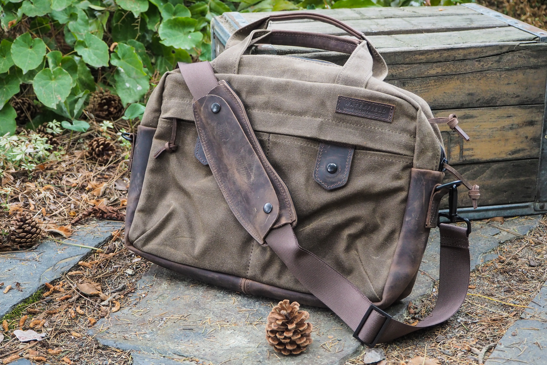
Of all the bags I’ve looked at for this roundup, this one is perhaps the most straightforward, in that it isn’t convertible, super-heavy, super-light, blue, or anything like that. It’s just a solid all-purpose laptop bag made of waxed canvas and leather, and as such makes for a sort of baseline with which to compare everything else.

[gallery ids="1839091,1839097,1839088,1839093,1839096,1839095,1839094,1839092,1839090,1839087"]

The Bolt’s canvas isn’t as thick as that on other Waterfield bags, since it’s lined and padded on the inside. It still has a nice finish, though, and the leather base and trim are similarly high-quality. The strap is, like the other bags from the company, nylon, where I would prefer canvas, but the grippy leather shoulder pad included is among the most practical and comfortable I’ve used.

Where the Bolt excels is not in sheer space, since it’s rather a compact bag (you can choose a larger size if you prefer), but in feeling that space is used well. There are snap pockets in the front and a larger zip one as well for quick access, all protected by a small flap but still easy to get at. On the back is a flap pocket and luggage strap so it can sit safely atop your roller bag.

And opening up the main compartment through its weather-proof zipper, the bag accordions open pleasantly to reveal laptop, tablet, notebook, and other slots all easily accessible. I even like the color in there!

I only wish it inspired a little more love. It’s not a bad-looking bag by any means, but it feels very pedestrian — few stylistic choices seem to have been made. It’s practical but not individual. To some that won’t matter — this is a solid bag. But it lacks a certain je ne sais quois that the company has to spare in its other bags.

Waterfield Outback Solo – $159

Pros:

  • Great material and construction
  • Compact but not microscopic

Cons:

  • Awkward to carry without strap
  • Not a lot of room in there (by design, but still)

Sometimes you’re just going out with a tablet or laptop and book, and don’t feel like taking a whole messenger style bag or briefcase. This little guy is sort of halfway between a laptop sleeve and a bag, and if you don’t mind its purselike nature it’s a perfect companion for those more minimal trips.

The laptop compartment is snug and well-padded. The outside has a slip pocket with some nooks for pens and the like, big enough to fit a 8.5×11″ notebook or not-too-thick book. Just don’t try putting groceries or anything in there.

[gallery ids="1839103,1839102,1839101,1839100,1839099,1839098"]

Closure is a magnetic snap that feels secure enough but I’d just as soon have something a little more physical. I’d like to mention that the closure strap looks a little sloppy in the photos above, but it’s really not like that in general use and will wear in nicely. And although it feels great to carry this light little guy with the shoulder strap (which stows away decently well), carrying it like a sleeve or clutch isn’t so hot — a small handle or strap would make this much better.

I’d recommend this to anyone who has a larger bag for trips but doesn’t want to pack and unpack it every time they want to step out to the coffee shop. This would work well as a sub-bag or laptop sleeve if you have lots of room in the big one.

Joshu+Vela Zip Briefcase – $198

Pros:

  • Excellent lighter material that will age well
  • Straightforward style and solid straps
  • Great giant brass zippers

Cons:

  • Which side’s the front?
  • Unstructured interior can make stowage and retrieval annoying

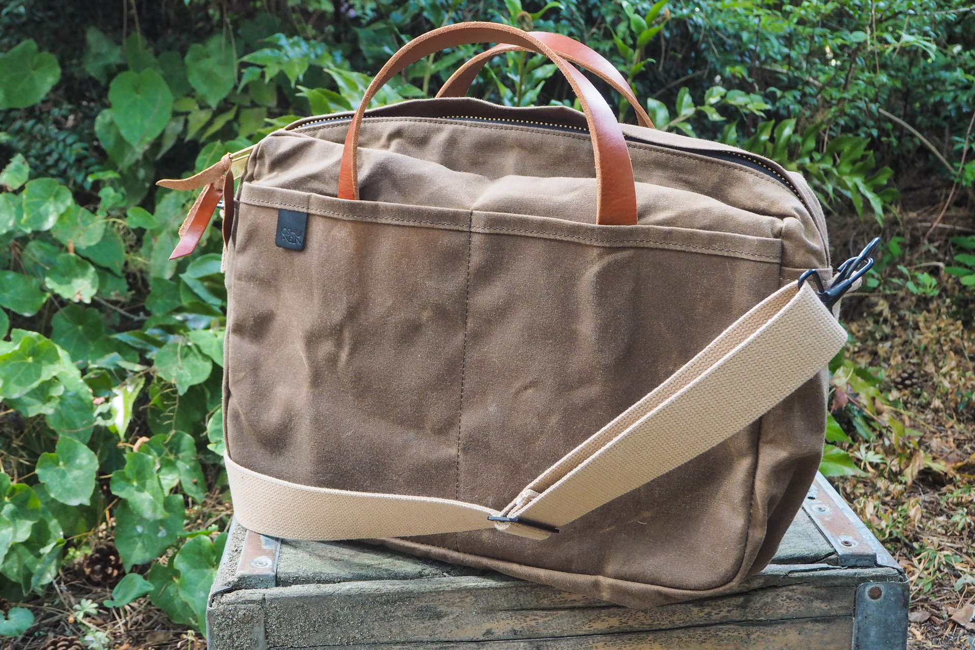
Coming from a shop more known for totes and lightweight, fashionable gear for everyday urban living, this one is heavy duty for them but light compared with some others in this roundup. Its style is subtle and straightforward, but high quality.

The material is a lighter weight and color canvas with a crispy feel that will very quickly show patterns of use as, for example, one front pocket is habitually used for a book or keys. Empty it is possibly the lightest waxed bag I’ve used, which of course makes it good for anyone trying to stay minimal. The simple leather straps are sturdy and comfortable, though their springy, upright nature does mean they occasionally interfere with access.

[gallery ids="1839045,1839054,1839046,1839053,1839052,1839051,1839050,1839044,1839049,1839048,1839047"]

I love the huge brass zipper and pulls, though I could do without the leather bits (you can remove them). I didn’t like the plain natural canvas strap at first but it, like other aspects of the bag, has grown on me.

The simplicity of the design is good, but it also leads to some problems. Unless you look closely it can be hard to tell which side is the front — only the zipper flap and small label hint at it. Something to secure or differentiate the front or rear pockets, even as simple as removing the divider in the back, would be welcome.

Inside has three divisions, but the billowing, unstructured canvas plus the limited zip-top entrance can make stowage and retrieval a little awkward, more so than a flap-top bag anyway. A tighter compartment for a laptop or tablet would be great in here rather than having it swim in a big undifferentiated section. There’s also no padding, so I’d recommend keeping your device in its own case (this also helps it fill out the space).

Manhattan Portage Cortelyou – $365

Pros:

  • Classy messenger/briefcase crossover style
  • Lovely blue color
  • Great handle, closure, and straps

Cons:

  • Not particularly waxy or robust
  • Steel and brass? Sacrilege
  • Interior material not for everyone (also has a tacky watermark)

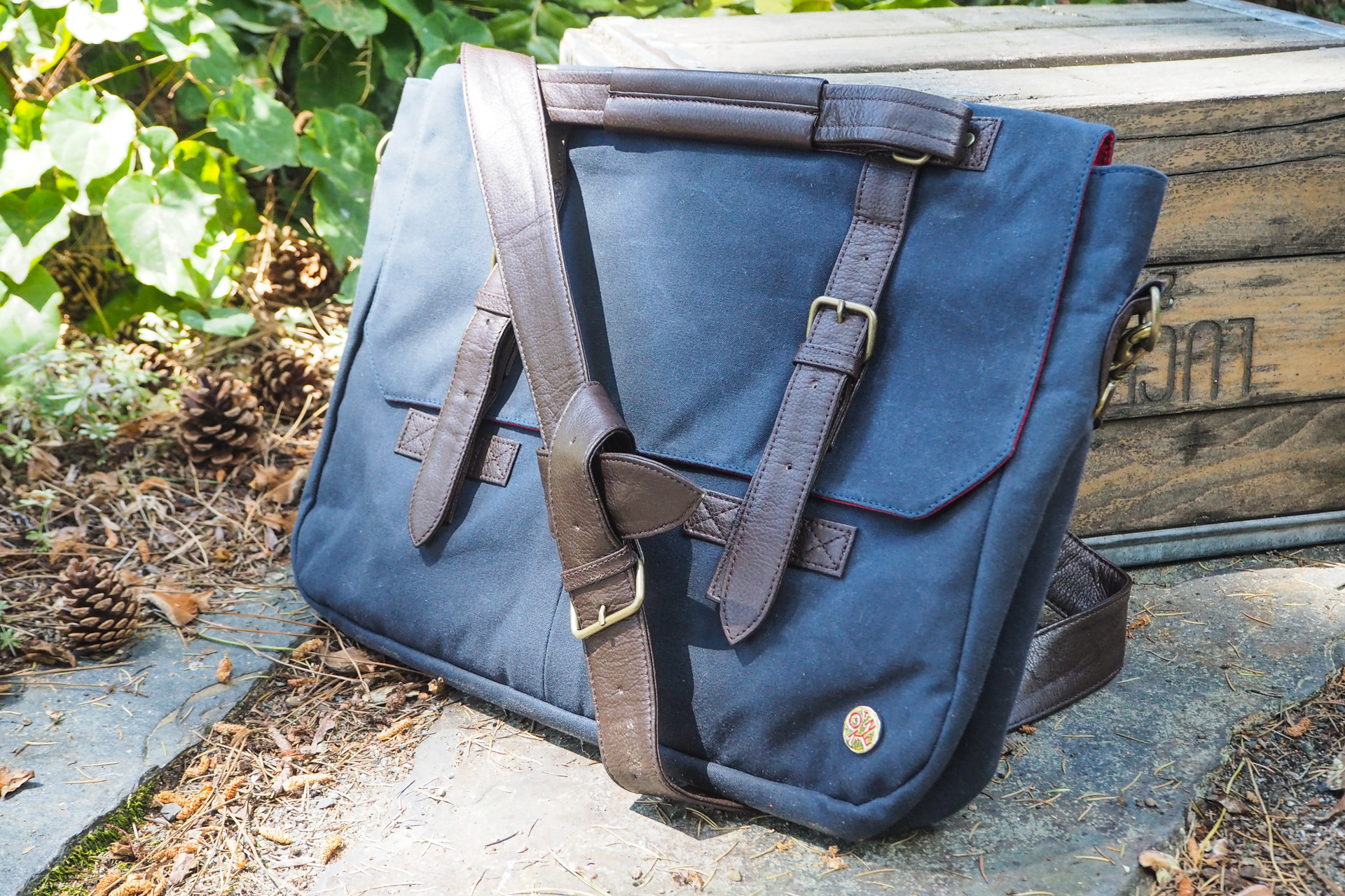
Waxed canvas is normally tan or brown, but that’s just tradition. I like the forest green of the Croots bag from last year or the Saddleback one below, but the rich navy blue of this Manhattan Portage Token bag is also excellent. The material is very light, with a fine weave and barely any wax. That means it probably won’t show the characteristic scuffs and patterns that give this type of bag its personality. (You can always wax it yourself.)

This bag, with its half-flap and top handle, straddles the line between laptop bag and briefcase. It’s not particularly thick but has lots of room for big documents, laptops, and other long items. Its structure means it’ll stay relatively svelte even when full — this won’t get lumpy.

[gallery ids="1839062,1839056,1839058,1839061,1839059,1839063,1839060,1839055,1839057"]

The leather straps and trim are a nice chocolate color and complement the blue well. It’s not heavy or stiff, and the shoulder strap in particular is very pliable — though so long I had to knot it to keep the extra out of the way (fortunately it looks cool that way). The snap closure can be a little tricky to get right by feel, but attaches solidly. The handle, which folds flat but pops up when you need it, is genius — probably the best handle of all the bags in this roundup, though not quite as robust as the Saddleback (but what is?).

The interior isn’t as to my liking. The red nylon watermarked with a branded pattern seems sort of gauche compared to the refined outside, and at the same time it feels like this choice of material should have allowed for more small pockets. It should help keep things dry, though, which is good considering the thinness of the waxed canvas layer.

Manhattan Portage Saratoga

Pros:

  • Convertible style makes it a good companion for conventions, business trips, etc
  • Plenty of handles and exterior pockets

Cons:

  • Not the best of both worlds (but not the worst either)
  • Straps make it feel bulky and lumpy if not stowed carefully

When I’m at CES or some other big show where I do a lot of walking but need to carry my basic loadout everywhere, I often wish I could transform my laptop bag into a backpack or vice versa. The Saratoga accomplishes this, and while it ends up compromising both forms as a result, it also fundamentally scratches an important itch.

The material is a soft-feeling canvas that doesn’t feel very rugged but is showing a nice wear pattern already. The weather-sealed zippers are good news for anyone who wants to take this out in the rain, but there are just too many of them. Six on the exterior, five visible on the front side! This thing jingles like a festive little elf.

[gallery ids="1839068,1839067,1839066,1839065,1839069"]

The back of the bag is a large pocket in which the pack straps sit, providing extra padding while they’re in there.  You pull them out and clip them onto some unobtrusive little D-rings, and boom, it’s a backpack. Doing the reverse is a little harder, as you need to make sure the straps don’t bunch up in their pouch.

I would have much preferred a more elegant pocket solution, not least because some of the pockets don’t make much sense while in one or the other configuration. And the leather bottom, while great in briefcase mode, makes it seem a little lopsided in backpack mode. Obviously these are drawbacks inherent to the switchable design, which brings its own benefits, but they’re worth considering. I might have liked a single big pocket on the front that can be opened from the side or top, and sub-pockets within.

The interior, while it’s the same watermarked red nylon as the one above, is populated with tons of little pockets and useful stashes that helpfully all close independently, meaning there’s no need to re-pack when you’re going from one mode to the other.

(I can’t seem to find this for sale any more – but keep your eyes open if you like it.)
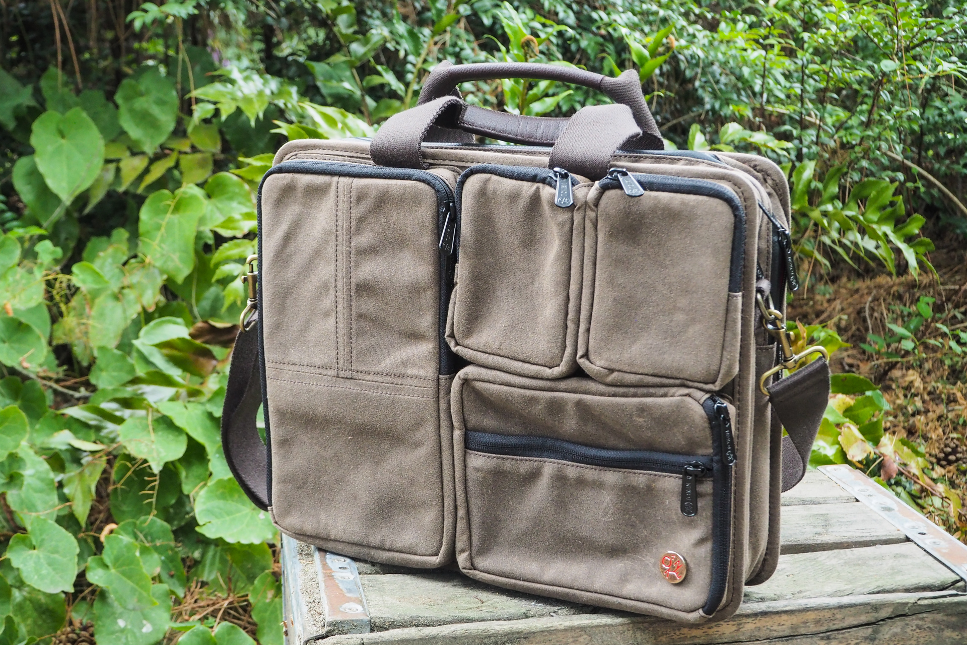
Manhattan Portage Hewes – $265

Pros:

  • Pockets! So many pockets!!

Cons:

  • Maybe too many pockets

I’ll just say right off the bat that this one isn’t for me — I prefer a plainer exterior, and this thing does not have that. On the other hand, for the organized gadget fiend, this might be a fantastic match.

[gallery ids="1839072,1839075,1839074,1839073,1839070,1839071,1839076"]

The front side is just pocket after pocket. There are two big enough for a small phone, another good for a notebook, pens, or a power adapter, an a third with a removable divider that could hold all manner of things small and large. Nothing too bulky will fit in them, but any number of audio recorders, lens filters, earbuds, and so on will go in there.

Then there are two totally separate full-size compartments, one with more organizing space inside and both with plenty of padding. The simple strap is easy to release and stashes inside nicely.

Saddleback Leather Co Canvas Messenger – $439

Devin Coldewey / TechCrunch

Pros:

  • Built like a waxed tank
  • Seriously, this thing is a beast
  • Spacious and handsome

Cons:

  • Also heavy as a tank
  • Very basic pockets and interior
  • Price reflects its “for life” nature

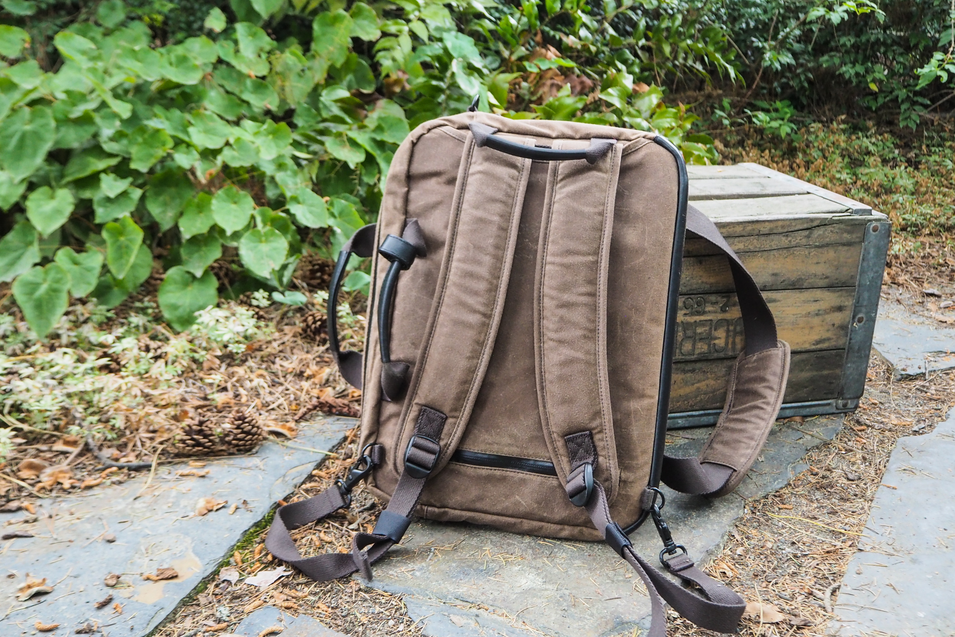
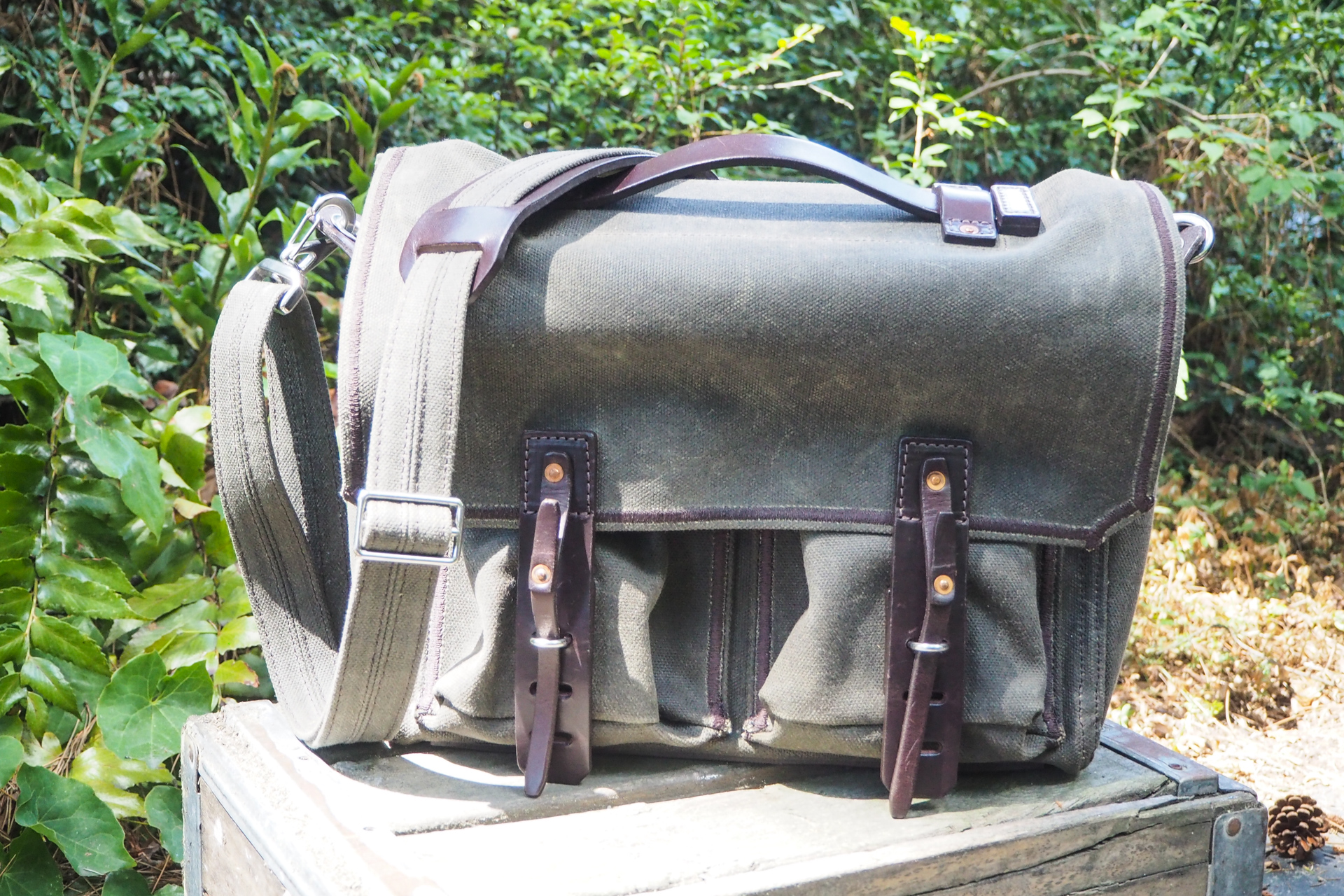
This bag came with a label on it sporting the company’s motto: “They’ll fight over it when you’re dead.” And I’m inclined to believe it. This is definitely by far the heaviest-duty waxed canvas bag I’ve had the pleasure of reviewing, which may or may not make it to your taste.

The olive-colored canvas is very thick and stiff, and waxed all the way through, not just in a layer on the outside. The stitching is industrial-grade and probably uses half a mile of thread. Quarter-inch-thick leather plates stiff as a board protect the back and bottom of the bag, and another serves to connect with the handle. The strap is a kind of folded-over canvas that feels even tougher than the leather. On top is a unique and practical thick leather handle that folds flat if necessary but feels very robust.

[gallery ids="1839078,1839081,1839083,1839082,1839084,1839086,1839085,1839080,1839079,1839077"]

The muscular materials and construction, however, preclude the inclusion of fine details like small pockets and pen sheaths. Instead there are two major exterior pockets that simply fold over themselves to close up, being held shut by the flap; there’s also room between them and the main compartment. Smaller side pockets under the massy strap hardware are good spots for flashlights but pens may disappear to the bottom.

This thing is also heavy as hell. Empty, it weighs as much as another bag with a light load. For some that weight will be reassuring but for others it’s just too much.

Inside the main compartment is plenty of room but little organization; there’s a single flap that will hold a laptop in place (my 13-inch MacBook Pro fits perfectly), and beyond that it’s just a big empty space. This is the only briefcase-style bag that rivals Filson’s (in my last roundup) for overnight capability. This one is definitely going to get your stuff waxy for the first few trips, though.

That’s all for today, but keep an eye out for more waxed canvas bags later in Bag Week as well!


Read Full Article