11 May 2018

Google Clips gets better at capturing candids of hugs and kisses (which is not creepy, right?)


Google Clips’ AI-powered “smart camera” just got even smarter, Google announced today, revealing improved functionality around Clips’ ability to automatically capture specific moments – like hugs and kisses. Or jumps and dance moves. You know, in case you want to document all your special, private moments in a totally non-creepy way.

I kid, I kid!

Well, not entirely. Let me explain.

Look, Google Clips comes across to me as more of a proof-of-concept device that showcases the power of artificial intelligence as applied to the world of photography, rather than a breakthrough consumer device.

I’m the target market for this camera – a parent and a pet owner (and look how cute she is) – but I don’t at all have a desire for a smart camera designed to capture those tough-to-photograph moments, even though neither my kid nor my pet will sit still for pictures.

I’ve tried to articulate this feeling, and I find it’s hard to say why I don’t want this thing, exactly. It’s not because the photos are automatically uploaded to the cloud or made public – they are not. They are saved to the camera’s 16 GB of onboard storage and can be reviewed later with your phone, where you can then choose to keep them, share them, or delete them. And it’s not even entirely because of the price point – though, arguably, even with the recent $50 discount it’s quite the expensive toy at $199.

Maybe it’s just the camera’s premise.

That in order for us to fully enjoy a moment, we have to capture it. And because some moments are so difficult to capture, we spend too much time with phone-in-hand, instead of actually living our lives – like playing with our kids or throwing the ball for the dog, for example. And that the only solution to this problem is more technology. Not just putting the damn phone down.

What also irks me is the broader idea behind Clips that all our precious moments have to be photographed or saved as videos. They do not. Some are meant to be ephemeral. Some are meant to be memories. In aggregate, our hearts and minds tally up all these little life moments – a hug, a kiss, a smile – and then turn them into feelings. Bonds. Love.  It’s okay to miss capturing every single one.

I’m telling you, it’s okay.

At the end of the day, there are only a few times I would have even considered using this product – when baby was taking her first steps, and I was worried it would happen while my phone was away. Or maybe some big event, like a birthday party, where I wanted candids but had too much going on to take photos. But even in these moments, I’d rather prop my phone up and turn on a “Google Clips” camera mode, rather than shell out hundreds for a dedicated device.

Just saying.

You may feel differently. That’s cool. To each their own.

Anyway, what I think is most interesting about Clips is the actual technology. That it can view things captured through a camera lens and determine the interesting bits – and that it’s already getting better at this, only months after its release. That we’re teaching A.I. to understand what’s actually interesting to us humans, with our subjective opinions. That sort of technology has all kinds of practical applications beyond a physical camera that takes spy shots of Fido.

The improved functionality is rolling out to Clips with the May update, and will soon be followed by support for family pairing which will let multiple family members connect the camera to their device to view content.

Here’s an intro to Clips, if you missed it the first time. (See below)

Note that it’s currently on sale for $199. Yeah, already. Hmmm. 


Read Full Article

Xiaomi is bringing its smart home devices to the US — but still no phones yet


Xiaomi, the Chinese smartphone maker that’s looking to raise as much as $10 billion in a Hong Kong IPO, is continuing to grow its presence in the American market after it announced plans to bring its smart home products to the U.S..

The company is best known for its well-priced and quality smartphones, but Xiaomi offers hundreds of other products which range from battery chargers to smart lights, air filter units and even Segway. On the sidelines of Google I/O, the company quietly made a fairly significant double announcement: not only will it bring its smart home products to the U.S., but it is adding support for Google Assistant, too.

The first products heading Stateside include the Mi Bedside Lamp, Mi LED Smart Bulb and Mi Smart Plug, Xiaomi’s head of international Wan Xiang said, but you can expect plenty more to follow. Typically, Xiaomi sells to consumers in the U.S. via Amazon and also its Mi.com local store, so keep an eye out there.

Smartphones, however, are a different question.

Xiaomi CEO Lei Jun — who stands to become China’s richest man thanks to the IPO — previously said the company is looking to bring its signature phones to the U.S. by early 2019 at the latest.

There’s no mention of that in Xiaomi’s IPO prospectus, which instead talks of plans to move into more parts of Europe and double down on Russia and Southeast Asia. Indeed, earlier this week, Xiaomi announced plans to expand beyond Spain and into France and Italy in Europe, while it has also inked a carrier deal with Hutchinson that will go beyond those markets into the UK and other places.

You can expect that it will take its time in the U.S., particularly given the concerns around Chinese OEMs like Huaweiwhich has been blacklisted by carriers — and ZTE, which has had its telecom equipment business clamped down on by the U.S. government.

Hat tip Android Police


Read Full Article

The Best HBO Shows of All Time and Where to Stream Them


Home Box Office (HBO) is the oldest and longest continuously operating pay television service in the United States. Once known primarily for its theatrically released motion pictures and occasional stand-up comedy and concert specials, the service is now the home to some of the most respected original television series ever created.

From comedies to dramas, HBO’s original series have won kudos and praise from viewers and reviewers alike. Here are 12 of the best HBO series of all time.

Each show on the list is available to stream with an HBO subscription (through HBO Go or HBO Now) with many of the older titles also available through Amazon Prime Video. Entire seasons and episodes are also available to purchase through Amazon.com and iTunes.

Boardwalk Empire (2010)

Best HBO Shows - boardwalk empire

56 episodes over five seasons

This period crime drama is set in Atlantic City, New Jersey during American Prohibition. Based on the book, Boardwalk Empire: The Birth, High Times, and Corruption of Atlantic City by Nelson Johnson, the series stars Steve Buscemi as Enoch “Nucky” Thompson.

Inspired by the real-life Enoch L. Johnson, “Nucky” is the corrupt treasurer of Atlantic County and one of its most influential political figures. Through five seasons, Boardwalk Empire blends fiction and historical characters, including mobsters, politicians, government agents, and more. Co-stars include Kelly Macdonald, Michael Shannon, and Shea Whigham.

All 56 episodes of Boardwalk Empire are available to stream on HBO and on Amazon Prime.

Curb Your Enthusiasm (2000)

Best HBO Shows - curb your enthusiasm

90 episodes over nine seasons

Two years after the end of NBC’s award-winning Seinfeld, co-creator Larry David brought Curb Your Enthusiasm to the small screen. Featuring David as a fictionalized version of himself, the comedy series ran for eight seasons and then abruptly ended. After a six-year absence, the series returned to HBO in 2017. Besides David, the series stars Jeff Garlin, Cheryl Hines, Susie Essman, and J.B. Smoove.

You can stream the first eight seasons of Curb Your Enthusiasm through HBO and Amazon Prime. Season 9 is available exclusively through HBO.

Game of Thrones (2011)

Best HBO Shows - game of thrones

67 episodes over seven seasons

Based on George R.R. Martin’s series of fantasy novels, the award-winning Game of Thrones will exit the airways in 2019 following the conclusion of Season 8. Featuring an international cast which includes Nikolaj Coster-Waldau, Lena Headey, Emilia Clarke, Peter Dinklage, and many others, the series is set on the fictional continents of Westeros and Essos. In these locations, the battle for the Iron Throne of the Seven Kingdoms continues.

Game of Thrones is one of the best television shows around thanks to its originality, in-depth storytelling, and immersive cinematography. I don’t typically like fantasy content. Nonetheless, Game of Thrones remains one of my favorite shows of all time, and I’m desperately seeking more shows to fill the Game of Thrones void.

You can stream Game of Thrones exclusively through HBO.

The Larry Sanders Show (1992)

Best HBO Shows - larry sanders

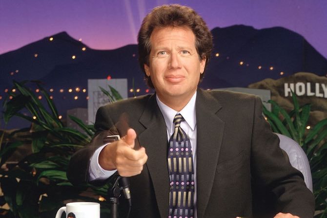
90 episodes over six seasons

One of the first original television series on HBO, The Larry Sanders Show is set in the office and studio of a fictional late-night talk show. Starring Garry Shandling in the title role, the comedy series also features Jeffrey Tambor, Rip Torn, and Janeane Garofalo.

The series grew out of Shandling’s stand-up comedy routine, previous work as a guest host on NBC’s The Tonight Show, and his earlier comedy, It’s Garry Shandling’s Show.

All 90 episodes of The Larry Sanders Show are available to stream on HBO.

Oz (1997)

Best HBO Shows - oz tv show

56 episodes over six seasons

For six groundbreaking seasons, viewers got a chance to experience the daily lives at Oswald State Correctional Facility, a fictional level 4 maximum-security state prison. Featuring an ensemble cast starring Kirk Acevedo, Christopher Meloni, and Rita Moreno, Oz doesn’t shy away from controversial subjects including drug use, rape, ethnic and religious conflicts, and homosexuality.

You can stream all episodes of Oz through HBO and Amazon Prime.

Sex and the City (1998)

Best HBO Shows - sex and the city

94 episodes over six seasons

In 1998, America and much of the world fell in love with Sex and the City, starring Sarah Jessica Parker, Kim Cattrall, Kristin Davis, and Cynthia Nixon. Set in New York City, the series follows the lives of a group of four women looking for romance, love, and sometimes, just sex.

Based on Candace Bushell’s 1997 by the same name, Sex and the City explores relevant and modern social issues, including promiscuity, femininity, and relationships.

Following the Sex and the City television run two motion pictures based on the series were released; Sex and the City and Sex and the City 2. The Carrie Diaries explores Parker’s Sex and the City character during high school.

Sex and the City is available to stream through HBO and Amazon Prime.

Silicon Valley (2014)

Best HBO Shows - silicon valley

44 episodes over five seasons

Ever wonder what it’s like to work at one of the big technology companies such as Apple, Google, or Facebook? Thinking of moving to California to try and create the next Twitter? Then you need to watch Silicon Valley, an HBO comedy television series created by Mike Judge, John Altschuler, and Dave Krinsky.

Starring Thomas Middleditch, Martin Starr, Kumail Nanjiani, Matt Ross, and Zack Woods, the series follows five young men who founded a startup company called Pied Piper.

Silicon Valley is one of the funniest comedy series on television. If you like technology, you’ll enjoy this series, along with these other Silicon Valley-type shows.

You can stream the series on HBO. Season 6 airs in 2019.

Six Feet Under (2001)

Best HBO Shows - six feet under

63 episodes over five seasons

Six Feet Under explores the multiple levels of death, including personal, religious, and philosophical. Set in a Los Angeles family-run funeral home, this ensemble drama stars Peter Krause, Michael C. Hall, Frances Conroy, Lauren Ambrose, Freddy Rodriguez, Mathew St. Patrick, and Rachel Griffiths.

Part drama, part dark comedy, Six Feet Under won numerous awards, including nine Emmy Awards, three Screen Actors Guild Awards, three Golden Globe Awards, and a Peabody Award.

Six Feet Under is available to stream through HBO and Amazon Prime.

The Sopranos (1999)

Best HBO Shows - the sopranos

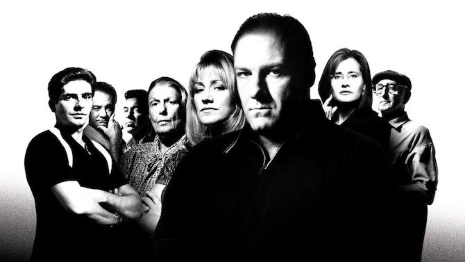
86 episodes over six seasons

One of the most acclaimed dramas of all time, The Sopranos revolves around New Jersey-based crime boss Tony Soprano (James Gandolfini) and his family and crime organization. Created by David Chase, the series was nominated for numerous awards during its run and won two Best Drama Primetime Emmy Awards.

Co-starring Edie Falco, Lorraine Bracco, Michael Imperioli, and a large ensemble cast, The Sopranos is noted for being the first series on a cable network to win the Primetime Emmy Award for Best Drama. Gandolfini and Falco were each nominated six times for Outstanding Lead Actor and Actress, respectively, both winning a total of three awards.

The Sopranos was the first HBO series experienced by many. Through six seasons, it presents a world that’s gritty, imperfect, and, yes, violent. It’s worth the ride—if you can handle it.

You can stream The Sopranos on HBO and Amazon Prime.

Veep (2012)

Best HBO Shows - veep

58 episodes over six seasons

In the HBO political satire comedy television series Veep, Julia Louis-Dreyfus stars as Selina Meyer, a scatterbrain US Vice President who ends up in the White House as President, at least for a while.

Co-starring Anna Chlumsky, Tony Hale, and Reid Scott, the series has won numerous awards over its run. This has included 12 Primetime Emmy Awards including those for Best Comedy Series and Outstanding Actress in a Comedy Series.

Calling Veep hilarious is an understatement. Louis-Dreyfus and the entire cast deserve the accolades that have come to them over the course of the series.

You can stream the entire run of Veep on HBO and the first two seasons on Amazon Prime. The comedy returns in 2019 for a final seventh season.

Westworld (2016)

Best HBO Shows - westworld

20 episodes over two seasons

The newest series on this list, Westworld is a science fiction thriller based on a 1973 film of the same name. The story takes place on a fictional amusement park populated by android “hosts”. Westworld is a place where high-paying guests can indulge in their wildest fantasies, for better and mostly worse.

Westworld features a large cast which includes Evan Rachel Wood, Thandie Newton, Jeffrey Wright, and James Marsden. One of the most talked about series on television, Westworld was recently renewed for a third season, which should debut in 2019.

You can stream Westworld exclusively through HBO.

The Wire (2002)

Best HBO Shows - the wire

60 episodes over five seasons

The Wire is a crime drama television series set in Baltimore, Maryland. Written by former police reporter David Simons, the series takes a look at how various government institutions in the city interact with law enforcement. Themes presented in the series include society and politics, the illegal drug trade, urban life, and more.

During its long run, The Wire was praised for its casting of character actors rather than big-name stars. It also featured real-life figures in the Baltimore community.

All five seasons of The Wire are available to stream through HBO and Amazon Prime.

You Can’t Go Wrong With HBO

If you’re looking for high-quality television entertainment, you can’t go wrong with HBO. For nearly three decades, the pay service has produced some of the best television shows on the planet.

For more information on HBO and its content, check out these amazing shows that make HBO Now worth the money.


Read Full Article

Algo-Rhythms: The future of album collaboration

6 Apps to Customize Your Mac’s Keyboard Behavior


Do you want your Mac’s function keys back? Does the Caps Lock key seem like a waste of space? Would you rather put the unused right Shift key to better use?

If you’re looking for a way to customize basic keyboard behavior, add new shortcuts, remap keystrokes, or navigate quickly without reaching for your mouse, you can do it all with a few (mostly free) apps.

1. Karabiner-Elements

Karabiner-Elements for Mac

Previously known as “keyremap4macbook” and just “Karabiner” before that, Karabiner-Elements has been rebuilt for scratch specifically for macOS Sierra and above.

You can use it remap your entire keyboard, whether it’s a MacBook, Magic Keyboard, or third-party USB input. It can make simple modifications, like remapping one key to behave as if it was another, or make complex modifications based on rules of your choosing. Many of these rules are available for download so you don’t have to build them yourself.

Reclaim your function keys by disabling special functions like brightness and volume control. You can assign those media keys to entirely different functions, and apply the special functions to regular old keys—like Caps Lock or right Shift.

The app lets you set up profiles, apply your changes on a per-keyboard basis, or create blanket rules that affect all input devices. It’s one of those apps that you don’t need until you realize what it can do, and how much productivity you’ve been missing out on.

Download: Karabiner-Elements (Free)

2. Thor

Thor for Mac

Thor is a simple lightweight tool for switching to the right application with a dedicated shortcut. The app’s beauty lies in its simplicity: pick an app, click Record Shortcut, and specify a combination of keys. Thor will instantly switch to or launch the app of your choosing when you trigger the shortcut.

You can quickly disable Thor by double-tapping a modifier key of your choosing. The worst part is deciding on which shortcuts to use. I found the Control key most useful, since it doesn’t get in the way like some of the other modifiers. Plus, shortcuts like Control + S for Safari or Control + E for Evernote are easy to remember.

There are other apps that can do what Thor does, but they’re usually far more complex and built around other functions. They’re also nowhere near as lightweight; Thor clocks in with a download size of 2.8MB from the Mac App Store.

Download: Thor (Free)

3. Keyboard Maestro

Easily one of the most powerful apps of its kind on macOS, Keyboard Maestro provides a dizzying array of customization for those who need it. The app is built around the principle of triggers and actions, and its usefulness isn’t just limited to keystroke triggers either.

Arguably the app’s biggest selling point is the ability to create as many shortcuts as you want. One example is using a keyboard shortcut to type a piece of information, like your name or email address. The app also functions as a text expansion app, allowing you to replace a trigger phrase like myname with a longer string like John Doe.

This is just the tip of what Keyboard Maestro can do, hence its $36 price tag. For your money you’ll get:

  • A fully-featured clipboard manager
  • AppleScript and XPath support
  • Window and mouse cursor manipulation
  • An application launcher and iTunes remote
  • Action-based macros, like the ability to open or delete specific files with a trigger
  • Touch Bar manipulation on the latest MacBook Pro
  • MIDI control, for triggering actions with MIDI input devices
  • Hundreds of actions and triggers

Fortunately, you can download Keyboard Maestro and try it out for yourself before you buy. If you’re an automation nerd, or simply looking for a way to trigger scripts, macros, and other desktop events, Keyboard Maestro is the ultimate app.

Download: Keyboard Maestro ($36, free trial available)

4. Fluor

Fluor for Mac

Just like Thor, Fluor is a simple app with a single goal: to define function key behavior depending on the currently active application. This is particularly handy when apps have a lot of keyboard shortcuts that require use of the function keys, or when playing games.

The app simply switches the behavior of the function keys, so in order to access the special (media) key functions, you have to hold the Fn key. You can create a custom set of rules for each app. Or you can activate an app, click on the Fluor icon in the menu bar, and select a preferred behavior.

It’s a great way to set up custom rules for particular apps, without having to pay for a more complex piece of software. This works best when used sparingly, so you don’t get confused about the default behavior when you hit a key.

Download: Fluor (Free)

5. Kawa

Kawa for Mac

Another basic app with one purpose, Kawa lets you bind a keyboard shortcut to a particular language input. It was designed out of necessity by the developer who frequently switched between keyboard layouts.

macOS uses the Command + Space shortcut to switch between input sources, but adding a third complicates this. Kawa lets you record language-specific keyboard shortcuts which instantly change the input to that of your choosing.

For best results, enable Show Input menu in menu bar under System Preferences > Keyboard > Input Sources so you can quickly glance at your currently selected language. Unfortunately the app is unsigned, so you’ll need to circumvent Gatekeeper restrictions to use it.

Download: Kawa (Free)

6. Shortcat

Shortcat for Mac

It’s no secret that taking your fingers off the keyboard slows you down. Shortcat aims to solve that problem by removing the need to reach for your mouse and trackpad. All you need to do is activate Shortcat with the keyboard shortcut, then start typing the name of an on-screen element.

Shortcat will highlight anything that matches your typed query. You can then “click” on the right element by holding Control and the relevant shortcut displayed on screen. You can also Tab between elements and click, double-click, or hover using the relevant shortcut.

If you’re willing to put the time into learning how to use Shortcat, you’ll be navigating your Mac without a pointing device like a pro. It works system-wide and in applications like Skype, though it won’t work for every third-party app you come across (I couldn’t get it working in Slack, for example).

Download: Shortcat ($18, free trial/beta available)

More Ways to Improve Mac Productivity

Now that your keyboard is set up the way you like it, try improving your Mac workflow with hot corners. By modifying your workstation to speed up your workflow, you’ll get more done in less time. To take this to the next level, download a few more Mac productivity wonders.


Read Full Article

YouTube rolls out new tools to help you stop watching


Google’s YouTube is the first streaming app that will actually tell users to stop watching. The company at its Google I/O conference this week introduced a series of new controls for YouTube that will allow users to set limits on their viewing, and then receive reminders telling them to “take a break.” The feature is rolling out now in the latest version of YouTube’s app along with others that limit YouTube’s ability to send notifications, and soon, one that gives users an overview of their binge behavior so they can make better-informed decisions about their viewing habits.

With “Take a Break,” available from YouTube’s mobile app Settings screen, users can set a reminder to appear every 15, 30, 60, 90 or 180 minutes, at which point the video will pause. You can then choose to dismiss the reminder and keep watching, or close the app.

The setting is optional, and is turned off by default so it’s not likely to have a large impact on YouTube viewing time at this point.

Also new is a feature that lets you disable notifications and sounds during a specified time period each day – say, for example, from bedtime until the next morning. When users turn on the setting to disable notifications, it will, by default, disable them from 10 PM to 8 AM local time, but this can be changed.

Combined with this is an option to get a scheduled digest of notifications as an alternative. This setting combines all the daily push notifications into a single combined notification that is sent out only once per day. This is also off by default, but can be turned on in the app’s settings.

And YouTube is preparing to roll out a “time watched profile” that will appear in the Account menu and display your daily average watch time, and how long you’ve watched YouTube videos today, yesterday, and over the past week, along with a set of tools to help you manage your viewing habits.

While these changes to YouTube are opt-in, it’s an interesting – and arguably responsible – position to take in terms of helping people manage their sometimes addictive behaviors around technology.

And it’s not the only major change Google is rolling out on the digital well-being front – the company also announced a series of Android features that will help you get a better handle on how often you’re using your phone and apps, and give you tools to limit distractions – like a Do Not Disturb setting, alerts that are silenced when the phone is flipped over, and a “Wind Down” mode for nighttime usage that switches on the Do Not Disturb mode and turns the screen to gray scale.

The digital well-being movement at Google got its start with a 144-page Google Slides presentation from product manager Tristan Harris, who was working on Google’s Inbox app at the time. After a trip to Burning Man, he came back convinced that technology products weren’t always designed with users’ best interests in mind. The memo went viral and found its way to then-CEO Larry Page, who promoted Harris to “design ethicist” and made digital well-being a company focus.

There’s now a Digital Wellbeing website, too, that talks about Google’s broader efforts on this front. On the site, the company touts features in other products that save people time, like Gmail’s high-priority notifications that only alert you to important emails; Google Photos’ automated editing tools; Android Auto’s distracted driving reduction tools; Google Assistant’s ability to turn on your phone’s DND mode or start a “bedtime routine” to dim your lights and quiet your music; Family Link’s tools for reducing kids’ screen time; Google WiFi’s support for “internet breaks;” and more.

Google is not the only company rethinking its role with regard to how much its technology should infiltrate our lives. Facebook, too, recently re-prioritized well-being over time spent on the site reading news, and saw its daily active users decline as a result.

But in Google’s case, some are cynical about the impact of the new tools – unlike Facebook’s changes, which the social network implemented itself, Google’s tools are opt-in. That means it’s up to users to take control over their own technology addictions, whether that’s their phone in general, or YouTube specifically. Google knows that the large majority won’t take the time to configure these settings, so it can pat itself on the back for its prioritization of digital well-being without taking a real hit to its bottom line.

Still, it’s notable that any major tech platform is doing this at all – and it’s at least a step in the right direction in terms of allowing people to reset their relationship with technology.

And in YouTube’s case, the option to “Take a Break” is at the very top of its Settings screen. If anyone ever heads into their settings for any reason, they’ll be sure to see it.

The new features are available in version 13.17 and higher of the YouTube mobile app on both iOS and Android, which is live now.

The changes were announced on May 8 during the I/O keynote, and will take a few days to roll out to all YouTube users. The “time watched profile,” however, will ship in the “coming months,” Google says.


Read Full Article

Automatic Photography with Google Clips


To me, photography is the simultaneous recognition, in a fraction of a second, of the significance of an event as well as of a precise organization of forms which give that event its proper expression.
Henri Cartier-Bresson

The last few years have witnessed a Cambrian-like explosion in AI, with deep learning methods enabling computer vision algorithms to recognize many of the elements of a good photograph: people, smiles, pets, sunsets, famous landmarks and more. But, despite these recent advancements, automatic photography remains a very challenging problem. Can a camera capture a great moment automatically?

Recently, we released Google Clips, a new, hands-free camera that automatically captures interesting moments in your life. We designed Google Clips around three important principles:
  • We wanted all computations to be performed on-device. In addition to extending battery life and reducing latency, on-device processing means that none of your clips leave the device unless you decide to save or share them, which is a key privacy control.
  • We wanted the device to capture short videos, rather than single photographs. Moments with motion can be more poignant and true-to-memory, and it is often easier to shoot a video around a compelling moment than it is to capture a perfect, single instant in time.
  • We wanted to focus on capturing candid moments of people and pets, rather than the more abstract and subjective problem of capturing artistic images. That is, we did not attempt to teach Clips to think about composition, color balance, light, etc.; instead, Clips focuses on selecting ranges of time containing people and animals doing interesting activities.
Learning to Recognize Great Moments
How could we train an algorithm to recognize interesting moments? As with most machine learning problems, we started with a dataset. We created a dataset of thousands of videos in diverse scenarios where we imagined Clips being used. We also made sure our dataset represented a wide range of ethnicities, genders, and ages. We then hired expert photographers and video editors to pore over this footage to select the best short video segments. These early curations gave us examples for our algorithms to emulate. However, it is challenging to train an algorithm solely from the subjective selection of the curators — one needs a smooth gradient of labels to teach an algorithm to recognize the quality of content, ranging from "perfect" to "terrible."

To address this problem, we took a second data-collection approach, with the goal of creating a continuous quality score across the length of a video. We split each video into short segments (similar to the content Clips captures), randomly selected pairs of segments, and asked human raters to select the one they prefer.
We took this pairwise comparison approach, instead of having raters score videos directly, because it is much easier to choose the better of a pair than it is to specify a number. We found that raters were very consistent in pairwise comparisons, and less so when scoring directly. Given enough pairwise comparisons for any given video, we were able to compute a continuous quality score over the entire length. In this process, we collected over 50,000,000 pairwise comparisons on clips sampled from over 1,000 videos. That’s a lot of human effort!
Training a Clips Quality Model
Given this quality score training data, our next step was to train a neural network model to estimate the quality of any photograph captured by the device. We started with the basic assumption that knowing what’s in the photograph (e.g., people, dogs, trees, etc.) will help determine “interestingness”. If this assumption is correct, we could learn a function that uses the recognized content of the photograph to predict its quality score derived above from human comparisons.

To identify content labels in our training data, we leveraged the same Google machine learning technology that powers Google image search and Google Photos, which can recognize over 27,000 different labels describing objects, concepts, and actions. We certainly didn’t need all these labels, nor could we compute them all on device, so our expert photographers selected the few hundred labels they felt were most relevant to predicting the “interestingness” of a photograph. We also added the labels most highly correlated with the rater-derived quality scores.

Once we had this subset of labels, we then needed to design a compact, efficient model that could predict them for any given image, on-device, within strict power and thermal limits. This presented a challenge, as the deep learning techniques behind computer vision typically require strong desktop GPUs, and algorithms adapted to run on mobile devices lag far behind state-of-the-art techniques on desktop or cloud. To train this on-device model, we first took a large set of photographs and again used Google’s powerful, server-based recognition models to predict label confidence for each of the “interesting” labels described above. We then trained a MobileNet Image Content Model (ICM) to mimic the predictions of the server-based model. This compact model is capable of recognizing the most interesting elements of photographs, while ignoring non-relevant content.

The final step was to predict a single quality score for an input photograph from its content predicted by the ICM, using the 50M pairwise comparisons as training data. This score is computed with a piecewise linear regression model that combines the output of the ICM into a frame quality score. This frame quality score is averaged across the video segment to form a moment score. Given a pairwise comparison, our model should compute a moment score that is higher for the video segment preferred by humans. The model is trained so that its predictions match the human pairwise comparisons as well as possible.
Diagram of the training process for generating frame quality scores. Piecewise linear regression maps from an ICM embedding to a score which, when averaged across a video segment, yields a moment score. The moment score of the preferred segment should be higher.
This process allowed us to train a model that combines the power of Google image recognition technology with the wisdom of human raters–represented by 50 million opinions on what makes interesting content!

While this data-driven score does a great job of identifying interesting (and non-interesting) moments, we also added some bonuses to our overall quality score for phenomena that we know we want Clips to capture, including faces (especially recurring and thus “familiar” ones), smiles, and pets. In our most recent release, we added bonuses for certain activities that customers particularly want to capture, such as hugs, kisses, jumping, and dancing. Recognizing these activities required extensions to the ICM model.

Shot Control
Given this powerful model for predicting the “interestingness” of a scene, the Clips camera can decide which moments to capture in real-time. Its shot control algorithms follow three main principles:
  1. Respect Power & Thermals: We want the Clips battery to last roughly three hours, and we don’t want the device to overheat — the device can’t run at full throttle all the time. Clips spends much of its time in a low-power mode that captures one frame per second. If the quality of that frame exceeds a threshold set by how much Clips has recently shot, it moves into a high-power mode, capturing at 15 fps. Clips then saves a clip at the first quality peak encountered.
  2. Avoid Redundancy: We don’t want Clips to capture all of its moments at once, and ignore the rest of a session. Our algorithms therefore cluster moments into visually similar groups, and limit the number of clips in each cluster.
  3. The Benefit of Hindsight: It’s much easier to determine which clips are the best when you can examine the totality of clips captured. Clips therefore captures more moments than it intends to show to the user. When clips are ready to be transferred to the phone, the Clips device takes a second look at what it has shot, and only transfers the best and least redundant content.
Machine Learning Fairness
In addition to making sure our video dataset represented a diverse population, we also constructed several other tests to assess the fairness of our algorithms. We created controlled datasets by sampling subjects from different genders and skin tones in a balanced manner, while keeping variables like content type, duration, and environmental conditions constant. We then used this dataset to test that our algorithms had similar performance when applied to different groups. To help detect any regressions in fairness that might occur as we improved our moment quality models, we added fairness tests to our automated system. Any change to our software was run across this battery of tests, and was required to pass. It is important to note that this methodology can’t guarantee fairness, as we can’t test for every possible scenario and outcome. However, we believe that these steps are an important part of our long-term work to achieve fairness in ML algorithms.

Conclusion
Most machine learning algorithms are designed to estimate objective qualities – a photo contains a cat, or it doesn’t. In our case, we aim to capture a more elusive and subjective quality – whether a personal photograph is interesting, or not. We therefore combine the objective, semantic content of photographs with subjective human preferences to build the AI behind Google Clips. Also, Clips is designed to work alongside a person, rather than autonomously; to get good results, a person still needs to be conscious of framing, and make sure the camera is pointed at interesting content. We’re happy with how well Google Clips performs, and are excited to continue to improve our algorithms to capture that “perfect” moment!

Acknowledgements
The algorithms described here were conceived and implemented by a large group of Google engineers, research scientists, and others. Figures were made by Lior Shapira. Thanks to Lior and Juston Payne for video content.

What Is Windows 10 Timeline? Why It’s Great and How to Use It


The April 2018 Update for Windows 10 is finally here, and that means a bunch of new features and improvements to play around with.

If you don’t have the update yet, see our post on manually downloading the April 2018 update. Notable changes include improvements to Windows Hello and more control over what data gets sent to Microsoft. But my favorite new feature? The Timeline. Here’s everything you need to know about it and how to start using it.

What Is Windows 10 Timeline?

Timeline is an enhancement to the Task View feature. Task View brings up an overview of all open and running applications, similar to how Task Switcher works. But whereas Task Switcher is activated using Alt + Tab, Task View is activated using Win + Tab.

Learn more in our overview of Task View in Windows 10.

So how does Timeline factor into this? Well, with the April 2018 Update, Task View doesn’t just show currently running applications. You can now scroll down and see a “timeline” of previous apps you’ve run, documents you’ve opened, and web pages you’ve visited. It’s like a browser history, but for all of Windows 10.

what is the windows 10 timeline

Windows will also try to be smart about it, analyzing how those apps, documents, and web pages were used together. If it thinks a certain group of apps, documents, and web pages were related, it’ll group them into Activities.

Everything in Timeline is, as you’d expect, listed chronically. The most recent Activities are at the top, and as you scroll down, you start heading further and further into the past. It’s also organized into two levels: the default view shows Activities by day, but you can zoom in on a day by clicking See all activities to view Activities by the hour.

By default, Timeline will store Activities in its history for up to several days, but you can extend that to 30 days if you sync Timeline to the cloud. It’s unclear how long individual apps and documents are kept, but I suspect they’re stored indefinitely. It’s also unclear how much drive space Timeline uses, but so far it seems negligible.

Why Windows 10 Timeline Is Useful

Or in other words, how can you benefit from Timeline?

Astute readers might notice that this sounds a lot like the Recently Used Apps feature in Windows 10 (and in previous versions of Windows), but a lot smarter and more organized. The ability to swap from one Activity to another is one with a lot of promise, especially if you tend to flip between multiple projects from day to day.

As previously mentioned, Timeline also has a syncing option that lets you sync your history to your Microsoft Account, allowing you to view and access your documents from any Windows 10 device as long as you log in using your Microsoft Account. It’s a clean way to “move” your workspace (e.g. from desktop to laptop).

Timeline supports searching through Activities, apps, and documents. Timeline also works particularly well with Microsoft Office and OneDrive, which shouldn’t be a surprise. Not only is the integration tight and in real-time, but Timeline can pull in data for Office and OneDrive documents from even before the feature was enabled.

The Downsides of Windows 10 Timeline

downsides of the windows 10 timeline

As of right now, Activities only work with Microsoft Office and Edge. I don’t see any data from Chrome, Postbox, or any other app in Timeline.

That’s a huge drawback, to be honest, but Microsoft has left the possibility open for third-party developers to be integrated into Timeline once they create “high-quality activity cards” for their apps. So even though Timeline feels a bit primitive right now, it will likely be a lot more useful within a year or so.

Privacy is another concern. If your computer has multiple users, the Activities for other users can show up in your Timeline, and vice versa. You can disable this in the settings, but if someone else has the right permissions, they can turn it back on. Not to mention the privacy risks of syncing the data with Microsoft’s cloud.

How to Set Up and Use Windows 10 Timeline

When you first get the April 2018 Update, Timeline should be enabled by default. Just open Task View using the Win + Tab keyboard shortcut (see our guide to Windows keyboard shortcuts) and scroll down. Then click “Welcome to your timeline” for a quick walkthrough of its features.

set up and use windows 10 timeline

To tweak the settings, open the Settings app by opening the Start Menu and clicking the gear icon labeled Settings. In the Settings app, navigate to Privacy > Activity History. Pay attention to:

  • “Let Windows collect my activities from this PC” controls whether or not the Timeline feature is enabled or disabled.
  • “Let Windows sync my activities from this PC to the cloud” controls whether or not your Activities are accessible from other devices.
  • Scroll down to Show activities from accounts to toggle which accounts’ Activities show up in your Timeline.

To see what Activity data is being tracked by Microsoft, visit the Activity History privacy page and explore and delete individual items. Or go back to the Settings app and click Clear to wipe all of it at once.

Other Windows 10 Features Worth Using

Timeline isn’t the only interesting feature to be added in recent months. Not long ago, Microsoft added a bunch of new features in the Fall Creators Update, including OneDrive On-Demand, the People app, and several improvements to Edge.

Moreover, there are lots of long-standing Windows 10 features you may have overlooked, such as Virtual Desktops, Storage Sense, File History backups, and Dynamic Lock (which automatically locks your PC when you step away). Windows 10 has come a long way. Don’t neglect its best aspects!


Read Full Article

Why Snapchat’s re-redesign will fail and how to fix it


Snap screwed it all up jumbling messages and Stories, banishing creators to Discover, and wrecking auto-advance. Prideful of his gut instincts, Snap CEO Evan Spiegel refused to listen to the awful user reviews and declining usage. Now a YouGov  study shows a 73% drop in user sentiment towards Snapchat, the app’s user count shrank in March, and its share price is way down.

Yet the re-redesign Snapchat is finally rolling out today in response won’t fix the problems. The company still fails to understand that people want a predictable app that’s convenient to lay back and watch, and social media stars are more similar to you and me than they are to news outlets producing mobile magazine-style Discover content.

There’s a much better path for Snapchat, but it will require an ego adjustment and a bigger reversal of the changes — philosophy be damned.

Snapchat’s impression amongst US users fell off a cliff when the redesign was rolled out early this year

Here’s what Snapchat was, is becoming, and should be.

The Old Snapchat

Snapchat’s best design was in September 2016. It lacked sensible Stories sorting, and got some questionable changes before the big January 2018 redesign, but the fundamentals were there:

  • Left: Messages in reverse chronological order
  • Right: Stories from everyone in reverse chronological order with a carousel of ranked preview tiles in a carousel above or below Stories
  • Auto-Advance: Automatic and instant


The Broken Snapchat

Snapchat’s big January 2018 redesign did two smart things. It added more obvious navigation buttons to ease in new and adult users. And it made the Stories list algorithmically sorted so you’d see your best friends first rather than just who posts most often, as TechCrunch recommended last April.

But it introduced a bunch of other problems like pulling creators out of the Stories list, turning the inbox into chaos with ad-laden Stories, and breaking auto-advance so you have to watch an annoying interstitial between each friend. Spiegel stubbornly refused to listen to the poor feedback, saying in February “Even the complaints we’re seeing reinforce the philosophy. Even the frustrations we’re seeing really validate those changes. It’ll take time for people to adjust”. That quickly proved short-sighted.

  • Left: Messages and Stories from friends mixed together, sorted algorithmically
  • Right: Discover, sorted algorithmically, with influencers and people who don’t follow you back mixed in
  • Auto-Advance: Interstitial preview screens

The Re-Redesigned Snapchat

Users hated the redesign, initial reviews were mostly negative, and Snapchat’s growth fell to its lowest rate ever. After some tests, Today Snapchat tells us it’s rolling out the re-redesign to the majority of iOS users that’s a little less confusing. Yet it doesn’t address the core problems, plus makes the Discover screen more overwhelming and ditches the smart sorting of friends’ Stories:

  • Left: Messages sorted reverse chronologically
  • Right: Friends’ Stories at the top sorted reverse chronologically, then subscriptions to creators sorted algorithmically, then Discover channels sorted algorithmically
  • Auto-Advance: Interstitial preview screens

The Right Snapchat

While the re-redesign makes Snapchat’s messaging inbox work like it used to, it reintroduces the problem of an unsorted Story list that’s dominated by whoever posts most often. It also leaves auto-advance broken out of a misguided hope of ensuring you never watch a frenemy or ex’s Story by accident and show up in their view counts. But that’s not worth ruining the laid-back viewing experience we’ve grown to love on Instagram Stories, and could be better solved with a mute button or just getting people to unfriend those they can’t be seen watching.

That’s why I recommend Snapchat move to a hybrid of all its designs:

  • Left: Messages sorted reverse chronologically
  • Right: Stories from all friends and creators, displayed as preview tiles, sorted algorithmically to preference close friends
  • Further Right: Discover, with preview tile sections for subscriptions, publishers, and Our Stories/Maps/Events [This whole screen could be crammed into the Stories page if Snap insisted on just one screen on the right]
  • Auto-Advance: Traditional instant auto-advance without interstitials, plus a mute button to hide people

This design would make the inbox natural and uncluttered, ensure you see all your closest friends’ Stories, keep influencers from being buried in Discover, give publishers and Snapchat’s own content recommendations including new creators room to breathe, and let you easily relax and watch a ton of Stories in a row.

Snapchat could have slowly iterated its way to this conclusion. It could have done extensive beta testing of each change to ensure it didn’t misstep. And perhaps facing an existential crisis from the exceedingly viable alternatives Instagram and WhatsApp, it should never have attempted a sweeping overhaul of its app’s identity. Twitter’s conservative approach to product updates looks wiser in retrospect. Instead, Snap is in decline.

Facebook’s family of apps have survived over the years by changing so gradually that they never shocked users into rebellion, or executing major redesigns when users had no comparable app to switch to. Snapchat calls itself a camera company, but it’s really a “cool” company — powered by the perception of its trendiness with American kids. But as ephemeral content proliferates and Stories become a ubiquitous standard soon to surpass feeds as the preferred way to share, they’ve gone from hip to utility. So if its features aren’t cool any more and are offered in a slicker way to a larger audience elsewhere, what is Snapchat anymore?


Read Full Article