You know it’s coming, the warning signs are there, and all of a sudden: you’re out of disk space. Although this isn’t as much a problem now as it was a few years ago—since hard drives are now both expansive and affordable—it’ll occur sooner or later.
Especially if you’re a gamer or designer using a PC laden with large files, folders, and programs. You may be asking “Well I’ve already run every cleaner out there, what’s next?” Read on!
Note: The following article assumes that you regularly clean your PC. If you rarely do, head to the following article for a brief on PC maintenance.
1. The Red Bar
You can only download files online for so long before they get a hold of you. Worse yet, that speedy SSD can easily get bogged down by the occasional large program.
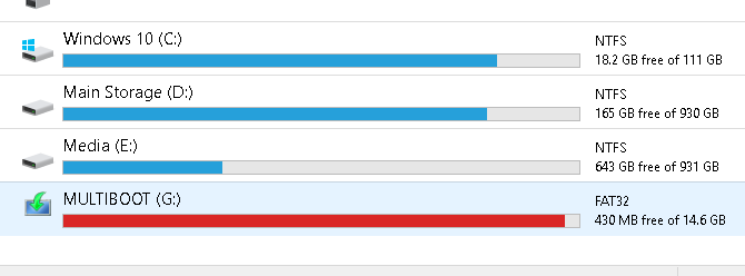
If you’ve already received warning from your Windows PC that your storage space is low, check it yourself by clicking your start menu and typing in file. Select the File Explorer option.
Scroll down the left-hand side of the window and select This PC.
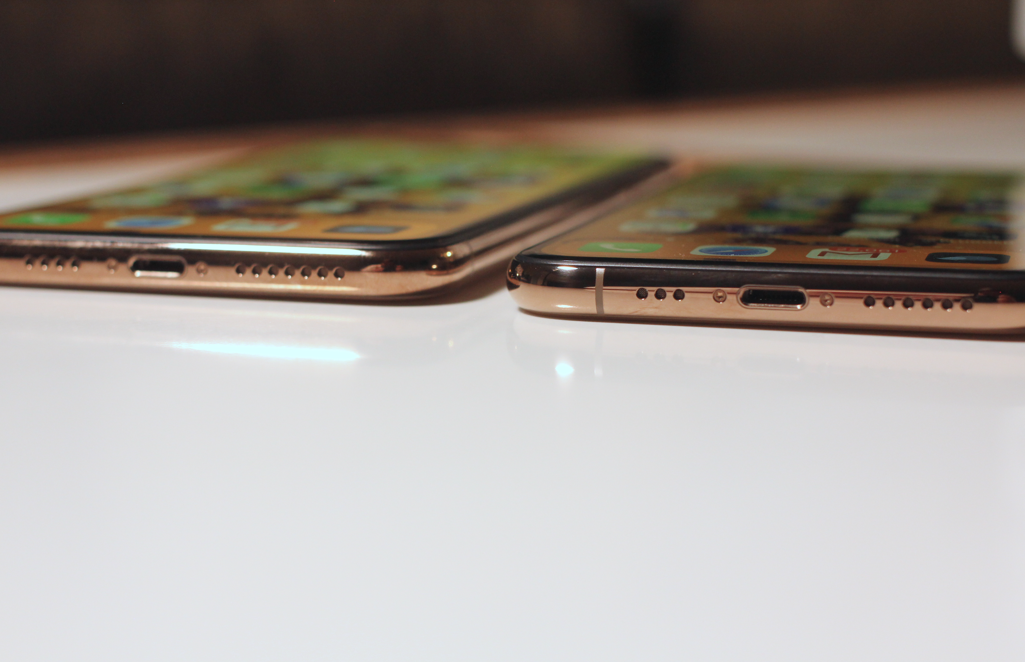
The above is an example of a flash drive filled to capacity. Your storage will appear red when it is near full. You will also receive notifications from your PC when your storage is at full capacity.
If the hard drive your OS is installed on is full, your PC will freeze and, at times, cease to function until you clear some storage space.
2. Disk Cleanup
The first thing you must do to fix a slow storage issue is clear the trash present on your PC. It won’t budge your PC much, unless you’re long overdue for a cleaning.
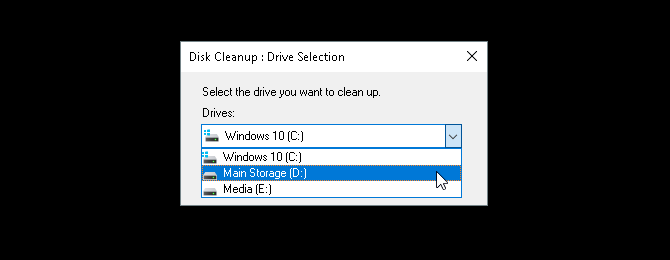
There are plenty of tried and true ways to clean PC clutter. Disk Cleanup is the default method to clear trash on Windows 10, and it works surprisingly well.
Click on your start menu and type in disk cleanup. Select the Disk Cleanup option, and then select the drive you want to clean.
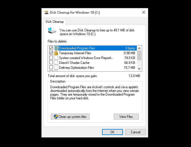
You’ll be presented with a selection of options to choose from.
To make some emergency space, the following options are the least invasive and won’t require you delete necessary files:
Downloaded Program Files
Temporary Internet Files
Thumbnails
Temporary files
Recycle Bin
That’ll take care of extraneous files, and should stop any hiccups you may be experiencing from the lack of storage.
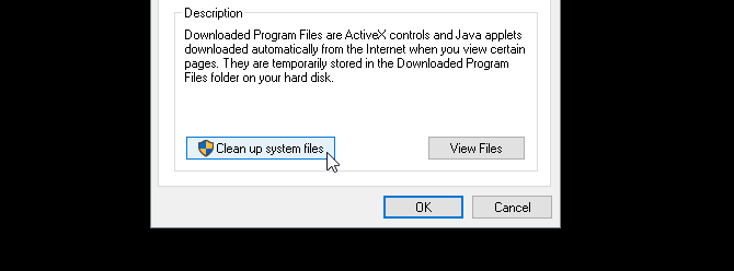
3. Clean Up System Files
System files can seriously bog down your PC. To view what extraneous system files you have on your PC, select the option labelled Clean up system files at the bottom of your Disk Cleanup window. You will have to re-scan your drive.
There are a few important entries in the following selection that may free up a considerable amount of disk space. These are:
Windows Update Cleanup: “Windows Update cleanup deletes or compresses older versions of updates that are no longer needed and taking up space.”
Previous Windows installation(s): Deletes previous versions of Windows located in your local drive, which are typically reserved as backup operating systems.
Both of these options, if available, are safe to delete if your PC is otherwise in good working condition. Previous Windows installations typically delete automatically after about 30 days.
4. Uninstall Programs and Apps
The best way to create space in your PC is to uninstall otherwise unused programs. Everyone installs programs they don’t need. Over time, those unused programs can really add up.
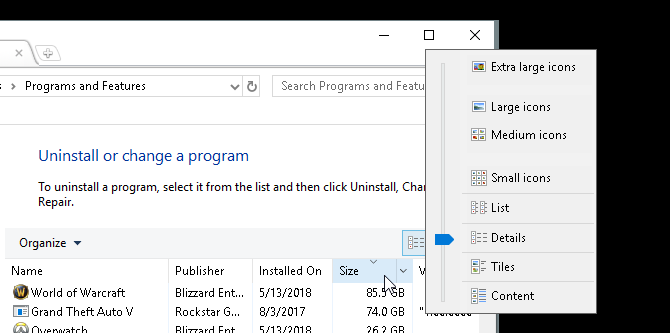
First, start by running your default uninstall program. Click on the start button and enter control panel. Select the Control Panel option. Then head to Programs > Programs and Features.
It’s a good idea to clear the largest possible installed programs you don’t use first. To organize your programs, click on the Organization icon to the top-left of your window and drag the blue slider to Details.
Then, click on the Size tab in your window. Your programs will appear in descending order according to size. Begin to scroll through your programs, and delete the programs you don’t use anymore by right-clicking your program and selecting Uninstall/Change.
Third-Party Uninstaller Programs
While the default uninstall program works well, it may also leave behind large, hidden files. To ensure you’ve completely deleted your files, you may want to look into installing a third-party uninstaller program.
My personal recommendation is Revo Uninstaller. It both locates and delete extraneous files associated with the program you uninstalled. Revo Uninstaller can also locate programs on your desktop that don’t typically appear in uninstall applications.
5. Locate Large File “Chunks”
An unfortunate side effect of digitized art and entertainment is storage clutter. If you design, game, or watch movies, huge chunks of your PC’s storage will be dedicated to large files.
The issue? Those large files are often embedded in obscure folders.
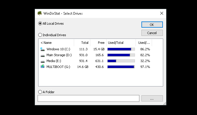
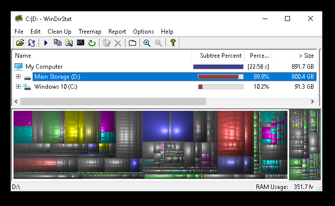
To visualize and locate large files, you’ll need to download and install WinDirStat. This program seems frozen in time, but WinDirStat is absolutely crucial when it comes to locating the particular size and scope of folders on your PC. Another good option is WizTree.
Install the application once you’ve cleared a bit of space on your PC. Then, run it by clicking your start menu and typing windirstat. Select the WinDirStat option. Finally, select one of the following options and click OK.
You can search all your local drives, including USB drives, individual drives, and even individual folders. Once you choose your selection, the program will load the display of your local files.
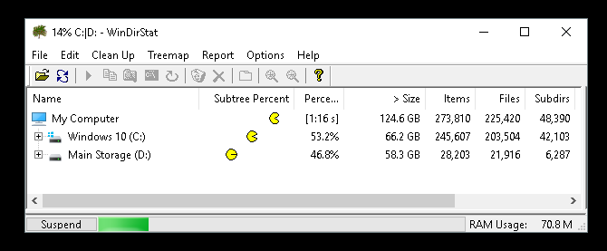
This process is both time-consuming and intensive, so limit the use of other programs like games or graphic editors.
Once you’re files are loaded, you will be presented with a color-coded display of your files and folders.
Larger blocks are single chunks of storage. Similar colored blocks are individual files located within the same folder.
Click on individual blocks on the bottom of your window to view the location of the file above.
You’ll note that most composite chunks of storage will be used for games or system folders.
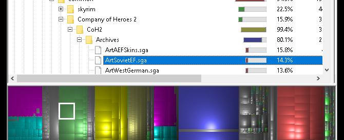
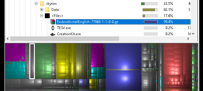
Click on large, single chunks, as those will clear the most clutter. Try to locate a downloaded ZIP or game add on you’ve forgotten about or stopped using.
They’re surprisingly easy to find, since the average PC user downloads so many different files and applications over the course of a hard drive’s lifespan.
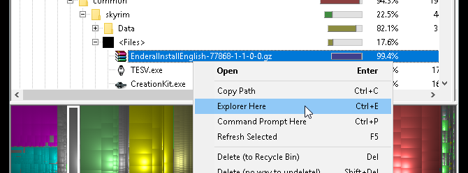
Right-click on your file and select Explorer Here. This will open your default file explorer to the selected file. Then, simply delete the file or folder.
Keep in mind, deleting parts of a program or game may render them obsolete. If you’re going to delete a file, ensure that it is not necessary for the use of another. Large, forgotten downloads are perfect candidate.
Cleaning Up Even More Disk Space
A download here and there, and next thing you know your PC has ground to a halt. It can be stressful trying to decide what file to remove when you’ve already exhausted typical cleansing tools.
No worries, now you know exactly how to go about clearing all that unwanted clutter. If necessary, keep going with our article on freeing up extra disk space in Windows 10.
The iPhone XS proves one thing definitively: that the iPhone X was probably one of the most ambitious product bets of all time.
When Apple told me in 2017 that they put aside plans for the iterative upgrade that they were going to ship and went all in on the iPhone X because they thought they could jump ahead a year, they were not blustering. That the iPhone XS feels, at least on the surface, like one of Apple’s most “S” models ever is a testament to how aggressive the iPhone X timeline was.
I think there will be plenty of people who will see this as a weakness of the iPhone XS, and I can understand their point of view. There are about a half-dozen definitive improvements in the XS over the iPhone X, but none of them has quite the buzzword-worthy effectiveness of a marquee upgrade like 64-bit, 3D Touch or wireless charging — all benefits delivered in previous “S” years.
That weakness, however, is only really present if you view it through the eyes of the year-over-year upgrader. As an upgrade over an iPhone X, I’d say you’re going to have to love what they’ve done with the camera to want to make the jump. As a move from any other device, it’s a huge win and you’re going head-first into sculpted OLED screens, face recognition and super durable gesture-first interfaces and a bunch of other genre-defining moves that Apple made in 2017, thinking about 2030, while you were sitting back there in 2016.
Since I do not have an iPhone XR, I can’t really make a call for you on that comparison, but from what I saw at the event and from what I know about the tech in the iPhone XS and XS Max from using them over the past week, I have some basic theories about how it will stack up.
For those with interest in the edge of the envelope, however, there is a lot to absorb in these two new phones, separated only by size. Once you begin to unpack the technological advancements behind each of the upgrades in the XS, you begin to understand the real competitive edge and competence of Apple’s silicon team, and how well they listen to what the software side needs now and in the future.
Whether that makes any difference for you day to day is another question, one that, as I mentioned above, really lands on how much you like the camera.
But first, let’s walk through some other interesting new stuff.
Notes on durability
As is always true with my testing methodology, I treat this as anyone would who got a new iPhone and loaded an iCloud backup onto it. Plenty of other sites will do clean room testing if you like comparison porn, but I really don’t think that does most folks much good. By and large most people aren’t making choices between ecosystems based on one spec or another. Instead, I try to take them along on prototypical daily carries, whether to work for TechCrunch, on vacation or doing family stuff. A foot injury precluded any theme parks this year (plus, I don’t like to be predictable) so I did some office work, road travel in the center of California and some family outings to the park and zoo. A mix of uses cases that involves CarPlay, navigation, photos and general use in a suburban environment.
In terms of testing locale, Fresno may not be the most metropolitan city, but it’s got some interesting conditions that set it apart from the cities where most of the iPhones are going to end up being tested. Network conditions are pretty adverse in a lot of places, for one. There’s a lot of farmland and undeveloped acreage and not all of it is covered well by wireless carriers. Then there’s the heat. Most of the year it’s above 90 degrees Fahrenheit and a good chunk of that is spent above 100. That means that batteries take an absolute beating here and often perform worse than other, more temperate, places like San Francisco. I think that’s true of a lot of places where iPhones get used, but not so much the places where they get reviewed.
That said, battery life has been hard to judge. In my rundown tests, the iPhone XS Max clearly went beast mode, outlasting my iPhone X and iPhone XS. Between those two, though, it was tougher to tell. I try to wait until the end of the period I have to test the phones to do battery stuff so that background indexing doesn’t affect the numbers. In my ‘real world’ testing in the 90+ degree heat around here, iPhone XS did best my iPhone X by a few percentage points, which is what Apple does claim, but my X is also a year old. The battery didn’t fail during even intense days of testing with the XS.
In terms of storage I’m tapping at the door of 256GB, so the addition of 512GB option is really nice. As always, the easiest way to determine what size you should buy is to check your existing free space. If you’re using around 50% of what your phone currently has, buy the same size. If you’re using more, consider upgrading because these phones are only getting faster at taking better pictures and video and that will eat up more space.
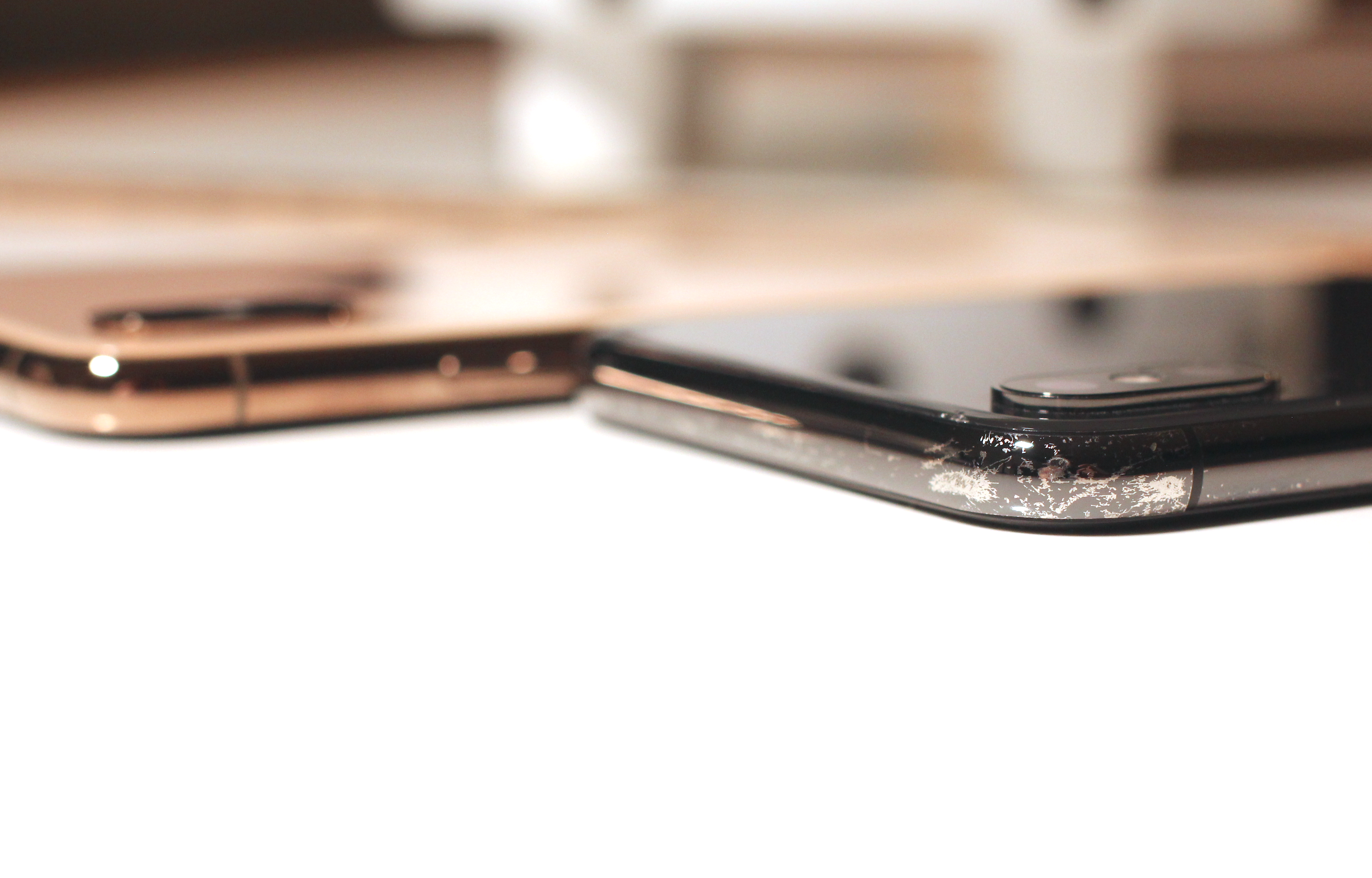
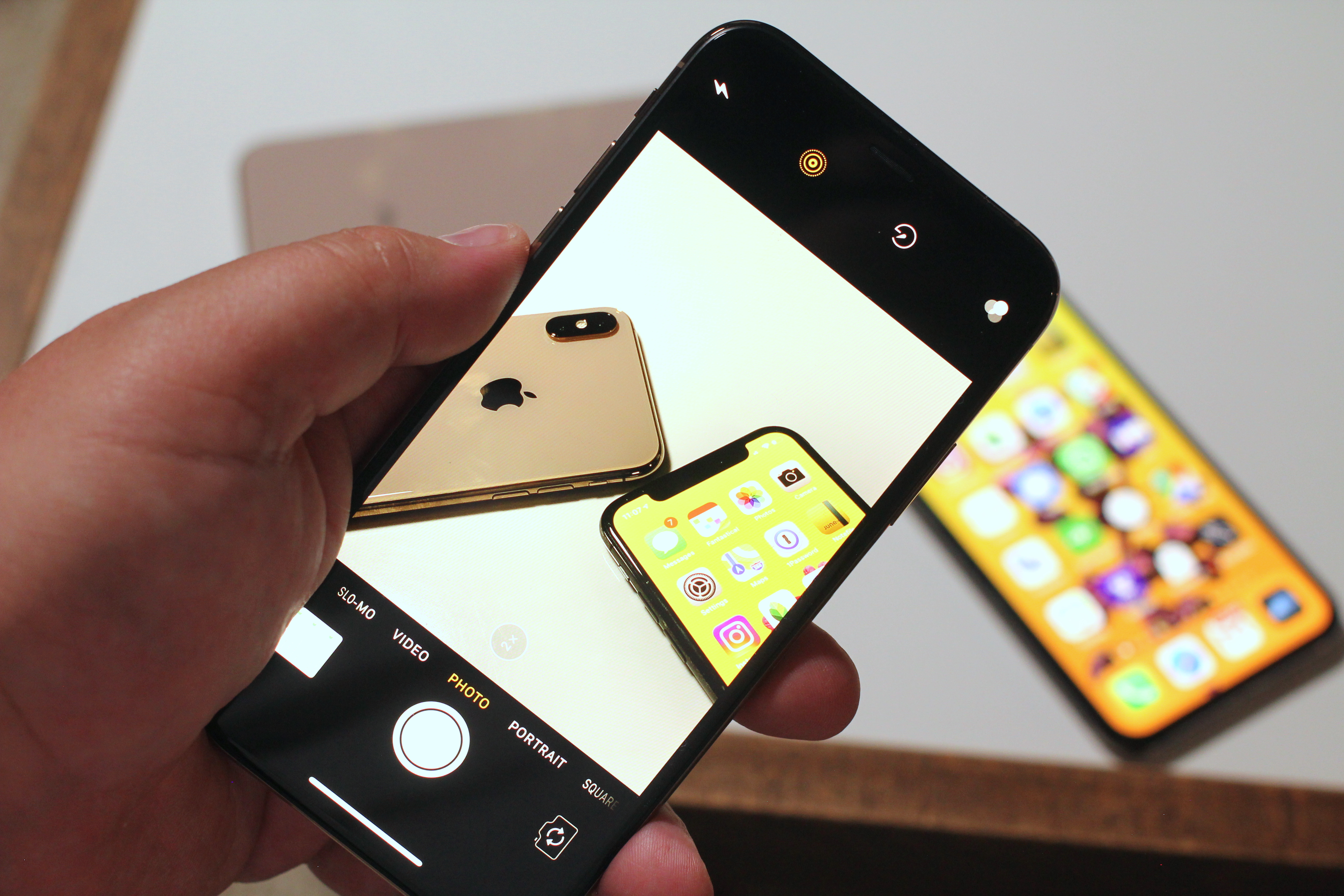
The review units I was given both had the new gold finish. As I mentioned on the day, this is a much deeper, brassier gold than the Apple Watch Edition. It’s less ‘pawn shop gold’ and more ‘this is very expensive’ gold. I like it a lot, though it is hard to photograph accurately — if you’re skeptical, try to see it in person. It has a touch of pink added in, especially as you look at the back glass along with the metal bands around the edges. The back glass has a pearlescent look now as well, and we were told that this is a new formulation that Apple created specifically with Corning. Apple says that this is the most durable glass ever in a smartphone.
My current iPhone has held up to multiple falls over 3 feet over the past year, one of which resulted in a broken screen and replacement under warranty. Doubtless multiple YouTubers will be hitting this thing with hammers and dropping it from buildings in beautiful Phantom Flex slo-mo soon enough. I didn’t test it. One thing I am interested in seeing develop, however, is how the glass holds up to fine abrasions and scratches over time.
My iPhone X is riddled with scratches both front and back, something having to do with the glass formulation being harder, but more brittle. Less likely to break on impact but more prone to abrasion. I’m a dedicated no-caser, which is why my phone looks like it does, but there’s no way for me to tell how the iPhone XS and XS Max will hold up without giving them more time on the clock. So I’ll return to this in a few weeks.
Both the gold and space grey iPhones XS have been subjected to a coating process called physical vapor deposition or PVD. Basically metal particles get vaporized and bonded to the surface to coat and color the band. PVD is a process, not a material, so I’m not sure what they’re actually coating these with, but one suggestion has been Titanium Nitride. I don’t mind the weathering that has happened on my iPhone X band, but I think it would look a lot worse on the gold, so I’m hoping that this process (which is known to be incredibly durable and used in machine tooling) will improve the durability of the band. That said, I know most people are not no-casers like me so it’s likely a moot point.
Now let’s get to the nut of it: the camera.
Bokeh let’s do it
I’m (still) not going to be comparing the iPhone XS to an interchangeable lens camera because portrait mode is not a replacement for those, it’s about pulling them out less. That said, this is closest its ever been.
One of the major hurdles that smartphone cameras have had to overcome in their comparisons to cameras with beautiful glass attached is their inherent depth of focus. Without getting too into the weeds (feel free to read this for more), because they’re so small, smartphone cameras produce an incredibly compressed image that makes everything sharp. This doesn’t feel like a portrait or well composed shot from a larger camera because it doesn’t produce background blur. That blur was added a couple of years ago with Apple’s portrait mode and has been duplicated since by every manufacturer that matters — to varying levels of success or failure.
By and large, most manufacturers do it in software. They figure out what the subject probably is, use image recognition to see the eyes/nose/mouth triangle is, build a quick matte and blur everything else. Apple does more by adding the parallax of two lenses OR the IR projector of the TrueDepth array that enables Face ID to gather a multi-layer depth map.
As a note, the iPhone XR works differently, and with fewer tools, to enable portrait mode. Because it only has one lens it uses focus pixels and segmentation masking to ‘fake’ the parallax of two lenses.
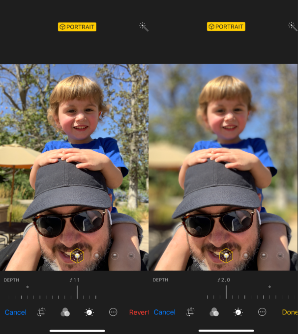
With the iPhone XS, Apple is continuing to push ahead with the complexity of its modeling for the portrait mode. The relatively straightforward disc blur of the past is being replaced by a true bokeh effect.
Background blur in an image is related directly to lens compression, subject-to-camera distance and aperture. Bokeh is the character of that blur. It’s more than just ‘how blurry’, it’s the shapes produced from light sources, the way they change throughout the frame from center to edges, how they diffuse color and how they interact with the sharp portions of the image.
Bokeh is to blur what seasoning is to a good meal. Unless you’re the chef, you probably don’t care what they did you just care that it tastes great.
Well, Apple chef-ed it the hell up with this. Unwilling to settle for a templatized bokeh that felt good and leave it that, the camera team went the extra mile and created an algorithmic model that contains virtual ‘characteristics’ of the iPhone XS’s lens. Just as a photographer might pick one lens or another for a particular effect, the camera team built out the bokeh model after testing a multitude of lenses from all of the classic camera systems.
I keep saying model because it’s important to emphasize that this is a living construct. The blur you get will look different from image to image, at different distances and in different lighting conditions, but it will stay true to the nature of the virtual lens. Apple’s bokeh has a medium-sized penumbra, spreading out light sources but not blowing them out. It maintains color nicely, making sure that the quality of light isn’t obscured like it is with so many other portrait applications in other phones that just pick a spot and create a circle of standard gaussian or disc blur.
Check out these two images, for instance. Note that when the light is circular, it retains its shape, as does the rectangular light. It is softened and blurred, as it would when diffusing through the widened aperture of a regular lens. The same goes with other shapes in reflected light scenarios.
Now here’s the same shot from an iPhone X, note the indiscriminate blur of the light. This modeling effort is why I’m glad that the adjustment slider proudly carries f-stop or aperture measurements. This is what this image would look like at a given aperture, rather than a 0-100 scale. It’s very well done and, because it’s modeled, it can be improved over time. My hope is that eventually, developers will be able to plug in their own numbers to “add lenses” to a user’s kit.
And an adjustable depth of focus isn’t just good for blurring, it’s also good for un-blurring. This portrait mode selfie placed my son in the blurry zone because it focused on my face. Sure, I could turn the portrait mode off on an iPhone X and get everything sharp, but now I can choose to “add” him to the in-focus area while still leaving the background blurry. Super cool feature I think is going to get a lot of use.
It’s also great for removing unwanted people or things from the background by cranking up the blur.
And yes, it works on non-humans.
If you end up with an iPhone XS, I’d play with the feature a bunch to get used to what a super wide aperture lens feels like. When its open all the way to f1.4 (not the actual widest aperture of the lens, by the way; this is the virtual model we’re controlling) pretty much only the eyes should be in focus. Ears, shoulders, maybe even nose could be out of the focus area. It takes some getting used to but can produce dramatic results.
A 150% crop of a larger photo to show detail preservation.
Developers do have access to one new feature though, the segmentation mask. This is a more precise mask that aids in edge detailing, improving hair and fine line detail around the edges of a portrait subject. In my testing it has led to better handling of these transition areas and less clumsiness. It’s still not perfect, but it’s better. And third-party apps like Halide are already utilizing it. Halide’s co-creator, Ben Sandofsky, says they’re already seeing improvements in Halide with the segmentation map.
“Segmentation is the ability to classify sets of pixels into different categories,” says Sandofsky. “This is different than a “Hot dog, not a hot dog” problem, which just tells you whether a hot dog exists anywhere in the image. With segmentation, the goal is drawing an outline over just the hot dog. It’s an important topic with self driving cars, because it isn’t enough to tell you there’s a person somewhere in the image. It needs to know that person is directly in front of you. On devices that support it, we use PEM as the authority for what should stay in focus. We still use the classic method on old devices (anything earlier than iPhone 8), but the quality difference is huge.”
The above is an example shot in Halide that shows the image, the depth map and the segmentation map.
In the example below, the middle black-and-white image is what was possible before iOS 12. Using a handful of rules like, “Where did the user tap in the image?” We constructed this matte to apply our blur effect. It’s no bad by any means, but compare it to the image on the right. For starters, it’s much higher resolution, which means the edges look natural.
My testing of portrait mode on the iPhone XS says that it is massively improved, but that there are still some very evident quirks that will lead to weirdness in some shots like wrong things made blurry and halos of light appearing around subjects. It’s also not quite aggressive enough on foreground objects — those should blur too but only sometimes do. But the quirks are overshadowed by the super cool addition of the adjustable background blur. If conditions are right it blows you away. But every once in a while you still get this sense like the Neural Engine just threw up its hands and shrugged.
Live preview of the depth control in the camera view is not in iOS 12 at the launch of the iPhone XS, but it will be coming in a future version of iOS 12 this fall.
I also shoot a huge amount of photos with the telephoto lens. It’s closer to what you’d consider to be a standard lens on a camera. The normal lens is really wide and once you acclimate to the telephoto you’re left wondering why you have a bunch of pictures of people in the middle of a ton of foreground and sky. If you haven’t already, I’d say try defaulting to 2x for a couple of weeks and see how you like your photos. For those tight conditions or really broad landscapes you can always drop it back to the wide. Because of this, any iPhone that doesn’t have a telephoto is a basic non-starter for me, which is going to be one of the limiters on people moving to iPhone XR from iPhone X, I believe. Even iPhone 8 Plus users who rely on the telephoto I believe will miss it if they don’t go to the XS.
But, man, Smart HDR is where it’s at
I’m going to say something now that is surely going to cause some Apple followers to snort, but it’s true. Here it is:
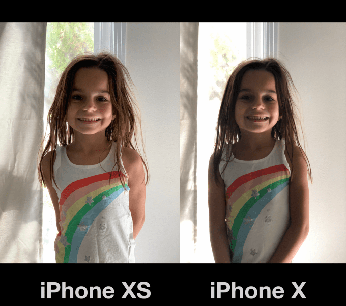
For a company as prone to hyperbole and Maximum Force Enthusiasm about its products, I think that they have dramatically undersold how much improved photos are from the iPhone X to the iPhone XS. It’s extreme, and it has to do with a technique Apple calls Smart HDR.
Smart HDR on the iPhone XS encompasses a bundle of techniques and technology including highlight recovery, rapid-firing the sensor, an OLED screen with much improved dynamic range and the Neural Engine/image signal processor combo. It’s now running faster sensors and offloading some of the work to the CPU, which enables firing off nearly two images for every one it used to in order to make sure that motion does not create ghosting in HDR images, it’s picking the sharpest image and merging the other frames into it in a smarter way and applying tone mapping that produces more even exposure and color in the roughest of lighting conditions.
iPhone XS shot, better range of tones, skintone and black point
iPhone X Shot, not a bad image at all, but blocking up of shadow detail, flatter skin tone and blue shift
Nearly every image you shoot on an iPhone XS or iPhone XS Max will have HDR applied to it. It does it so much that Apple has stopped labeling most images with HDR at all. There’s still a toggle to turn Smart HDR off if you wish, but by default it will trigger any time it feels it’s needed.
And that includes more types of shots that could not benefit from HDR before. Panoramic shots, for instance, as well as burst shots, low light photos and every frame of Live Photos is now processed.
The results for me have been massively improved quick snaps with no thought given to exposure or adjustments due to poor lighting. Your camera roll as a whole will just suddenly start looking like you’re a better picture taker, with no intervention from you. All of this is capped off by the fact that the OLED screens in the iPhone XS and XS Max have a significantly improved ability to display a range of color and brightness. So images will just plain look better on the wider gamut screen, which can display more of the P3 color space.
Under the hood
As far as Face ID goes, there has been no perceivable difference for me in speed or number of positives, but my facial model has been training on my iPhone X for a year. It’s starting fresh on iPhone XS. And I’ve always been lucky that Face ID has just worked for me most of the time. The gist of the improvements here are jumps in acquisition times and confirmation of the map to pattern match. There is also supposed to be improvements in off-angle recognition of your face, say when lying down or when your phone is flat on a desk. I tried a lot of different positions here and could never really definitively say that iPhone XS was better in this regard, though as I said above, it very likely takes training time to get it near the confidence levels that my iPhone X has stored away.
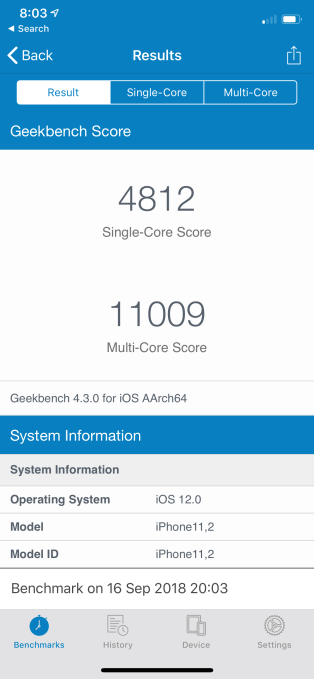
In terms of CPU performance the world’s first at-scale 7nm architecture has paid dividends. You can see from the iPhone XS benchmarks that it compares favorably to fast laptops and easily exceeds iPhone X performance.
The Neural Engine and better A12 chip has meant for better frame rates in intense games and AR, image searches, some small improvement in app launches. One easy way to demonstrate this is the video from the iScape app, captured on an iPhone X and an iPhone XS. You can see how jerky and FPS challenged the iPhone X is in a similar AR scenario. There is so much more overhead for AR experiences I know developers are going to be salivating for what they can do here.
The stereo sound is impressive, surpassingly decent separation for a phone and definitely louder. The tradeoff is that you get asymmetrical speaker grills so if that kind of thing annoys you you’re welcome.
Upgrade or no
Every other year for the iPhone I see and hear the same things — that the middle years are unimpressive and not worthy of upgrading. And I get it, money matters, phones are our primary computer and we want the best bang for our buck. This year, as I mentioned at the outset, the iPhone X has created its own little pocket of uncertainty by still feeling a bit ahead of its time.
I don’t kid myself into thinking that we’re going to have an honest discussion about whether you want to upgrade from the iPhone X to iPhone XS or not. You’re either going to do it because you want to or you’re not going to do it because you don’t feel it’s a big enough improvement.
And I think Apple is completely fine with that because iPhone XS really isn’t targeted at iPhone X users at all, it’s targeted at the millions of people who are not on a gesture-first device that has Face ID. I’ve never been one to recommend someone upgrade every year anyway. Every two years is more than fine for most folks — unless you want the best camera, then do it.
And, given that Apple’s fairly bold talk about making sure that iPhones last as long as they can, I think that it is well into the era where it is planning on having a massive installed user base that rents iPhones from it on a monthly or yearly or biennial period. And it doesn’t care whether those phones are on their first, second or third owner, because that user base will need for-pay services that Apple can provide. And it seems to be moving in that direction already, with phones as old as the five-year-old iPhone 5s still getting iOS updates.
With the iPhone XS, we might just be seeing the true beginning of the iPhone-as-a-service era.
Facebook Ad Breaks, the social network’s pre-roll and mid-roll video ads, are launching in 21 new countries.
Facebook announced that Ad Breaks were generally available last month in five countries: the United States, United Kingdom, Ireland, Australia and New Zealand. Now it’s adding territories in Europe, Latin and South America and Asia to the list.
“We started very conservatively,” she said. “It’s a very new initiative for us … We needed to get the user experience right.”
In particular, she said the company found that that these ads work best with longer videos, which is why there’s now a minimum length of three minutes.
Facebook has rolled out other improvements too, like the ability to automatically detect the best moments to insert the ad (though video publishers can still place the Ad Breaks manually, if they choose).
“As you watch a video, there are points in this video where the pause or Ad Break feels natural to the viewer,” Smith said. “For example, between scenes, or where it doesn’t interrupt speech, where the story line feels good to take a break — those are all signals” used to select Ad Break locations.
Beyond the minimum length for individual videos, Facebook also requires that Pages participating in the Ad Breaks program have at least 10,000 followers and need to have received at least 30,000 one-minute views on videos that are at least one minute long. They also need to meet Facebook’s general monetization standards.
The Ad Breaks sign-up page will now automatically tell creators whether they’re eligible to participate. Smith described these standards as a way to ensure “a really positive experience” for video creators, advertisers and regular users. (After concerns that ads were being played before inappropriate or controversial content, YouTube set a higher bar for eligibility earlier this year, though that’s led to widespread complaints from creators.)
Here are the new countries where Ad Breaks are generally available: Belgium, Denmark, France, Germany, Netherlands, Norway, Portugal, Spain, Sweden, Argentina, Bolivia, Chile, Colombia, the Dominican Republic, Ecuador, El Salvador, Guatemala, Honduras, Mexico, Peru and Thailand. As part of this expansion, Facebook is adding support for five new languages, namely French, German, Portuguese, Spanish and Thai.
“We’re making sure we’re very thoughtful, rolling this out in phases,” Smith said. “As we get ready to honor our commitment to our partners to enable them to monetize, we’re very excited.”
Is that default Linux look getting you down? Want more from your Linux desktop than GNOME, KDE, or MATE? Fortunately, Linux is the most configurable operating system around, so personalizing the appearance of your desktop is easy.
Various tools, tricks and tweaks can be used to personalize your Linux desktop. You might simply want to swap out a few familiar desktop utilities, or change your theme. You might even install a brand new environment.
Use these five methods for personalizing your Linux desktop environment:
Tweak your desktop utilities
Switch the desktop theme (most distros ship with many themes)
Add new icons and fonts (the right choice can have an amazing effect)
Reskin your desktop with Conky
Install a new desktop environment (an extreme option that may suit you)
Let’s take a look at each of these options in turn.
1. Tweak the Linux Desktop Utilities
Get started tweaking the look of your Linux desktop by changing the key desktop utilities. Several such apps are available, but we’re going to look at the three most common: the file manager, the window manager, and the sidebar or panel.
File Manager
Whether you’re looking for something with a different look, or simply something more functional than GNOME Files (formerly known as Nautilus), you have a few options.
Konqueror, Midnight Commander, or the KDE Dolphin tool are all strong alternatives. If you’re looking for something as simple as GNOME Files, however, try Thunar, or PCManFM.
Window Manager
Changing the actual windows in your Linux distribution is also an option. The placement and appearance can be adjusted with a new window manager. Choose from Compiz, Metacity, Kwin, Mutter, and many others.
Dock
While a new window manager will let you adjust your panel, you might also try a macOS-style dock. This can be implemented using Plank (this comes with several dock themes), or Cairo-Dock (also known as Glx-Dock).
Further changes can be made to your Linux desktop. One of the built in options is to change the desktop theme.
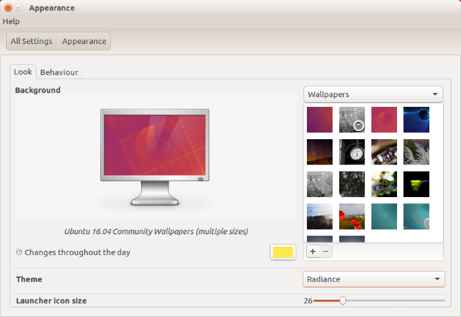
For instance, you can easily change the desktop background, or wallpaper. In Ubuntu, use the Appearance setting to do this. You can the follow this with a change to icons and fonts (see below).
Note, however, that how you change your desktop may affect your mood, and as a result, productivity. While a light desktop theme might give you encouraging vibes, darker themes are more suitable for gaming PCs.
3. Install New Icons and Fonts
Many replacement icon packs are available for Linux, typically themed to give a specific feel. For instance, if you want to replicate the feel of Android’s Material Design, you can input similar “flat” icons such as the Luv icons theme.
Finding the right icon pack can take some time. Often, the first icon pack you find doesn’t fit with your planned desktop theme, despite looking amazing in isolation. Get it right, however, and you’ve got a stunning new look for your Linux desktop.
How to Add New Fonts to Linux
If you’re changing the look of your PC, switching to a new font is a good idea. But it doesn’t always work out right. A new desktop font should be clear, subtle, and almost unnoticeable. Ostentatious fonts typically leave you with an overcrowded, ugly desktop.
You can find new fonts online at sites like fontsquirrel.com, a library of free and open-source fonts. Wherever you go, ensure you download your fonts to the /.fonts/ directory, which you should create in your Home directory.
After extracting the TTF file into the /.fonts/ directory, you can select the new font by right-clicking the desktop. Select Change Desktop Background > Fonts and choose the new font in the dropdown menu, then click Close to confirm.
If you want to use a font from your Windows PC, see our guide to using Microsoft fonts in Linux.
4. Reskin Your Desktop With Conky
Although ostensibly a system monitoring tool, Conky also supports a number of stunning themes and widgets. This lets you reskin your desktop, adding stunning new elements for a truly personal Linux environment.
Installation is straightforward. Simply open a Terminal and enter:
sudo apt update
sudo apt install conky-all
To run Conky, input the command:
conky
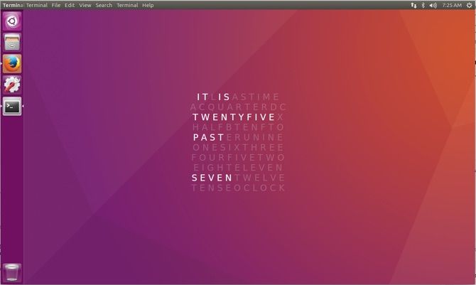
This will reveal the plain, “naked” version of Conky, which you can then reskin to prettify your desktop. By editing the ~/.conkyrc file, you will end up with stunning desktop elements, such as this clock:
If Conky doesn’t bring you the fresh new look you need, it’s probably time to install a new desktop environment. So many are available, but you might have trouble with some; not all are compatible with every Linux version.
The solution isn’t as scary as you might think. While there was a time when swapping to a new desktop environment was fraught with difficulties, these days it’s a lot simpler. As long as there is a version of the desktop for your distro you should be fine. Note that you will need to run a web search for the specific details for each desktop environment.
Linux is incredibly flexible in so many ways. Making your desktop environment look the way you want, either for aesthetic or productivity purposes (or a combination of the two) is straightforward, and usually quick.
The steps above should let you reconfigure your desktop to look the way you want. If it doesn’t, you have alternatives that you can install in just a few minutes.
If you still can’t get your desktop to look the way you want, perhaps it’s time to try a totally different version of Linux? See our list of the top Linux distributions for suggestions.
Bumble is officially serving the papers in the suit against Tinder parent, Match Group. Bumble had said in March it was filing a suit of $400 million against Match Group for fraudulently obtaining trade secrets, following Match’s suit filed only weeks before, which had claimed patent infringement and misuse of intellectual property.
Match’s original lawsuit said that Bumble had copied “Tinder’s world-changing, card-swipe-based, mutual opt-in premise,” and accused Tinder-turned-Bumble employees Chris Gulczynski and Sarah Mick of copying elements of the design.
Following Match’s suit, Bumble responded then filed a separate action that raised new allegations against Match Group. It said that when Bumble and Match Group were in acquisition talks, Match filed its suit to make Bumble look less attractive to other suitors. Bumble also said that Match Group fraudulently requested for Bumble to provide “confidential and trade secret information” which Match Group said they “needed to provide a higher offer for Bumble,” the suit alleged.
Bumble’s suit also said that no subsequent offer came, and Match Group instead requested and obtained this information solely for “the financial benefit of its dating app businesses.”
And it said that Match Group “published false or disparaging information about Bumble, including statements in the press falsely claiming that Bumble infringed Match’s intellectual property, as well as false statements in the Lawsuit.”
Bumble and Match Group had tried to come to some sort of settlement over the months since the lawsuits were filed, in hopes of finding another solution outside of having to take their claims to court. But with court papers now being served, it appears that’s not going to be the case.
Match Group has had Bumble on its radar as one of its top competitors and a threat to its dating app business led by Tinder. It has tried to acquire Bumble twice, and has been turned down. Last year, for example, Match was in discussions with Bumble over a deal that then valued it at over $1 billion.
In the months since, Bumble has grown significantly as its business continues to expand outside the U.S. The company is now available in English-language countries like Canada, Australia, and the U.K., and is investing in expansions into Germany and Mexico. Latin America andSouth America are also on the roadmap for 2019, and Asia is in the works, as well.
In addition, Bumble has now upped its revenue run rate to $200 million per year. That doesn’t mean Bumble is making $200 million in 2018, only that it has exceeded its original expectations of $150 million in revenue for the year.
The revenues come entirely from Bumble’s in-app subscription business – the app doesn’t run ads.
The app also recently passed 40 million users, Wolfe recently noted on stage at TechCrunch Disrupt SF 2018 alongside news of Bumble’s new “snooze” feature that allows users to take a time-out from the app. She also spoke of Bumble’s plans to invest in its non-dating businesses, grow its real-world footprint through an expansion of its “Hive” locations, and introduce advertising.
In terms of how this suit will impact Bumble, Wolfe said, “we’re focused on our growth. We’re focused on ending misogyny, and we’re actively pursuing an IPO.”
Microsoft released a new version of Skype for desktop earlier this year, with the aim to unify the messenger across all devices. We’re going to show you some fun or unusual features that the latest edition of Skype has that you might not know about.
Whether it’s learning a new language, sending a silly video clip, or polling your friends, hopefully you learn something new about Skype as it enters its fifteenth year of existence.
If you have your own fun tip to share about Skype, be sure to let us know in the comments.
1. Use Emoticons, Stickers, and Mojis
There’s nothing better than an emoji. Why use words when an animated image will do the job? If you love emojis, Skype has you covered with an assortment of different ones.
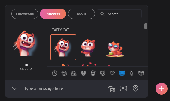
The types of emojis are split into Emoticons, Stickers, and Mojis. Access them from a chat by clicking the smiling face to the left of the message box.
Use the labeled tabs to switch between the three and the symbols beneath to change category. Hover over something to preview it on the left-hand pane and click it to send it into chat.
Emoticons cover the usual yellow-faced cartoons, but also animals, objects, and more. Send them by themselves to see them big, or alongside a text message. Stickers are larger, non-animated images that belong to a set. Mojis are animated clips that come with sound and include unusual theme choices like Charlotte’s Web and The Minions.
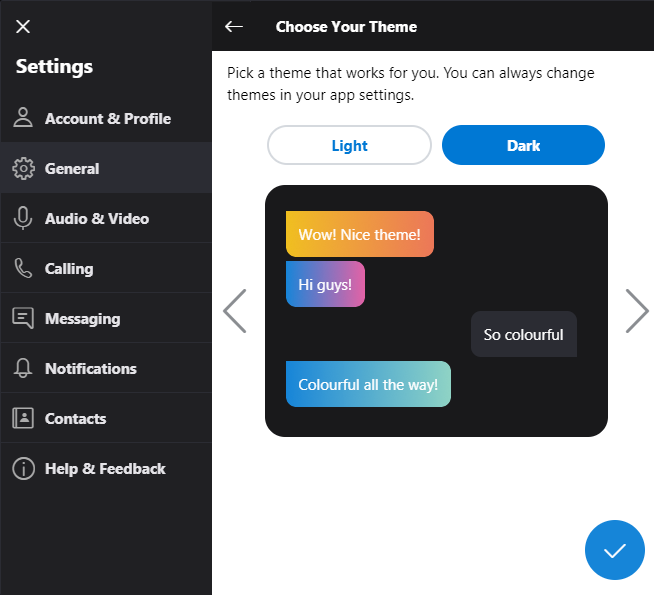
2. Choose a Colorful Skype Theme
Color is the spice of life, so why not add some color to your Windows applications? And you can customize Skype to get in on the fun. To get started, click the three dots in the top-left of the window. Click Settings> General.
First, click Theme. Here you can switch between Light and Dark, depending on what you want the background color of Skype to be. Then use the left and right arrows to move between the different themes; the chat preview will show you how it’ll look in messaging. When you’re done, click the tick icon.
Next, click Color. Here you can click a color, from a small selection like orange, mint, and rose. This will change the color of certain user interface elements, like some sliders and buttons.
3. Rename Your Skype Contacts
People use Skype for all sorts of reasons. Keeping in touch with family, interviewing for jobs, and shooting the breeze with friends. While you can have a unique username, Skype lists all your contacts using their real names. Where’s the fun in that?
It’s easy to rename your contacts so that you can give them a cheeky nickname or change it to your relation like “Mom”. To begin, click the Contacts tab from the left-hand pane.
Right-click the contact that you want to rename and click View profile. Click the pencil icon next to that person’s name. Input their new name and click the tick icon.
And don’t worry—only you will see this name change!
4. Enable the Skype Translator Bot
It’s no easy task to learn a new language, and there are many apps out there to help you. If you have contacts who don’t share the same tongue as you, that doesn’t mean you can’t talk to them. Skype has a translator bot that works for text and voice chats, for languages like German, Italian, French, and more.
To get started, right click the contact you want to translate. Go to View profile > Start translator. This will create a group chat with you, your contact, and the Skype Translator bot. It will guide you through choosing the language for both parties, along with the gender of the robot translator.
The video above shows the translation bot in work during a voice call. It’s the old Skype interface, but the mechanics of it remain the same. You need to pause to hear the translation when on a voice call, but it’s automatic when typing.
As you might expect, the technology isn’t flawless. While it can impressively translate 13 languages in calls and 50 on instant message, it does get things wrong. For best results, use a headset rather than your device’s in-built microphone. As such, don’t use the translations it provides as definitive, but it’s certainly great to be able to converse with someone in another language.
5. Record Your Skype Calls
If you always have memorable calls and wish you could watch and listen back to them, you’re in luck. Skype recently added the ability to record your calls. This feature will include everyone’s video (including yours) and any screen shares.
To do so, during your Skype call, click the plus symbol and click Start recording. A banner appears for all chat members to let them know you’re recording. When the call is over, the recording is posted to chat and it’s available to be downloaded for 30 days.
You can get the download from the chat, but also by clicking More Options > Save as. Or if you want to share the recording with someone else, click Forward instead.
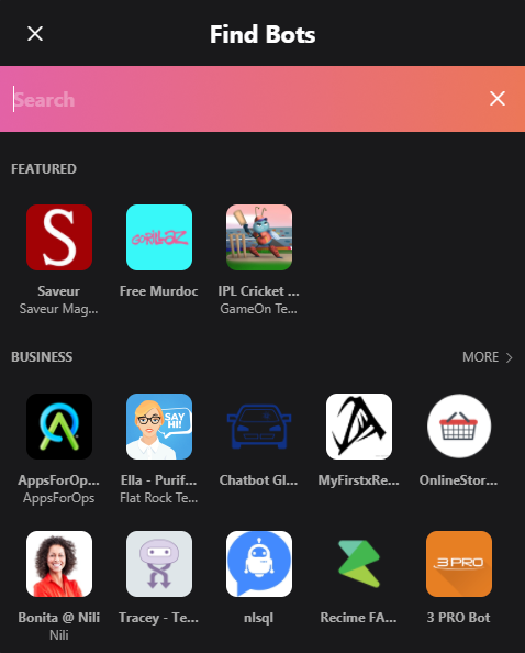
6. Engage With Skype Bots
Skype has all sorts of bots ready for you to chat with and call. To check out the selection, go to the Contacts tab from the left-hand pane. Click + Contact > Add Bots. This will open a new window where you can scroll through a selection of tabs or search for a specific one.
It’s not the greatest interface since it mixes foreign and business-specific bots in with the more general ones. The best way to find something is to click More next to each category header. This will bring up a list of all the bots within that category (like Business, Education, Health, and more), with a brief description about them.
If you want fun, check the Entertainment and Games categories. Here you’ll find good bots like Blackjack (the card game), Doctor Who Bot (an adventure with the time traveler), and Meme Cat (you can guess what that is.) Once you’ve found a bot you like, select it and click Get Started.
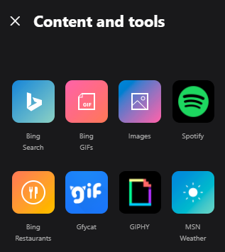
7. Share Music, Restaurants, Polls, and More
There’s so much more that Skype can do! Hop into a chat with someone and click the plus symbol next to the chat box. This will expand the Content and tools panel to the right of the screen.
Various services are listed here which you can use to embed multimedia content into the chat. For example, click Spotify to send a tune, Poll to ask a quick question, or TripAdvisor to recommend a restaurant.
You can also send money, choose a hilarious GIF, post a YouTube video, and more. You can expect that Microsoft will continue to add services here as they create their own and work with third-party providers to embed theirs.
A new feature in the latest version of Google Chrome that logs users into the browser when they sign in to a Google site has come under fire.
Until recently, it was the user’s choice to log-in to the browser. Now, any time that you sign in to a Google site in Chrome 69 — like Google Search, Gmail or YouTube — Chrome will also log you in, too.
But the change has left users unclear why the “feature” was pushed on them in the first place. Many security folks have already panned the move as unwanted behavior, arguing it violates their privacy. Some users had good reasons not to want to be logged into Chrome, but now Chrome seems to takes that decision away from the user.
Matthew Green, a cryptography professor at Johns Hopkins, rebuked the move in a blog post over the weekend, arguing that the new “forced login” feature blurs the once-strong barrier between “never logged in” and “signed in” — and erodes user trust.
“Where Facebook will routinely change privacy settings and apologize later, Google has upheld clear privacy policies that it doesn’t routinely change,” said Green. “Sure, when it collects, it collects gobs of data, but in the cases where Google explicitly makes user security and privacy promises — it tends to keep them.”
“This seems to be changing,” he said.
Google staff defended the change on Twitter, said there was little to worry about — that the change was designed to only alert the user that they were logged in, and that the browser wouldn’t sync their bookmarks, browsing history and passwords across devices without permission.
Tying my browsing history to an identity *implicitly* has privacy implications, even if I somehow avoid the option that uploads this data to Google.
Green conceded that although Google is not syncing data from the beginning, the user interface makes it difficult to know if browser data is shared with Google once a user is logged in. The “dark pattern” of the browser’s logged-in user interface now makes it possible to trick a user into switching on sync by mistake. Once your data is shared, there’s little a user can do to pull back. Without giving his explicit consent to have his data synced in future, he said Google could later decide, as it did with the “forced login” feature, to switch on the browser sync feature without telling anyone.
“Just because you’re violating my privacy doesn’t make it OK to add a massive new violation,” he said.
Other security experts agreed with Green, with some promising to switch browsers.
Sadly I noticed I’m logged in to Chrome on my work account. Moving over to Firefox this morning. I agree about the “dark pattern” on the Sync “button”. https://t.co/jO7k1KrktP
Trust is a fickle thing. Chrome isn’t just seen as secure and trustworthy, but many see it as neutral, Green said — a free and open source tool, rather than an extension of Google other core businesses. By breaking down that “sacred wall” between the two has users rattled — and some wanting to switch from Chrome altogether.
What may have been a helpful feature on paper to stop users from accidentally using someone else’s account on a shared computer has blown up in Google’s faces — and not because of the decision, but because users weren’t given a choice.