
If you work with data in Microsoft Excel, then creating a chart is a clean and attractive way to display that data. Excel offers many chart types from pie charts to bar graphs to line charts.
For working with statistical data, a box and whisker chart is the type you need. If you’ve never made one before, we’ll show you how to create a box and whisker plot in Excel, then double-check the calculations, and customize the chart for presentation.
What Is a Box and Whisker Plot?
A box and whisker plot, or box plot, is a chart that’s used to display a five-number summary of data. This type of chart works well for showing statistical data such as school grades or scores, before and after process changes, or similar situations for numerical data comparisons.
For more help on when to use which type of Excel chart type, check out our helpful guide.
When defining a box plot, here’s how Towards Data Science explains it:
A boxplot is a standardized way of displaying the distribution of data based on a five number summary (“minimum”, first quartile (Q1), median, third quartile (Q3), and “maximum”).
For viewing a box and whisker plot, the box shows the first quartile to the third quartile with a line through the center at the median. The whiskers go from each quartile to the minimum or maximum.
- Minimum: The smallest value in a data set.
- First quartile: The middle value between the Minimum and Median—25th percentile.
- Median: The middle value of a data set.
- Third quartile: The middle value the Median and the Maximum—75th percentile.
- Maximum: The largest value in a data set.
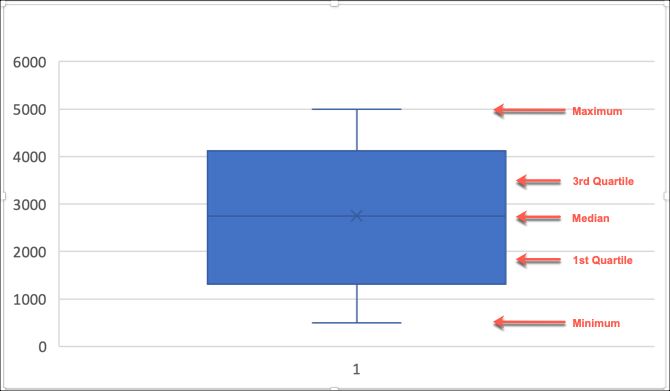
Create Your Microsoft Excel Box and Whisker Plot
As with any other type of chart or graph in Excel, it all starts with your data. Open up the workbook and spreadsheet in Excel containing your data set. Then, follow the steps below to create the box and whisker plot.
- Select your data. Either click the first cell, hold down your mouse, and then drag through the rest of the cells or click the upper left cell, hold down the Shift key, and then click the bottom right cell.
- Click the Insert
- In the Chart section in the ribbon, click Insert Statistical Chart and select Box and Whisker.
Your new box and whisker plot will pop right into your spreadsheet.
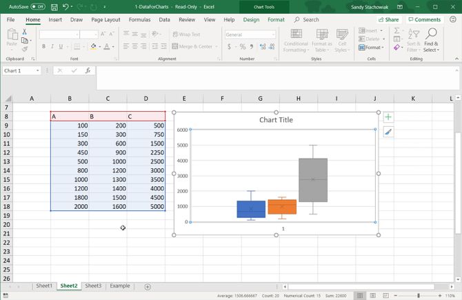
Double-Check Your Box Plot Data
You can rely on Excel to plot your data with the correct numbers. However, if you prefer to double-check those numbers or just need them for yourself, you can do so quite easily with Excel’s built-in functions.
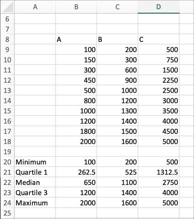
Head back to your data set and follow these instructions for finding the minimum, first quartile, median, third quartile, and maximum for your data set.
Minimum, Median, and Maximum Functions
- Start by clicking the cell where you want the initial function. We’ll start with Minimum.
- Click the Formulas
- Choose More Functions from the ribbon and mouse over Statistical.
- In the pop-out box, scroll down in the list to MIN and select it.
- When the function appears in the cell, you can drag through your data set or enter the cell labels by typing them in the Function Arguments box that also appears and click OK.
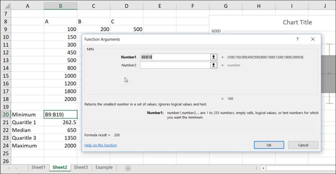
Now, just do the same for the Median and Maximum, choosing MEDIAN and MAX as the functions in the list.
Quartile Function
- Click the cell where you want the first quartile
- Click the Formulas
- Choose More Functions from the ribbon and mouse over Statistical.
- Scroll down in the list to EXC and select it.
- When the function appears in the cell, the Function Arguments will also appear. Select the data set as you did with MIN or enter it in the Array box in the arguments window.
- Also in the arguments window, enter the quartile number in the Quart In this case, it will be the number 1 for first quartile.
- Click OK.
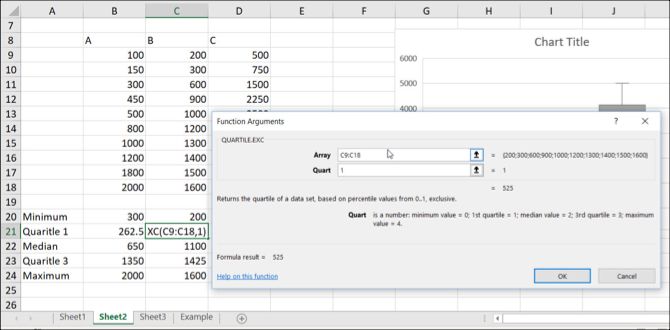
When you add the function for the third quartile, you’ll follow the same steps as above, but enter the number 3 in the Quart box.
Customize Your Microsoft Excel Box and Whisker Plot
Now that you have your box and whisker plot, you can customize it with a variety of options, just like other charts in Excel. Select your box plot and a small menu will appear on the top right with buttons for Chart Elements and Chart Styles.
Chart Elements
This area allows you to select the elements of the chart you want to display such as axes, chart title, data labels, and a legend. And some of the elements let you drill down even further. For instance, if you want a legend, you can select the location it should display on the chart.
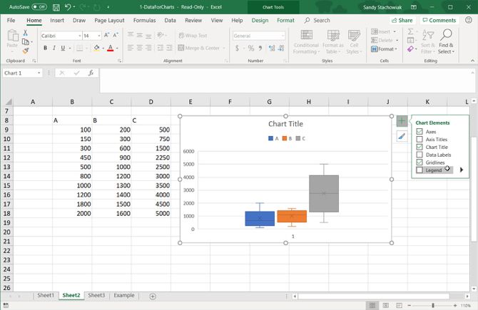
Chart Styles
This section lets you change the appearance of the chart. You can pick from different styles and color schemes to give your chart some pizzazz. Putting your mouse over any style or color theme will show you a preview of how your box plot will look. When you find what you like, just click to select it and you’ll see the changes immediately in your chart.

Moving or Resizing Your Chart
To move your box and whisker plot to another location on the spreadsheet, select it and when the four-sided arrow appears, drag your chart to its new spot.
To resize your chart, select it and then drag one of the circles on the border of the box plot in the direction you want to expand it.

Now Learn to Make Pie Charts in Microsoft Excel
While you can certainly scour the internet searching for a box and whisker maker, what better way to create one than with Microsoft Excel and its flexible features.
And if you work with Excel often and would like to make a pie chart to display your data, take a look at our tutorial specifically for that chart type.
Read the full article: How to Make a Box and Whisker Plot in Microsoft Excel
Read Full Article
No comments:
Post a Comment