Kobo’s latest e-reader is a complete about-face from its anonymous, cheap, and highly practical Clara HD; the Forma is big, expensive, and features a bold — not to say original — design. It’s clearly meant to take on the Kindle Oasis and e-reader fans for whom price is no object.
The $280 Forma joins a number of other e-readers in using a one-handed design, something which is, we might as admit up front, isn’t for everyone. That said, I’ve found that my reading style on these devices has been able to adapt from one form factor to another — it’s not like they made it head-mountable or something. You still hold it like you would any other small device.
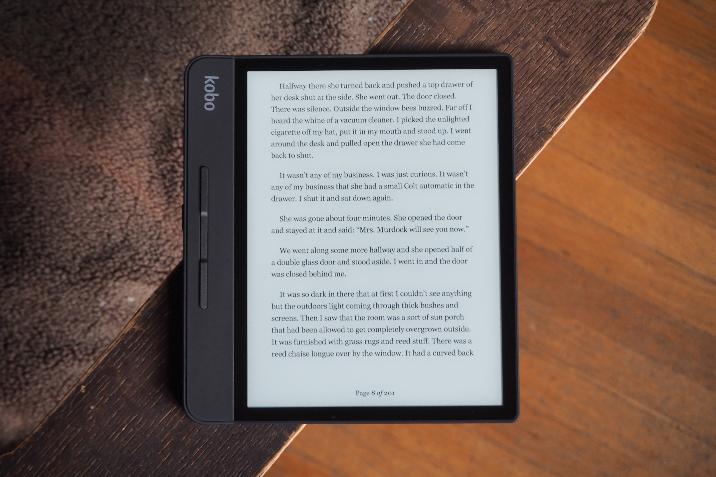
It uses an 8-inch E-Ink Carta display with 300 pixels per inch, which is more than enough for beautiful type. The frontlight — essentially a layer above the display that lights up and bounces light off it to illuminate the page — is a Kobo specialty, adjustable from very cold to very warm in cast and everywhere in between.

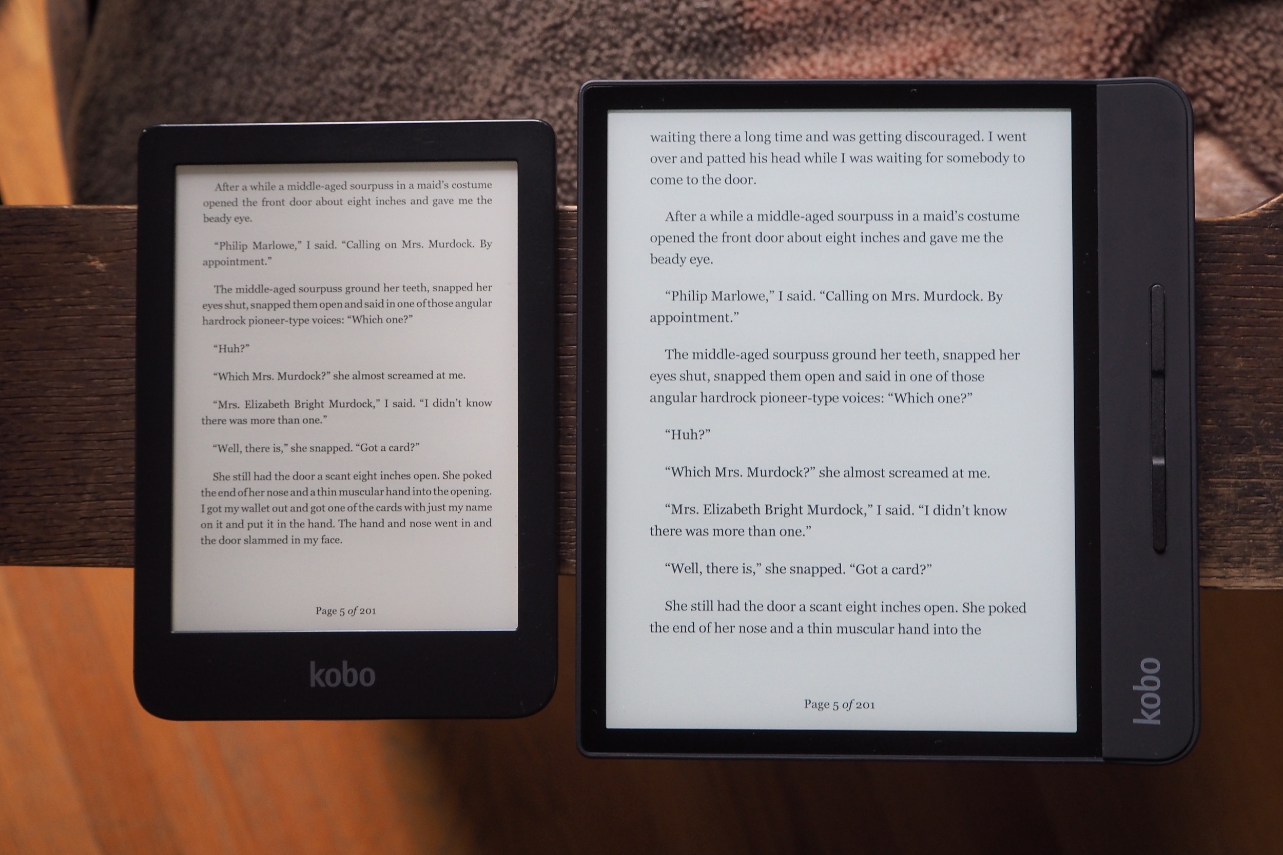
The Clara HD, Kobo’s best entry-level device, left, and the Forma. (The color cast of the screens is adjustable.)
The screen will be very similar to that of the Aura One, Kobo’s previous high-end reader, but the Forma’s asymmetric design gives it slightly closer to square dimensions.
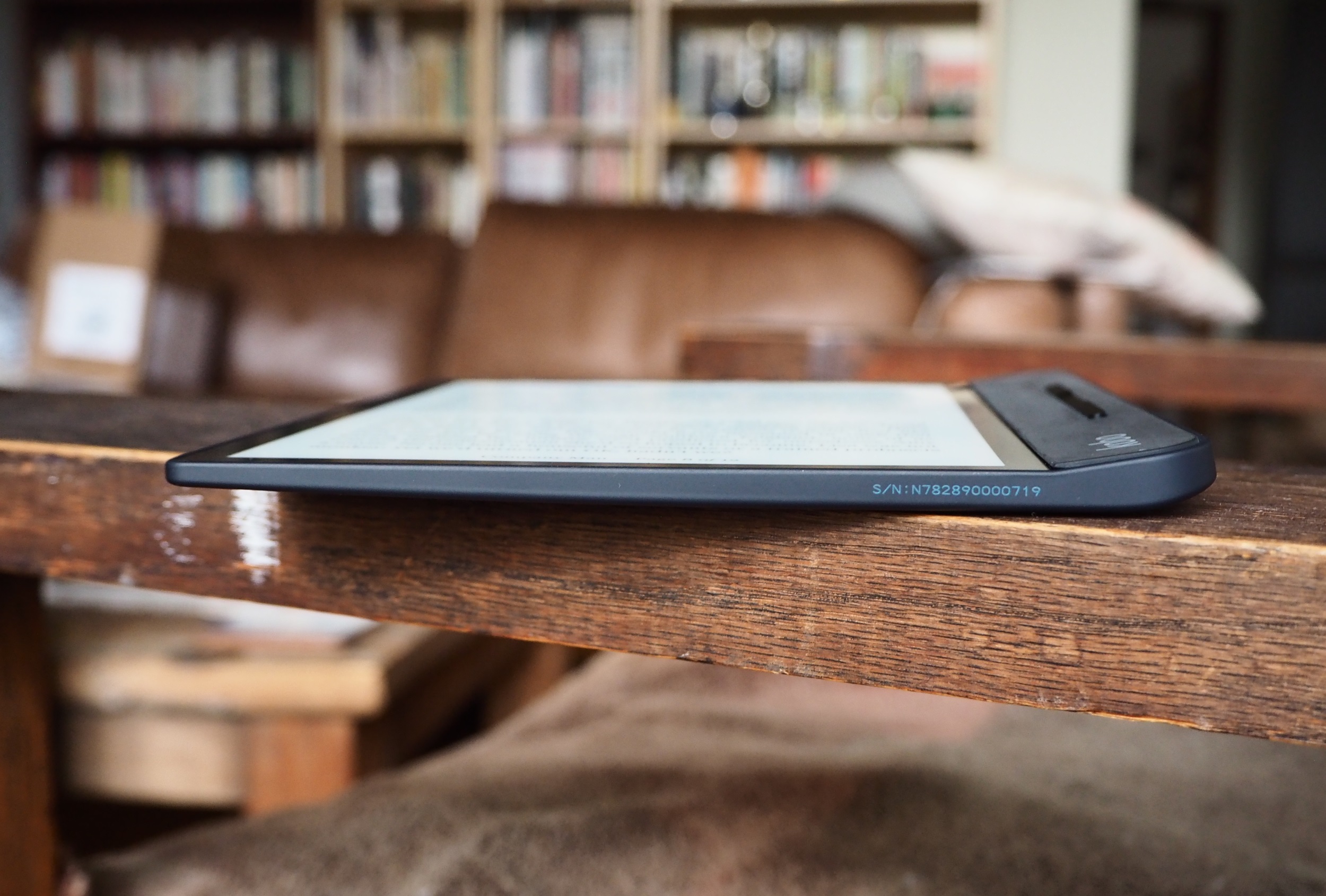
Where it differs from the Kindle Oasis is in size and a couple important particulars of design. The Forma is slightly larger, by about 20 millimeters (3/4″ or so) in height and width, and is ever so slightly but not noticeable thicker. (I didn’t have one to compare on hand, unfortunately.)
It’s also worth saying that like all Kobo devices, there are no forced advertisements on this one and you can load your own books as easy as that. To me Kindles aren’t even an option any more because of the “special offers” and limited file support.
Chin or ear?
The shape is similar, as anyone can see, but the Kobo team decided to go against having a flush front side and instead give the device a “chin,” as we used to call it on HTC phones, though being on the side it would perhaps more accurately be termed an “ear.” The screen, of course, is flat, but the grip on the side rises up from it at a 15 degree angle or so.
Is this better or worse than having a flush front? Aesthetically I prefer the flush screen but practically speaking it is better to have a flat back so it lies flat when you put it down or prop it against something. That the Oasis sits at a tilt when you set it down on a table is something that bothers me. (I’m very sensitive, as you can tell.)
[gallery ids="1725793,1725785,1725792,1725787,1725788,1725786"]It’s still very light, only 30 grams more than the Clara, the same amount less than the Aura One, and nearly equal to the Oasis. Despite being larger than any of those, it’s no less portable. That said, the Clara will fit in my back pocket, and this one most definitely will not.
The device is fully waterproof, like the Oasis, although liquid on the screen can disrupt touch functionality (this is just a physics thing). Nothing to worry about, just wipe it off. The USB port is just wide open, but obviously it’s been sealed off inside. Don’t try charging it underwater.
I am worried about the material the grip is made of: a satin-finish plastic that’s very nice to the touch but tends to attract fingerprints and oils. Look, everyone has oils. But the grip of the Forma won’t let you forget it.
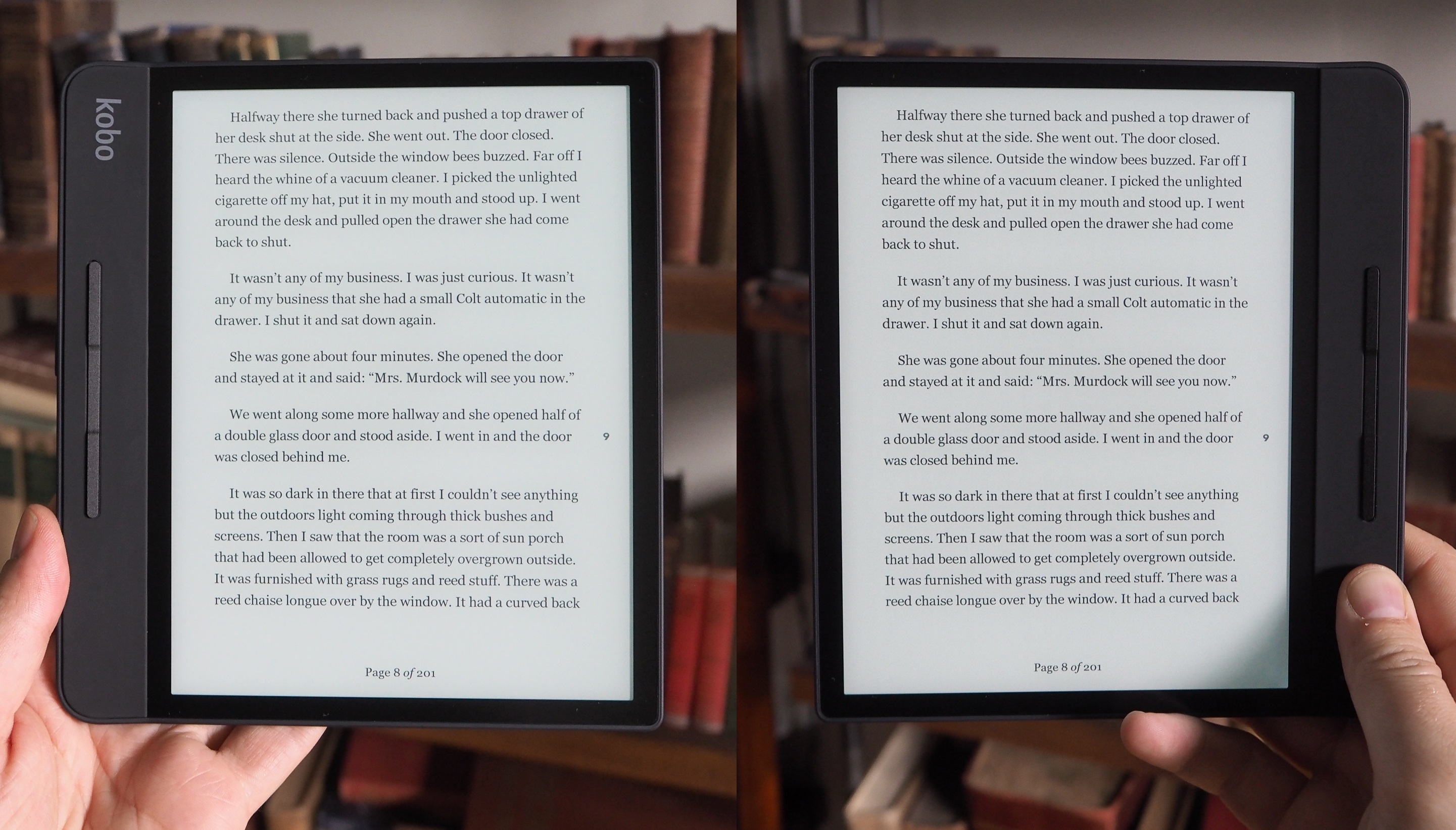
Although the power button is mushy and difficult to tell if you’ve pressed it right, the page-turn buttons are pleasantly clicky, and despite their appearance of being lever-like, they can easily be pressed anywhere along their length. Which goes forward and which backward switches automatically if you flip the reader over to use the other hand.
This flipping process happens more or less instantaneously, with a rare exceptions in my brief testing. Neither side feels more “correct,” for instance because of the weight distribution or anything.
The only one that doesn’t feel correct is the landscape mode. I’m not sure why someone would want to read this way, though I’m sure a few will like it. It just seems like a missed opportunity. Why can’t I have two pages displayed side by side, like a little pocket paperback? I’d love that! I’ve already asked Kobo about this and I assume that because I have done so, they will add it. As it is most books simply feel strange in this mode.
Familiar software, unfamiliar price
Text handling seems unchanged from Kobo’s other devices, which means it’s just fine — the typefaces are good and there are lots of options to adjust it to your taste book by book.
Kobo’s much-appreciated drag-and-drop book adding and support for over a dozen formats (epub, cbr, mobi, etc) is here as well with no changes. Pocket integration is solid and extremely useful.
The Forma (like Kobo’s other readers) does have Overdrive support, meaning that with a library card and account there you can easily request and read books from your local branch’s virtual stock. This is an underutilized service in general (by me as well) and I need to take advantage of it more.
So far, so good. But the real question is whether this thing is worth the $280 they’re charging for it — $30 more than the Kindle Oasis and even an even bigger jump over the Aura One. In my honest opinion, for most people, the answer is no. For the dollar you get a lot more from the Clara HD, which also has the advantage of being compact and pocketable.
But it must be said that the Forma is clearly a niche device aimed at people who use their e-reader a lot and want that bigger screen, the waterproofing, the thin profile, the one-handed design. There’s a smaller, but not necessarily small, number of people who are willing to pay for that. As it is the Forma is among the most expensive e-readers out there and it’s hard to justify that price for ordinary people who just want a good reader with the warmth control and good type.
The Forma is successful at what it aims to do — provide a credible competitor to Amazon’s most expensive device, and beat it at its own game in the ways Kobo usually beats Kindle. That much I can say for certain. Whether to buy it is between you and your wallet.
Read Full Article


No comments:
Post a Comment