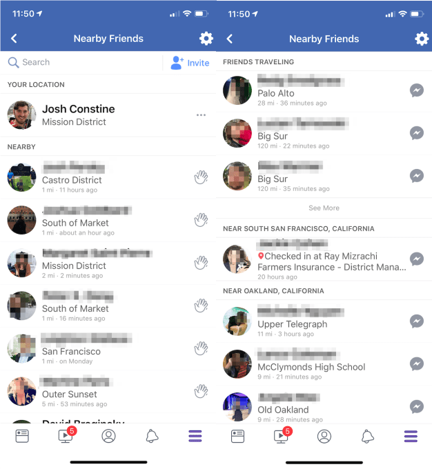
Helping friends meet up offline has been a massive missed opportunity for Facebook. Whether because the brand is too creepy or the politely opt-in 2015 rollout of its location sharing feature wasn’t creepy enough, Facebook Nearby Friends never quite took off. Only 103 of my 1120 friends in San Francisco have it turned on.
It’s not the only one struggling with “The quest to cure loneliness”. Foursquare Swarm, Glympse, Apple’s Find My Friends, and Google Maps’ real-time coordinate sharing option have all failed to become a ubiquitous standard.

The redesigned map homescreen of Facebook Nearby Friends
But last year, Snapchat launched a different take on the idea based on its biggest acquisition ever, French app Zenly. With Snap Map, it wasn’t just about the utility of seeing a list of friends’ locations like on Facebook, but also splayed them out across map that you could dive into to see their latest geo-tagged Stories. It was as much about fun and content as it was about actually hanging out with people in person.
Now Facebook is testing a significant redesign of Nearby Friends that looks a lot more like Snap Map. It replaces the list view of the neighborhoods and cities friends are in with a map that groups friends together by city. A “view list” button opens up the former homescreen, though in both views you still can only see a friend’s approximate location in a neighborhood or city, not their exact coordinates. Facebook confirms to TechCrunch that “We’re testing a new design for Nearby Friends, a tool people have used for the past four years to meet with their friends in person. People have complete control over whether to use Nearby Friends or not. They can turn it on in the Nearby Friends bookmark.”
That statement both subtly promotes Facebook’s opt-in privacy setting for Nearby Friends while urging people to actually go back and activate it. The screenshot was generated from the code of Facebook’s Android app by mobile researcher and frequent TechCrunch tipster Jane Manchun Wong. Interestingly, after TechCrunch’s inquiry, Wong tells me Facebook appears to have deactivated server-side the ability to access the map feature.
The reason this matters is that Facebook is desperate for engagement, especially amongst younger users who are slipping away from it to Snapchat and Instagram. If revamped with this map and other improvements, Nearby Friends could become a more popular utility that keeps people opening Facebook. Getting more people to share their real-time location could open new opportunities for local ad targeting. And Facebook could benefit from showing it unlocks meaningful offline connection given its recent brand troubles following election interference and calls that it’s the opposite of “time well spent”.

The existing design of Facebook Nearby Friends
Snap Map was smart, but it’s sadly buried behind an awkward pinch gesture from Snapchat’s homescreen, or inside the search bar where some users wouldn’t expect it. Internal Snapchat usage data scored by Taylor Lorenz for The Daily Beast revealed that Snap Map had sunk from a high of 35 million daily unique viewers after its June 2017 launch to just 19 million by that September — merely 11 percent of Snapchat’s users at the time. Users never seemed to cease on it as a method of browsing Snapchat’s geo-tagged content.
Unfortunately, none of these location apps have figured out that meeting up isn’t all about location. It’s about availability. It doesn’t matter if I see my best friend is at a coffee shop right away if they’re not actually available to hang out. They could be on date, having a business meeting, or trying to get some work done. If I drop in just because I see they’re close by, it could be awkward. You’d have to first message them, but you can come off seeming desperate if they can’t or don’t want to meet up with you.
Location apps need an availability indicator similar to the green “online” dot used by many chat apps. You could toggle that on if you wanted to show you’re interested in some spontaneous friend time.

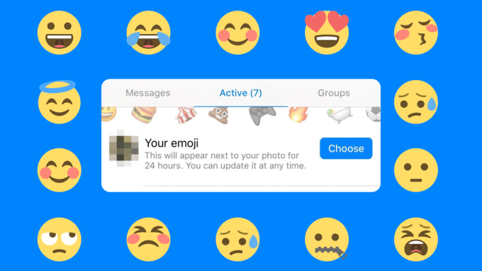
Facebook’s actually spent the last year trying to build this into Messenger in the form of “Your Emoji” status. It lets you pick an emoji like a martini, fork and knife, or barbell that’s temporarily overlaid on your profile pic thumbnail to let people know you’re down for drinking, getting dinner, or working out. The feature is yet to be widely tested, indicating that Facebook hasn’t quite cracked the nut of encouraging online meetups.
Ideally, Facebook would combine Nearby Friends and Your Emoji to help users share both approximately where they are and whether they want to hang out. The next step would be making it easy to watch a friend’s geo-tagged Facebook Story from wherever they are. And then, Facebook could further copy Snap Map by making public Stories and other location-based content accessible from the map so you could browse it for fun instead of the News Feed or Stories tray.
Facebook needs to rethink its entire product stack to embrace the high-definition cameras, big phone screens, and fast network connections that make it easier to convey information through imagery than text. Visual communication is the future and that goes far beyond Stories.
Read Full Article
No comments:
Post a Comment