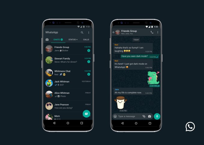
Facebook-owned WhatsApp is finally giving users’ eyes a break by rolling out a dark mode setting to the messaging app — years after some other tech giants figured out how to offer a ‘dimmer pixels’ switch.
The messaging giant says the feature is rolling out globally in the “coming days” to the latest version of WhatsApp on both Android and iOS.
The setting can be enabled via system settings for users running the most recent versions of the respective smartphone OSes — or via the WhatsApp settings option on Android:
Users on Android 10 and iOS 13 can use dark mode by enabling it in system settings. Users on Android 9 and below can go into WhatsApp Settings > Chats > Theme > select ‘Dark’.
We’re told iPhone users not running the latest OS are out of luck. “Dark Mode will only be available to users on iOS 13 and above,” said a spokesman.
WhatsApp says the eye-soothing option has been the most requested feature from users everywhere.
Nonetheless it’s taken its sweet time to jump aboard the dark mode bandwagon.
YouTube, for example, announced a dark mode for its iOS app a full two years ago. While Twitter added an even darker mode to its dark mode more than a year ago. Google was also showing off a system-wide dark mode for Android Q last May. In June Apple followed suit, previewing iOS 13’s eye-soothing setting.
Apparently Facebook has low interest in moving fast and soothing things. But, er, it got there in the end…
In a blog post about the launch, WhatsApp writes that it spent its time “researching and experimenting” how to design a dark mode that would ensure “readability” and maintain “information hierarchy”.
Which is a fancy way of saying it didn’t want to reduce eye-strain so much that users might actually remember they need to fall asleep, rather than carry on WhatsApping through the night.
“When choosing colours, we wanted to minimise eye fatigue and use colours that are closer to the system defaults on iPhone and Android respectively,” it writes, before reversing the intent by expressing the counter design: “We wanted to help users easily focus their attention on each screen. We did this by using colour and other design elements to make sure the most important information stands out.”
Perhaps it’s clear why it took the company so long to ‘fix’ eye strain after all.
The Android flavor of the dark mode (below) also appears a smidge less dark on the contacts screen view vs the iOS version (pictured at the top of this post) — though that may be to do with differences in how the two OSes handle dark mode at the system level since WhatsApp said it wanted to reflect those choices.

Read Full Article
No comments:
Post a Comment