Smart speakers have come a long way over the past few years as Amazon, Google and Apple have delivered pretty noteworthy strides in the IQs of their assistants. Where speakers haven’t advanced as much is in how they offer users choices; Google Assistant can only list out so many options before you get sick of listening, so throwing a screen onto these devices was a pretty inevitable evolution.
At CES earlier this year, Google showcased what it called Smart Displays, basically an answer to Amazon’s Echo Show. Today, Lenovo’s device, the first of the bunch, goes on sale.
The device, to be clear, pretty much just looks like an Android tablet that you plug with Google Assistant on it. What’s interesting is how the device handles visual feedback for audio commands, giving lightweight visual context for some queries and more robust video/photo content for others. Google clearly doesn’t have all of the core tenets of its Smart Display interface philosophy hammered out, and yet for the most part this is a very pleasant product that strikes all of the right notes on design.
[gallery ids="1680847,1680844,1680843,1680845"]The device comes in two flavors, a $249 10-inch 1080p version and a $199 8-inch 720p version. There aren’t any difference beyond the screen size so it really depends on where you’re keeping it. I’d imagine that people who are putting something like this on their nightstand as a way-too-smart alarm clock might want the smaller version whereas if you have a bit more room in your kitchen or living room the 10-inch version might offer some needed screen real estate. For this review I tested out the 10-inch $249 variant.
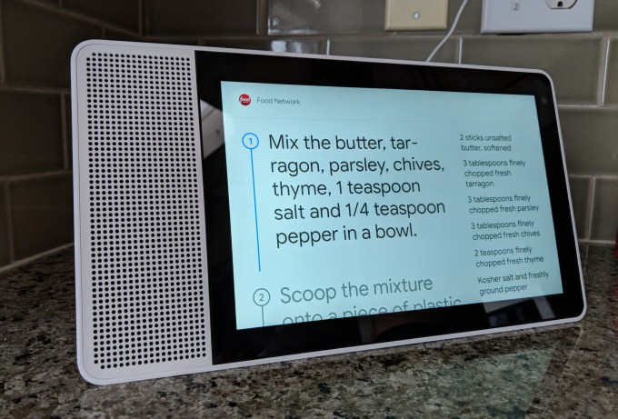
While I didn’t have too many qualms with the hardware, it was much easier to pick out things that bothered me about the way Google has approached the Smart Display software. While some tasks were refreshingly thought out, like searching for and progressing through recipe instructions, others, like finding a specific YouTube video were frustratingly difficult.

The Smart Display is fundamentally a Google Home device that can also communicate to you through visuals. It may look like a tablet with a speaker, but you will not find anything resembling a full app on the device, you will not be entering in text via an onscreen keyboard and you will certainly never see a “menu” button. This is a tablet with an identity crisis, a product that can use certain functionality to communicate with you but also wants you to speak with your words and let its AI prowess do the more stringent workof telling you what you would like.
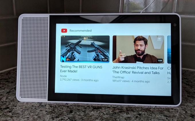
Asking the device to “open YouTube” will take you to a screen with a list of recommended videos and… nothing else. Fair enough, everything is sparsely simple, but it’s frankly a little annoying to wander through voice commands to navigate to something right in front of you that you know you could tap towards much more quickly. This is one of the key advantages that the Smart Display holds over the Amazon Echo Show so I just feel like they should have been a little bit more heavy-handed in porting a fuller version of the app.
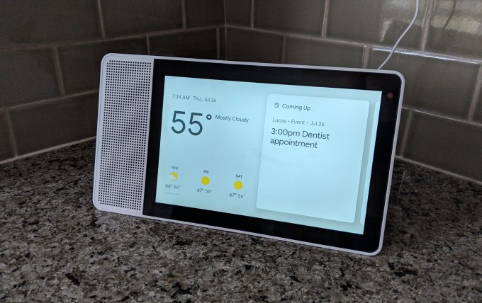
The onscreen content is more often than not just an added perk, for more informational queries it can be useful to see what a person looks like if you’re asking Google who they are, it can be useful to see a 5-day weather forecast rather than having Alexa list all of the days out. For the most part, it seems less than necessary and I rarely found myself actually looking at the screen after I had asked a question.

Google has been doing some work in stringing commands together or adding support for follow-up questions in some contexts, but with a screen that can now show you the device is still listening I wish the company just kept the mic running during certain situations. When you’re progressing through the steps of a recipe, for instance, each time you have to keep repeating “Hey Google, next!” (you can also tap an onscreen button but that’s not always ideal when deep in cooking).
Some of these features could use updates, but there are other things that Google has nailed right out of the box. Routines are great on the Smart Display. Saying,”Hey Google, good morning,” will turns on my lights, tells me about my meetings for the day, showcase the weather and my commute and gives a nice little rundown of the news. This was all possible on my display-less Google Home already, but something about doing this on the Smart Display just feels much more Jarvis-like a la Tony Stark and I feel like I’m living in a fairly cool future, as long as I cut off the news headlines in time.

Let’s take a closer look at the hardware though because Lenovo has actually built a very thoughtful product, and I must say it’s been a little bit since I’ve been wowed by consumer hardware coming from them. More often than not, Lenovo gear seems to occupy that area where it’s mostly quite good but one or two things are off and the whole things just feels second-tier as a result. Their Smart Display, on the other hand, is beautiful and honestly much better looking than any Home product that Google has shipped itself.
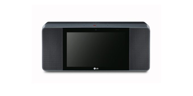
Sound-wise, this speaker is also much better than I was expecting for its small footprint. It seems louder and crisper than the standard Google Home falling short of those metrics when compared to the pricier Max though you are also certainly getting less speaker for your money than a comparably-priced (but screen-less) product like the Sonos One. Both JBL and LG also have Smart Display products in the pipeline that seem to place more of an emphasis on powerful sound, but the whole boombox look that they have going on just doesn’t do it for me.

There were a couple of hardware quirks with Lenovo’s Smart Display, but really nothing major. I wasn’t generally getting the greatest viewing angle from the device on my kitchen counter so some sort of hinge on the stand would have been nice to adjust the angle of the screen. The device’s ability to be viewable in both portrait and landscape was interesting but you can really only use it in portrait for Duo calls as Google doesn’t really seem to want the Smart Display to be used in that orientation. The touchscreen was also at times a little less responsive than I would have liked but fared well enough by and large.
Lenovo’s Smart Display is very pretty and offers some great value as well as some interesting ideas from Google. It strangely doesn’t feel like a huge upgrade over its screen-less Google Home variants especially because navigating videos is still a bit harder than it should be, but with pretty decent sound and a few nice visual feedback features there are some very novel ideas present even if they don’t feel entirely fleshed out.
Read Full Article
No comments:
Post a Comment