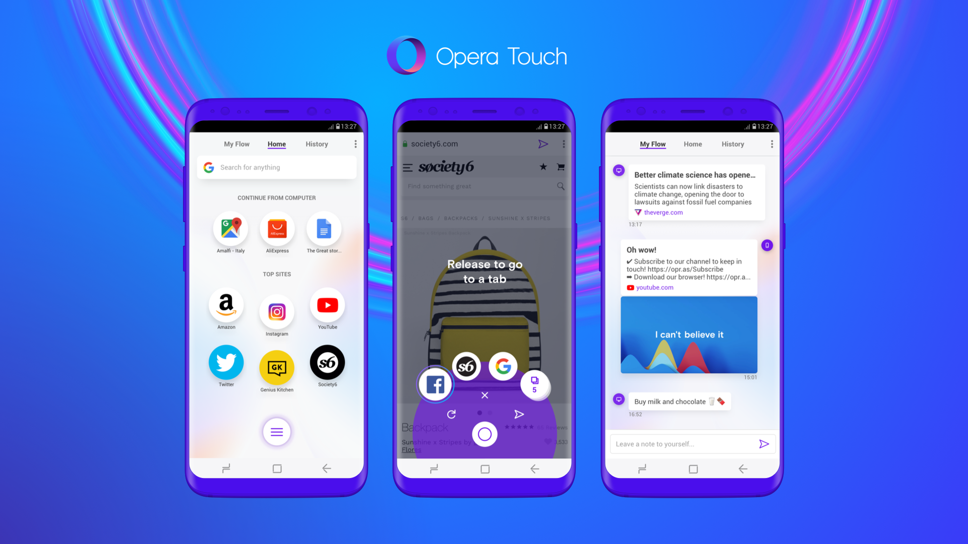
Opera today announced a new mobile browser, Opera Touch, that shows that there’s still plenty of room for a competitor in the mobile browsing world. Opera Touch takes some ideas from the company’s experimental Opera Neon desktop browser and packages it into a highly usable package for Android, with an iOS version coming soon.
It’s not so much that Touch reinvents the wheel, but that it seems to have been designed with the idea of putting the user first. This starts with small touches, like putting the tab switcher and access to your bookmarks at the bottom of the page, so that you never have to do some finger gymnastics to reach the top of your screen again (or use two hands, which I guess is also an option…). Safari users are surely quite familiar with having access to these features at the bottom of the screen, but on the main Android browsers, it’s been oddly absent.
When you hold it down, this ‘fast action’ button also gives you easy access to your tabs and a simple tap lets you quickly start a search or type a URL.
“We have moved the browser’s key functions within your thumb’s reach,” said Maciej Kocemba, product manager at Opera, in today’s announcement. “This means that, unlike in most other browsers, you can more easily browse and search the web when on the move.”
The browser also comes with Opera’s ad blocker, if that’s your thing, as well as cryptojacking protection.
What’s maybe most important, though, is that the Opera desktop browser (version 52 is launching today) and Opera Touch can now easily share information with each other without the need for logins and passwords. You simply scan a QR code from the desktop version with Opera Touch and you should be ready to go.
This new feature, dubbed ‘Flow,’ didn’t quite work for me when I tested the new mobile and desktop browsers ahead of the launch, but I assume that’s just pre-launch jitters. When it works, though, it should free you from having to email links to yourself, something too many people still do, despite that face that most mobile browsers to support some kind of syncing with the desktop counterparts. Often, though, those features are rather hidden.
Of course, not everything can be perfect. One feature I sorely miss in Opera Touch is the ability to actually manage my bookmarks. Touch automagically fills in your list of most often used sites, but there is no way to pin a bookmark to a specific spot in that list. To be fair, most people probably just type the first few letters of the site they want to go to and that’s fine, but a bit more flexibility here would be nice.
If you’re interested in looking at an alternative browser, Opera Touch is definitely worth a try. It works best in combination with the desktop version, but it’s also perfectly fine as a stand-alone mobile browser.

Read Full Article
No comments:
Post a Comment