Networking Problems
Samsung, which once led the smartphone market in India, slid to the third position in the quarter that ended in December even as the South Korean giant continues to make major bets on the rare handset market that is still growing.
According to research firm Counterpoint, Chinese firm Vivo surpassed Samsung to become the second biggest smartphone vendor in India in Q4 2019. Xiaomi, with command over 27% of the market, maintained its top stop in the nation for the 10th consecutive quarter.
Vivo’s annual smartphone shipment grew 76% in 2019. The Chinese firm’s aggressive positioning of budget $100 to $150 S series of smartphones in the brick and mortar market and acceptance of e-commerce sales helped it beat Samsung, said Counterpoint analysts. Vivo’s market share jumped 132% between Q4 of 2018 and Q4 of 2019, according to the research firm.
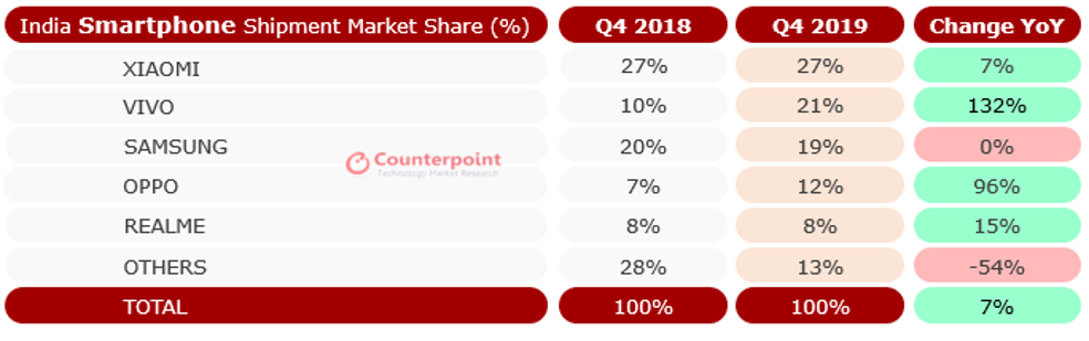
Realme, which spun out of Chinese smartphone maker Oppo, claimed the fifth spot. Oppo assumed the fourth. Realme has taken the Indian market by a storm. The two-year-old firm has replicated Xiaomi’s playbook in the country and so far focused on selling aggressively low-cost Android smartphones online.
The report, released late Friday (local time), also states that India, with 158 million smartphone shipments in 2019, took over the U.S. in annual smartphone shipment for the first time.
India, which was already the world’s second largest smartphone market for total handset install base, is now also the second largest smartphone market for annual shipment of smartphones in a year.
Tarun Pathak, a senior analyst at Counterpoint, told TechCrunch that about 150 million to 155 million smartphone units were shipped in the U.S. in 2019.
More to follow…


Smart speaker manufacturer Sonos clarified its stance when it comes to old devices that are no longer supported. The company faced some criticisms after its original announcement. Sonos now says that you’ll be able to create two separate Sonos systems so that your newer devices stay up to date.
If you use a Zone Player, Connect, first-generation Play:5, CR200, Bridge or pre-2015 Connect:Amp, Sonos is still going to drop support for those devices. According to the company, those devices have reached their technical limits when it comes to memory and processing power.
While nothing lasts forever, it’s still a shame that speakers that work perfectly fine are going to get worse over time. For instance, if Spotify and Apple Music update their application programming interface in the future, your devices could stop working with those services altogether.
But the announcement felt even more insulting as the company originally said that your entire ecosystem of Sonos devices would stop receiving updates so that all your devices remain on the same firmware version. Even if you just bought a Sonos One, it would stop receiving updates if there’s an old speaker on your network.
“We are working on a way to split your system so that modern products work together and get the latest features, while legacy products work together and remain in their current state,” the company writes.
It’s not ideal, but the company is no longer holding your Sonos system back. Sonos also clarifies that old devices will still receive security updates and bug fixes — but there won’t be any new feature.
I still think Sonos should add a computing card slot to its devices. This way, you wouldn’t have to replace speakers altogether. You could get a new computing card with more memory and faster processors and swap your existing card. Modularity is going to be essential if tech companies want to adopt a more environmental-friendly stance.


Founder Andreas Kröpfl has spent almost a decade hard-grafting in the b2b unified communications space, building a videoconferencing business with a patented single-stream system and a claim of no ‘drop-offs’ thanks to “unique low-bandwidth technology”.
His Austria-based startup’s current web-based videoconferencing system, eyeson (née Visocon), which launched in 2018, has had some nice traction since launch, as he tells it, garnering a few million customers and getting a nomination nod as a Gartner Cool Vendor last year.
Eyeson’s website touts ‘no hassle, no, lag, no downloads’ video calls. Pricing options for the target b2b users run the gamut from freelance pro to full-blown enterprise. While the business itself has pulled in a smidge less than $7M in investor funding over the years.
But when TechCrunch came across Kröpfl last December, pitching hard in startup alley at Disrupt Berlin, he was most keen to talk about something else entirely: Video dating.
That’s because last summer the team decided to branch out by building their own video dating app, reusing their core streaming tech for a consumer-focused social experiment. And after a period of internal beta testing — which hopefully wasn’t too awkward within a small (up-til-then) b2b-focused team — they launched an experimental dating app in November in India.
The app, called Ahoi, is now generating 100,000 video calls and 250,000 swipes per day, says Kröpfl.
This is where he breaks into a giggle. The traction has been crazy, he says.
In the staid world of business videoconferencing you can imagine eyeson’s team eyeing the booming growth of certain consumer-focused video products rather enviously.
Per Kröpfl, they had certainly noticed different desires among their existing users — which pushed them to experiment. “We saw that private people like the simple fun features (GIF reactions, …) and that business meetings were more focused on ‘drop-off’ [rates] and business features,” he tells us. “To improve both in one product was not working any more. So eyeson goes business plus SaaS.”
“Cloning eyeson but make it social,” is how he sums up the experiment.
Ahoi is very evidently an MVP at this stage. It also looks like a pretty brave and/or foolish (depending on your view) full-bore plunge into video dating, with nothing so sophisticated as a privacy screen to prevent any, er, unwanted blushes… (Whereas safety screening is an element we’ve recently seen elsewhere in the category — see: Blindlee.)
There’s also seemingly no way for users to specify the gender they wish to talk to.
Instead, Ahoi users state interests by selecting emoji stickers — such as a car, cat, tennis racket, games console or globetrotter. And, well, it goes without saying that even if you like cars a lot you’re unlikely to change your sexual orientation over the category.
There are no generic emoji that could be used to specify a sexual interest in men or women. But, er, there’s a horse…
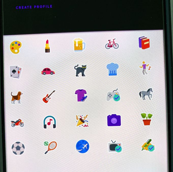
Such limits may explain why Ahoi is generating so many early swipes — and rather fewer actual calls — in that the activity sums to (mostly) men looking for women to videochat with and being matched with, er, men.
And frustration, sexual or otherwise, probably isn’t the greatest service to try and sell.
Still, Kröpfl reckons they’ve landed on a winning formula that makes handy reuse of their core videoconferencing tech — letting them growth hack in a totally new category. Swipe right to video date.
“People are disappointed by perfect profiles on Tinder and the reality when meeting people,” he posits. “Wasted time. Especially women do not want to be stalked by men pretending to be someone else. We solve both by a real live conversation where only after a call both can decide to be connected or never see each other again.”
Notably, marketing around the app does talk rather fuzzily about it being a way to “find new pals”.
So while Kröpfl frames the experiment as dating, the reality of the product is more ‘open to options’. Think of it as a bit like Chatroulette — just with slightly more control (in that you have a few seconds to decide if you don’t want to talk to the next in-app match).
The very short countdown timer (you get just five seconds to opt out of a matched video chat) is very likely generating a fair number of unintended calls. Though such high velocity matching might appeal to a certain kind of speed dating addict.
Kröpfl says Ahoi has been seeing up to 20,000 new users added daily. They’re bullishly targeting 3M+ users this year, and already toying with ideas for turning video dates into a money spinner by offering stuff like premium subscriptions and/or video ads. He says the plan is to turn Ahoi into a business “step by step”.
“Everyone loves to make his profile better,” he suggests, floating monetization options down the line. Quality filtering for a fee is another possibility (“everyone is annoyed by being connected to the wrong people”).
They picked India for the test launch because it has a lot of people on the same timezone, a large active mobile user-base and cheap marketing is still “easily possible”. He also says that dating apps seemed popular there, in their experience. (Albeit, the team presumably didn’t have a great deal of relevant experience in this category — given Ahoi is an experiment.)
The intent is also to open Ahoi up to other markets in time too, once they get more accustomed to dealing with all the traffic. Kröpfl notes they had to briefly take the app off the store last month, as they worked on adding more server capability.
“It is very early and we were not prepared for this usage,” he says, admitting they’ve been “struggling to work on early feedbacks”. “We had to make it invisible temporarily — to improve server capacity and stability.”
The contrast in pace of uptake between the stolid (but revenue-generating) world of business meeting-fuelled videoconferencing and catnip consumer dating — which is money-sucking unless or until you can hit a critical mass of usage and get the chance to try applying monetization strategies — does sound like it’s been rather irresistible to Kröpfl.
Asked what it feels like to go from one category to the other he says “crazy, surprised and thrilling”, adding: “It is somehow also frustrating when all the intense b2b work is not as closely interesting to people as Ahoi is. But amazing that it is possible thanks to an extremely focused and experienced team. I love it.”
TechCrunch’s Manish Singh agreed to brave the local video dating app waters in India to check Ahoi out for us.
He reported back not having seen any women using the app. Which we imagine might be a problem for Ahoi’s longer term prospects — at least in that market.
“I spoke with one guy, who said his friend told him about the app. He said he joined to talk to girls but so far, he is only getting matched with boys,” said Singh. “I saw several names appear on the app, but all of them were boys, too.”
He told us he was left wondering “why people are on these apps, and why they have so much free time on a weekday”.
For ‘people’ it seems safe to conclude that most of Ahoi’s early adopters are men. As the Wall Street Journal reported back in 2018, India’s women are famously cool on dating apps — in that they’re mostly not on them. (We asked Kröpfl about Ahoi’s gender breakdown but he didn’t immediately get back to us on that.)
That market quirk means those female users who are on dating apps tend to get bombarded with messages from all the lonely heart guys with not much to swipe. Which, in turn, could make a video dating app like Ahoi an unattractive prospect to female users — if there’s any risk at all of being inundated with video chats.
And even if there are enough in-app controls to prevent unwelcome inundation by default, women also might not feel like they want their profile to be seen by scores of men simply by merit of being signed up to an app — as seems inevitable if the gender balance is so skewed.
Add to that, if the local perception among single women is that men on dating apps are generally a turn-off — because they’re too eager/forward — then jumping into any unmoderated video chat is probably not the kind of safe space these women are looking for.
No matter, Kröpfl and his team are clearly having far too much fun growth hacking in an unfamiliar, high velocity consumer category to sweat the detail.
What’s driving Ahoi’s growth right now? “Performance marketing mainly,” he says, pointing also to “viral engagement by sharing and liking profiles”.
Notably, there are a lot of reviews of Ahoi on Google Play already — an unusual amount for such an early app. Many of them appear to be five star write-ups from accounts with European-sounding names and a sometimes robotic grasp of language.
“Eventhough Ahoi has been developed recently, it had high quality for user about calling, making friends and widing your knowlegde [sic],” writes one reviewer with atrocious spelling whose account is attached to the name ‘Dustin Stephens.’
“Talking with like minded people and same favor will creat a fun and interesting atmosphere. Ahoi will manage for you to call like condition above,” says another apparently happy but not entirely clear user, going by the name ‘Elisa Herring’.
There’s also a ‘Madeleine Mcghin’, whose profile uses a photo of the similarly named child who infamously disappeared during a holiday in Portugal in 2007. “My experience with this app was awesome,” this individual writes. “It gives me the option to find new people in every country.”
Another less instantly tasteless five-star reviewer, ‘Stefania Lucchini’, leaves a more surreal form of praise. “A good app and it will bring you extra income, I would say it’s a great opportunity to have AHOI and be a part of it but it’s that it will automatically ban you even if you don’t show it. Marketing. body part, there are still 5 stars for me,” she (or, well, ‘it’) writes.
Among the plethora of dubious five-star reviews a couple of one-star dunks stand out — not least because they come from accounts with names that sound like they might actually come from India. “Waste u r time,” says one of these, who uses the name Prajal Pradhan.
This pithy drop-kick has been given a full 72 thumbs-up by other Play Store users.

Wikipedia has surpassed a notable milestone today: The English version of the world’s largest online encyclopedia now has more than six million articles.
The feat, which comes roughly 19 years after the website was founded, is a testament of “what humans can do together,” said Ryan Merkley, chief of staff at Wikimedia, the nonprofit organization that operates the omnipresent online encyclopedia.
The 6 millionth article is about Maria Elise Turner Lauder, a 19th-century Canadian school teacher, travel writer and fiction writer. The article was written by Rosie Stephenson-Goodknight, a longtime editor of Wikipedia.
Wikipedia is available in dozens of languages, but its English-language version has the most number of articles. Following the English edition, which hit 5 million articles in late 2015, are the German version, with about 2.3 million articles, and the French version, which has about 2.1 million articles.
The English edition is also the most visited project on the website. According to publicly disclosed figures, the English version of the website averages about 255 million pageviews a day. According to web analytics firm SimilarWeb, Wikipedia overall is the eighth most visited website.
Over the years, Wikipedia has conducted seminars in many nations to encourage more people to become contributors in their own local languages, and has also improved its tools to make it easier for them to write, publish and cite items.
When Jimmy Wales founded Wikipedia, he said his goal was to provide “free access to the sum of all human knowledge.” According to one estimate, the sum of human knowledge would require 104 million articles — and we will need 20 more years to get there.

Waymo said Thursday it will begin mapping and eventually testing its autonomous long-haul trucks in Texas and parts of New Mexico, the latest sign that the Alphabet company is expanding beyond its core focus of launching a robotaxi business.
Waymo said in a tweet posted early Thursday it had picked these areas because they are “interesting and promising commercial routes.” Waymo also said it would “explore how the Waymo Driver” — the company’s branded self-driving system — could be used to “create new transportation solutions.”
Waymo plans to mostly focus on interstates because Texas has a particularly high freight volume, the company said. The program will begin with mapping conducted by Waymo’s Chrysler Pacifica minivans.
The mapping and eventual testing will occur on highways around Dallas, Houston and El Paso. In New Mexico, Waymo will focus on the southern most part of the state.
Interstate 10 will be a critical stretch of highway in both states — and one that is already a testbed for TuSimple, a self-driving trucking startup that has operations in Tucson and San Diego. TuSimple tests and carries freight along the Tucson to Phoenix corridor on I-10. The company also tests on I-10 in New Mexico and Texas.
Waymo, which is best known for its pursuit of a robotaxi service, integrated its self-driving system into Class 8 trucks and began testing them in Arizona in August 2017. The company stopped testing its trucks on Arizona roads sometime later that year. The company brought back its truck testing to Arizona in May 2019.
Those early Arizona tests were aimed at gathering initial information about driving trucks in the region, while the new round of truck testing in Arizona marks a more advanced stage in the program’s development, Waymo said at the time.
Waymo has been testing its self-driving trucks in a handful of locations in the U.S., including Arizona, the San Francisco area and Atlanta. In 2018, the company announced plans to use its self-driving trucks to deliver freight bound for Google’s data centers in Atlanta.
Waymo’s trucking program has had a higher profile in the past year. In June, Waymo brought on 13 robotics experts, a group that includes Anki’s co-founder and former CEO Boris Sofman, to lead engineering in the autonomous trucking division.

Snapchat and NBC Olympics are again teaming up to produce customized Olympics content for users in the U.S. — this time, for the 2020 Tokyo Olympics this summer. The companies had previously worked together during the Rio 2016 and PyeongChang 2018 Olympics. The PyeongChang Olympic Winter Games in 2018 reached over 40 million U.S. users, up 25% from the 2016 Rio Olympics.
In addition, 95% of those users were under the age of 35.
This younger demographic is getting harder to reach in the cord-cutting era, as many people forgo pay-TV subscriptions and traditional broadcast networks in favor of on-demand streaming services, like Netflix. That limits the reach of advertisers, impacting NBC’s bottom line.
The Snap partnership helps to fix that, as it offers NBC Olympics a way to sell to advertisers who want to reach younger fans who don’t watch as much — or any — TV. Snapchat today reaches 90% of all 13 to 24 year-olds in the U.S., and 75% of all 13 to 34 year-olds. 210 million people now use Snapchat daily.
NBC Olympics says it’s the exclusive seller of all the new customized content associated with the Games, working in partnership with Snap.
This year, it’s also putting out more content than before.
The company plans to release more than 70 episodes across four daily Snapchat shows leading up to and during the Games. That’s triple the number of episodes it offered in 2018.
For the first time, it’s creating two daily Highlight Shows for Snapchat, which will be updated in near real-time. The shows will include the must-see moments from the day in Tokyo.
In addition, two unscripted shows will air during the Games, each with two episodes per day. One, “Chasing Gold,” which first debuted during PyeongChang 2018, will follow the journeys of Team USA athletes. The second show is new this year, and will be a daily recap of the most memorable moments curated especially for Snapchat users. Both are being produced by The NBCUniversal Digital Lab.
The deal will also see Snap curating daily Our Stories during the Games, as it has done in previous years. The stories will include photos and videos from fans as well as content from the NBC Olympics.
“We know the audience on Snap loves the Olympic Games,” said Gary Zenkel, President, NBC Olympics, in a statement. “After two successful Olympics together, we’re excited to take the partnership to another level and produce even more content and coverage from the Tokyo Olympics tailored for Snapchatters, which also will directly benefit the many NBC Olympics advertisers who seek to engage further with this young and active demographic.”
Snapchat isn’t the only digital destination for Olympics content, however. NBC and Twitter teamed up to stream limited live event coverage, highlights and a daily Olympics show from the Tokyo Games. It was unclear at the time the deal was announced if NBC had opted for Twitter over Snapchat. Now we know that’s not the case — in fact, Snap’s deal with NBC is even bigger than before.
NBCU had said earlier, it expected to exceed $1.2 billion in ad sales for the 2020 Games, which are also presented on NBC, NBCSN, Olympic Channel: Home of Team USA, and NBC Sports’ digital platforms.

Lidar sensors are likely to be essential to autonomous vehicles, but if there are none of the latter, how can you make money with the former? Among the industry executives I spoke with, the outlook is optimistic as they unhitch their wagons from the sputtering star of self-driving cars. As it turns out, a few years of manic investment does wonders for those who have the wisdom to apply it properly.
The show floor at CES 2020 was packed with lidar companies exhibiting in larger spaces, seemingly in greater numbers than before. That seemed at odds with reports that 2019 had been a sort of correction year for the industry, so I met with executives and knowledgeable types at several companies to hear their take on the sector’s transformation over the last couple of years.
As context, 2017 was perhaps peak lidar, nearing the end of several years of nearly feverish investment in a variety of companies. It was less a gold rush than a speculative land rush: autonomous vehicles were purportedly right around the corner and each would need a lidar unit… or five. The race to invest in a winner was on, leading to an explosion of companies claiming ascendancy over their rivals.
Unfortunately, as many will recall, autonomous cars seem to be no closer today than they were then, as the true difficulty of the task dawned on those undertaking it.


Snapchat and NBC Olympics are again teaming up to produce customized Olympics content for users in the U.S. — this time, for the 2020 Tokyo Olympics this summer. The companies had previously worked together during the Rio 2016 and PyeongChang 2018 Olympics. The PyeongChang Olympic Winter Games in 2018 reached over 40 million U.S. users, up 25% from the 2016 Rio Olympics.
In addition, 95% of those users were under the age of 35.
This younger demographic is getting harder to reach in the cord-cutting era, as many people forgo pay-TV subscriptions and traditional broadcast networks in favor of on-demand streaming services, like Netflix. That limits the reach of advertisers, impacting NBC’s bottom line.
The Snap partnership helps to fix that, as it offers NBC Olympics a way to sell to advertisers who want to reach younger fans who don’t watch as much — or any — TV. Snapchat today reaches 90% of all 13 to 24 year-olds in the U.S., and 75% of all 13 to 34 year-olds. 210 million people now use Snapchat daily.
NBC Olympics says it’s the exclusive seller of all the new customized content associated with the Games, working in partnership with Snap.
This year, it’s also putting out more content than before.
The company plans to release more than 70 episodes across four daily Snapchat shows leading up to and during the Games. That’s triple the number of episodes it offered in 2018.
For the first time, it’s creating two daily Highlight Shows for Snapchat, which will be updated in near real-time. The shows will include the must-see moments from the day in Tokyo.
In addition, two unscripted shows will air during the Games, each with two episodes per day. One, “Chasing Gold,” which first debuted during PyeongChang 2018, will follow the journeys of Team USA athletes. The second show is new this year, and will be a daily recap of the most memorable moments curated especially for Snapchat users. Both are being produced by The NBCUniversal Digital Lab.
The deal will also see Snap curating daily Our Stories during the Games, as it has done in previous years. The stories will include photos and videos from fans as well as content from the NBC Olympics.
“We know the audience on Snap loves the Olympic Games,” said Gary Zenkel, President, NBC Olympics, in a statement. “After two successful Olympics together, we’re excited to take the partnership to another level and produce even more content and coverage from the Tokyo Olympics tailored for Snapchatters, which also will directly benefit the many NBC Olympics advertisers who seek to engage further with this young and active demographic.”
Snapchat isn’t the only digital destination for Olympics content, however. NBC and Twitter teamed up to stream limited live event coverage, highlights and a daily Olympics show from the Tokyo Games. It was unclear at the time the deal was announced if NBC had opted for Twitter over Snapchat. Now we know that’s not the case — in fact, Snap’s deal with NBC is even bigger than before.
NBCU had said earlier, it expected to exceed $1.2 billion in ad sales for the 2020 Games, which are also presented on NBC, NBCSN, Olympic Channel: Home of Team USA, and NBC Sports’ digital platforms.


When Dfinity raised $102 million in funding in 2018 at a $2 billion valuation in a round jointly led by Andreessen Horowitz and Polychain Capital, it was thought of as a step change in the world of blockchain technology. In an area that was synonymous with generating a lot of headlines around cryptocurrency speculation, this was a shift in focus, looking instead at the architecture behind Bitcoin, Ethereum and the rest, and how it could be used for more than just “mining,” distributing and using new financial instruments — with a major, mainstream VC backing the idea, no less.
Dfinity launched with a very lofty goal: to build what it called the “Internet Computer”: a decentralized and non-proprietary network to run the next generation of mega-applications. It dubbed this public network “Cloud 3.0”.
Now, it looks like this Cloud is now about to break.
In Davos this week, Dfinity launched the Bronze edition of its Internet Computer, a limited release that takes the startup one step closer to its full commercial release, expected later this year.
And to prove out the concept of how an application would run on its new network, Dfinity today demonstrated an open social network called LinkedUp.
The startup has rather cheekily called this “an open version of LinkedIn,” the Microsoft-owned social network for professionals. Unlike LinkedIn, LinkedUp, which runs on any browser, is not owned or controlled by a corporate entity.
LinkedUp is built on Dfinity’s so-called Internet Computer, its name for the platform it is building to distribute the next generation of software and open internet services.
The software is hosted directly on the internet on a Switzerland-based independent data center, but in the concept of the Internet Computer, it could be hosted at your house or mine: the compute power to run the application — LinkedUp, in this case — is coming not from Amazon AWS, Google Cloud or Microsoft Azure, but is instead based on the distributed architecture that Dfinity is building.
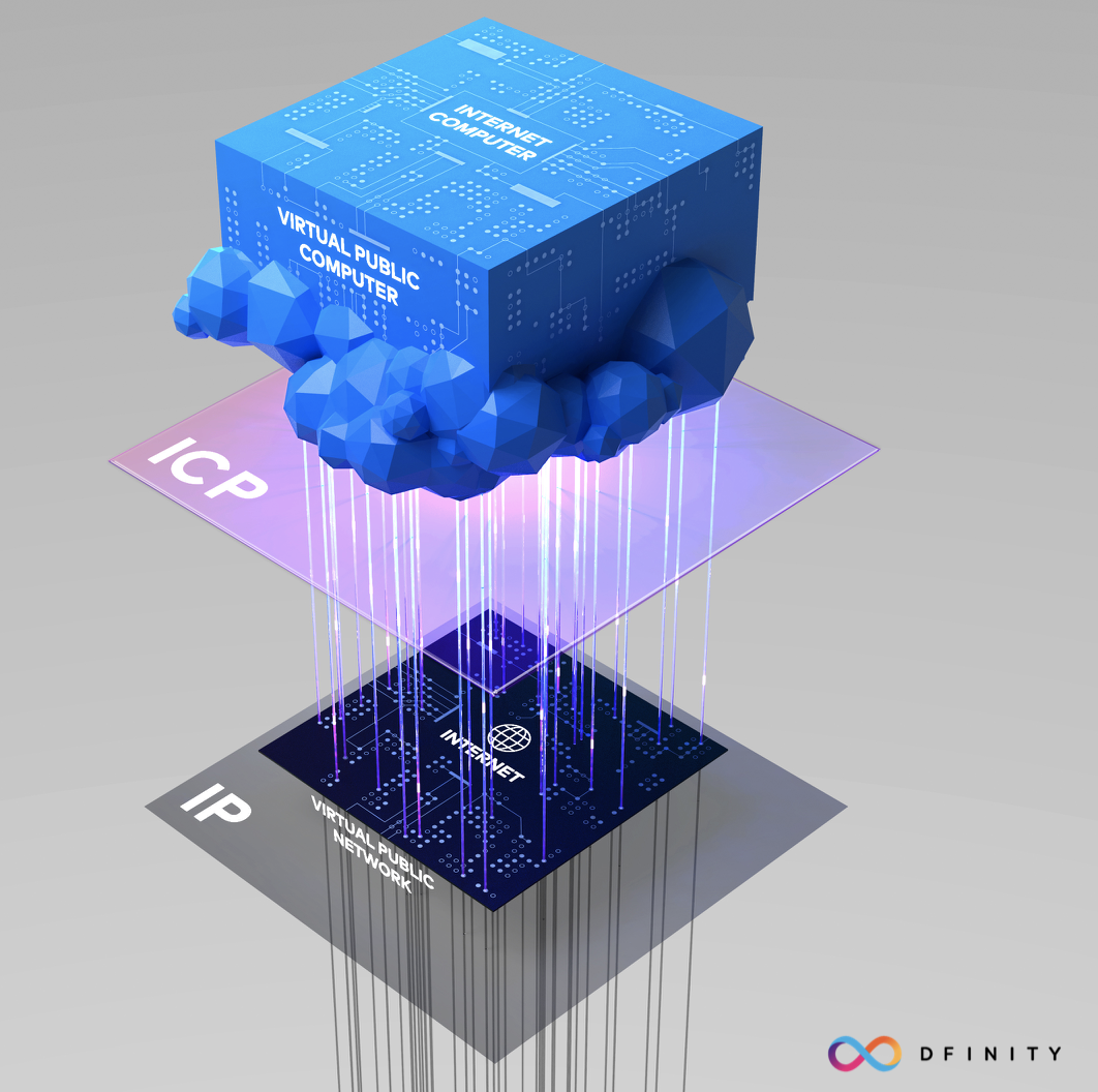 Specifically, Dfinity notes that when enterprises and developers run their web apps and enterprise systems on the Internet Computer, the content is decentralised across a minimum of four or a maximum of an unlimited number of nodes in Dfinity’s global network of independent data centers.
And while the company initially was described as a blockchain-based system, that’s also had some refinement. A spokesperson describes the Internet Computer as a “next-generation distributed computing system — similar to its Mainframe, Client Server, and Public Cloud predecessors” that is based on cryptography.
“While DFINITY is not building a traditional blockchain/smart contract platform, it uses advanced cryptography in its consensus layer [of the Internet Computer stack] to ensure apps and workloads have the same security guarantees as Bitcoin or Ethereum,” the spokesperson added, “but its network of independent data centres ensures the speed and scale required by corporates and entrepreneurs.” The Internet Computer also has governance tokens to ensure the ownership of the technology is distributed, he said.
LinkedUp is a test case for all of this, and so Dfinity is open-sourcing LinkedUp for developers to create other types of open internet services on the structure it has built.
This “open social network for professional profiles” suggests that, on Dfinity’s model, one could create an “Open WhatsApp,” “Open eBay,” “Open Salesforce” or “Open Facebook.”
(Good news, since LinkedIn might not be so happy about a lookalike service with a name and layout that also looks very familiar, were it to go much further as a commercial endeavor. “While we can’t comment specifically on any proposed trademark, LinkedIn does monitor and take action as necessary to protect our trademarks,” a spokesperson said.)
“Big tech has hijacked the internet and stifled innovation by owning the proprietary infrastructure and user relationships,” said Dominic Williams, founder and chief scientist at Dfinity in a statement. “As a result, a handful of for-profit companies have created a monopolistic and closed internet. The Internet Computer provides a means to rebuild internet services in open form.”
So perhaps what we should be calling this is not LinkedUp, but more a new sort of “Linux for the cloud.”
Dfinity claims the application was built by “1.5 engineers in three weeks,” thus demonstrating how easy the infrastructure is to use.
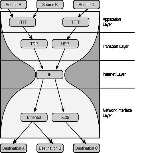
The tools include a Canister Software Developer Kit and a simple programming language called Motoko that is optimized for Dfinity’s Internet Computer.
“The Internet Computer is conceived as an alternative to the $3.8 trillion legacy IT stack, and empowers the next-generation of developers to build a new breed of tamper-proof enterprise software systems and open internet services. We are democratizing software development,” Williams said. “The Bronze release of the Internet Computer provides developers and enterprises a glimpse into the infinite possibilities of building on the Internet Computer — which also reflects the strength of the Dfinity team we have built so far.”
Dfinity says its “Internet Computer Protocol” allows for a new type of software called autonomous software, which can guarantee permanent APIs that cannot be revoked. When all these open internet services (e.g. open versions of WhatsApp, Facebook, eBay, Salesforce, etc.) are combined with other open software and services it creates “mutual network effects” where everyone benefits.
We quizzed Dfinity a little more on all this and asked whether this was an actual launch.
A spokesperson told us: “Since our first major milestone of launching a terminal-based SDK and new programming language called Motoko — by the co-creator of WebAssembly — on 1 November, DFINITY has released 13 new public versions of the SDK, to our second major milestone [at WEF Davos] of demoing a decentralized web app called LinkedUp on the Internet Computer running on an independent data center in Switzerland. Subsequent milestones towards the public launch of the Internet Computer will involve (1) on-boarding a global network of independent data centers, (2) fully tested economic system, and (3) fully tested Network Nervous Systems for configuration and upgrades.”
It also looks like Dfinity will not be raising more money just yet.
But the question is how they plan to woo people to it? “Dfinity has been working with a select group of Fortune 500 companies, strategic consultancies, systems integrators, venture capitalists, and universities,” the company said.
We are not sure that will quite suffice to take out Facebook, LinkedIn and all the other tech giants, but we’re fascinated to see how this plays out.

Time is supposed to make technology better. The idea is simple: With more time, humans make newer, better technology and our lives improve. Except for when the opposite happens.
Google is a good example of this. I’ve been harping on the matter for a while now. Google mobile search, in case you haven’t used it lately, is bad. It often returns bloated garbage that looks like a cross between new Yahoo and original Bing.
Here’s how it butchered a search query for “Metallica” this morning:
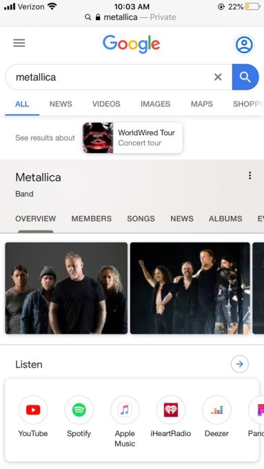
Remember when that interface was simpler, and easier to use, and didn’t try to do literally every possible thing for every possible user at once?
It’s not just Google’s mobile search interface that makes me want to claw my eyes out and learn how to talk to trees. Everyone now knows that Mountain View has effectively given up on trying to distinguish ads from organic results (Does the company view them as interchangeable? Probably?). TechCrunch’s Natasha Lomas covered the company’s recent search result design changes today, calling them “user-hostile,” going on to summarize the choices as its “latest dark pattern.”
Google, once fanatical about super-clean, fast results is now trying to help you way too much on mobile and fool you on Chrome.
Chrome itself kinda sucks and is getting worse. But we all know that. Of course, that all this is shaking out around the same time that the company’s founders left is, you know, not shocking.
I’d also throw TweetDeck into the mix. It’s garbage slow and lags and sucks RAM. Twitter has effectively decided that its power users are idiots who don’t deserve good code. Oh, and Twitter is deprecating some cool analytics features it used to give out to users about their followers.
Chrome and TweetDeck are joined by apps like Slack that are also slowing down over time. It appears that as every developer writes code on a computer with 64,000 gigs of RAM, they presume that they can waste everyone else’s. God forbid if you have the piddling 16 gigs of RAM that my work machine has. Your computer is going to lag and often crash. Great work, everyone!
Also, fuck mobile apps. I have two phones now because that’s how 2020 works and I have more apps than I know what to do with, not to mention two different password managers, Okta and more.I’m so kitted out I can’t breathe. I have so many tools available to me I mostly just want to put them all down. Leave me alone! Or only show me the thing I need — not everything at once!
Anyhoo video games are still pretty good as long as you avoid most Battle Royale titles, micropayments, and EA. Kinda.

Time is supposed to make technology better. The idea is simple: With more time, humans make newer, better technology and our lives improve. Except for when the opposite happens.
Google is a good example of this. I’ve been harping on the matter for a while now. Google mobile search, in case you haven’t used it lately, is bad. It often returns bloated garbage that looks like a cross between new Yahoo and original Bing.
Here’s how it butchered a search query for “Metallica” this morning:
Remember when that interface was simpler, and easier to use, and didn’t try to do literally every possible thing for every possible user at once?
It’s not just Google’s mobile search interface that makes me want to claw my eyes out and learn how to talk to trees. Everyone now knows that Mountain View has effectively given up on trying to distinguish ads from organic results (Does the company view them as interchangeable? Probably?). TechCrunch’s Natasha Lomas covered the company’s recent search result design changes today, calling them “user-hostile,” going on to summarize the choices as its “latest dark pattern.”
Google, once fanatical about super-clean, fast results is now trying to help you way too much on mobile and fool you on Chrome.
Chrome itself kinda sucks and is getting worse. But we all know that. Of course, that all this is shaking out around the same time that the company’s founders left is, you know, not shocking.
I’d also throw TweetDeck into the mix. It’s garbage slow and lags and sucks RAM. Twitter has effectively decided that its power users are idiots who don’t deserve good code. Oh, and Twitter is deprecating some cool analytics features it used to give out to users about their followers.
Chrome and TweetDeck are joined by apps like Slack that are also slowing down over time. It appears that as every developer writes code on a computer with 64,000 gigs of RAM, they presume that they can waste everyone else’s. God forbid if you have the piddling 16 gigs of RAM that my work machine has. Your computer is going to lag and often crash. Great work, everyone!
Also, fuck mobile apps. I have two phones now because that’s how 2020 works and I have more apps than I know what to do with, not to mention two different password managers, Okta and more.I’m so kitted out I can’t breathe. I have so many tools available to me I mostly just want to put them all down. Leave me alone! Or only show me the thing I need — not everything at once!
Anyhoo video games are still pretty good as long as you avoid most Battle Royale titles, micropayments, and EA. Kinda.


Twitter is pouring a little more fuel on the messaging fire. It’s added a heart+ button to its direct messaging interface which lets users shortcut to a pop-up menu of seven emoji reactions so they can quickly express how they’re feeling about a missive.
Emoji reactions can be added to text or media messages — either via the heart+ button or by double tapping on the missive to bring up the reaction menu.
The social network teased the incoming tweak a few hours earlier in a knowing tweet about sliding into DMs that actually revealed the full line-up of reaction emojis — which, in text form, can be described as: Crying lol; shocked/surprised; actually sad; heart; flame; thumb-up and thumb-down.

So instead of a smilie face Twitter users are being nudged towards an on-brand-message Twitter heart, in keeping with its long-standing pick for a pleasure symbol.
The flame is perhaps slightly surprising for a company that’s publicly professed to wanting to improve the conversational health of its platform.
If it’s there to stand in for appreciation a clap emoji could surely have done the trick. Whereas flame wars aren’t typically associated with constructive speech. But — hey — the flame icon does catch the eye…
Say more with new emoji reactions for Direct Messages!
To add a reaction, click the
icon that appears when you hover over the message on web or double tap the message on mobile and select an emoji from the pop-up.
For more about DM reactions: https://t.co/sdMumGDBYl https://t.co/QxMVmGt8eY
— Twitter Support (@TwitterSupport) January 22, 2020
Twitter is late to this extroverted party. Rival messaging platforms such as Apple iMessage and Facebook Messenger have had emoji reactions for years, whereas Twitter kept things relatively minimal and chat-focused in its DM funnel — to its credit (at least if you value the service as, first and foremost, an information network).
So some might say Twitter jumping on the emoji reaction bandwagon now is further evidence it’s trying to move closer to rivals like Facebook as a product. (See also: Last year’s major desktop product redesign — which has been compared in look and feel to the Facebook News Feed.)
But if so this change is at least a relatively incremental one.
Twitter users have also, of course, always been able to react to an incoming DM by sending whatever emoji or combination of emoji they prefer as a standard reply. Though now lazy thumbs have a shortcut to emote — so long as they’re down with Twitter’s choice of icons.
In an FAQ about the new DM emoji reactions, Twitter notes that emoting will by default send a notification to all conversation participants “any time a new reaction is added to a message”.
So, yes, there’s attention-spamming potential aplenty here…
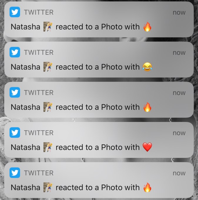
Adjust your notification and DM settings accordingly.
You can only choose one reaction per missive. Each symbol is displayed under the message/media with a count next to it — to allow for group tallies to be totted up.
NB: Clicking on another symbol will swap out the earlier one — generating, er, more notification spam. And really annoying people could keep flipping their reaction to generate a real-time emoji streaming game of notification hell (hi growth hackers!) with folks they’ve been DMing with. So that’s another good reason to lock down your Twitter settings.
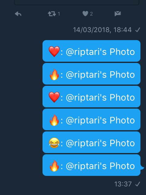
Users still running older version of Twitter’s apps which don’t support message reactions will see a standard text emoji message per reaction sent (see examples below). This kinda confusingly makes it look like the reaction sender has actually been liking/flaming their own stuff. So all the more reason to not be spammy about emoji.


Voicemail is such an integral part of using a modern phone that we tend not to think about it much. At least, you don’t think about it until you switch cellular providers and you need to set up voicemail on your phone. Maybe you even forgot that setting up voicemail is something you have to do.
Getting voicemail set up on your iPhone is a simple process. The only problem is that the process can be different depending on which carrier you use. That’s why we’ve gathered everything you need to know about using voicemail on your iPhone here.
For the most part, setting up voicemail is the same, no matter which carrier you use. We’ll go through the basic steps first, then look at any carrier-specific quirks you may run into.
The first step you need to take is opening the Phone app. Assuming you haven’t re-arranged your home screen, the icon will appear in the dock at the bottom of your screen. If for some reason you can’t find it, you can search for it. Swipe down from the middle of your screen and search for “phone” in the search bar at the top.
Once you’ve opened the app, tap the Voicemail icon at the bottom-right of the screen. You’ll see a message letting you know that you need to set up your voicemail before you can use it. Tap the button labeled Set Up Now to begin.
If you’ve used Apple’s visual voicemail service before, you’ll see a prompt to enter your password. Otherwise, you need to create a password and enter it twice. Once you’ve done this, tap Done.
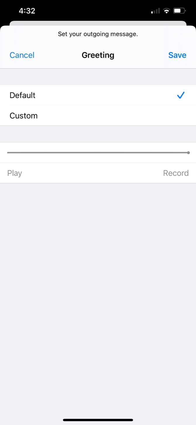
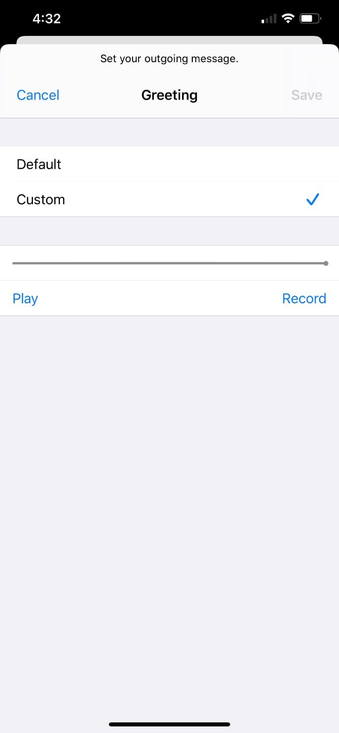
Next, you’ll see the greeting screen. Here you can either record a custom greeting or select Default to use your carrier’s default voicemail message. To record your own, tap Custom, then hit the Record button to start recording.
Play back your message to make sure you’re happy with it, then tap Done at the top of the screen.
Now your phone is ready to use Apple’s visual voicemail feature, assuming your carrier supports it. If you run into trouble, we’ll tackle that later on.
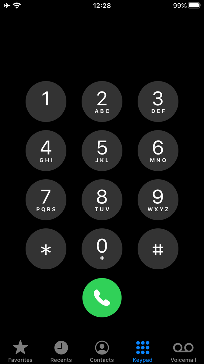
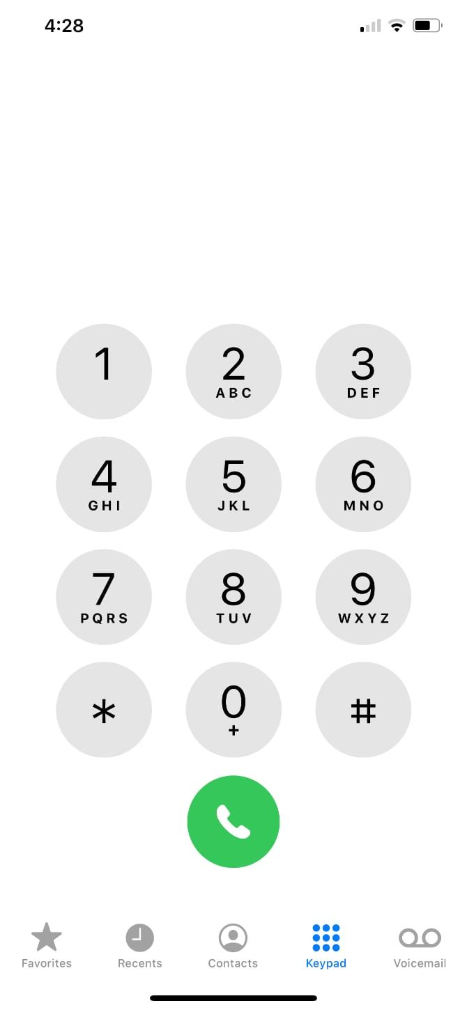
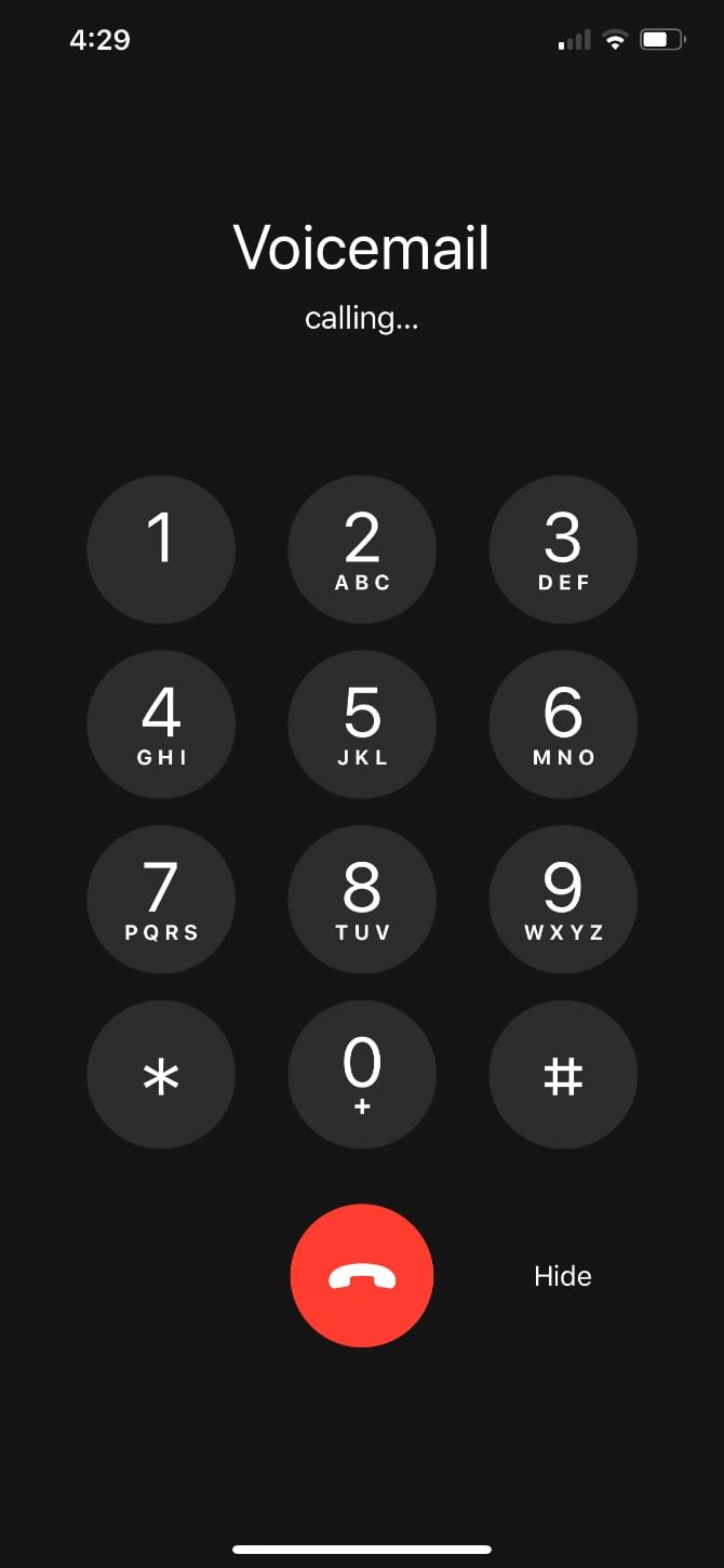
If you’re wondering how to set up voicemail on the iPhone as an AT&T customer, it’s a little different. To access the company’s voicemail service, you need to go through a bit of setup. Start by pressing and holding 1 on the number pad in the Keypad section of the Phone app.
Assuming you already have voicemail with AT&T, enter your password. Your voicemail greeting and all your old messages will transfer to your iPhone. If you’re a new AT&T customer, follow the prompts to create your password and leave your voicemail greeting.
For Verizon or T-Mobile customers, setting up voicemail on your iPhone is easy. If you’ve followed our steps above, you’re already done.
Both T-Mobile and Verizon direct you to Apple’s basic voicemail instructions to get started.
As with AT&T, you need to go through an extra setup step with Sprint. Press and hold 1 on the dial pad in the Phone app to begin.
For a new voicemail box, you need to create a four to 10 digit passcode. Then you need to record your name. After you’ve done this, you can choose between recording a personal greeting or using the standard greeting. Finally, you can choose whether to enable One-Touch Access to your voicemail.
Make sure to do this all without hanging up or canceling the process. If you don’t go through all the steps, you’ll have to repeat everything again.
Outside of the major carriers above, you may use another like Virgin Mobile, Boost Mobile, or Straight Talk Wireless. Most of these are Mobile Virtual Network Operators (MVNO). This means they use one of the major carriers above as their backbone instead of setting up their own infrastructure.
This is good news, because it means setting up voicemail is similar to one of the above approaches. In most cases, your carrier will have instructions for setting up your voicemail. If not, your best bet is to follow Apple’s instructions for setting up voicemail on your iPhone.
Visual voicemail is a handy feature, especially if you deal with a lot of voice messages. While support on Android is iffy to the point that there are many third-party visual voicemail apps to make it work, support on the iPhone is much better.
Apple supports visual voicemail on the iPhone for most, but not all, carriers in the United States and Canada. To see if the iPhone supports visual voicemail for your carrier, check Apple’s detailed breakdown of carrier support.
If your carrier supports it, the setup process will automatically configure visual voicemail. If you’re having trouble with visual voicemail not working, try checking for a carrier-bundle update by going to Settings > General > About. If an update is available, a notification will let you know.
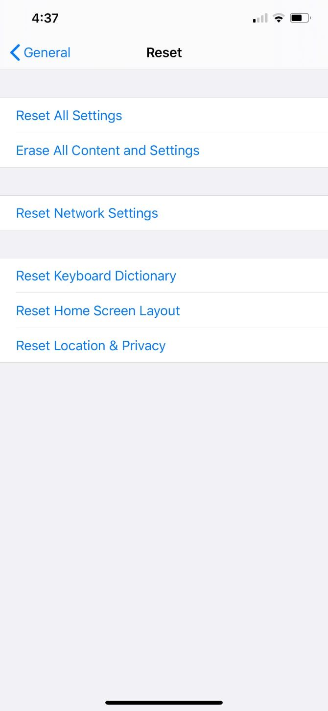
Assuming you’ve tried the above and still run into trouble, you can try resetting the network settings on your iPhone. To do this, go to Settings, then General, then Reset. Here, tap Reset Network Settings.
This only takes a moment and may solve your problem. However, keep in mind that doing so will reset your saved Wi-Fi networks, any VPN configurations, and similar network settings.
Finally, there are a few other areas to check. Try calling someone to make sure you have a cellular connection. If this fails, that could explain why visual voicemail isn’t working. You can also try calling your own number to make sure that your voicemail is fully set up.
By the way, we’ve also showed how to record a phone call on your iPhone if you need to do that.
If you’re setting up voicemail, it usually means that you’ve either switched providers or just got a new phone. If you’re the proud owner of a new iPhone, you should be all ready to use voicemail, but that doesn’t mean you’re finished setting up.
To get the most out of your phone, there are a few tweaks, changes, and other bits and pieces of setup to get out of the way. Not a fan of tinkering with your phone? Just take a look at our guide to the tweaks you should make to a new iPhone.
Read the full article: How to Set Up Voicemail on the iPhone

Netflix is a great streaming service with a ton of content to watch on all sorts of different devices. However, sometimes, you’ll encounter Netflix error codes that stop you in your tracks.
In this article, we’ve tried to round up some of the most common Netflix error codes, explain what they are, and how to fix them. So we recommend bookmarking this one in case you need it again…

You’ll see Netflix error 11800 when there is a problem with the playback of your selected content on a mobile device. Usually, the error code will be accompanied by one of two messages:
or
This indicates that the information which is on your device is out of date or corrupted and needs to be refreshed. Typically, you will see this error on an Apple device like an iPhone, iPad, or Apple TV.
The easiest way to fix this error is to restart your device. This should clear out any old information used by the Netflix app and allow you to reload your content. If this does not work, you should update the Netflix app through the App Store.
This is an error which appears when you access Netflix from a browser, specifically from Chrome. Firstly, it may indicate you are using a link to a page which no longer exists (for example, if you use a bookmark to access Netflix). To fix this, go directly to www.netflix.com.
Secondly, this could be caused by an incompatibility with one of your browser extensions. Try disabling browser extensions to fix the error.

This error occurs if you try to access Netflix from a browser while using a VPN or proxy. As Netflix only has the rights to show certain content in certain countries, it restricts users from accessing content from outside of their home country. In the last few years the site has cracked down on people using a VPN to access Netflix.
This is annoying if you are using a VPN or proxy for security reasons rather than trying to change your region, as you cannot safely connect to the Netflix website. Instead, you have to disconnect your VPN or proxy and then refresh the page, or use VPNs that still work with Netflix.
This error code arises when you are using the Netflix app and are trying to download an episode or movie while connected to a VPN or proxy. You’ll see an error message: “There was a problem with this download. (10013)”
To fix this issue, as with the one above, you must disable your VPN or proxy. Once it is disabled, you’ll be able to download your content as normal.
Using the Netflix app, you can download episodes or movies to your device to watch when you don’t have internet access. However, sometimes when you do this you will get an error saying, “This title can no longer be watched offline. (AVF:11800;OS:42800;).”
This means that the downloaded file you are trying to watch has become corrupted or has been deleted or moved. Unfortunately there is no way to fix this if you don’t currently have an internet connection, as you need to re-download the file.
However, if you do have internet access then you can easily fix this error. Go to the Downloads section of the app by either clicking the arrow icon at the bottom of the app or by tapping the menu icon and selecting My Downloads. Now tap Edit in the top-right corner of the screen. Select the file that is not working and tap the red X icon to delete it.
Now re-download the episode or movie and you should be able to watch it without errors.
The Netflix error UI-800-3 comes up when you are using a device such as a Blu-ray player, Roku box, games console, smart TV, or Amazon Fire Stick. It indicates that the information stored on your device is out of date and needs to be refreshed.
This can be fixed simply by restarting your device. If this does not work, you can try signing out of Netflix on your device and then signing back in. Finally, if this does not work either, you can disconnect the device from your network, restart your router, and reconnect your device.
This error arises when a network connectivity issue affects your ability to download content via the iOS app. This usually happens when there is a block of some kind on the internet connection you are using. For example, if you are on a school or work Wi-Fi network, there may be a firewall in place which blocks streaming.
To fix this error, you should try connecting to a different Wi-Fi network.
Alternatively, this issue can sometimes be caused by having the incorrect time displayed on your device. Check your device’s date and time settings and make sure they are correct.
These errors occur along with a message saying, “Cannot play title. Please try again later.” This usually happens because your Netflix app is out of date. First, trying updating the Netflix app. If that doesn’t fix the problem, try uninstalling and reinstalling the app.
This error can also sometimes be fixed by restarting your device.
Finally, if you are using an HDMI adapter to watch content from an Apple device on an external display, make sure you are using one of the compatible HDMI adapters.
When using an iOS device, you might see an error saying, “Network Error. A network connection is required to continue downloading.” Or on a device like a games console, smart TV, or Blu-ray player, you might see the error codes, NW-2-5 or NW-3-6.
All of these codes indicate a network connectivity issue which is preventing your device from contacting the Netflix servers. To fix it, first restart your device. If that does not work, try going closer to the source of the Wi-Fi to get a better signal, or use a wired connection instead. If this doesn’t work either, try restarting your router.
Finally, one error you may see when using Netflix in a web browser is a message saying, “There was an unexpected error. Please reload the page and try again.”
To fix this, refresh the page and try again. If that does not work, try clearing your browser’s cache and browser history, or restarting your computer.
Using these tips, you should be able to fix the most common Netflix error codes on mobile devices, smart TVs, and web browsers. And if you encounter a Netflix error code we haven’t listed, feel free to ask for help in the comments below.
To learn more tips and tricks to get the most out of Netflix, check out the ultimate guide to Netflix.
Read the full article: 10 Netflix Error Codes and How to Fix Them

Back in the good old days, recruiters would sift through every job application to find the perfect hire. But now, most companies use an automated system to find the right people. Rezi is a platform that helps you build a résumé that is optimized for recruitment algorithms. You can currently get a lifetime subscription for just $29 at MakeUseOf Deals.
Using an ATS, or applicant tracking system, allows recruiters to hire people much faster than ever before. However, these systems are trained to look for specific keywords. If your résumé doesn’t include these buzzwords and phrases, you may not be considered.
Rezi makes it easy to build a résumé that will get you noticed. This online platform allows you to create a professional career summary in minutes. All the while, you get feedback via the Rezi Score, which measures how your résumé will fare in most recruiter systems.
You can access Rezi on desktop and mobile devices, and create unlimited résumés. Used by over 100,000 job seekers, the platform has helped candidates secure interviews at Airbnb, Spotify, Google, Atlassian, and Microsoft.
You would normally pay $540 for lifetime access to Rezi, but you can currently grab your subscription for just $29.
You can’t beat free! Get $70+ worth of premium Mac apps for free today!
Prices subject to change
Read the full article: Make Yourself More Hireable With Rezi Smart Résumé Builder — Now 94% Off
Did you notice a recent change to how Google search results are displayed on the desktop?
I noticed something last week — thinking there must be some kind of weird bug messing up the browser’s page rendering because suddenly everything looked similar: A homogenous sea of blue text links and favicons that, on such a large expanse of screen, come across as one block of background noise.
I found myself clicking on an ad link — rather than the organic search result I was looking for.
Here, for example, are the top two results for a Google search for flight search engine ‘Kayak’ — with just a tiny ‘Ad’ label to distinguish the click that will make Google money from the click that won’t…

Turns out this is Google’s latest dark pattern: The adtech giant has made organic results even more closely resemble the ads it serves against keyword searches, as writer Craig Mod was quick to highlight in a tweet this week.
Last week, in its own breezy tweet, Google sought to spin the shift as quite the opposite — saying the “new look” presents “site domain names and brand icons prominently, along with a bolded ‘Ad’ label for ads”:
But Google’s explainer is almost a dark pattern in itself.
If you read the text quickly you’d likely come away with the impression that it has made organic search results easier to spot since it’s claiming components of these results now appear more “prominently” in results.
Yet, read it again, and Google is essentially admitting that a parallel emphasis is being placed — one which, when you actually look at the thing, has the effect of flattening the visual distinction between organic search results (which consumers are looking for) and ads (which Google monetizes).
Another eagle-eyed user Twitter, going by the name Luca Masters, chipped into the discussion generated by Mod’s tweet — to point out that the tech giant is “finally coming at this from the other direction”.
‘This’ being deceptive changes to ad labelling; and ‘other direction’ being a reference to how now it’s organic search results being visually tweaked to shrink their difference vs ads.
Google previously laid the groundwork for this latest visual trickery by spending earlier years amending the look of ads to bring them closer in line with the steadfast, cleaner appearance of genuine search results.
Except now it’s fiddling with those too. Hence ‘other direction’.
Masters helpfully quote-tweeted this vintage tweet (from 2016), by journalist Ginny Marvin — which presents a visual history of Google ad labelling in search results that’s aptly titled “color fade”; a reference to the gradual demise of the color-shaded box Google used to apply to clearly distinguish ads in search results.
Those days are long gone now, though.
Now a user of Google’s search engine has — essentially — only a favicon between them and an unintended ad click. Squint or you’ll click it.
This visual trickery may be fractionally less confusing in a small screen mobile environment — where Google debuted the change last year. But on a desktop screen these favicons are truly minuscule. And where to click to get actual information starts to feel like a total lottery.
A lottery that’s being stacked in Google’s favor because confused users are likely to end up clicking more ad links than they otherwise would, meaning it cashes in at the expense of web users’ time and energy.
Back in May, when Google pushed this change on mobile users, it touted the tweaks as a way for sites to showcase their own branding, instead of looking like every other blue link on a search result page. But it did so while simultaneously erasing a box-out that it had previously displayed around the label ‘Ad’ to make it stand out.
That made it “harder to differentiate ads and search results,” as we wrote then — predicting it will “likely lead to outcry”.
There were certainly complaints then. And there will likely be more now — given the visual flattening of the gap between ad clicks and organic links looks even more confusing for users of Google search on desktop.
We reached out to Google to ask for a response to the latest criticism that the new design for search results makes it almost impossible to distinguish between organic results and ads. But the company ignored repeat requests for comment.
Of course it’s true that plenty of UX design changes face backlash, especially early on. Change in the digital realm is rarely instantly popular. It’s usually more ‘slow burn’ acceptance.
But there’s no consumer-friendly logic to this one. (And the slow burn going on here involves the user being cast in the role of the metaphorical frog.)
Instead, Google is just making it harder for web users to click on the page they’re actually looking for — because, from a revenue-generating perspective, it prefers them to click an ad.
It’s the visual equivalent of a supermarket putting a similarly packaged own-brand right next to some fancy branded shampoo on the shelf — in the hopes a rushed shopper will pluck the wrong one. (Real life dark patterns are indeed a thing.)
It’s also a handy illustration of quite how far away from the user Google’s priorities have shifted, and continue to drift.
“When Google introduced ads, they were clearly marked with a label and a brightly tinted box,” says UX specialist Harry Brignull. “This was in stark contrast to all the other search engines at the time, who were trying to blend paid listings in amongst the organic ones, in an effort to drive clicks and revenue. In those days, Google came across as the most honest search engine on the planet.”
Brignull is well qualified to comment on dark patterns — having been calling out deceptive design since 2010 when he founded darkpatterns.org.
“I first learned about Google in the late 1990s. In those days you learned about the web by reading print magazines, which is charmingly quaint to look back on. I picked up a copy of Wired Magazine and there it was – a sidebar talking about a new search engine called ‘Google’,” he recalled. “Google was amazing. In an era of portals, flash banners and link directories, it went in the opposite direction. It didn’t care about the daft games the other search engines were playing. It didn’t even seem to acknowledge they existed. It didn’t even seem to want to be a business. It was a feat of engineering, and it felt like a public utility.
“The original Google homepage was recognised a guiding light of purism in digital design. Search was provided by an unstyled text field and button. There was nothing else on the homepage. Just the logo. Search results were near-instant and they were just a page of links and summaries – perfection with nothing to add or take away. The back-propagation algorithm they introduced had never been used to index the web before, and it instantly left the competition in the dust. It was proof that engineers could disrupt the rules of the web without needing any suit-wearing executives. Strip out all the crap. Do one thing and do it well.”
“As Google’s ambitions changed, the tinted box started to fade. It’s completely gone now,” Brignull added.
The one thing Google very clearly wants to do well now is serve more ads. It’s chosen to do that deceptively, by steadily — and consistently — degrading the user experience. So a far cry from “public utility”.
And that user-friendly Google of old? Yep, also completely gone.