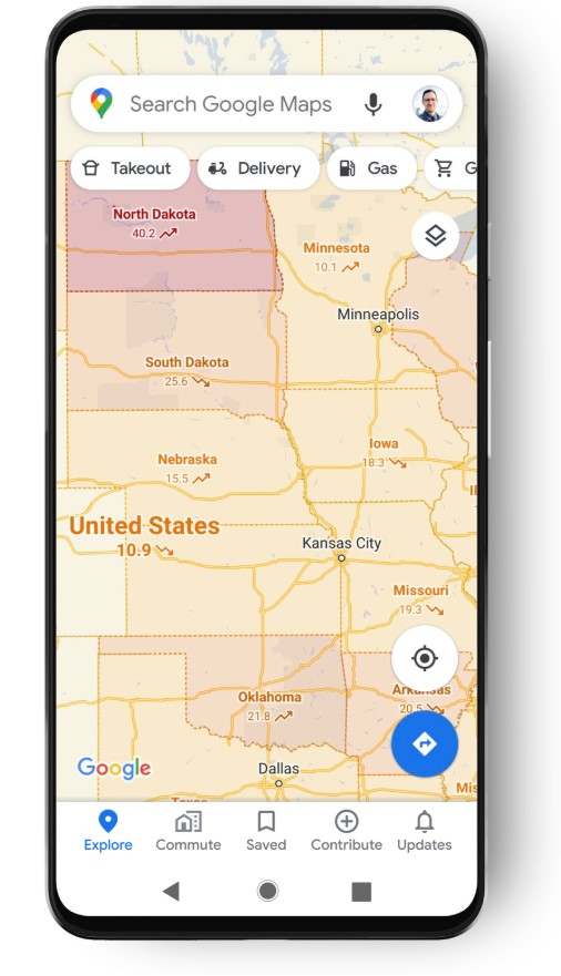
Google today announced an update to Google Maps that will bring a new COVID-19 layer to the service to help you better understand the number of cases in a given area. With the pandemic continuing to spread in many countries — and ahead of what many fear will be a second wave — Google Maps users can now enable this feature and see a color-coded map based on the number of cases per 100,000 people, as well as labels that indicate whether numbers are trending up or down.
This data will be available for all the 220 countries and territories that Google Maps currently supports. Where possible, the data is granular down to the city level, but that obviously depends on the numbers Google is able to pull in.
Google says the data comes from a number of sources, including Johns Hopkins, The New York Times and Wikipedia, which get their their information from local and intergovernmental government organizations. That’s the same sources Google pulls from when it displays COVID data on its search results pages.
This new layer is now rolling out for Google Maps on Android and iOS this week, so it may take a few days before you’ll be able to see it. It doesn’t look like Google plans to bring it Maps on desktop any time soon, though.
Read Full Article

No comments:
Post a Comment