Apple unveiled the next major version iOS a few weeks ago. I’ve been playing around with beta versions of iOS 14 and here’s what you should expect when you update your iPhone to the final release of iOS 14 this fall.
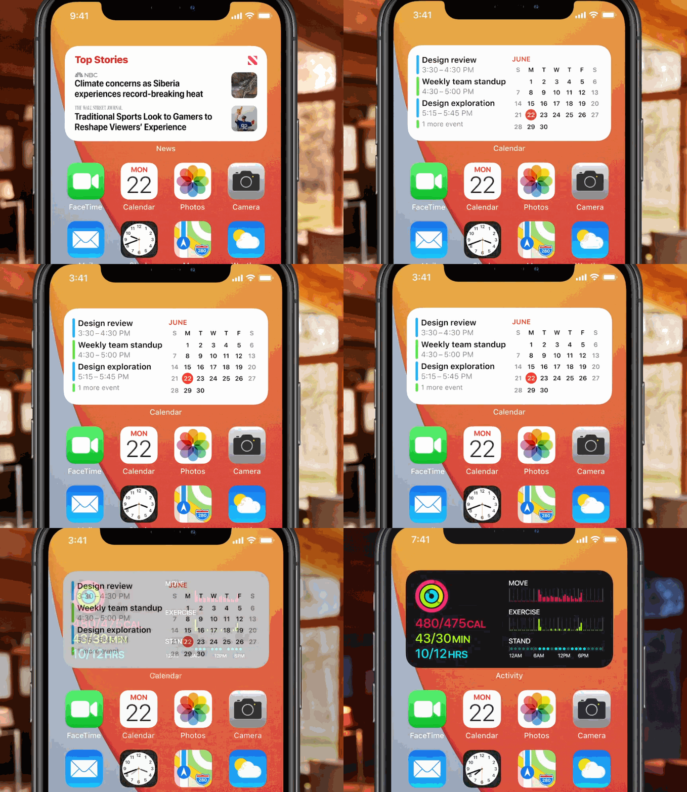
The most interesting change is something you’re not going to notice at first. The home screen has been rethought. In some ways, the iPhone now works more like Android devices. You can add widgets to the home screen and there’s a new app launcher called the App Library.
If you’ve been using a smartphone for many years, chances are your device is cluttered with a dozen apps you frequently use, some of apps you only need a few times a year and a ton of apps that are no longer useful.
Maybe your home screen is perfectly organized and you’re thinking that this doesn’t apply to you. Arguably, you’re part of the minority. Many people tell me they don’t even know where app icons are located anymore and they just pull down to use the search feature.
With iOS 14, changes are not immediately visible. If you want to keep using your phone just like before, nobody is stopping you. But the home screen is now more customizable.

When you tap and hold on a home screen icon, there’s a new menu that lists all the widgets you can install on your home screen. Many default apps already support widgets, such as Reminders, Calendar, Stock, Weather, Music etc. And each widget comes in multiple sizes if you want to see more or less info.
The most interesting thing about widgets is that you can stack them and flip through them. Otherwise, they’d quickly take over your entire home screen. Apple also tries to surface the widget that is more relevant to the time of the day and what you’re doing.
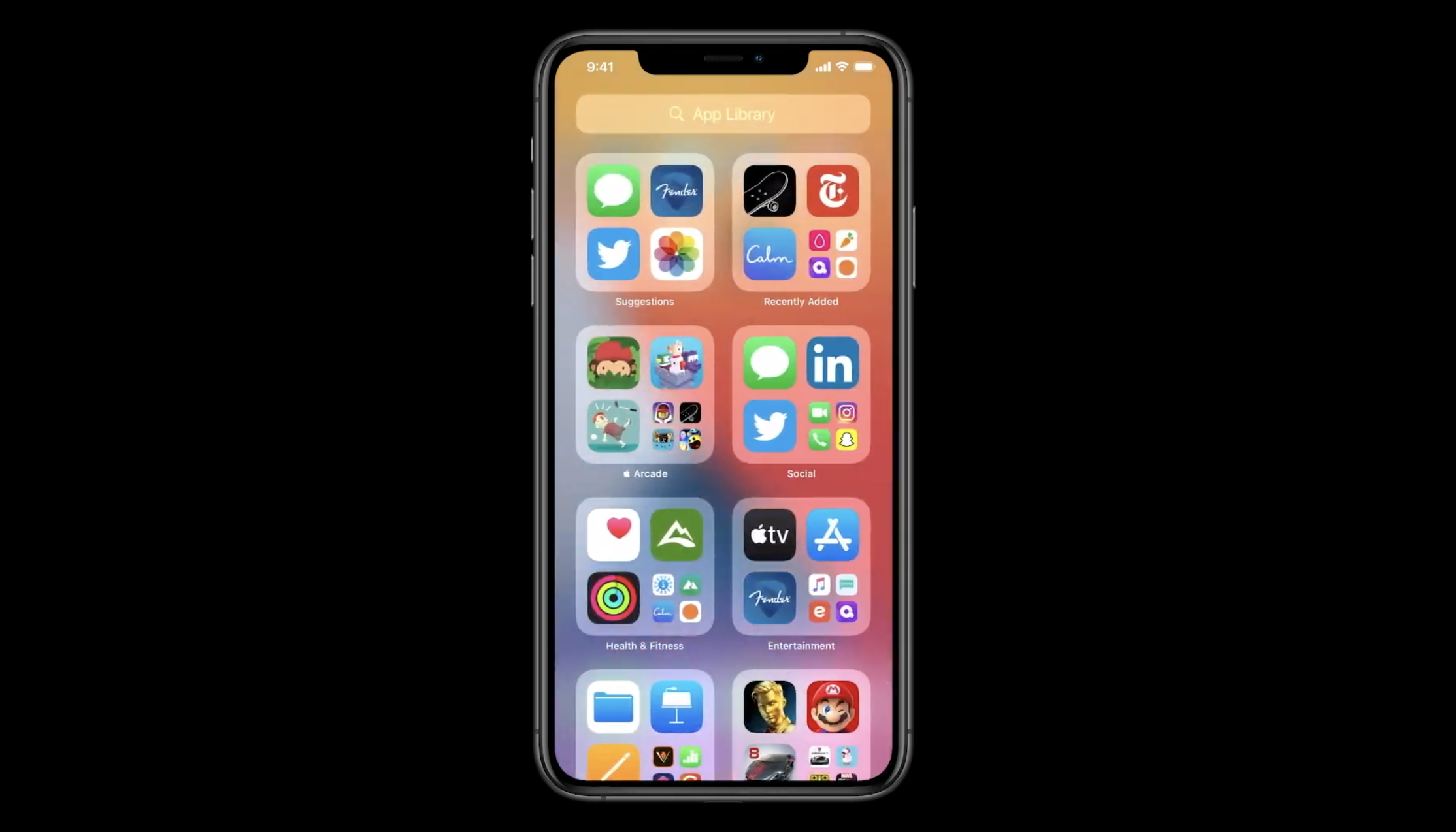
The second big change with the home screen is that there’s a new page at the right of your last page. The App Library groups all your apps on your phone by category. Some icons are bigger than others as Apple tries once again to surface the most important apps to you.
In my experience, categories don’t work that well as they’re based on the broad categories of the App Store. But you can always tap on the search bar at the top to display an alphabetical list of your apps. It could be useful if you can’t remember the name of an app for instance.

Image Credits: Apple
Fighting app fatigue
Those changes for the home screen might seem minor, but they are important to change the current app paradigm. People simply don’t want to download new apps. They don’t want to create a new account and they don’t want to have another icon.
Now that you can hide pages of apps and that there’s the App Library, downloading new apps has become less intimidating. If you combine that with Sign in with Apple, you can go from no app to interacting with content in no time.
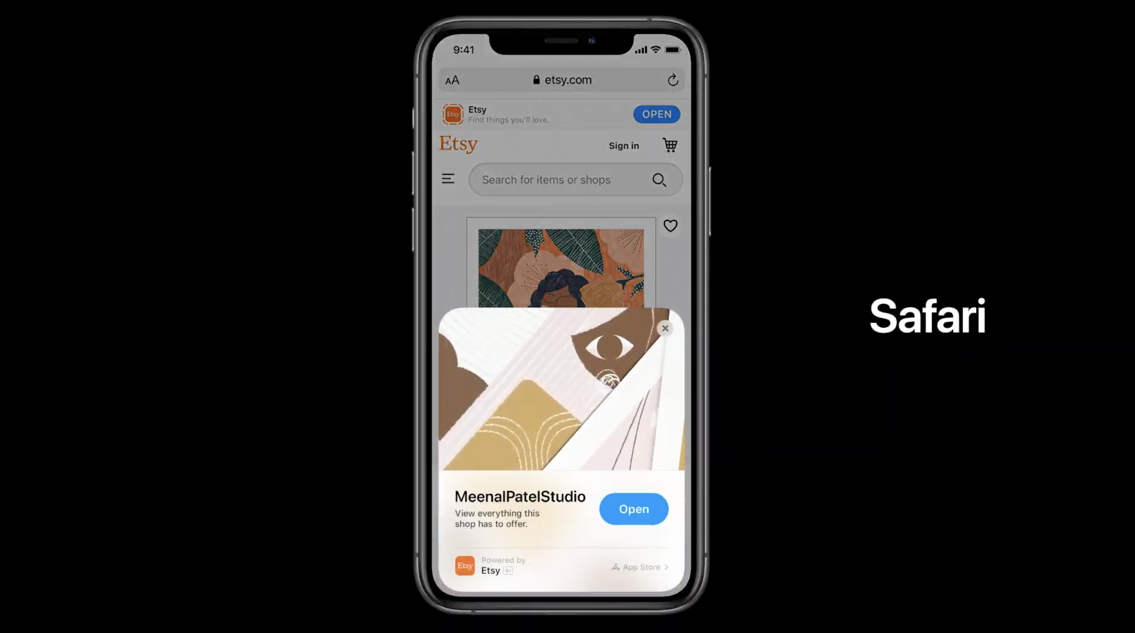
In addition to that, Apple is introducing App Clips. They are sort of mini apps that you can launch without installing an app. It’s a small part of an app that you can easily share. I haven’t had the chance to try it out yet as third-party developers have yet to take advantage of App Clips.
There are many ways to share App Clips. You can launch those apps from the web, from Messages, from Maps, from NFC tags or from QR codes. Get ready to see stickers at cafés, on scooters or in museums. Scan a code or tap your phone on it and you get an app-like experience. If you want to dive deeper, you can download the full app from the App Library.
But it’s also going to have some major impacts on utility apps, apps that you don’t use that often or travel apps for instance. Sure, you may keep your favorite social app on your home screen. But you’re going to forget about apps that only live in the App Library.
Developers will be happy that downloading apps is easier. And yet, it is going to be harder to make people come back to your app after the first launch.

Image Credits: Apple
Some app refinements
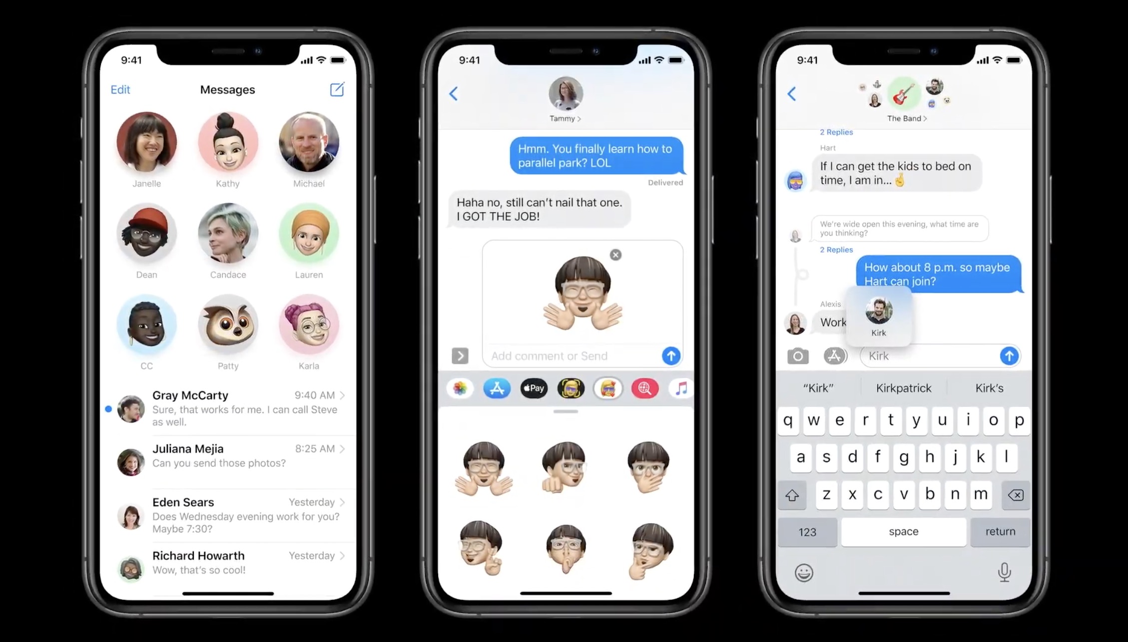
Let me list some quality-of-life improvements that are going to make your phone works better. In Messages, you can now pin conversations to the top. Group conversations are also receiving a major update with the ability to @-mention people, reply to specific messages and set a group of photos. Once again, Apple is bringing Messages closer to WhatsApp and Telegram. But it’s not a bad thing.
In Maps, there are many new features that I already detailed in a separate post. I encourage you to read it if you want to learn more about guides, electric vehicle routing, cycling directions and more.
The Home app has been improved with a new row of icons that describe the status of your home. For instance, you can see the temperature, see if a door is open, see if lights are on, etc.
Like every year, Notes and Reminders are getting some small improvements. For instance, document scanning has been improved, search has been improved, you can assign reminders to others and more. Those apps have become really powerful with these small incremental updates.

Image Credits: Apple
All the rest
There are many things that I haven’t mentioned yet or that I haven’t tried because I can’t use those features yet. Similarly, it’ll take some time before developers start adopting those features. Here’s a quick rundown:
- Incoming calls don’t take over the entire screen anymore. You get a notification at the top of the screen, which is so much better if you don’t want to answer a call.
- Similarly, Siri doesn’t overtake the screen. Your display fades out. I think more people are going to use Siri because of this as it doesn’t feel as invasive.
- Your AirPods will automatically switch between your iPhone, iPad, Mac, etc.
- When you’re on a FaceTime call or watching a video, you can switch to another app and keep the video in a corner. There’s not much else to say other than it’s nice.
- Cycling directions in Apple Maps: I’m a bike lover but the feature isn’t available in Paris. It’s hard to know whether directions make sense in San Francisco or New York as I don’t know cycling infrastructure that well in those cities.
- When you pull down to search for something, iOS now automatically highlights the first result. You can tap Go on the keyboard to hit the first result. It’s so much better.
- HomeKit-compatible security cameras can now recognize faces based on tags in Photos.
- You can unlock cars with your phone using NFC if you have a compatible car.
- Following the acquisition of Dark Sky, you’ll be able to see next-hour precipitation in Apple’s Weather app.
- You’ll be able to choose a different web browser and email client as default apps with iOS 14.
What about stability?
The big issue of iOS 13 was that it was quite buggy when it launched in September 2019. It’s hard to know whether iOS 13 is going to perform better on this front as it’s still a beta.
But, as you can see, Apple didn’t try to reinvent the wheel with default apps. There are a ton of improvements across the board, but no big redesign of Photos or Messages for instance. And I think it’s a good thing.
Changes on the home screen as well as App Clips could have wider implications for developers. It could change the way you discover and install apps today. So it’s going to be interesting to see if the developer community embraces App Clips.
Read Full Article
No comments:
Post a Comment