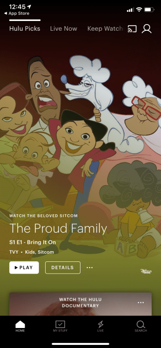
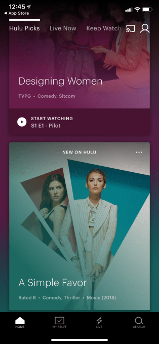
At this year’s CES event, Hulu announced plans to trial an updated version of its user interface that would do away with the confusing landing page called “Lineup.” At the time, the company said it was considering both “Hulu Picks” option or an “Unwatched in My Stuff” screen as a replacement for “Lineup.” Today, Hulu’s new interface is rolling out across iOS devices, the company says.
The Hulu interface launched in 2017 was not always well-liked — something Hulu had acknowledged after a complaint became the most upvoted item on Hulu’s customer feedback forums a couple of years ago. Users felt the interface was too difficult to navigate and the layout was confusing, among other things.
Some of Hulu’s challenges were around the fact that it was trying to merge an on-demand library with a live TV service, while also finding room to promote its original content.
But some of its other design choices were just odd — like its decision to make a single piece of content the main focus for many of its screens, for example. Meanwhile, its landing page “Lineup” never really made sense, either. Its name hinted at some form personalization, but instead, it was more often filled with suggestions of what Hulu was promoting, like “The Handmaid’s Tale.”
The updated iOS interface ditches “Lineup,” and replaces it with “Hulu Picks.” This is more clearly a collection of things to watch that’s curated by Hulu staff, rather than algorithmically derived by user viewing behavior.

However, the other landing page Hulu had been considering, “Unwatched in My Stuff,” is still available, just a few swipes over.
While Hulu still gives a single piece of content the focus on its main screens on the iPhone, it’s now easier to see there’s more content available if you swipe down, as the top of the next item’s card is peeking up from the bottom of the screen.
On iPhone, this means you can see two items at a time. On iPad, you can see two rows totaling 6 cards on the app’s main screen when in landscape mode.

This same format applies not only to “Hulu Picks,” but also to neighboring screens like “Live Now,” “Unwatched in My Stuff,” “My Channels,” and the genre-based sections like “Sports,” “News,” “TV,” “Movies,” “Kids,” “Hulu Originals,” and others. Ony the “Keep Watching” screen retains the more traditional thumbnails.
This seems like a small change, but it goes a long way to increase the discoverability of Hulu content, as it reduces how many times you have to swipe to see more suggestions.

Other changes touted at CES like adding expanded metadata next to content (genre, rating, year) or the ability to mark content as “unwatched” haven’t made an appearance. (Plenty of items still lack a rating). The 14-day live TV guide mentioned at CES isn’t available on iOS, either.
Hulu didn’t publicly announce the launch of the iOS redesign, but did confirm it’s rolling out now, only to iOS. They said other devices will get the update “soon.”
Read Full Article
No comments:
Post a Comment