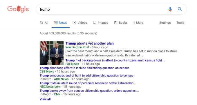
The Google News tab is getting a makeover. Google announced this week, by way of a tweet, a significant redesign of the Google.com News tab on the desktop, which will organize articles in a card-style layout, while also better emphasizing publisher names. The end result makes Google News more aesthetically pleasing, but it comes at the expense of information density.
To be clear, the changes here are focused on the News tab of Google.com — not the dedicated Google News product at news.google.com. You land on the News tab when you search for a term on Google.com, and then click over to “News” to see the latest coverage instead of Google’s list of search results.
As the preview of the redesign shows, news articles are currently organized in a compact list of links, allowing you to see several headlines around a single topic with just a glance. This design, admittedly, is a bit old-school — but it works.
Within the stack of links, the headline is blue, the publisher is green, and the articles are labeled as “In-depth” or “Opinion,” when relevant. There are small photo thumbnails by the lead story, with other publishers’ links underneath appearing as only text.

The updated design is more readable as articles are spaced out and placed in cards, similar to the main Google News product. There’s more white space and longer previews of each story, as well.
But the change means you’re seeing far fewer results on the screen before you have to scroll down.
The updated News tab makes it more obvious where the news is coming from, because publishers’ names are given more prominence. They also get their logo next to the headline, so it’s easier to identify your favorite news outlets with a glance. This is reminiscent of the recent mobile redesign for Google Search, which also put increased attention on the publishers by featuring them at the top of a link alongside their logo.
In addition to providing you with a set of News search results, the redesigned tab includes a new carousel labeled “People also searched for” that points you to other relevant news based on your search query.
Not everyone is thrilled about the update, given it makes it more difficult to quickly scan a number of headlines at once. And because there are fewer publishers’ articles on the first screen, traffic to those “below the fold” will likely drop.
Google says the changes will roll out over the next couple of weeks.
Read Full Article

No comments:
Post a Comment