The smartphone arms race isn’t always pretty. The knock-down, drag-out fight between Apple and Samsung in particular has given rise to some nasty lawsuits and wincing commercials year in and out as the two companies invest millions in outdoing one another.
But Google is playing another game entirely. The company has never really been concerned with battling it out over flashy designs and specs. It’s really exactly the sort of approach you’d expect from a software-first company. I won’t go so far as to suggest that the Pixel 3 is a utilitarian phone, but it’s safe to say that the hardware exists in service of the company’s software innovations.
If it were like other companies, last week’s hardware event would have been an opportunity for Google to bask in processor speed and pixel density. Instead, it blew through such things. It was a strange spectacle to behold, really, as someone who’s been through a million of these things. The company more or less announced all of the products at once and moved onto more important topics like algorithms and machine learning.
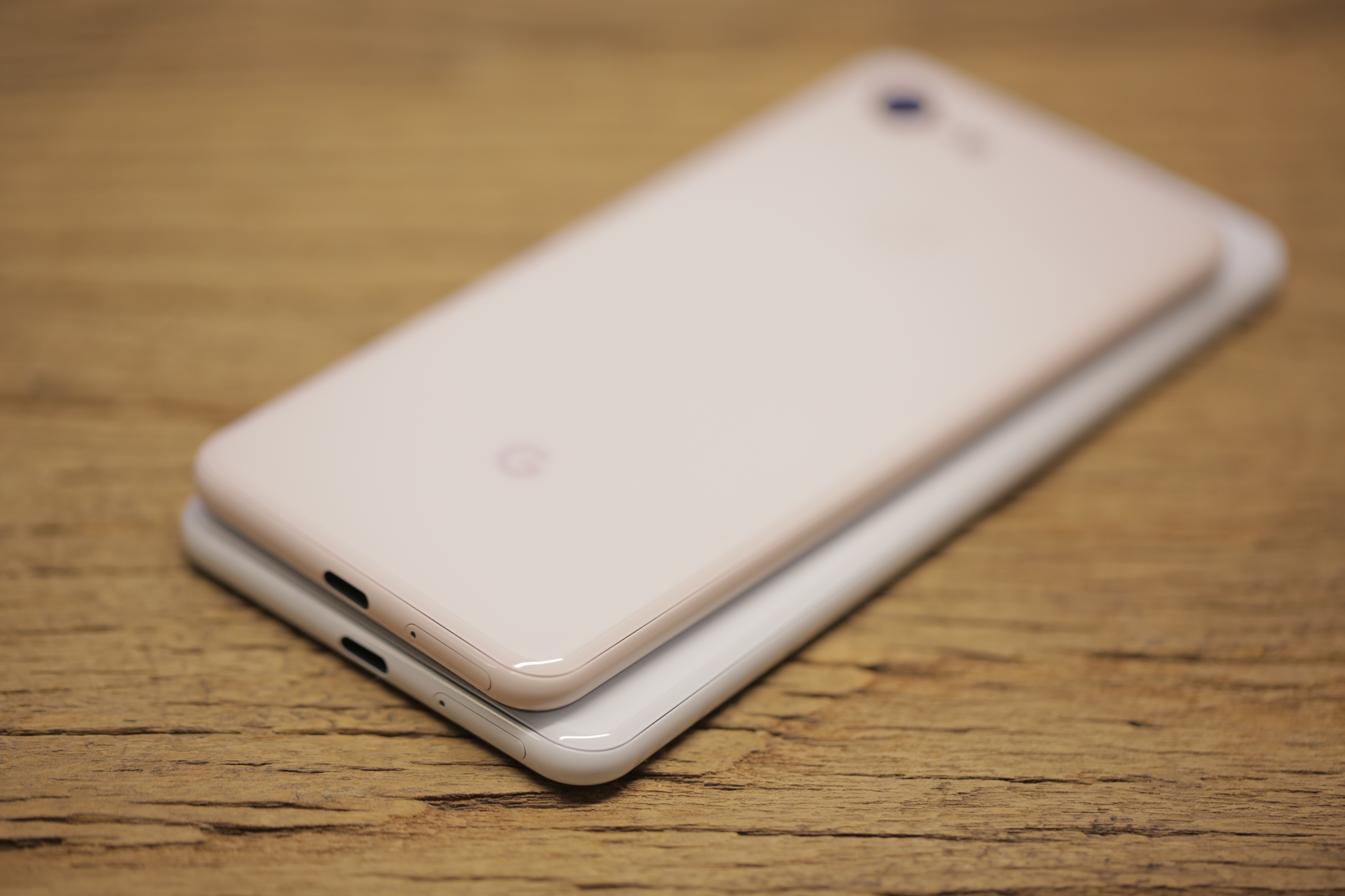
For many intents and purposes, Google’s approach to smartphones is a breath of fresh air. From a more practical standpoint, the company’s path often means less radical hardware upgrades, year over year. If you’re wondering whether to upgrade from the Pixel 2, the simple answer is: no, what are you, made out of money? But here’s Taylor’s slightly more nuanced approach to the question, if that’s your thing.
The fact is that Google has always been less interested than Apple or Samsung in keeping you beholden to the constant upgrade cycle. In fact, a number of the new photo features introduced this round will also be making their way onto older models, when possible. That’s not a promise all of the competition is willing to make.
The bottom line for products like the Pixel 3, Pixel Slate and Home Hub is that Google is intent on delivering the best hardware showcase for what it’s been working on over on the software side. That we happen to get one of the best Android smartphones out of the deal is a happy side effect.
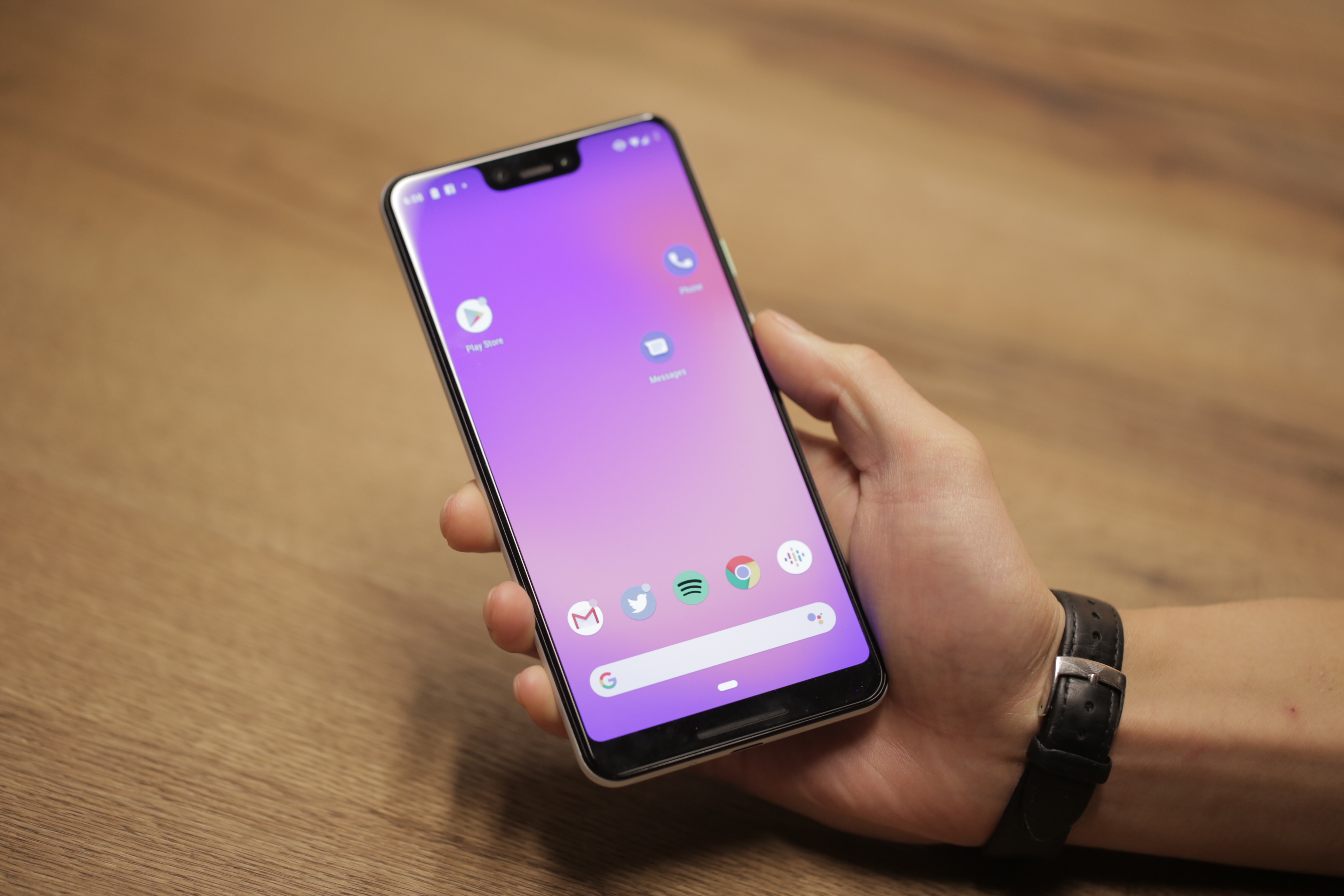
Top level, here are the key hardware changes from the last version:
- Bigger screen: This the single largest hardware change, so to speak. The Pixel 3 bumps up from five inches to 5.5 inches, while the XL moves up in the world from six to 6.3. Both a pretty sizable upgrade, all told.
- Dual front-facing cameras: Seemingly a bit of a head scratcher, given that the back of the device sticks to one. More on that below.
- Wireless charging: Better late than never, right?
We walked away from the Google event with both handsets in a branded tote bag that also included the new Pixel Stand. It’s clear that the company was looking to outfit reviewers with the best experience possible. As someone who cycles through a lot of phones for work, I’ve found myself gravitating toward larger phones.
With that in mind, most of the rest of this piece pertains to my experiences with the Pixel 3 XL. That said, Anthony kindly agreed to take the Pixel 3 out on the town for a photo safari, so the imaging samples in this review are taken from both handsets. Spec-wise, the two products are quite similar, beyond the standard array of things that come with a larger phone: screen, battery, et al.
There’s a sentiment you’ll read a lot when it comes to large flagships — that the company has done a good job keeping the footprint small, in spite of the massive screen size. Indeed, a lot of progress has been made on this front in recent generations, between thinner bodies and the rapid extinction of the bezel. That said, the Pixel 3 XL is a big phone by just about any measure.
Sure, Apple came from behind, only to rocket to the top of display sizes with the 6.5-inch XS Max. But the 6.3-inch XL isn’t far behind. It’s also a few fractions of a millimeter thicker than Apple’s massive handset at 7.9mm — though it still has nothing on the Note 9’s 8.8mm. Either way, the thing isn’t for the small of hand or limited in pocket space — and one-handed use probably isn’t in the cards if you’re not a professional basketball player.
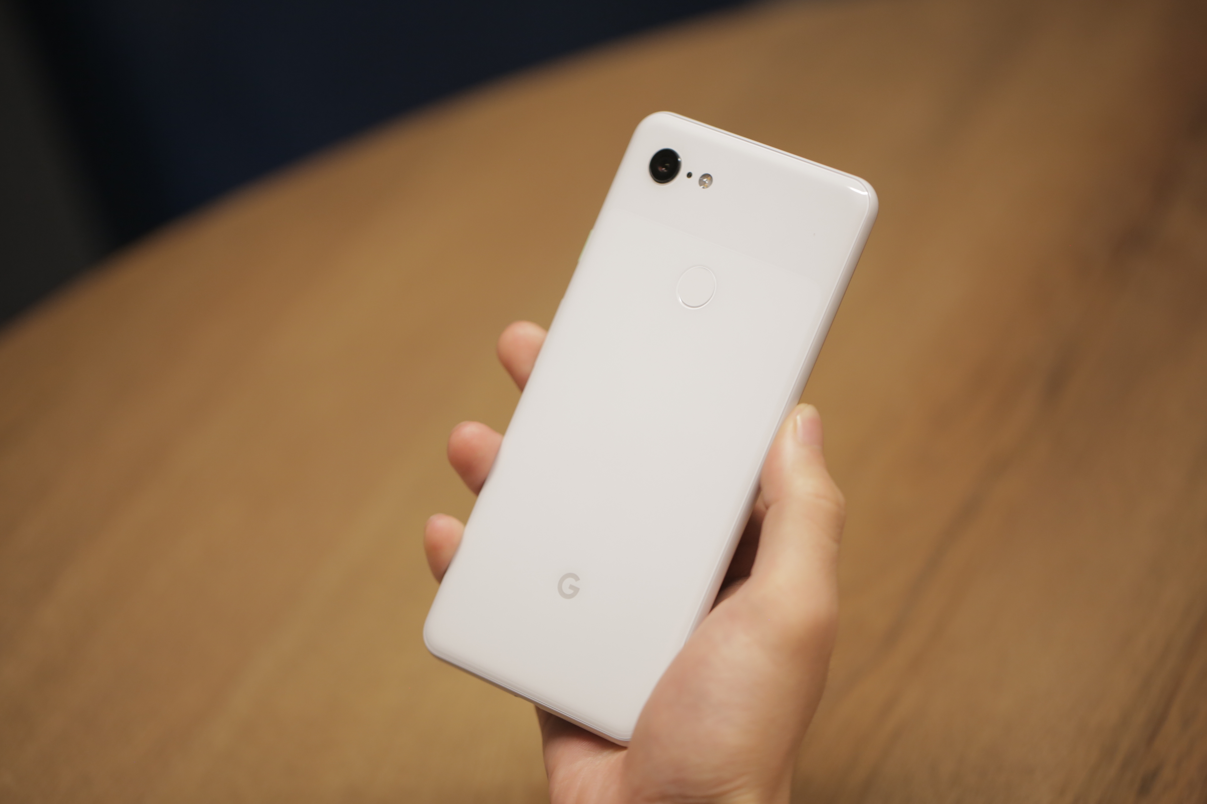
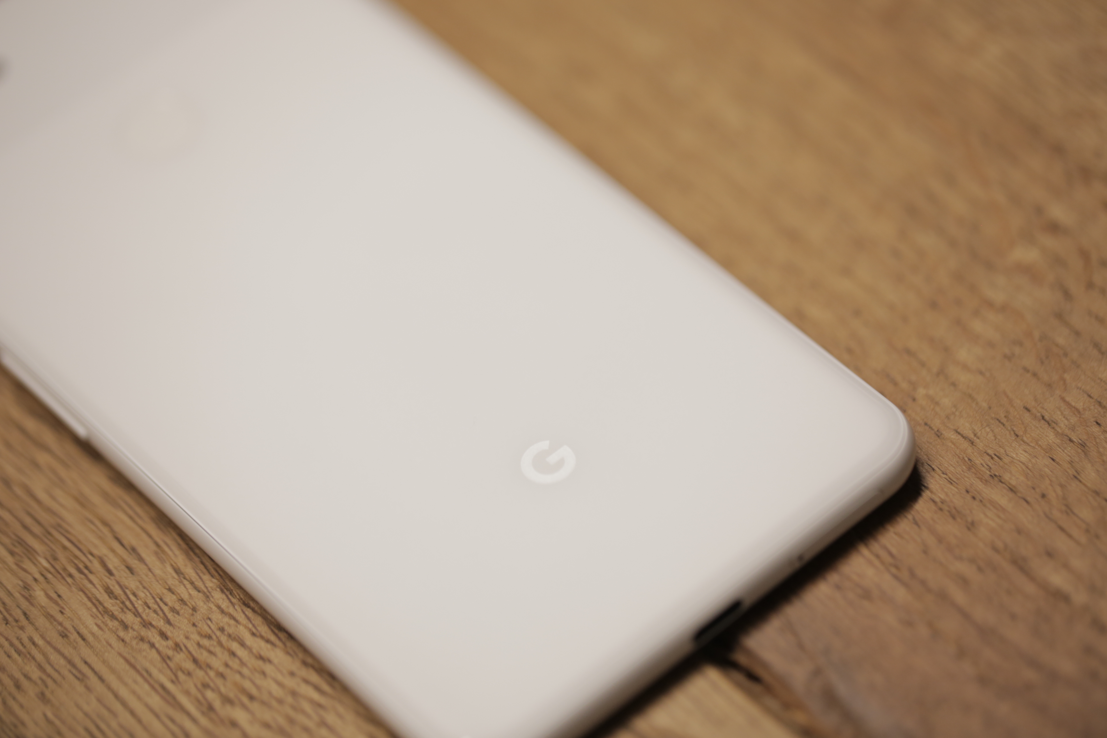
Not much has changed aesthetically changed since the 2. And, indeed, the Pixel’s design language has become iconic in its own way, from the brightly colored power button to the dual-surface rear. The plasticky version found on prior generations has been replaced with a double glass surface — shiny up top and matte on the bottom.
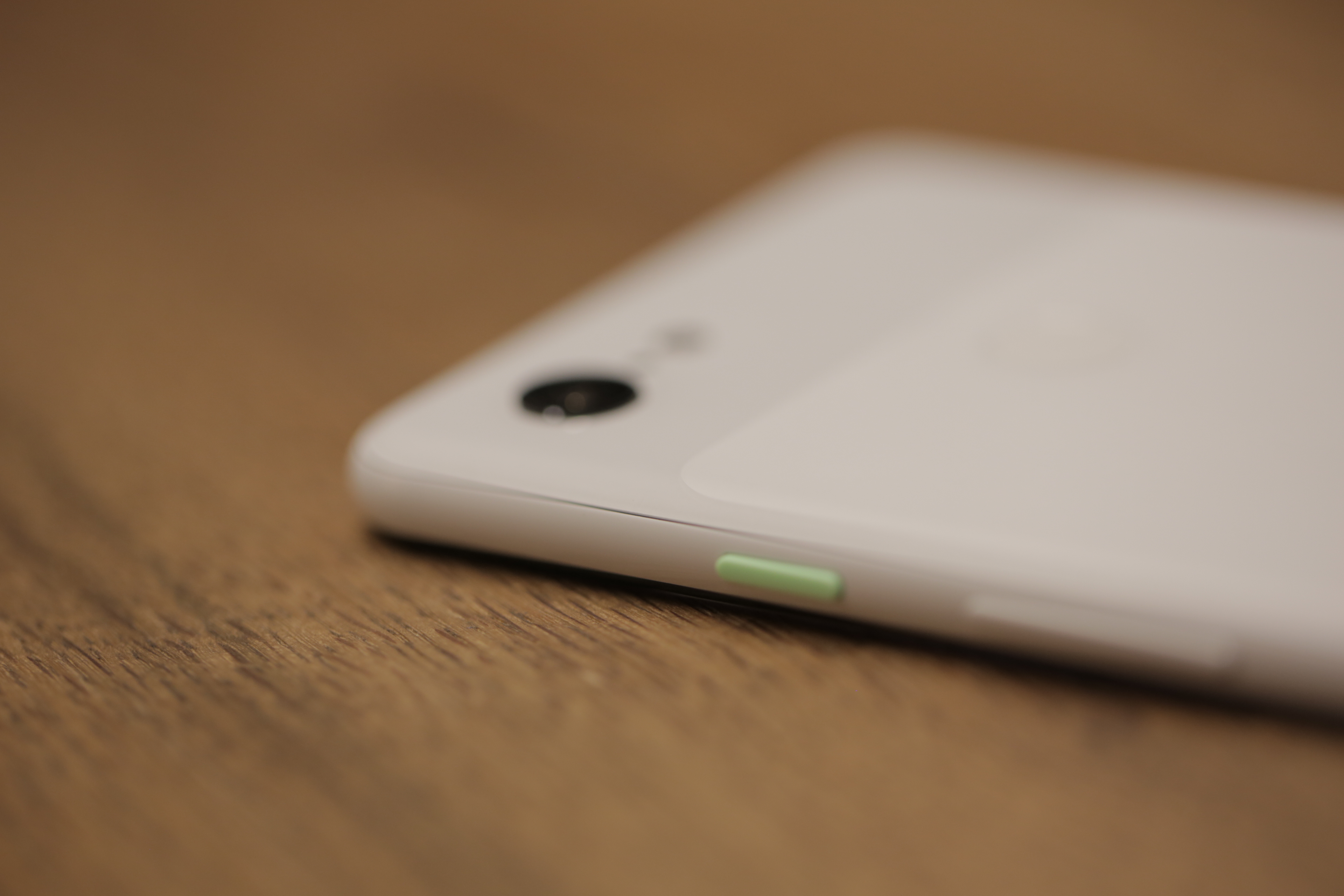
It’s a subtle contrast and should help avoid slippage for those souls brave enough to go without a case. This last bit is a very real issue I’ve run into switching between the iPhone XS and Note 9, of late. Those shiny backs will slip right out of your hand if you’re not paying attention.
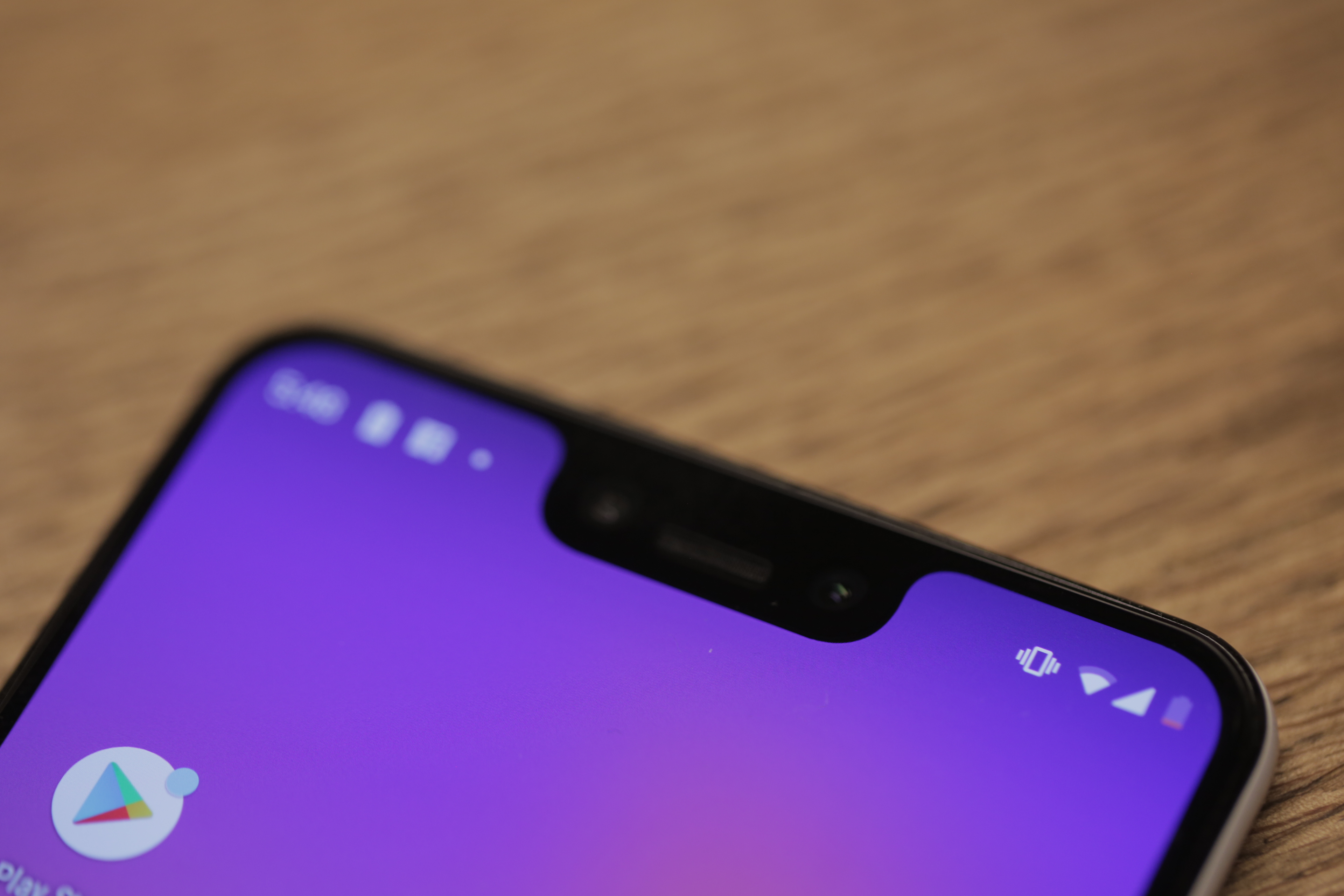
Up front, you’ll find that word of the Pixel 3 XL’s notch was, in fact, not exaggerated. It’s the stuff of legend. Turns out this is because of those dual front-facing cameras. Google is really committed to helping users up their selfie game here. At least that’s the immediate impact of that decision.
Dual cameras could have other benefits down the road, including depth sensing for things like augmented reality and, perhaps, face unlock. For now, however, it means taking pictures of yourself and friends at a semi-pro level.
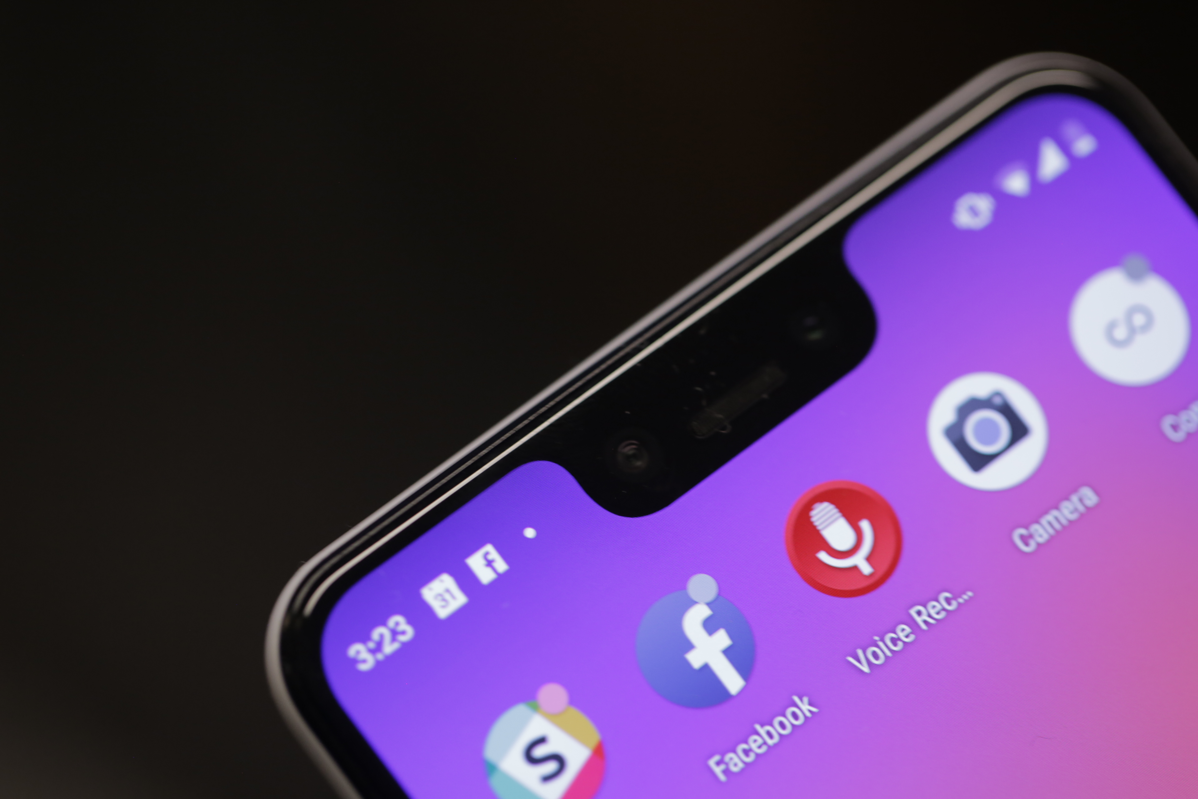
The notch, it turns out, is a key design distinction between the 3 and 3 XL. The reasoning is — as with the rest of what Google’s hardware team did here — a pragmatic one. “With the small one,” VP of Product Management Brian Rakowski told me in an interview last week, “it turns out the space is just too small when you put the wide-angle lens in. It’s a narrower phone, so you have room for an icon or two, whereas on the bigger phone everything you need for the status icons is up there, and it’s a very good use of the space.”
In spite of its software embrace with Android Pie, Google is neither definitively pro or anti-notch. The company is, simply put, notch agnostic. If, however, you have a problem with that admittedly unsightly cutout, there’s a fix for that. Active Edge is back. It’s a feature that’s grown on me a bit since HTC introduced it as Edge Sense back on the U11 in May of last year. With a pinch of the phone’s frame, you can fire up Assistant. It’s one of several ways to invoke Google’s AI, but it definitely beats Samsung’s longtime insistence on including a devoted Bixby button. And besides, Google Assistant is actually, you know, useful.
Google’s generally done a good job listening to user feedback with its software features, and nowhere is that better represented than with the Adaptive mode for its screen color profiles. Last year’s Natural mode was met with some fairly widespread negative feedback for the effect in had in “muddying” the colors — most notably the reds, which ended up somewhere between blood-red and brown.
It was one of those things the company insisted was good for you, but ultimately user irritation won the day. Adaptive splits the difference, saturating colors for things like your Gmail icon, while keeping it in check for things like skin tone. It’s a pretty happy medium, all told, but if you’re not into it, you can always adjust things in settings.
The headphone jack is, of course, still gone. Google drew a line in the sand last year, after making a show keeping it on-board with the first generation. There’s a bit of a mea culpa here, however, in the form of souped up earbuds included in-box. The headphones are very clearly inspired by last year’s Pixel Buds.
That, much like the accessories themselves, is a bit of a mixed bag. The biggest upshot here is that the things plug directly into the USB-C port at the bottom. Sure the box still includes a headphone jack to USB adapter, but including headphones with a standard jack with a phone that doesn’t natively support the tech is downright bizarre.
The looping up top is a nice way to keep the buds in your ears without those bizarrely sharp fins that so many headphone makers rely on. I took the headphones for a run this morning and they didn’t fall out once.
The headphones also offer a number of the Pixel Buds’ software features free of charge, including easy access to Google Assistant and real-time translations through the Google Translate app.
The downside, on the other hand, is a major one. Even as far as free in-box headphones go, the Pixel USB-C earbuds are uncomfortable. This, I will be the first to admit, is a wholly subjective thing and highly dependent on the size and shape of our earholes. But man, the thing hurt to put in and take out, outdoing Apple’s last generation free buds for discomfort levels.
This is a space where companies can learn a lot from Samsung. The earbuds that ship with the Galaxy S9 and Note 9 are fantastic. I’m actually using them right now, plugged into my MacBook, in spite of not having a Samsung device anywhere near my person.
That said, the on-board sound has been improved, courtesy of the addition of front-facing speakers.
Interestingly, battery capacity has been increased for the Pixel 3 (from 2,700 to 2,915mAh), but not the Pixel 3 XL — in fact, it’s actually gone down slightly (from 3,520 to 3,430). That’s no doubt part of why the company was a bit cagey about this particular spec, only really mentioning battery as it pertains to the new charging tech.
As the company told me at the event, the ultimate goal is making sure battery life either stays constant or improves, courtesy of a combination of hardware and software. Battery was a focus for Android Pie, which should help offset some of the mAh loss on the XL. In my own testing, I was able to get just over a full day with standard usage — around 27 hours, all told. Not immaculate, but not bad.
Running the battery down did, however, give me occasion to appreciate the estimates that kick in when you’re critically low on juice. Android estimates when it thinks you’ll be completely SOL, shifting expectations as you change your usage. It’s either a lifesaver or source of anxiety depending on how you absorb such information.
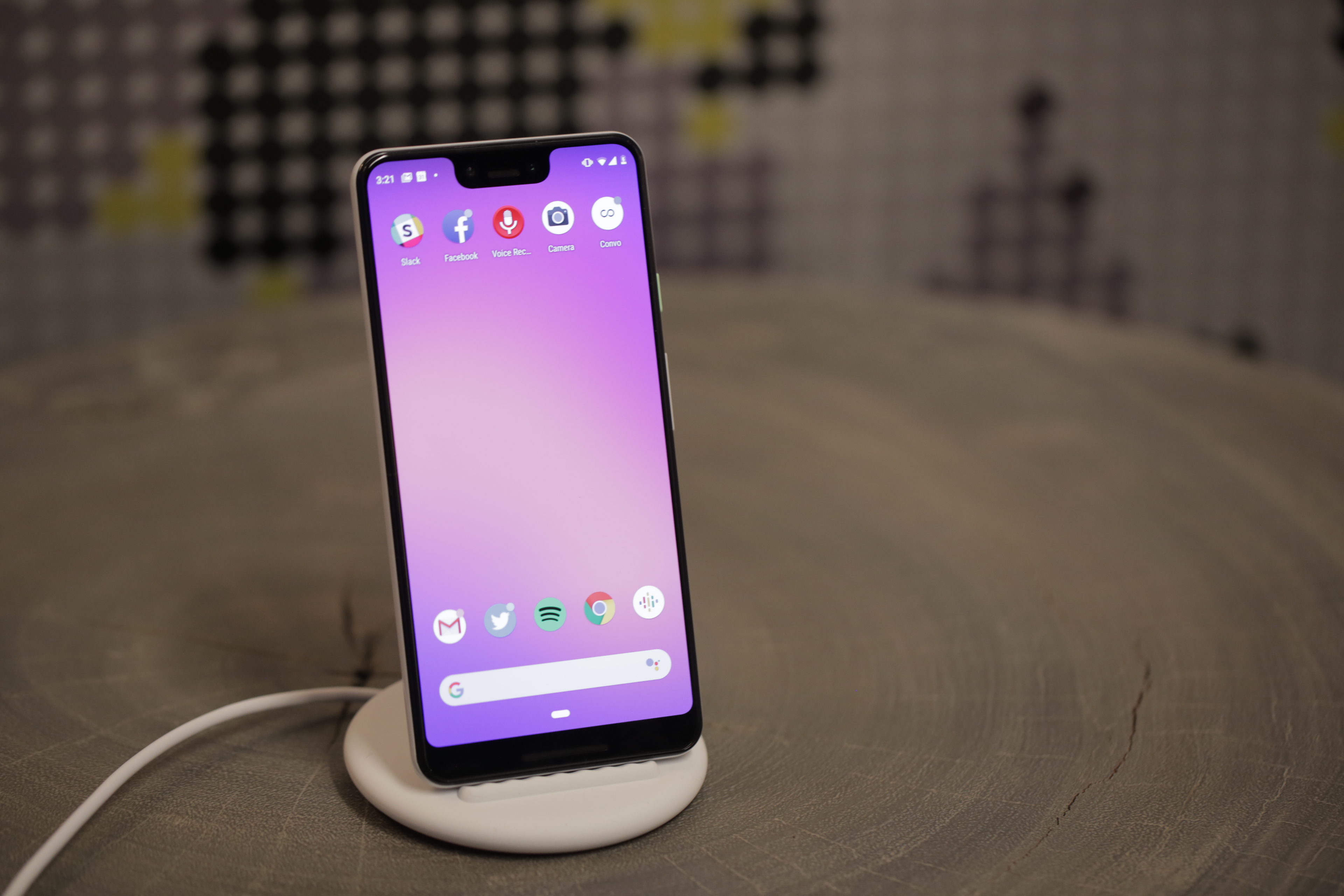
The Pixel Stand, meanwhile, is a smart little accessory. At $79, it’s one I’d consider strongly if picking up the handset. Granted, it lacks the ambition of Apple’s three-product-charging AirPower, but among its other clear advantages is the fact I’ve held it in my hand and can confirm it’s a real thing that actually exists. The accessory takes advantage of that glass back to charge wirelessly via the Qi standard.
The stand is soft and silicon and fairly minimalist, designed to go unseen when not in use. When it is, however, it transforms the Pixel into a makeshift Home Hub, serving up Google Photos and bringing a visual component to Assistant. It’s a clever take of the charging stand — and hopefully a good enough excuse to stop you from falling asleep with your phone every night.
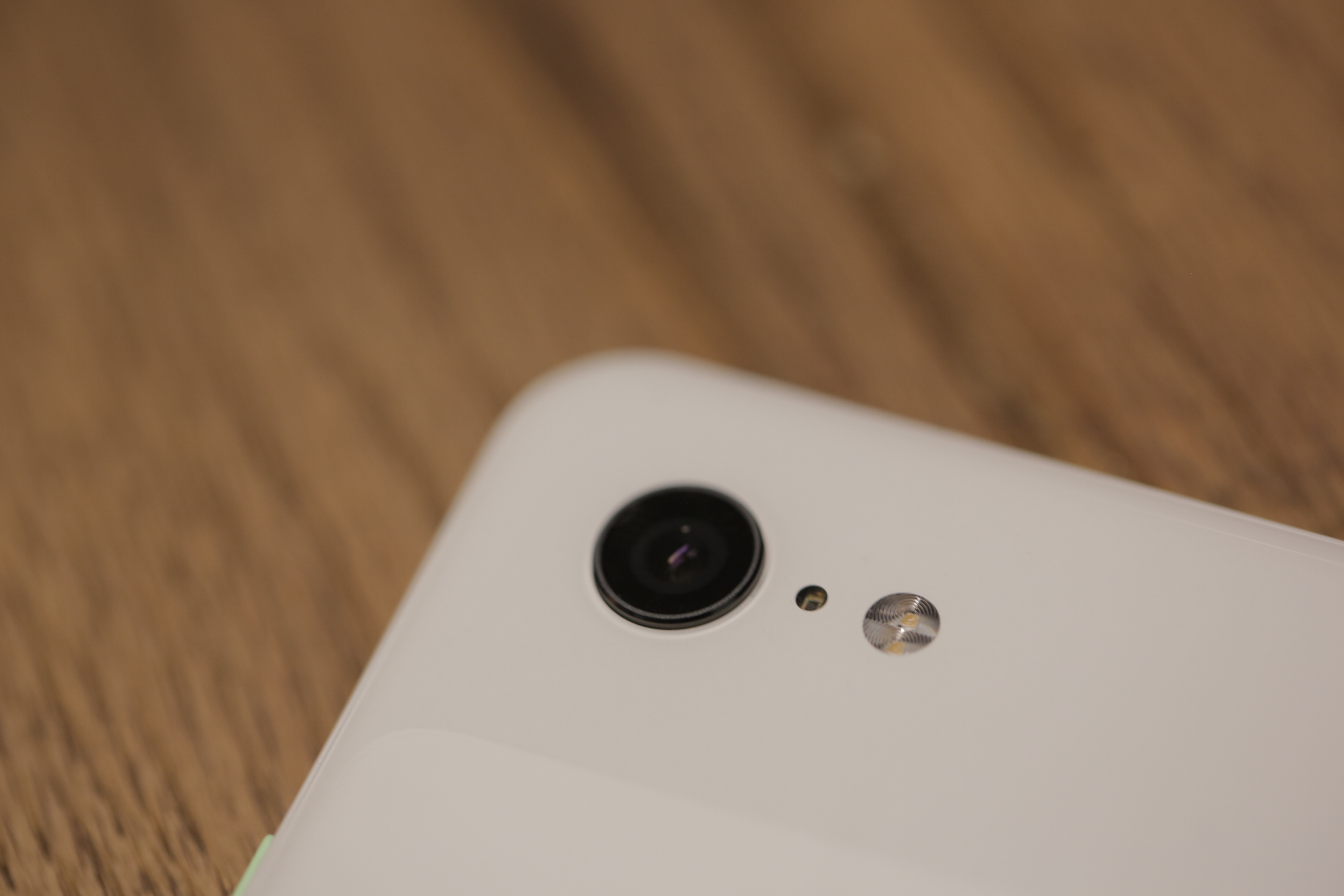
Okay, okay — it’s time to talk about the camera. We’ve got one of our reviewers doing a really in-depth testing on the Pixel camera, which you’ll be able to read as a standalone in the near future. For now, a couple of quick things to note.
The camera situation is a bit counterintuitive. There’s a second front-facing camera, while the back of the device bucks the industry standard of moving to two — or even three — lenses.
Rakowski again, “We look at all of the different configurations we can get. If we would have added another lens, it would have given us no benefit over what we get with one really good lens.”
That means, like the latest iPhone, the upgrades here are more software than hardware. If anyone gets the benefit of the doubt on that front, it’s Google. The company’s been making great strides in imaging, courtesy of silicon and machine learning, all of which were well demonstrated on the Pixel 2.
The Pixel 3 continues that grand tradition with some really impressive strides. Best of all, unlike many of the camera software tricks introduced by competitors in recent years, many of these additions are majorly useful day-to-day applications.
The camera software has HDR+ on by default — a smart move on Google’s part. While many users will buy the new Pixel based on photo performance, an even larger percentage of owners are unfamiliar with photog terms like HDR. I speak from experience, having personally enabled the feature on many friends’ phones.
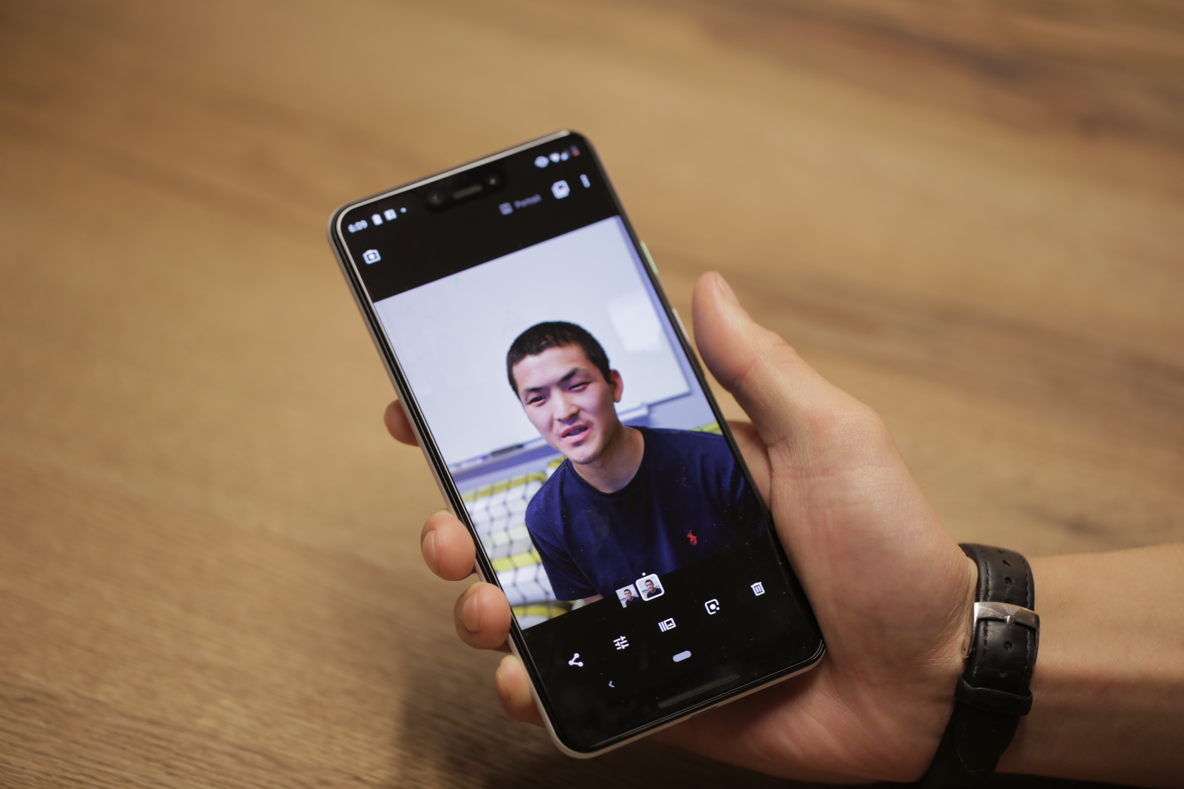
In Google’s application, the feature snaps eight frames more or less instantly, digitally stitching them together in a matter than impressively captures uneven light settings in a single frame. In fact, this kind of burst shooting is the key to many of the Pixel 3’s best features.
Take Top Shot. The feature utilizes the many frames taken when making a Motion Photo. Once the shot is taken, swipe up and you can scroll through the images on a timeline to pick the frame you want. Generally, the AI does a solid job picking the ideal image, but the ability to customize (assuming users can locate the feature) is certainly welcome.

That customization carries over into features like Portrait Mode. The Pixel has long done a solid job with the feature in spite of not having a full two cameras for depth sensing. Instead, the phone uses a dual lens to approximate a depth map. And while camera suppliers would no doubt argue the benefit of including a full second or third camera, it’s hard to quibble with the results here. Once a shot is taken, you can manually adjust the blurred-out bokeh effect behind the subject.

[Standard v Super Res Zoom]
Super Res Zoom also stitches together pieces of a photo to offer up a zoomed-in version. Here the tech actually builds upon your own shaky hands, using algorithmic tech to fill in the holes. It’s still no match for the optical zoom of telephotos like the one found on the new iPhone, but it definitely improves upon stand zoom.

[Left: iPhone XS, Right, Google Pixel 3 XL]
Night Sight, meanwhile, uses multiple shots to improve the color on low-light shots. It’s a clever workaround for a lack of dual-apertures, doing a fine job of brightening up photos. That said, there’s still noticeable noise on photos shot in dark settings.
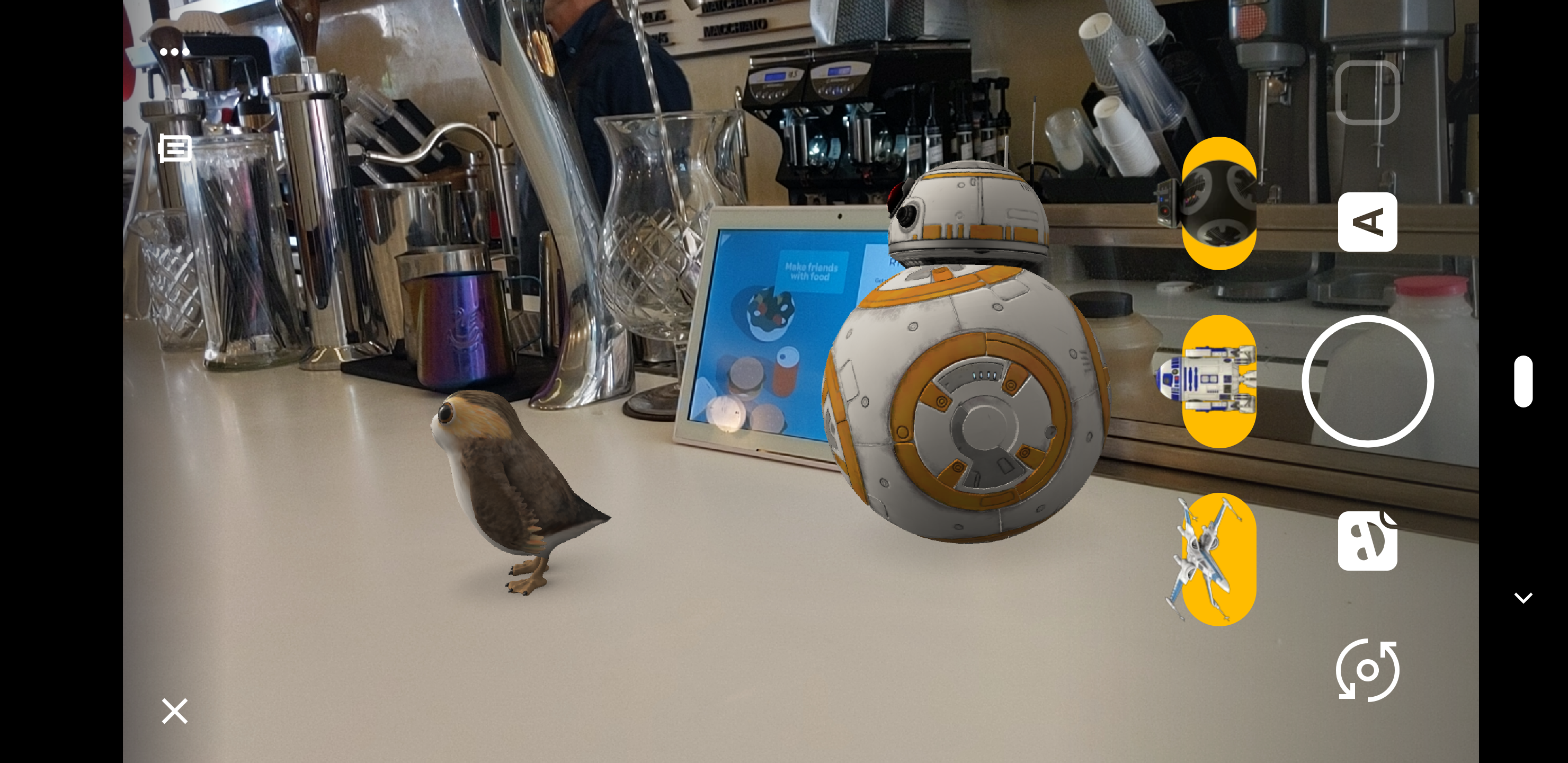
More camera features worth noting:
- Playground is a fun one-stop shop for augmented reality stickers. There are Star Wars and Avengers in there, among others. This is Google’s fun addition to the camera software. There are no Animojis or AR Emojis here, thanks to the lack of face detection, but it’s a fun glimpse at the future of in-camera AR.
- Lots of additional selfie options. The dual front-facing cameras means wide-angle selfies, for cramming in a larger group. The camera software, meanwhile, corrects the standard fish-eye lens distortion.
- Photobooth mode, meanwhile, will snap a shot when you smile.
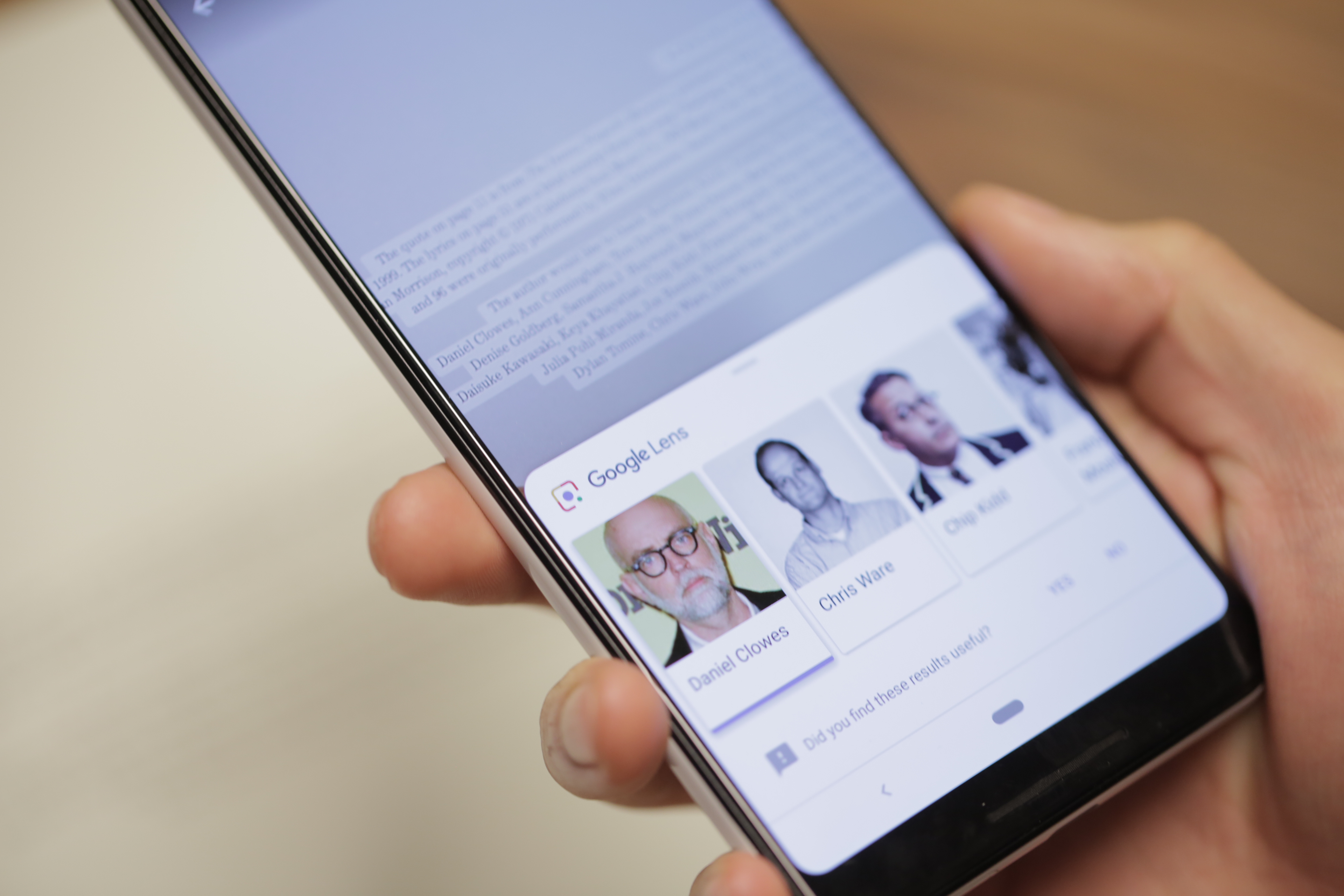
- Lens continues to impress. Check out the above shot of the thank you page from Adrian Tomine’s Killing and Day, which pops up faces and bios for those fellow authors mentioned.
A Google exec recently told me that price wasn’t really a factor when building hardware. In all things, however, the company is pragmatic. Google’s move away from the ongoing spec wars means the company isn’t chasing premium hardware for the sake of itself. That ultimately benefits the user from a pricing perspective.
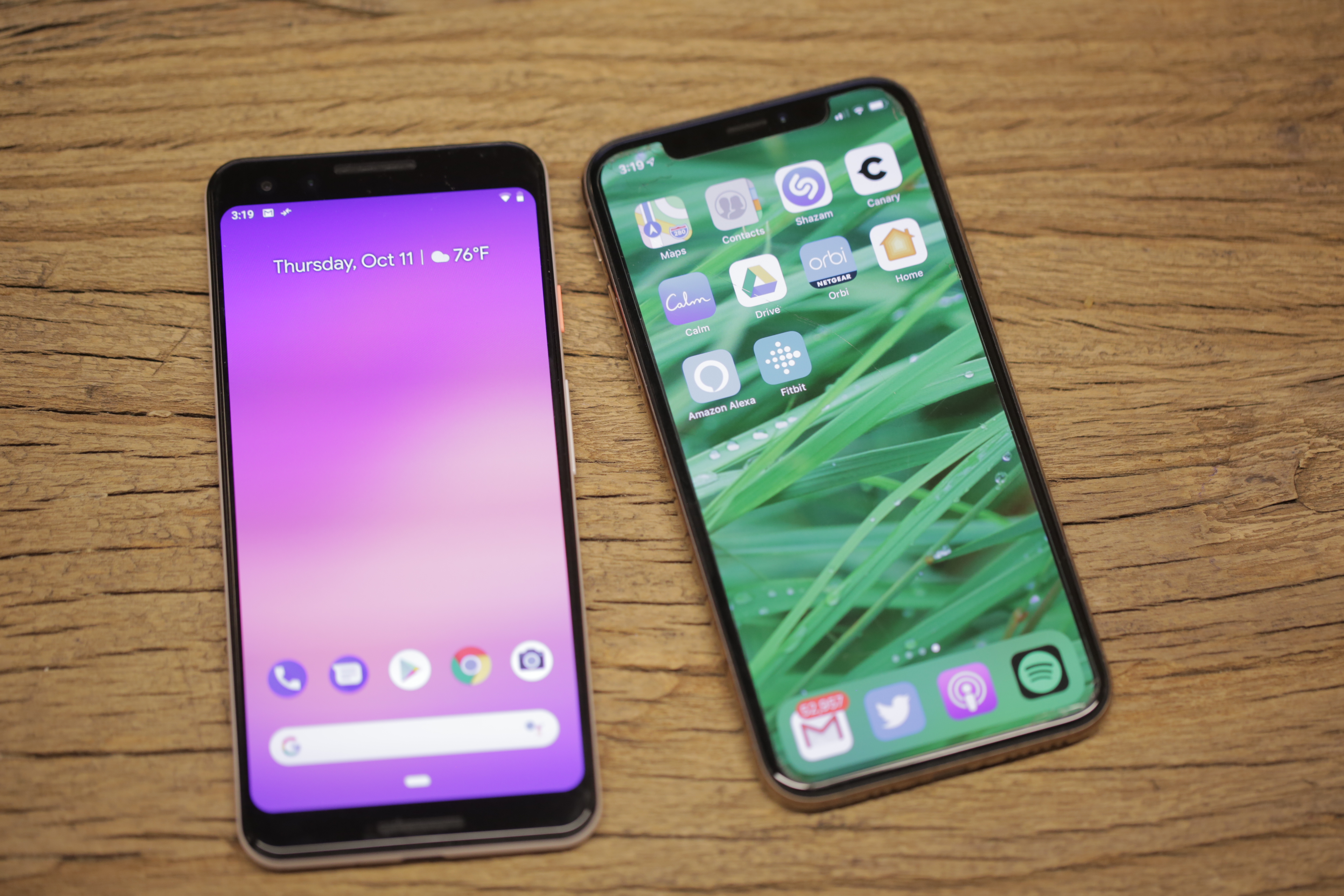
Google doesn’t lead with the fact that the Pixel 3 starts at $799, but in a world full of flagships that start at $200 more, maybe it should. Sure, it’s not exactly cheap, but these days, it feels like a downright steal for a top-tier flagship.
Like its predecessor, the Pixel 3 isn’t about flash. It is, however, another solid showcase for Google’s impressive innovations.
Read Full Article
No comments:
Post a Comment