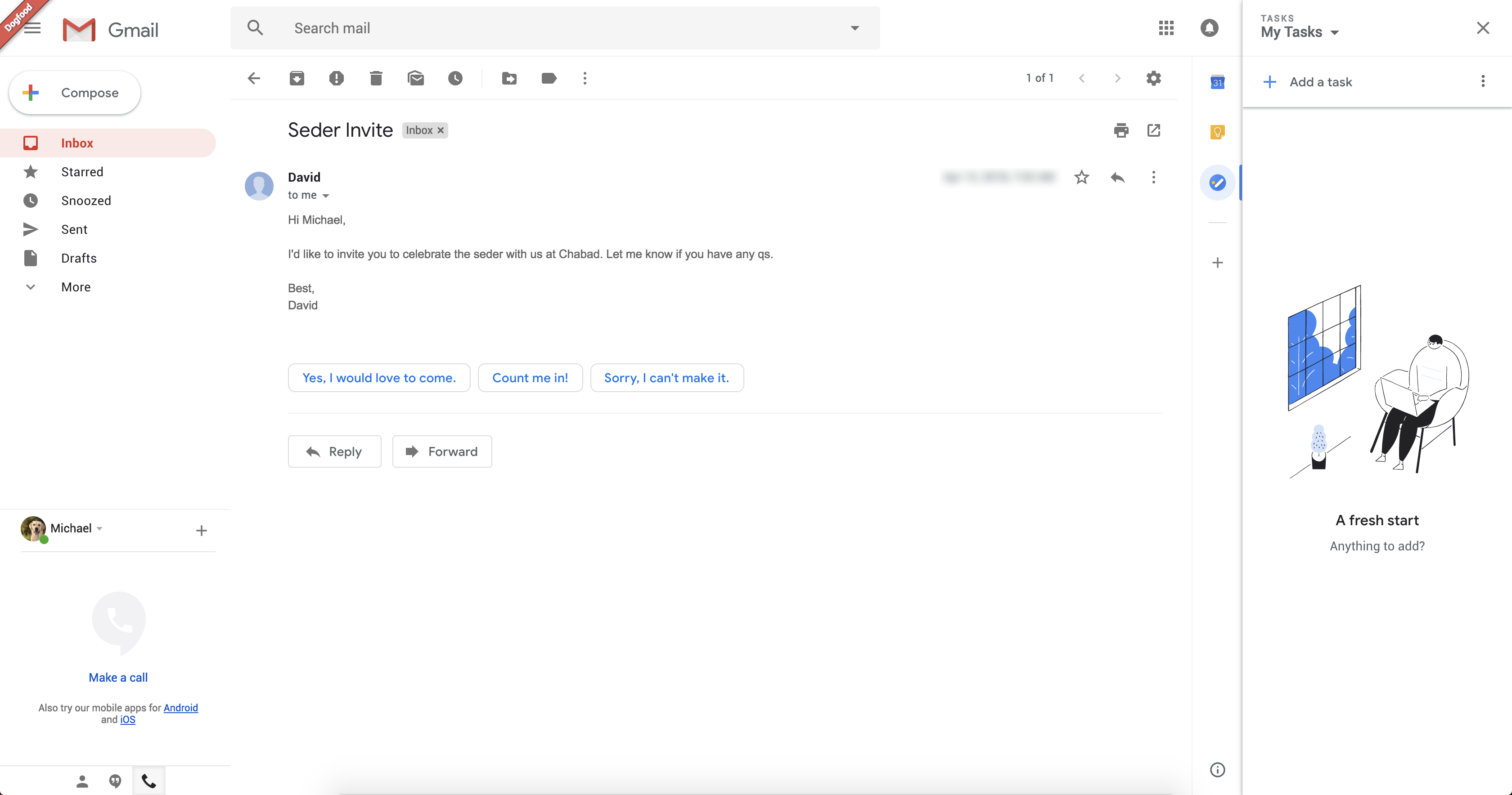
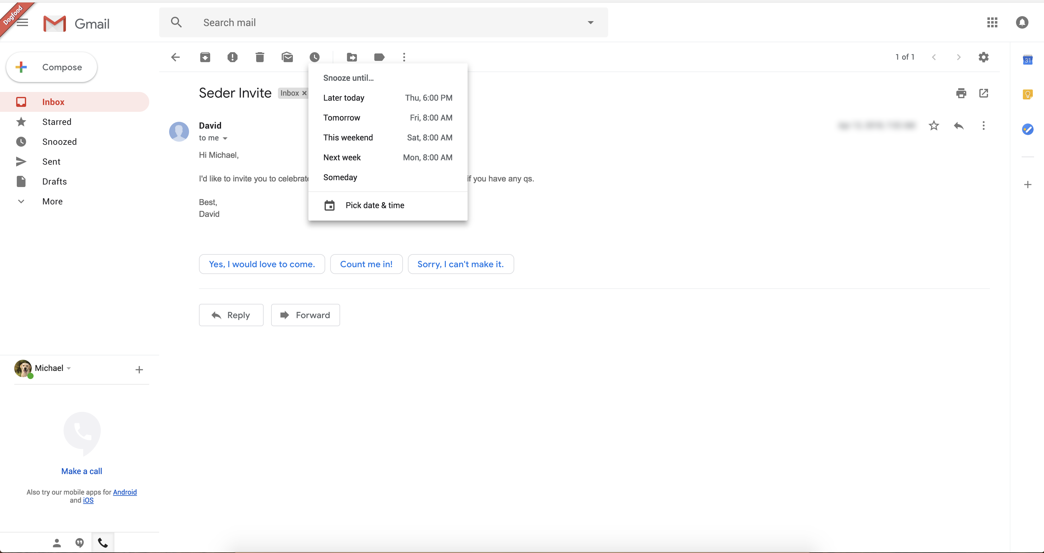
Yesterday, Google pressed the Send button too quickly and informed G Suite customers that a new Gmail was coming soon. TechCrunch obtained a few screenshots of the new interface from a tipster called Chaim. I confirmed the authenticity of those screenshots with another person who saw the new design. So here’s what you can expect.

As you can see, the new Gmail looks like a hybrid between the current Gmail interface and inbox.google.com. It isn’t a huge departure from the current interface metaphor. So existing Gmail users will still feel right at home.
The new Gmail also looks more like modern Google products with Material design. Android users know these buttons, colors and popups quite well already. All the text buttons have been replaced by icons and it looks much cleaner than before.
On those screenshots, you can see some of the new features that Google mentioned yesterday. You can snooze emails so that they reappear in your inbox hours or days later. On the screenshot, you can see “later today”, “tomorrow”, “this weekend”, “next week” and “someday”. There could be settings to configure those shortcuts.

As you can see, Gmail will suggest smart replies in each email thread. It seems to be working like in the mobile app with a handful of suggestions below the last email.
But the most interesting part is the column on the right-side of the screen. This expandable area lets you load widgets of other apps. By default, Gmail lets you open Google Calendar, Keep and Tasks so that you can add an event while replying to a thread.
Streak co-founder Aleem Mawani also told me that Gmail extensions, such as Clearbit, Streak and Dropbox, will be compatible with the new design. Many of those apps rely on the InboxSDK library, and it looks like you’ll be able to integrate apps in Gmail using the same SDK. According to Google, The new Gmail design is going to come out in a few weeks.

Read Full Article
No comments:
Post a Comment