07 April 2013

Why Gmail Redesigned the Compose Interface


Many people complained about the new UI for composing messages in Gmail, others found it useful, but it's interesting to know what's the main goal of the new interface. I initially thought that Google wanted make it easier to use other Gmail features while you're composing a message, but an article from Co.Design suggests something else.


What it looks like, really, is a slightly oversized version of Gchat. And that's no accident. Google's actively trying to make email less fussy and formal--or, in other words, to make it a little more like instant messaging. And as Jason Cornwell, Gmail's lead designer, explains, one of the ways to do that is simply to 'give you permission to write shorter messages.' (...) Picture the standard full-screen compose window. The one that gives you a dauntingly huge text box to fill and an array of options for formatting whatever you manage to put in it. What that really looks like, with its button-strewn toolbar, is an empty word processor--and according to Cornwell, what it communicates to users is this: 'Write something long. It was a space that was sort of intimidating, I think, to write a message like "Hey, wanna get lunch?"' he explains. 'We wanted the new compose to facilitate these quicker messages. Or at least make it a space where that felt appropriate.


Gmail's lead designer says that "a very small percentage of emails involve a formatting action," so that's the reason why you need two clicks instead of only one click to make text bold. Once you click the "formatting options" button, the bar stays open, so you can use other features without an additional click.


Co.Design argues that Gmail now competes with SMS, instant messaging and social networks, so Google had to simplify the interface "to keep up with the times".


The old interface:


The new interface:


4 Cool Features That Make Opera A Browser Worth Checking Out


why opera is the bestIt was only months ago that I finally made the transition from Firefox to Chrome, but it’s a decision I’m pleased with making. While I do feel like Google Chrome is the best browser out there for the average internet user, Opera will always be my favorite “dark horse” in the category.


Though it’s probably known best for it’s presence in the mobile space, Opera’s desktop browser has always had a good feel to it. It’s very fast, responsive, renders well, and is packed with so many features that other browsers carelessly overlook and don’t seem to consider. Let’s appreciate Opera in this post and check out a few of those features.


Speed Dial


While Opera is certainly not the only browser out that supports this feature anymore, it was easily one of the first.


why opera is the best


Opera’s Speed Dial page is very configurable, allowing you to change the number of columns on the page, the zoom level, and you can even set a custom background image to the page to give it more of a unique feel.


why use the opera browser


As you can see in the screenshot above, I’ve played with those settings a bit. Speed Dial is, in my opinion, the most sensible homepage available (in any browser). Opera has had years and years of experience with it, and they do it right.


Tab Arrangements & Placements


This may be one of the most underrated features available in any browser. As an unfortunate single-monitor user, I don’t get that great benefit of being able to do two things at once (in two different windows) very often. With Opera, I can.


why use the opera browser


Right-clicking the title bar and hovering over the Arrange menu will expand several different ways that you can arrange your open tabs. The cleanest and most convenient way is to tile them vertically (as resolutions are wider than they are tall).


why use the opera browser


You can surely imagine how this can be useful. Maybe you’re interested in watching a long video on YouTube while doing work in another window. Tile the windows, play the video, and do your work in the opposite window. This is so much more efficient than bringing up two copies of a single browser.


why opera browser


Opera also offers the ability to change the placement of your tab bar entirely. Top, bottom, left, or right are all fair game, and docking tabs to the left or right side will display your tabs in a more interesting thumbnail view.


Stacking Tabs


For the longest time, I had searched through add-ons and extensions for Firefox and Chrome to find something like this, but I failed. Does it exist? Possibly. But, it comes with Opera right out of the box. Stacking tabs is a way to basically assign a parent tab to additional tabs.


why opera browser


Above, you can see the MakeUseOf tabs are stacked. The main tab is the leftmost, while those after it can be stacked and then unstacked again.


why opera browser


How is this useful? It’s a great space-saver and synergizes very well with websites that may require you to have several different tabs open (such as Reddit). Assigning these tabs to a single stack will allow you to navigate and enjoy the website as normal without sacrificing a whole heap of real estate in the tab bar. Being able to stack tabs is something that I’d call a “quality of life” feature, and it’s something that has saved me headaches in the past.


Opera Turbo


Again, the only way to really describe a feature like this is to call it underrated. Opera Turbo is a very niche feature that is going to help such a small minority of users, but to those of who make some use it could see it as the deciding factor between Opera and another browser.


why opera is the best


To dumb the process down a bit, Opera Turbo simply lowers the quality of images on every website. If you don’t think this change is noticeable, try using a shoddy satellite or DSL connection. I’ve had to do it before, and it is. Right-clicking on an image will allow you to reload it in full quality if you desire. You can set Opera Turbo as on, off, or to detect when it needs to be used.


I wouldn’t call any of these features groundbreaking or exceptional. While some stand out more than others, they are quite simple. Nonetheless, it’s good to see Opera thinking outside of the box to provide users with features you won’t find somewhere else. What’s your favorite Opera feature? Let me know in the comments!


The post 4 Cool Features That Make Opera A Browser Worth Checking Out appeared first on MakeUseOf.


06 April 2013

Facebook Announces “Home”, A Social Homescreen For Android [Updates]


Android users will soon have a new way to connect with their friends and family. Facebook announced on Thursday that it is releasing “Home”, a homescreen replacement app designed to provide Android users with a more social experience.


Home replaces the Android standard homescreen with a Facebook-inspired set of features, giving you access to photos, status updates, and notifications without having to open their Facebook app. Non-Facebook apps will be accessible within Home, and features such as Messenger can be used simultaneously with these apps.


Home’s shining star is the Cover Feed—a replacement for the general homescreen and your lock screen. As already mentioned, the standard features of Facebook will be accessible using the Cover Feed as soon as you turn on your phone, without even having to unlock it.


Home will launch in the US on April 12 for devices running Android 4.0 and up. The international version of the app will be released at an unspecified time. AT&T’s HTC First is set to come with Home pre-installed (also available April 12), and tablets are expected to receive the Home app within the next few months.


In case you were wondering, Facebook has offered some reasoning for the creation of Home. According to the social network, we use our phones to access Facebook on a near-constant basis anyway, so why not make the device itself more socially-oriented than task-oriented?


Should phones really be more socially oriented? Or is Facebook going too far?


Sources: Facebook via TechCrunch


The post Facebook Announces “Home”, A Social Homescreen For Android [Updates] appeared first on MakeUseOf.


What Is Onion Routing, Exactly? [MakeUseOf Explains]


Internet privacy. Anonymity was one of the greatest features of the Internet in its youth (or one of its worst features, depending on who you ask). Leaving aside the sorts of problems that spring forth from anonymous interaction, such as the lack of consequences, Internet privacy and anonymity is important for preventing some serious crimes, like identity theft.


And so when topics related to Internet privacy pop up, you’ll often hear of “private browsing” and “proxy servers” and such. But honestly, the Internet is never truly anonymous. For the most part, your activities can be traced back to you; the only difference is how difficult it is to trace your actions back to you. That’s where “onion routing” comes in.


The Basics Of Onion Routing


One way to understand onion routing is to start with the concept of proxy servers. A proxy server is a server that relays your connection through that server, which basically adds a step in the path of your data packets. If someone traced your IP address, they’d see it as the proxy server’s IP address instead of your home address.


But proxy servers aren’t exactly anonymous. They keep logs of all the traffic that passes through, which means that they can actually point back to you if necessary. For most activities, the proxy server is fine even though it’ll add a bit of latency to your connection. Your anonymity would not be entirely protected, however, if your proxy service was hit with a subpoena for your IP information.


Onion routing is like an advanced form of proxy routing. Instead of routing through a single unprotected server, it uses a network of nodes that constantly encrypt your data packets at every step. Only at the end of this “chain” of onion nodes does your data become decrypted and sent to the final destination. In fact, only this “exit node” has the power to decrypt your message, so no other node can even see what you’re sending.


Due to the multiple layers of encryption, which not-so-coincidentally resemble the layers within an onion, it’s extremely difficult to trace your information back to you as the source when you use onion routing.


A Simple Example


Have you ever heard of Tor? It’s a secure network that uses onion routing to keep all of your activity as encrypted and hidden as possible. Did you know that Tor actually stands for “the onion router”? If that name sounded weird to you before, now you know why it’s called what it is.


Anyway, here’s an example using Tor to help you visualize the process of onion routing a little better. This abstract example that takes you on the journey of a data packet through Tor’s onion routing.


  • Your computer has an onion routing client installed, which in this case is Tor. This client encrypts all data packets sent from your computer (Alice).

  • Your computer sends a data packet to Node A.

  • Node A encrypts your already-encrypted data packet and sends it to Node B.

  • Node B encrypts your already-encrypted data packet and sends it to Node C.

  • This cycle continues until the data packet reaches Node Z, which is the “exit node.”

  • Node Z decrypts all of the layers of encryption on your data packet and finally sends it off to the destination (Bob). Destination thinks your data packet originated from Node Z, not you.

  • When data is sent back to you, the chain is reversed with Node Z becoming the first node and your computer being the exit node.


As you can see, the multiple layers of encryption make it really hard to break into your data packets. It’s like a vault within a vault within a vault – even if you break into one, you still have to break into all of the rest.


How You Can Benefit From Onion Routing


One way to utilize an onion routing network is to set up your website within the network to keep it secret from prying eyes. For example, you can do this on Tor to make it so only Tor network users can view and access your site. Some people might use this opportunity for dark and nefarious purposes, but there are also legitimate reasons for hiding your site on an encrypted network.


If you’re interested, check out Chris’s tutorial on setting up an anonymous Tor site.


But for the most part, Tor is used to maintain your anonymity on the regular Internet that everyone else uses. Don’t want huge corporations like Amazon, Google, and Microsoft to know everything about your browsing habits? Then set up a Tor client and start hiding your activity now. As far as I know, it’s the safest and most effective way to stay hooked up to the Internet while eliminating many privacy issues.


Conclusion


The takeaway? Just get it into your head that the Internet is not the anonymous free-for-all that it once had the reputation of being. Thanks to advancements in technology and logging methods, most actions can be traced back to the proper agent. Not to say that onion routing is foolproof, because all forms of security can be cracked, but the amount of effort needed to crack onion routing is enough to say that it’s an effective anonymizer.


If you’re a big privacy freak, you should look into the Tor network.


Image Credits: Actual Onion Via Shutterstock, People Network Via Shutterstock, Secure Website Via Shutterstock


The post What Is Onion Routing, Exactly? [MakeUseOf Explains] appeared first on MakeUseOf.


05 April 2013

5 Essential Websites For Planning A Trip To The Beach


A day at the beach is often imagined as the most relaxing vacation possible. But, like any trip, a visit to the beach isn’t always ideal. Coastal areas can have weather conditions dramatically different from those just fifty miles inland and water temperatures may be cold even when the weather is nice.


Just a few minutes of planning can ensure that your day (or week) at the beach is beautiful rather than windy, rainy or cold. Here are five websites that will help you decide when to travel.


Weather.com’s Marine Weather Page


This page is a solid weather source for people living in or visiting the United States who want to know simple, direct information about weather conditions. Just enter a location with 60 miles of the coast and you’ll be directed to not only local weather but also relevant sea conditions like temperature, wave height and tides.


You can also use this site to view the latest fishing forecasts and browse average coastal temperatures at popular locations on the Pacific, Atlantic and Gulf shores. That’s handy if you’re planning a trip for next spring and want to see when ocean temperatures warm to your liking.


BuoyWeather


This website is a worldwide authority maritime conditions. Its key features is a map, powered by Google Maps, that lets users browse conditions by pinpointing an exact location rather than looking up a nearby city.


The site’s focus on sea conditions makes it particularly useful for beach-goers who own or want to rent a boat. Buoy can tell you if conditions or clear or dangerous, and it can do this for any region in world, not just North America.


Buoy’s only downside is limited information and forecasting for free users. If you’d like to see if conditions will be good tomorrow, the free site is fine. But if you want to know about next week you’ll have to go premium by paying $14.95 per month or $79.95 per year.


The CDC’s Skin Cancer Page


Excessive exposure is a serious problem for beach-goers, and while many people know that wearing sunscreen is a generally good idea, most don’t know what kind to buy, or what other items might be useful.


That’s where the CDC’s Skin Cancer Page is helpful. Despite the alarmist name, the page is less about skin cancer itself and more about ways to protect yourself from coming home with an uncomfortable, skin-damaging sunburn. For example, did you know that a wet t-shirt blocks far fewer UV ways than a dry one?


Besides offering useful information, the CDC’s page will let you build a checklist of must-have items like sunblock, sunglasses, portable shades and spare clothing. All of this will make your visit more convenient and keep you from looking like a human lobster.


Bing Travel


Many people who live near a coast will make a day trip, but there’s a good chance you’re not one of those people. That means you’ll need to plan your stay with a hotel and perhaps a flight, and for that you should probably turn to Bing Travel.


By itself, Bing Travel doesn’t offer much. What it does do, however, is act as a launchpad from which the other major travel sites can be reached. This makes comparison shopping easy, and while many travel sites do promise the best price possible or convenient side-by-side shopping, going through Bing ensures you’re receiving the most accurate (and lowest) prices. Plus, it’s tied into Bing Maps, giving you an excuse to enjoy Microsoft’s unpopular but shockingly good Google Maps competitor.


Local Tourism Sites


You’re probably not just planning a trip to “the beach”. You’re probably planning a trip to a beach, which mostly likely resides in or near a town. And that town probably has a local tourism site.


Finding a town’s tourism information is usually as simple as searching Google for “town name” tourism. Entering the state, principality or country can narrow down multiple results.


Local tourism sites can offer a lot of useful information. They’ll point out local businesses including restaurants and hotels, provide directions to the most popular beaches (and often public parks or campgrounds, if nearby) and some will even serve up printable coupons that can save you money on food and lodging.


Finally, local tourism sites can inform you of important trip information a national site would miss including local traffic problem, closures and special events. Nothing can spoil a relaxing, romantic day at the beach more quickly than a family weekend or fisherman’s conference you didn’t know about.


Conclusion


These websites will help you make your trip to the beach as picture-perfect as possible. Do you know of any other helpful resources worth checking out? Let us know in the comments.


Image Credits: Joe Shlabotnik, City of Newport Oregon


The post 5 Essential Websites For Planning A Trip To The Beach appeared first on MakeUseOf.


Nokia Music App For Windows 8


CLICK HERE TO SEE FULL POST


Smartphone users who own Windows Phone powered devices have been enjoying the Nokia Music service for a while now with the help of official Nokia Music app. The premium music service from Nokia can now be enjoyed on your Windows 8 as well using Nokia Music app. Nokia just announced that Nokia Music app will [...]

Do You Love Or Hate April Fools’ Day Online? [We Ask You]


It’s now April, which means the one day of the year which celebrates jokers, pranksters, and trolls is over for another 12 months. I am of course referring to April Fools’ Day, an invented holiday that falls on April 1 each year. Some people love it, others hate it; there is very little middle ground.


In the real world most people don’t bother playing tricks on people for April Fools’, a fact we should all be grateful for. But the Web is a whole new ball game. And it seems to be getting worse. As someone who works online and who needs to be able to sort the fake news from the real news, I notice these things to the nth degree, but is it the same for everyone? And if so, does it bother you at all? This topic forms the basis for this week’s We Ask You discussion.


This Week’s Question…


We want to know, Do You Love Or Hate April Fools’ Day Online? It’s a simple question, but one which is likely to prompt passionate opinions on both sides. This probably only applies to those who are addicted to the Internet, because the rest of the population likely just takes a break from the Internet for this one day of the year. At least.


Every April Fools’ Day is the same, with Google playing numerous pranks on the public across its many services. Other companies tend to also get involved, though to a lesser degree. This year saw the likes of Sony, Nokia, Microsoft, Twitter, Netflix, Roku, Toshiba, Virgin, Samsung, and Soundcloud all making an effort.


Some April Fools’ Day gags are easy to spot and shared across the InterWebs by eagle-eyed people. But others are either much more difficult to figure out or don’t get enough attention to be flagged as mere jokes. Here are 8 April Fools’ Day pranks you may have missed this year, but are they entertaining or just annoying?


Do you appreciate these efforts by companies both big and small to troll their users? Or does it instead wind you up to the point that you’d forego using the product or service that the prank is connected to? Do you think we should all embrace April Fools’ Day online? Or rally against it until the culprits are forced to cease and desist?


Drawing Conclusions


All comments will be digested to form conclusions in a follow-up post next week where we will detail what You Told Us. One reader will be chosen for the coveted Comment Of The Week, getting their name up in lights, the respect of other readers, and 150 MakeUseOf points to use for MakeUseOf Rewards. What more motivation than that do you need to respond?


We Ask You is a weekly column dedicated to finding out the opinions of MakeUseOf readers. The questions asked are usually open-ended and likely to necessitate a discussion. Some are opinion-based, while others see you sharing tips and advice, or advocating tools and apps to fellow MakeUseOf Readers. This column is nothing without you, as MakeUseOf is nothing without you.


Image Credit: Sean MacEntee


The post Do You Love Or Hate April Fools’ Day Online? [We Ask You] appeared first on MakeUseOf.


Cut The Crap, Facebook – Give Me What I Want To Read


Every since its launch, we’ve seen Facebook change. And change. Again, and again, and again. While many changes are actually for the best, there’s one thing these updates never fails to add to our news feed: more clutter. There’s also something our ever-growing list of friends never fails to bring to our news feed: even more clutter. Between Facebook’s ads, sponsored posts, and upcoming “personalized” news feed, and your friends’ posts about politics, religion, babies, cats, and weddings, it’s getting harder and harder to see the things that really matter.


Are you ready to change that? Don’t get too excited, I haven’t found a magic way to re-design your Facebook feed according to your wildest dreams, but there are ways and tools that can help you focus on what you’re really interested in, while doing away with noise, boring posts, uninteresting people you’re not sure why you ever friended, and unnecessary announcements. Whether you’re only interested in links, in photos, or in a specific group of people, there’s a way to focus your updates on what you want to see.


Facebook’s Built-In Options


facebook-declutter


There are several ways to use Facebook’s built-in options to de-clutter your news feed. These include changing the way your feed is sorted, manually hiding posts you don’t like seeing as you stumble upon them, customizing which friends appear on your news feed and what kinds of updates you’re seeing from them, and creating Facebook lists that can help you curate your news feed according to how much you care.


None of these things is complicated, but it does take some patience to go through your settings and fix things up. If you’re up for it, head over to Tina’s post about managing your Facebook news feed, and learn exactly who you can perform each of these actions.


Unwhatever.me [Chrome]


Unwhatever.me is only one of nine different extensions that can help you clean up your news feed easily. The extensions are available for Chrome only, which is a shame, but do a swift job of purging certain keywords out of your Facebook life.


unwhatever.me


After installing the extension, specify the keywords you want to filter out in the extension’s options, and watch the magic at work. You can also set up a photo feed to replace the posts that get filtered out. The extension comes with an Instagram feed already built it (grumpy cat), but you can easily change the tag to show pictures you’d like. If you change your mind and what to see a hidden post, click “undo” to view it.


unwhatever.me[15]


If you’re too lazy to specify your own keywords, sibling extensions such as Unbaby.me, Unpolitic.me, Unfoodpic.me, and Unwedding.me can you help you get rid of common annoying subjects you may not care about. All extensions are available for Chrome, and can be downloaded from the Unwhatever.me page.


Social Fixer


Social Fixer is a Facebook-cleaning old timer, and can be used for much more than simple news feed filtering. The extension is available for any browser you can think of, besides Internet Explorer, and adds various tweaks and features to Facebook.


social-fixer-


One of the features Social Fixer offers is filtering. This isn’t as simple as Unwhatever.me, but if you’re willing to spend a few minutes on tweaking it, you can set up your news feed to really show only the things you’re interested in. You can filter our certain people, apps, keywords, etc., and set up different actions for your filters.


You can use Social Fixer to create different tabs for your news feed, and filter your content into those tabs. You can then ignore certain tabs for as long as you want, and explore them only when you feel like it.


Learn more about setting up Social Fixer and creating filters.


The New New New News Feed


Facebook’s news feed keeps changing, and the latest iteration will offer another built-in way to filter your news feed. Want to see only photos? No problem. Only music-related updates? There’s a feed for that. As it looks right now, there’s not going to be a way to create actual personalized news feeds, except for the already-existing lists.


new-news-feed-


Will the new news feed help silence the news feed noise, or increase it? That remains to be seen, but you can go a long way to getting a de-cluttered and focuses feed even without it.


Know of other ways to see only what you care about on Facebook? Share in the comments!


Image Credit: Funnel image via Shutterstock


The post Cut The Crap, Facebook – Give Me What I Want To Read appeared first on MakeUseOf.


Desktop Notifications for Google Voice


Some readers of this blog spotted a new feature of the Google Voice extension for Chrome: desktop notifications. I didn't notice it, since Google Voice can't be used outside US.


"I've recently started getting notifications from the Chrome Google Voice extension every time I receive a SMS to my GV number. Of particular interest is the icon, which looks like an amalgamation of communications services' icons. Is it a harbinger of the new unified messaging service rumored to be on the way?" says Alec, a read of this blog.


Apparently, Google works on a new product called Babel that integrates Google Talk, Gmail Chat, Google+ Hangouts, Google+ Messenger. "You'll get a seamless messenger experience across Android, iOS, Chrome, Google+ and Gmail. From what we have seen, there is no mention of Google Voice or other services outside of the five we just mentioned, but that doesn't necessarily mean they won't be there at some point. As of now, this is being tested internally as a cross-platform service," reports Droid Life.


{ Thanks, Alec and Evan. }


Improved Gmail Search Suggestions


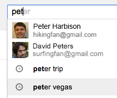
A recent post from Gmail's Google+ page mentioned 2 new Gmail search features: enhanced contact suggestions with thumbnails and suggestions from your Gmail search history.


"If you've searched your email for 'supercalifragilisticexpialidocious' or other lengthy phrases, it just got easier to find what you're looking for. Autocomplete predictions in Gmail may now include your past Gmail searches. Past searches as well as the new contact thumbnails shown below are rolling out to all Gmail users globally, including Google Apps for Business customers, over the next few days."


Are contact thumbnails in Gmail search a new feature? Not if you've previously joined the Gmail Field Trail, which adds many other cool features that integrate Gmail, Google Calendar, Google Drive and Google Search.


Updated Google Search Interface for Tablets


Google updated the search interface for tablets to make it look more like the desktop interface. There's now a "search tools" button that replaces the wrench button, "more" is a regular menu and the icons for specialized search engines have been removed.


Here's the new interface:


... and here's the old one (screenshot from October 2011, when Google tested this interface):


This is a much more recent screenshot: