21 October 2019

Pixel 4 review: Google ups its camera game


Google’s first-party hardware has always been a drop in the bucket of global smartphone sales. Pixel devices have managed to crack the top five in the U.S. and Western Europe, but otherwise represent less than 1% of the overall market. It’s true, of course, that the company got a late start, largely watching on the sidelines as companies like Samsung and Huawei shipped millions of Android devices.

Earlier this year, Google admitted that it was feeling the squeeze of slowing smartphone sales along with the rest of the industry. During Alphabet’s Q1 earnings call, CEO Sundar Pichai noted that poor hardware numbers were a reflection of “pressure in the premium smartphone industry.”

Introduced at I/O, the Pixel 3a was an attempt to augment disappointing sales numbers with the introduction of a budget-tier device. With a starting price of $399, the device seemingly went over as intended. The 3a, coupled with more carrier partners, helped effectively double year over year growth for the line. Given all of this, it seems like a pretty safe bet that the six-month Pixel/Pixela cycle will continue, going forward.

Of course, the addition of a mid-range device adds more onus for the company to differentiate the flagship. With a starting price of $799, the Pixel 4 certainly isn’t expensive by modern flagship standards. But Google certainly needs to present enough distinguishing features to justify a $400 price gulf between devices — especially as the company disclosed software upgrades introduced on flagship devices will soon make their way onto their cheaper counterparts.

Indeed, the much-rumored and oft-leaked devices bring some key changes to the line. The company has finally given in and added a dual-camera setup to both premium models, along with an upgraded 90Hz display, face unlock, radar-based gestures and a whole bunch of additional software features.

The truth is that the Pixel has always occupied a strange place in the smartphone world. As the successor to Google’s Nexus partnerships, the product can be regarded as a showcase for Android’s most compelling features. But gone are the days of leading the pack with the latest version of the operating system. The fact that OnePlus devices already have Android 10 means Google’s going head to head against another reasonably price manufacturer of quality handsets.
google pixel 4 009

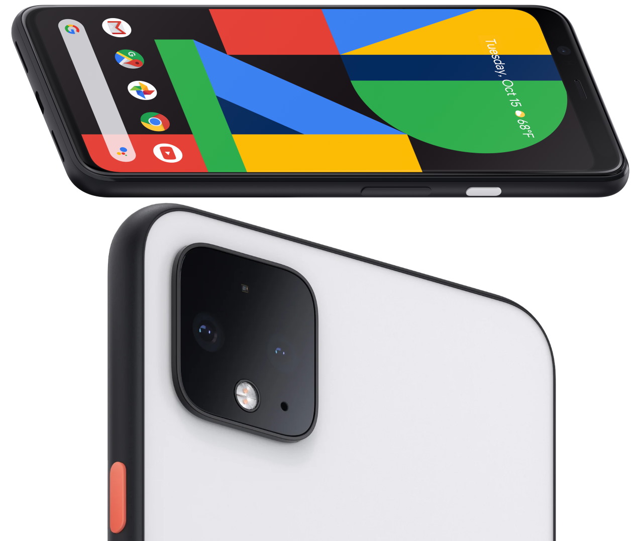
The Pixel line steps up a bit on the design side to distinguish the product from the “a” line. Google’s phones have never been as flashy as Samsung’s or Apple’s, and that’s still the case here, but a new dual-sided glass design (Gorilla Glass 5 on both), coupled with a metal band, does step up the premium feel a bit. The product is also a bit heavier and thicker than the 3, lending some heft to the device.

There are three colors now: black, white and a poppy “Oh So Orange,” which is available in limited quantities here in the U.S. The color power button continues to be a nice touch, lending a little character to the staid black and white devices. While the screen gets a nice update to 90Hz OLED, Google still has no interest in the world of notches or hole punches. Rather, it’s keeping pretty sizable bezels on the top and bottom.

The Pixel 4 gets a bit of a screen size boost from 5.5 to 5.7 inches, with an increase of a single pixel per inch, while the Pixel 4 XL stays put at 6.4 inches (with a PPI increase of 522 to 537). The dual front-facing camera has been ditched this time out, instead opting for the single eight megapixel, similar to what you’ll find on the 3a.

Storage hasn’t changed, with both 64 and 128GB options for both models; RAM has been bumped up to a default 6GB from 4GB last time out. The processor, too, is the latest and greatest from Qualcomm, bumping from a Snapdragon 845 to an 855. Interestingly, however, the batteries have actually been downgraded.
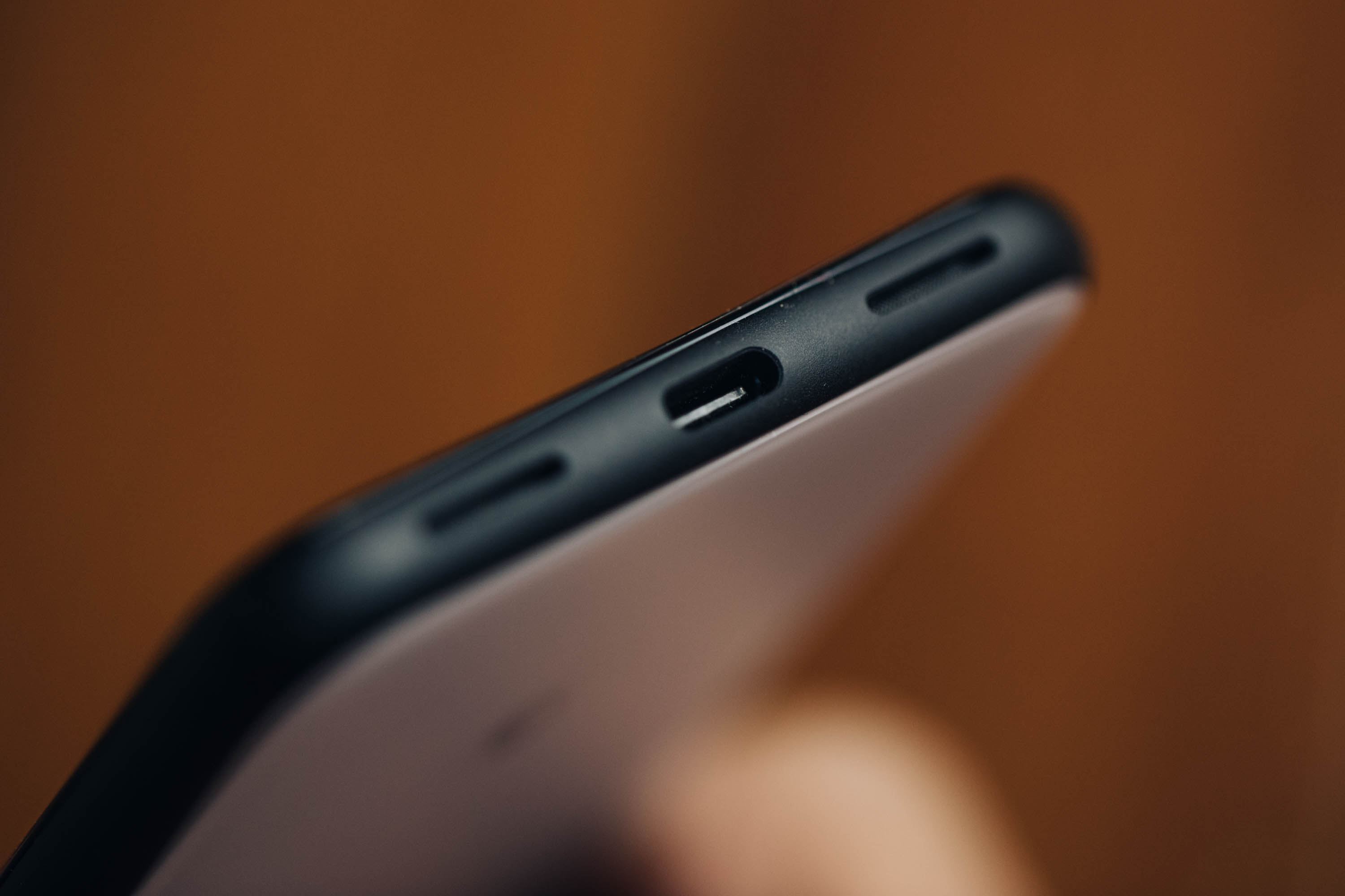
google pixel 4 013

The 4 and 4 XL sport a 2,800 and 3,700mAh, respectively. That should be augmented a bit by new battery-saving features introduced in Android 10, but even still, that’s not the direction you want to see these things going.

The camera is, in a word, great. Truth be told, I’ve been using it to shoot photos for the site since I got the phone last week. This Google Nest Mini review, Amazon Echo review and Virgin Galactic space suit news were all shot on the Pixel 4. The phone isn’t yet a “leave your DSLR at home” proposition, of course, but damn if it can’t take a fantastic photo in less than ideal and mixed light with minimal futzing around.

There’s no doubt that this represents a small but important shift in philosophy for Google. After multiple generations of suggesting that software solutions could do more than enough heavy lifting on image processing, the company’s finally bit the bullet and embraced a second camera. Sometimes forward progress means abandoning past stances. Remember when the company dug its heels in on keeping the headphone jack, only to drop it the following year?
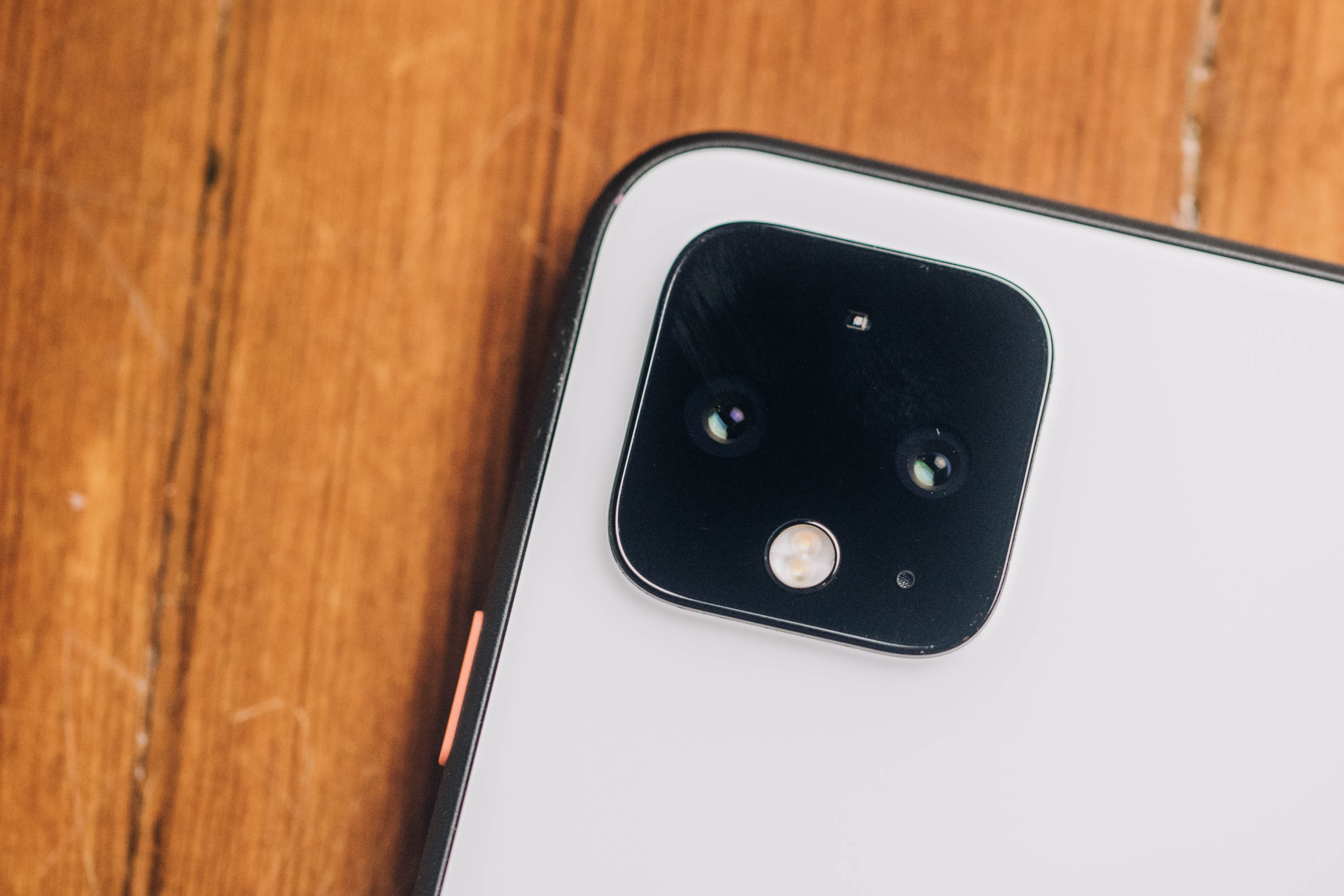
google pixel 4 010

The addition of a second camera isn’t subtle, either. In fact, it’s hard to miss. Google’s adopted a familiar square configuration on the rear of the device. That’s just how phones look now, I suppose. Honestly, it’s fine once you conquer a bit of trypophobia, with a pair of lenses aligned horizontally and a sensor up top and flash on bottom — as one of last week’s presenters half joked, “we hope you’ll use it as a flash light.”
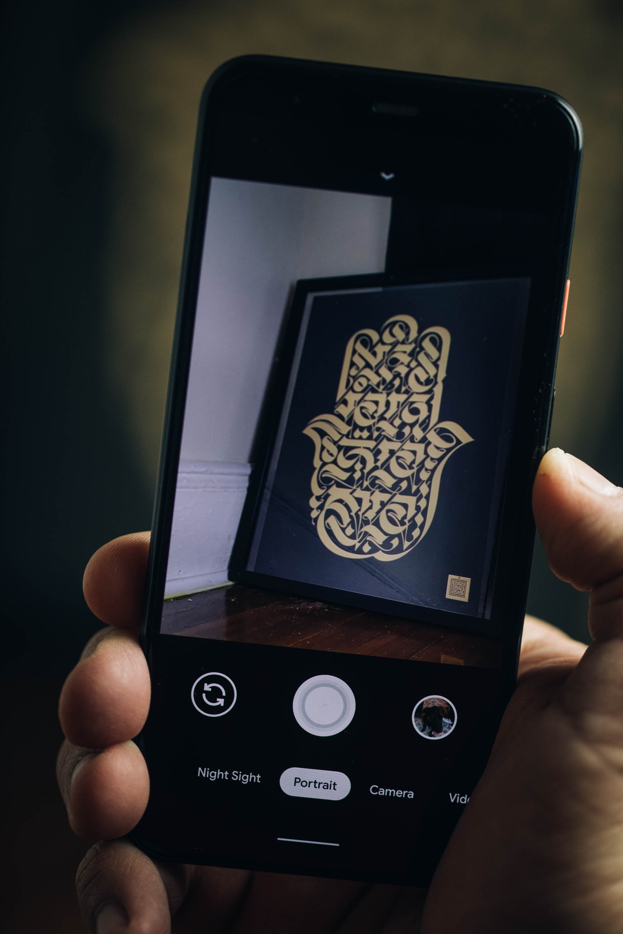
google pixel 4 008

That, of course, is a reference to the Pixel’s stellar low-light capabilities. It’s been a welcome feature, in an age where most smartphone users continue to overuse their flashes, completely throwing off the photo in the process. Perhaps the continued improvements will finally break that impulse in people — though I’m not really getting my hopes up on that front. Old habits, etc.

The 4 and 4 XL have the same camera set up, adopting the 12.2-megapixel (wide angle) lens from their predecessors and adding a 16-megapixel (telephoto) into the mix. I noted some excitement about the setup in my write-up. That’s not because the two-camera setup presents anything remarkable — certainly not in this area of three, four and five-camera flagships. It’s more about the groundwork that Google has laid out in the generations leading up to this device.

00100trPORTRAIT 00100 BURST20191016105119747 COVER 1

Essentially it comes down to this: Look at what the company has been able to accomplish using software and machine learning with a single camera setup. Now add a second telephoto camera into the mix. See, Super High Res Zoom is pretty impressive, all told. But if you really want a tighter shot without degrading the image in the process, optical zoom is still very much the way to go.

There’s a strong case to be made that the Pixel 4’s camera is the best in class. The pictures speak for themselves. The aforementioned TechCrunch shots were done with little or no manual adjustments or post-processing. Google offers on-screen adjustments, like the new dual-exposure control, which lets you manually adjust brightness and shadow brightness on the fly. Honestly, though, I find the best way to test these cameras is to use them the way most buyers will: by pointing and shooting.

[gallery ids="1900084,1900086,1900087,1900088,1900090,1900091,1900092"]

The fact is that a majority of people who buy these handsets won’t be doing much fiddling with the settings. As such, it’s very much on handset makers to ensure that users get the best photograph by default, regardless of conditions. Once again, software is doing much of the heavy lifting. Super Res Zoom works well in tandem with the new lens, while Live HDR+ does a better job approximating how the image will ultimately look once fully processed. Portrait mode shots look great, and the device is capable of capturing them at variable depths, meaning you don’t have to stand a specific distance from the subject to take advantage of the well-done artificial bokeh.

Our video producer, Veanne, who is admittedly a far better photographer than I can ever hope to be, tested out the camera for the weekend. 

[gallery ids="1900045,1900046,1900047,1900048,1900049,1900050,1900051,1900052"]

Although Veanne was mostly impressed by the Pixel 4’s camera and photo editing capabilities, here are three major gripes.

“Digital zoom is garbage.”

Google Pixel 4 digital zoom is garbage


“In low lighting situations, you lose ambiance. Saturday evening’s intimate, warmly lit dinner looked like a cafeteria meal.”

Pixel 4 camera sample


“Bright images in low lighting gives you the impression that the moving objects would be in focus as well. That is not the case.”


Other additions round out the experience, including “Frequent Faces,” which learns the faces of subjects you frequently photograph. Once again, the company is quick to point out that the feature is both off by default and all of the processing happens on the device. Turning it off also deletes all of the saved information. Social features have been improved, as well, with quick access to third-party platforms like Snapchat and Instagram.

Google keeps pushing out improvements to Lens, as well. This time out, language translation, document scanning and text copy and pasting can be performed with a quick tap. Currently the language translation is still a bit limited, with only support for English, Spanish, German, Hindi and Japanese. More will be “rolling out soon,” per the company.
google pixel 4 003

Gestures is a strange one. I’m far from the first to note that Google is far from the first to attempt the feature. The LG G8 ThinQ is probably the most recent prominent example of a company attempting to use gestures as a way to differentiate themselves. To date, I’ve not seen a good implementation of the technology — certainly not one I could ever see myself actually using day to day.

The truth is, no matter how interesting or innovative a feature is, people aren’t going to adopt it if it doesn’t work as advertised. LG’s implementation was a pretty big disappointment.

Simply put, the Pixel’s gestures are not that. They’re better in that, well, they work, pretty much as advertised. This is because the underlying technology is different. Rather than relying on cameras like other systems, the handset uses Project Soli, a long-promised system that utilizes a miniature radar chip to detect far more precise movement.

Soli does, indeed work, but the precision is going to vary a good deal from user to user. The thing is, simply detecting movement isn’t enough. Soli also needs to distinguish intention. That means the system is designed to weed out accidental gestures of the manner we’re likely making all the time around our phones. That means the system appears to be calibrated to bigger, intentional movements.
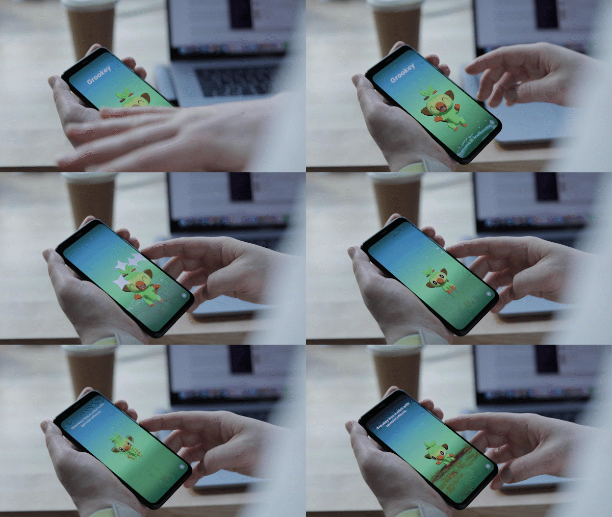
picka 2

That can be a little annoying for things like advancing tracks. I don’t think there are all that many instances where waving one’s hands across a device Obi-Wan Kenobi-style is really saving all that much time or effort versus touching a screen. If, however, Google was able to customize the experience to the individual over time using machine learning, it could be a legitimately handy feature.

That brings us to the next important point: functionality. So you’ve got this neat new piece of tiny radar that you’re sticking inside your phone. You say it’s low energy and more private than a camera. Awesome! So, how do you suggest I, you know, use it?

There are three key ways, at the moment:

  • Music playback
  • Alarm Silencing
  • Waving at Pokémon

The first two are reasonably useful. The primary use case I can think of are when, say, your phone is sitting in front of you at your desk. Like mine is, with me, right now. Swiping my hand left to right a few inches above the device advances the track. Right to left goes a track back. The movements need to be deliberate, from one end of the device to the other.

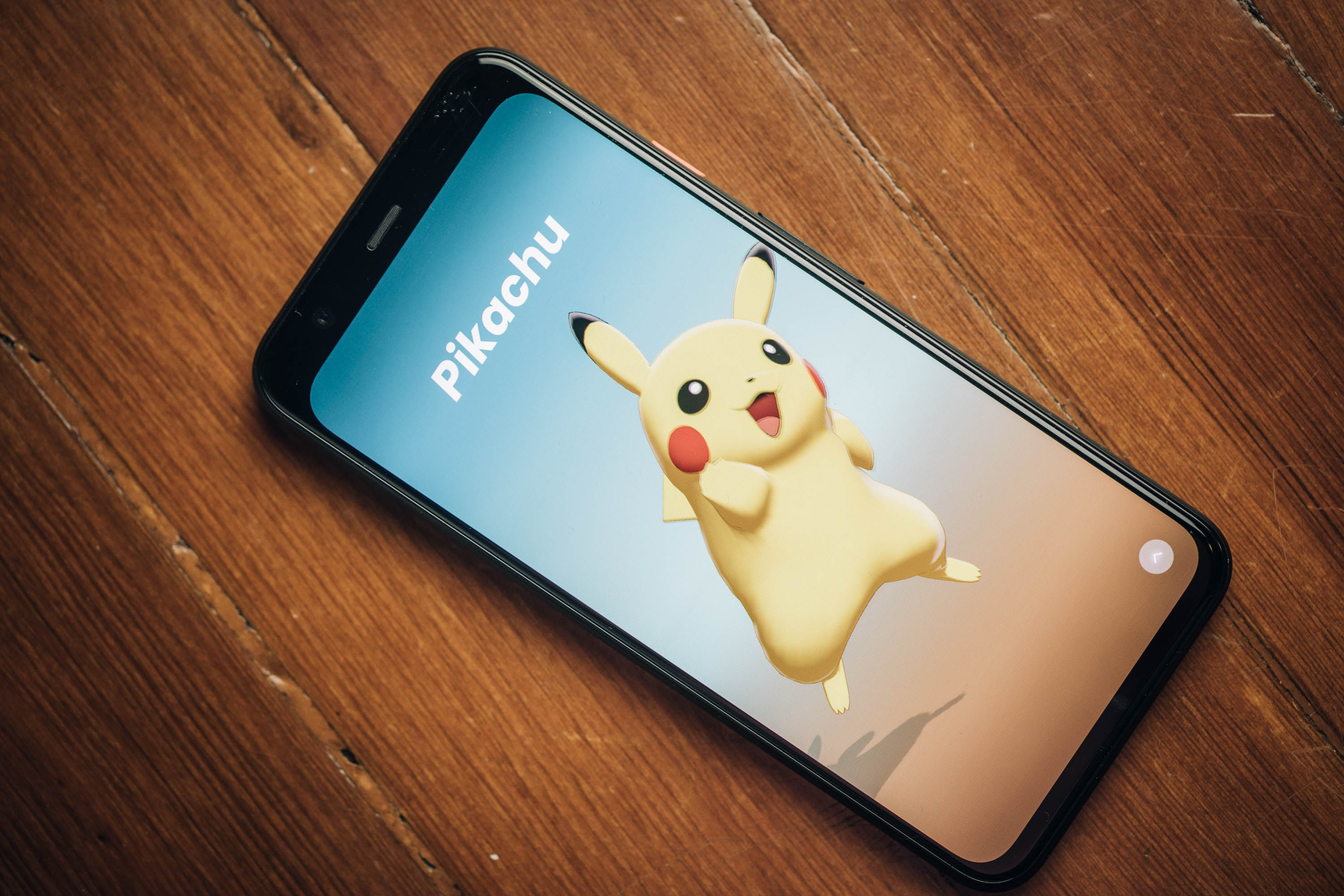
And then there’s the phenomenon of “Pokémon Wave Hello.” It’s not really correct to call the title a game, exactly. It’s little more than a way of showcasing Motion Sense — albeit an extremely delightful way.

You might have caught a glimpse of it at the keynote the other day. It came and went pretty quickly. Suddenly Pikachu was waving at the audience, appearing out of nowhere like so many wild Snorlaxes. Just as quickly, he was gone.

[gallery ids="1900104,1900106,1900107,1900108,1900109,1900110,1900111,1900112,1900113,1900114,1900115,1900116,1900117"]

More than anything, it’s a showcase title for the technology. A series of five Pokémon, beginning with Pikachu, appear demanding you interact with them through a series of waves. It’s simple, it’s silly and you’ll finish the whole thing in about three minutes. That’s not really the point, though. Pokémon Wave Hello exists to:

  1. Get you used to gestures.
  2. Demonstrate functionality beyond simple features. Gaming, AR — down the road, these things could ultimately find fun and innovative ways to integrate Soli.

For now, however, use is extremely limited. There are some fun little bits, including dynamic wallpaper that reacts to movement. The screen also glows subtly when detecting you — a nice little touch (there’s a similar effect for Assistant, as well).

Perhaps most practical, however, is the fact that the phone can detect when you’re reaching for it and begin the unlocking process. That makes the already fast new Face Unlock feature ever faster. Google ditched the fingerprint reader this time around, opting for neither a physical sensor nor in-screen reader. Probably for the best on the latter front, given the pretty glaring security woes Samsung experienced last week when a British woman accidentally spoofed the reader with a $3 screen protector. Yeeesh.

There are some nice security precautions on here. Chief among them is the fact that the unlock is done entirely on-device. All of the info is saved and processed on the phone’s Titan M chip, meaning it doesn’t get sent up to the cloud. That both makes it a speedier process and means Google won’t be sharing your face data with its other services — a fact Google felt necessary to point out, for obvious reasons.

For a select few of us, at least, Recorder feels like a legitimate game changer. And its ease of use and efficacy should be leaving startups like Otter.ai quaking at its potential, especially if/when Google opts to bring it to other Android handsets and iOS.

I was initially unimpressed by the app upon trying it out at last week’s launch event. It struggles to isolate audio in noisy environments — likely as much of a hardware as software constraint. One on one and it’s far better, though attempting to, say, record audio from a computer can still use some work.
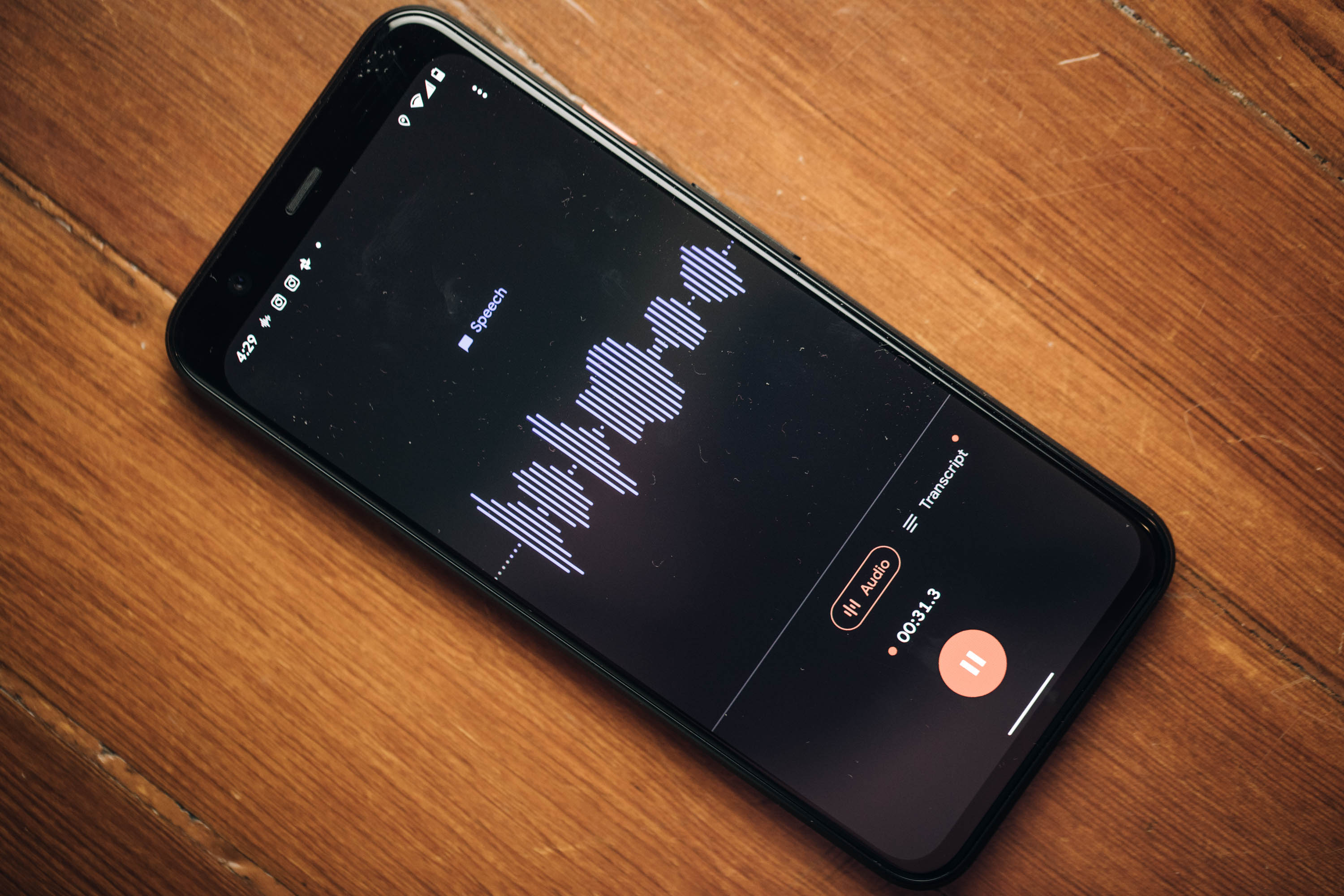
google pixel 4 004

Open the app and hit record and you’ll see a waveform pop up. The line is blue when detecting speech and gray when hearing other sounds. Tap the Transcript button and you’ll see the speech populate the page in real time. From there you can save it with a title and tag the location.

The app will automatically tag keywords and make everything else searchable for easy access. In its first version, it already completely blows Apple’s Voice Memos out of the water. There’s no comparison, really. It’s in a different league. Ditto for other apps I’ve used over the years, like Voice Record.

Speaking to the product, the recording was still a little hit or miss. It’s not perfect — no AI I’ve encountered is. But it’s pretty good. I’d certainly recommend going back over the text before doing anything with it. Like Otter and other voice apps, you can play back the audio as it highlights words, karaoke-style.

The text can be saved to Google Drive, but can’t be edited in app yet. Audio can be exported, but not as a combined file. The punctuation leaves something to be desired and Recorder is not yet able to distinguish individual voices. These are all things a number of standalone services offer, along with a web-based platform. That means that none of them are out of business yet, but if I was running any of them, I’d be pretty nervous right about now.

As someone who does interviews for a living, however, I’m pretty excited by the potential here. I can definitely see Recorder become one of my most used work apps, especially after some of the aforementioned kinks get ironed out in the next version. As for those who don’t do this for a living, usefulness is probably a bit limited, though there are plenty of other potential uses, like school lecturers.
google pixel 4 005

The Pixel continues to distinguish itself through software updates and camera features. There are nice additions throughout that set it apart from the six-month-old 3a, as well, including a more premium design and new 90Hz display. At $799, the price is definitely a vast improvement over competitors like Samsung and Apple, while retaining flagship specs.

The Pixel 4 doesn’t exactly address what Google wants the Pixel to be, going forward. The Pixel 3a was confirmation that users were looking for a far cheaper barrier of entry. The Pixel 4, on the other hand, is priced above OnePlus’s excellent devices. Nor is the product truly premium from a design perspective.

It’s unclear what the future will look like as Google works to address the shifting smartphone landscape. In the meantime, however, the future looks bright for camera imaging, and Google remains a driving force on that front.


Read Full Article

20 October 2019

Giphy Arcade Lets You Create and Play Mini Games


Giphy has launched Giphy Arcade, which lets you create, play, and share your own mini-games. Giphy is best known as a search engine for GIFs, and Giphy Arcade is an attempt to bring the thinking behind GIFs to gaming. And it kinda works.

How to Create and Play Giphy Arcade Games

Giphy Arcade is essentially a database of mini-games you can play online. There are a limited number of styles of game available, but beyond that every element is customizable. So while the gameplay will feel familiar, the art style and music may not.

Giphy Arcade has three different components. At its core, it lets you play mini-games quickly and easily on the web regardless of the device you’re using. However, you can also remix the games to your own liking, and share them online with a single link.

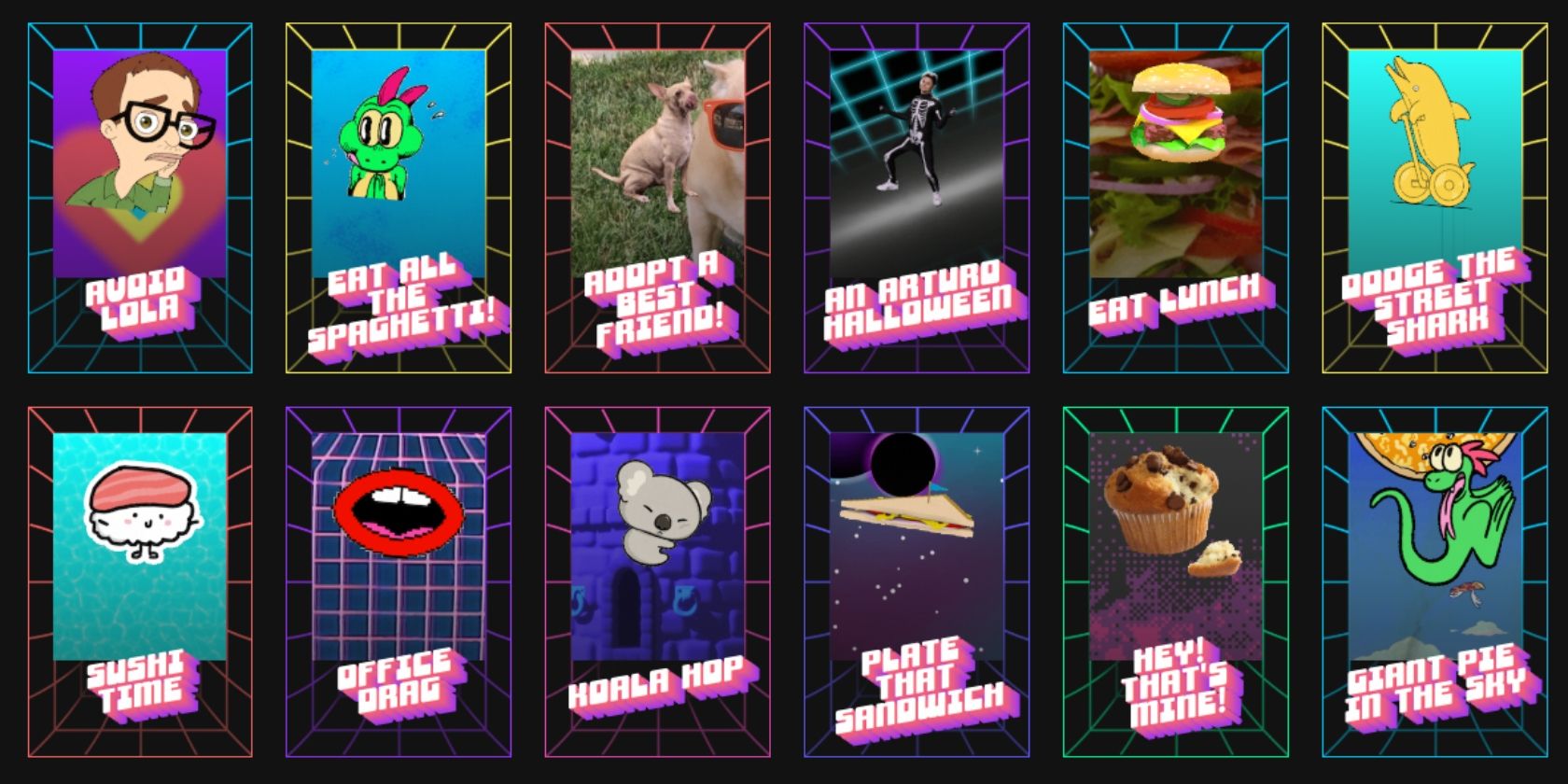
To create a game from scratch you first choose a game template. Game styles include Floppy Bard, Runner, Blast ‘Em Up, and Brick Buster. Then, you choose your hero and other graphical components, plus your soundtrack. Finally, give it a title, and it’s ready.

You can also remix any game you play on Giphy Arcade, customizing it with your own characters and components. Either way, your game will be given a simple URL which you can share with family, friends, and/or everyone online as easily as you would share a GIF.

Giphy Arcade Could Turn Everyone Into Gamers

The games on Giphy Arcade aren’t going to win any awards. They’re simple twists on old-skool genres we’ve all seen before. However, they’re fun to play, and the ability to create your own web-based mini-game is rather compelling. See my effort, Chuck Norris Rulez.

Giphy Arcade could help turn more people into gamers too. Because even your gran could get the hang of these simple efforts. And once your gran has become a gamer, she should check out our list of addictive mobile games you can play for five minutes at a time.

Read the full article: Giphy Arcade Lets You Create and Play Mini Games


Read Full Article

The Essential CSS3 Properties Cheat Sheet


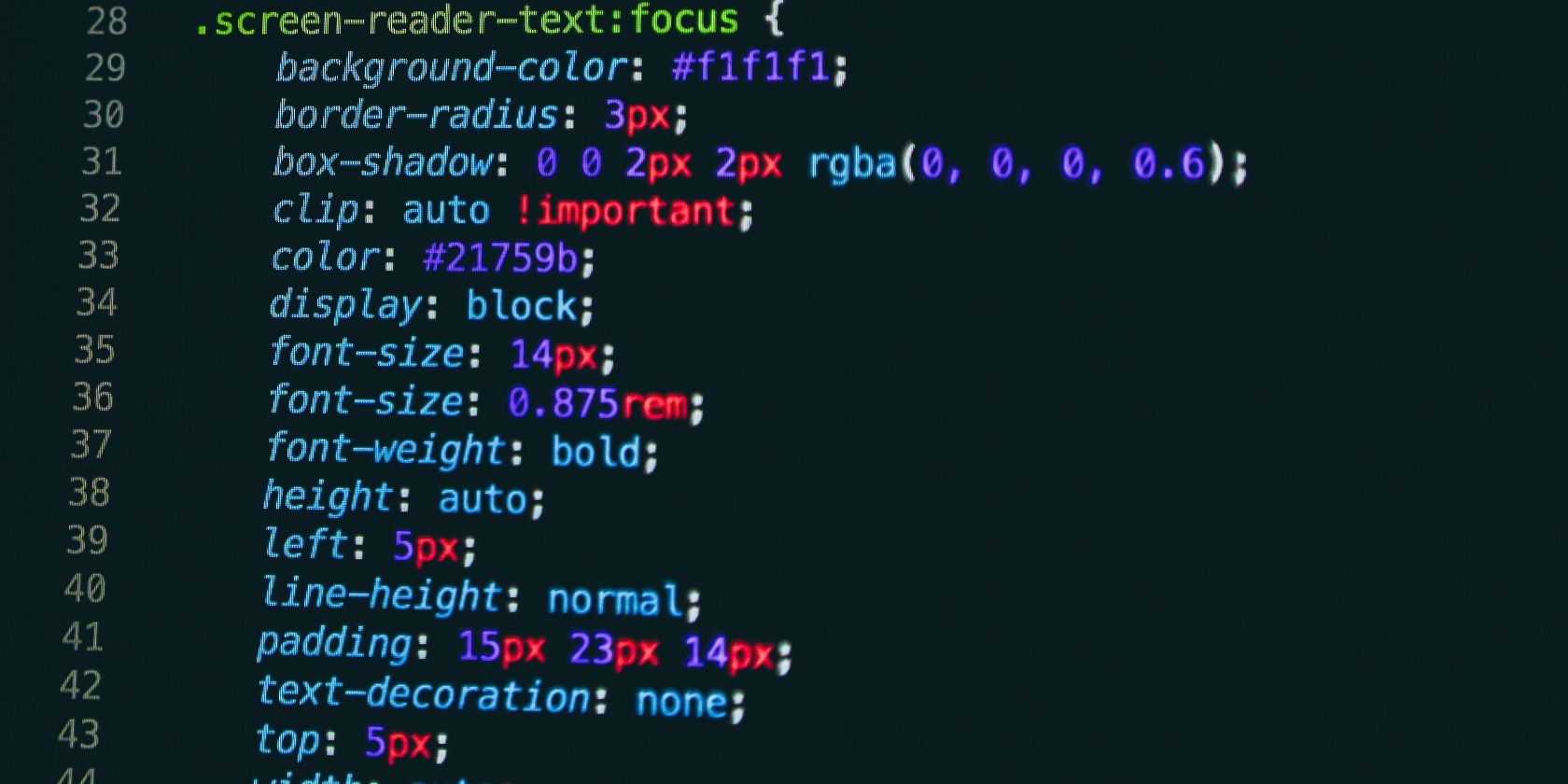
Screenshot of sample CSS properties used in a code snippet

Cascading Style Sheets or CSS define the look and feel of the web as we know it. While HTML and JavaScript focus on the functional side of the web, CSS deals with the visual aspects of it.

Need help navigating the world that is CSS3? Download our "Essential CSS3 Properties Cheat Sheet" today!

After you’ve learned how to build static webpages with HTML, it’s time to discover how to style them and make them presentable with CSS. And our CSS3 properties cheat sheet below can help you with that! It covers the essential syntax you need to know about in CSS3, which is the latest version of CSS.

A working knowledge of CSS helps you customize colors, fonts, borders, backgrounds, layouts, and much more on webpages in a streamlined manner. What’s more, it comes in handy while designing web and mobile applications too.

FREE DOWNLOAD: This cheat sheet is available as a downloadable PDF from our distribution partner, TradePub. You will have to complete a short form to access it for the first time only. Download Essential CSS3 Properties Cheat Sheet.

The Essential CSS3 Properties Cheat Sheet

Shortcut Action
Background Properties
background Defines a variety of background properties within one declaration.
background-attachment Specifies whether the background image is fixed or scrolls with the webpage.
background-color Defines the background color of an element on the webpage.
background-image Defines an element’s background image.
background-clip Specifies how far the background images or color extends for an element.
background-origin Specifies the positioning area of the background images.
background-position Defines the origin of a background image.
background-repeat Specifies how the background image is tiled.
background-size Specifies the size of the background images.
Border Properties
border Sets the border width, style, and color for all four sides of an element.
border-bottom Sets the width, style, and color for the bottom border of an element.
border-bottom-color Sets the color of the bottom border of an element.
border-bottom-left-radius Defines the shape of the bottom-left border corner of an element.
border-bottom-right-radius Defines the shape of the bottom-right border corner of an element.
border-bottom-style Sets the style of the bottom border of an element.
border-bottom-width Sets the width of the bottom border of an element.
border-color Sets the color of the border on all the four sides of an element.
border-image Specifies how an image is to be used in place of the border styles.
border-image-outset Specifies the amount by which the border image area extends beyond the border box.
border-image-repeat Specifies how the border image is tiled.
border-image-slice Specifies the inward offsets of the image-border.
border-image-source Specifies the location of the image to be used as a border.
border-image-width Specifies the width of the image-border.
border-left Sets the width, style, and color of the left border of an element.
border-left-color Sets the color of the left border of an element.
border-left-style Sets the style of the left border of an element.
border-left-width Sets the width of the left border of an element.
border-radius Defines the shape of the border corners of an element.
border-right Sets the width, style, and color of the right border of an element.
border-right-color Sets the color of the right border of an element.
border-right-style Sets the style of the right border of an element.
border-right-width Sets the width of the right border of an element.
border-style Sets the style of the border on all the four sides of an element.
border-top Sets the width, style, and color of the top border of an element.
border-top-color Sets the color of the top border of an element.
border-top-left-radius Defines the shape of the top-left border corner of an element.
border-top-right-radius Defines the shape of the top-right border corner of an element.
border-top-style Sets the style of the top border of an element.
border-top-width Sets the width of the top border of an element.
border-width Sets the width of the border on all the four sides of an element.
Color Properties
color Defines and sets the color for text.
opacity Defines the transparency of an element.
Dimension Properties
height Defines the height of an element.
max-height Defines the maximum height of an element.
max-width Defines the maximum width of an element.
min-height Defines the minimum height of an element.
min-width Defines the minimum width of an element.
width Specify the width of an element.
Generated Content Properties
content Inserts generated content.
quotes Specifies quotation marks for embedded quotations.
counter-reset Creates or resets one or more counters.
counter-increment Increments one or more counter values.
Flexible Box Layout
align-content Specifies the alignment of flexible container's items.
align-items Specifies the default alignment for items.
align-self Specifies the alignment for selected items.
flex Specifies the components of a flexible length.
flex-basis Specifies the initial main size of the flex item.
flex-direction Specifies the direction of the flexible items.
flex-flow A shorthand property for the flex-direction and the flex-wrap properties.
flex-grow Specifies how the flex item will grow relative to the other items inside the flex container.
flex-shrink Specifies how the flex item will shrink relative to the other items inside the flex container.
flex-wrap Specifies whether the flexible items should wrap or not.
justify-content Specifies how flex items are aligned along the main axis of the flex container after any flexible lengths and auto margins have been resolved.
order Specifies the order in which a flex items are displayed and laid out within a flex container.
Font Properties
font Defines a variety of font properties within one declaration like the font-style, font-variant, font-weight, font-size/line-height, and the font-family.
font-family Defines a list of fonts for element.
font-size Defines the font size for the text.
font-size-adjust Preserves the readability of text when font fallback occurs.
font-stretch Selects a normal, condensed, or expanded face from a font.
font-style Defines the font style for the text.
font-variant Specifies the font variant.
font-weight Specifies the font weight of the text.
List Properties
list-style Defines the display style for a list and list elements.
list-style-image Specifies the image to be used as a list-item marker.
list-style-position Specifies the position of the list-item marker.
list-style-type Specifies the marker style for a list-item.
Margin Properties
margin Sets the margin on all four sides of the element.
margin-bottom Sets the bottom margin of the element.
margin-left Sets the left margin of the element.
margin-right Sets the right margin of the element.
margin-top Sets the top margin of the element.
Multi-Column Layout Properties
column-count Specifies the number of columns in a multi-column element.
column-fill Specifies how columns will be filled.
column-gap Specifies the gap between the columns in a multi-column element.
column-rule Specifies a straight line, or "rule", to be drawn between each column in a multi-column element.
column-rule-color Specifies the color of the rules drawn between columns in a multi-column layout.
column-rule-style Specifies the style of the rule drawn between the columns in a multi-column layout.
column-rule-width Specifies the width of the rule drawn between the columns in a multi-column layout.
column-span Specifies how many columns an element spans across in a multi-column layout.
column-width Specifies the optimal width of the columns in a multi-column element.
columns A shorthand property for setting column-width and column-count properties.
column-count Specifies the number of columns in a multi-column element.
Outline Properties
outline Sets the width, style, and color for all four sides of an element's outline.
outline-color Sets the color of the outline.
outline-offset Set the space between an outline and the border edge of an element.
outline-style Sets a style for an outline.
outline-width Sets the width of the outline.
Padding Properties
padding Sets the padding on all four sides of the element.
padding-bottom Sets the padding to the bottom side of an element.
padding-left Sets the padding to the left side of an element.
padding-right Sets the padding to the right side of an element.
padding-top Sets the padding to the top side of an element.
Print Properties
page-break-after Inserts a page break after an element.
page-break-before Inserts a page break before an element.
page-break-inside Inserts a page break inside an element.
Table Properties
border-collapse Specifies whether table cell borders are connected or separated.
border-spacing Sets the spacing between the borders of adjacent table cells.
caption-side Specifies the position of table's caption.
empty-cells Shows or hides borders and backgrounds of empty table cells.
table-layout Specifies a table layout algorithm.
border-collapse Specifies whether table cell borders are connected or separated.
Text Properties
direction Defines the text direction/writing direction.
tab-size Specifies the length of the tab character.
text-align Sets the horizontal alignment of inline content.
text-align-last Specifies how the last line of a block or a line right before a forced line break is aligned when text-align is justify.
text-decoration Specifies the decoration added to text.
text-decoration-color Specifies the color of the text-decoration-line.
text-decoration-line Specifies what kind of line decorations are added to the element.
text-decoration-style Specifies the style of the lines specified by the text-decoration-line property
text-indent Indents the first line of text.
text-justify Specifies the justification method to use when the text-align property is set to justify.
text-overflow Specifies how the text content will be displayed, when it overflows the block containers.
text-shadow Applies one or more shadows to the text content of an element.
text-transform Transforms the case of the text.
line-height Sets the height between lines of text.
vertical-align Sets the vertical positioning of an element relative to the current text baseline.
letter-spacing Sets the extra spacing between letters.
word-spacing Sets the spacing between words.
white-space Specifies how white space inside the element is handled.
word-break Specifies how to break lines within words.
word-wrap Specifies whether to break words when the content overflows the boundaries of its container.
Transform Properties
backface-visibility Specifies whether or not the "back" side of a transformed element is visible when facing the user.
perspective Defines the perspective from which all child elements of the object are viewed.
perspective-origin Defines the origin (the vanishing point for the 3D space) for the perspective property.
transform Applies a 2D or 3D transformation to an element.
transform-origin Defines the origin of transformation for an element.
transform-style Specifies how nested elements are rendered in 3D space.
Transition Properties
transition Defines the transition between two states of an element.
transition-delay Specifies when the transition effect will start.
transition-duration Specifies the number of seconds or milliseconds a transition effect should take to complete.
transition-property Specifies the names of the CSS properties to which a transition effect should be applied.
transition-timing-function Specifies the speed curve of the transition effect.
Visual Formatting Properties
display Specifies how an element is displayed onscreen.
position Specifies how an element is positioned.
top Specifies the location of the top edge of the positioned element.
right Specifies the location of the right edge of the positioned element.
bottom Specifies the location of the bottom edge of the positioned element.
left Specifies the location of the left edge of the positioned element.
float Specifies whether or not a box should float.
clear Specifies the placement of an element in relation to floating elements.
z-index Specifies a layering or stacking order for positioned elements.
overflow Specifies the treatment of content that overflows the element's box.
overflow-x Specifies how to manage the content when it overflows the width of the element's content area.
overflow-y Specifies how to manage the content when it overflows the height of the element's content area.
resize Specifies whether or not an element is resizable by the user.
clip Defines the clipping region.
visibility Specifies whether or not an element is visible.
cursor Specifies the type of cursor.
box-shadow Applies one or more drop-shadows to the element's box.
box-sizing Alters the default CSS box model.
Animation Properties
animation Specifies the behavior of all animations.
animation-delay Specifies when the animation will start with a delay.
animation-direction Specifies whether the animation should play forward, backward, or in alternate cycles.
animation-duration Specifies the number of seconds or milliseconds an animation should take to complete one cycle.
animation-fill-mode Specifies how a CSS animation should apply styles to its target before and after it is executing.
animation-iteration-count Specifies the number of times an animation cycle should be played before stopping.
animation-name Specifies the name of @keyframes defined animations that should be applied to the selected element.
animation-play-state Specifies whether the animation is running or paused.
animation-timing-function Specifies how a CSS animation should progress over the duration of each cycle.

Go Beyond the Basics of CSS

Once you’ve mastered the building blocks of CSS, we recommend upgrading your CSS skills and learning JavaScript to take your webpages to a new level of stunning.

Image Credit: Nick Karvounis on Unsplash

Read the full article: The Essential CSS3 Properties Cheat Sheet


Read Full Article

Reel vs. Real: 5 Sites Where Famous Celebrities Reveal Their Other Side


celebrities-real

When you take a celebrity away from the carefully PR-controlled interviews and staged interactions, what are they really like? Here are five glimpses into a whole new side of celebrities and famous people.

We aren’t just talking about Hollywood here, although that’s usually the focus. It can be musicians, athletes, politicians, models, artists, businesspeople, and anyone else who is recognized widely. You’ll read tales of people who encountered them in real life, people who didn’t know who they are, and get as close as you can to drunken confessions. Read on…

1. Mean Stars (Web): Celebrity Encounters in Real Life

People share their real-life celebrity encounters at Mean Stars

“One time, I was in an elevator and you won’t believe who got on with me!” Everybody has a celebrity encounter they like to talk about. Mean Stars is a collection of stories from regular folks who met famous people in real life.

The website focuses mainly on actors and musicians, but there is the odd athlete or politician too. Each celebrity has a 100-point rating to show how mean or nice they are, based on an average of all stories uploaded about them. Quite a few stories even have a photograph to go with it.

You can quickly browse the Nicest or Meanest celebrities, check those with the most stories about them, or click “Random” for a stroke of serendipity. Here’s a quick spoiler: the meanest celebrity is deadmau5 while the nicest celebrity is Chuck Norris. Who would have guessed that?

2. Comments By Celebs (Instagram): Influencer Replies On Instagram

View this post on Instagram

The One Where Jen Breaks Instagram. #CommentsByCelebs

A post shared by Comments By Celebs (@commentsbycelebs) on

Do you follow someone famous on Instagram? Chances are, other celebrities do that too. It seems to be the social media platform of choice for most actors, models, and athletes. And often, such verified influencers comment on and reply to each other’s posts. It’s easy to miss these interactions, which is why Comments By Celebs curates them.

Emma Diamond and Julie Kramer scour Instagram for what celebrities are posting in someone’s cascading comments section. You’d be surprised by how much goes unnoticed. For instance, Jennifer Aniston’s post with her co-stars from Friends had over 23 famous people replying to it. And you can see them all if you follow Comments By Celebs.

There are three other sub-accounts from the same team:

  1. Comments By Athletes: To see what sportspersons are talking about with each other.
  2. Comments By Bravo: Comments by and related to Bravo TV.
  3. Comments By Bachelor: Comments from participants of the Bachelor series.

3. Don’t You Know Who I Am (Web): When Celebs Aren’t Recognized

Reddit's Don't You Know Who I Am (r/DontYouKnowWhoIAm) is a collection of people not knowing the person they are talking to is exactly the person they are talking about, leading to hilarious celebrity encounters

In the world of social media, it’s easy for someone to mistake a celebrity’s real Twitter account for a fake one, or vice versa. Sometimes, people don’t recognize a famous person even in real life. All such interactions are recorded in the subreddit r/DontYouKnowWhoIAm.

The entries are a mixture of comeuppances, humorous encounters, and satisfying stories of instant justice. For example, one of the most popular entries has Ed Solomon talking about how his mansplaining was rebuffed when he tried to weigh in on a discussion about Men In Black. For those who don’t know, Solomon wrote Men In Black.

It’s not always a celebrity encounter, but the subreddit is super fun nonetheless. The only thing more fun than regular schadenfreude is watching someone make a complete fool of themselves in front of a famous person.

4. Hot Ones (Web / YouTube): Closest Celebs Get to Drunk Interviews

In Hot Ones, celebrities eat spicy chicken wings and answer questions while uncomfortable. It's the closest thing to drunk interviews

If you haven’t seen Hot Ones yet, you’re missing one of the best things on the internet. In this YouTube series, host Sean Evans interviews a new celebrity in each episode, while challenging them to eat 10 increasingly spicier chicken wings.

Now, you know celebrities aren’t going to show up drunk for interviews. But when they’ve bitten into a sauce that registers above one million Scoville units, it has a similar effect where they let their guard down. Hot Ones has some excellent confessions and accidental outbursts as famous people get candid… and cuss freely.

But it’s not about the wings as much as it is about Evans and his crack researchers (I personally think they’re even better than the famous Nardwuar). Time after time, Evans has shocked interviewees with some obscure tidbit. There are literally compilations of celebrities complimenting the Hot Ones team for their thoroughness and creative questions.

Each episode is a little under half an hour. So far, Evans has interviewed a range of famous celebrities including Scarlett Johansson, Gordon Ramsay, Stone Cold Steve Austin, Crissy Tiegen, Seth Meyers, Noel Gallagher, and more. If you like it, also check out the spin-off Truth Or Dab.

5. Disgraceland (Podcast): How Musicians Got Away With Crimes

Disgraceland is a podcast about true crime stories involving famous musicians

It should come as no surprise that rock stars, rappers, and pop musicians have often flirted with the law of the land. But you’d be shocked by just how much they’ve got away with. The podcast Disgraceland is full of these true crime stories about musicians.

In each season, musician Jake Brennan hosts 12 episodes detailing stories about everyone from John Lennon to Snoop Dogg. It goes beyond just scandalous. There are tales of how Jerry Lee Lewis and Sam Cooke both got away with murder, John Lennon’s assassination, and the Rolling Stones perhaps trafficking heroin.

This isn’t a true crime podcast even though it sells itself as one. Brennan enjoys the act of story-telling more than anything else. So take the stories with a pinch of salt even if they are based in reality. You might want to do a little more research at times, beyond the glossary of sources provided by Disgraceland.

You Can Ask Celebs Questions Directly!

Celebrities can no longer ignore the internet, and that opens avenues for you to interact directly with them. Reddit regularly hosts Ask Me Anything (AMAs), while celebrities active on Twitter or Instagram do quick AMAs on their timeline.

If you’re not on any of these social networks, you can ask questions to celebrities through Google. It’s a niche Google service, but it’s kind of fun!

Read the full article: Reel vs. Real: 5 Sites Where Famous Celebrities Reveal Their Other Side


Read Full Article

MediaLab acquires messaging app Kik, expanding its app portfolio


Popular messaging app Kik is, indeed, “here to stay” following an acquisition by the Los Angeles-based multimedia holding company, MediaLab.

It echoes the same message from Kik’s chief executive Tim Livingston last week when he rebuffed earlier reports that the company would shut down amid an ongoing battle with the U.S. Securities and Exchange Commission. Livingston had tweeted that Kik had signed a letter-of-intent with a “great company,” but that it was “not a done deal.”

Now we know the the company: MediaLab. In a post on Kik’s blog on Friday the MediaLab said that it has “finalized an agreement” to acquire Kik Messenger.

Kik is one of those amazing places that brings us back to those early aspirations,” the blog post read. “Whether it be a passion for an obscure manga or your favorite football team, Kik has shown an incredible ability to provide a platform for new friendships to be forged through your mobile phone.”

MediaLab is a holding company that owns several other mobile properties, including anonymous social network Whisper and mixtape app DatPiff. In acquiring Kik, the holding company is expanding its mobile app portfolio.

MediaLab said it has “some ideas” for developing Kik going forwards, including making the app faster and reducing the amount of unwanted messages and spam bots. The company said it will introduce ads “over the coming weeks” in order to “cover our expenses” of running the platform.

Buying the Kik messaging platform adds another social media weapon to the arsenal for MediaLab and its chief executive, Michael Heyward.

Heyward was an early star of the budding Los Angeles startup community with the launch of the anonymous messaging service, Whisper nearly 8 years ago. At the time, the company was one of a clutch of anonymous apps — including Secret and YikYak — that raised tens of millions of dollars to offer online iterations of the confessional journal, the burn book, and the bathroom wall (respectively).

In 2017, TechCrunch reported that Whisper underwent significant layoffs to stave off collapse and put the company on a path to profitability.

At the time Whisper had roughly 20 million monthly active users across its app and website, which the company was looking to monetize through programmatic advertising, rather than brand-sponsored campaigns that had provided some of the company’s revenue in the past. Through widgets, the company had an additional 10 million viewers of its content per-month using various widgets and a reach of around 250 million through Facebook and other social networks on which it published posts.

People familiar with the company said at the time that it was seeing gross revenues of roughly $1 million and was going to hit $12.5 million in revenue for that calendar year. By 2018 that revenue was expected to top $30 million, according to sources at the time.

The flagship Whisper app let people post short bits of anonymous text and images that other folks could like or comment about. Heyward intended it to be a way for people to share more personal and intimate details —  to be a social network for confessions and support rather than harassment.

The idea caught on with investors and Whisper managed to raise $61 million from investors including Sequoia, Lightspeed Venture Partners, and Shasta Ventures. Whisper’s last round was a $36 million Series C back in 2014.

Fast forward to 2018 when Secret had been shut down for three years while YikYak also went bust — selling off its engineering team to Square for around $1 million. Whisper, meanwhile, seemingly set up MediaLab as a holding company for its app and additional assets that Heyward would look to roll up. The company filed registration documents in California in June 2018.

According to the filings, Susan Stone, a partner with the investment firm Sierra Wasatch Capital, is listed as a director for the company.

Heyward did not respond to a request for comment.

Zack Whittaker contributed reporting for this article. 


Read Full Article
19 October 2019

The new iPhone is ugly


I’ll be the first to admit that I’m a bit old-fashioned when it comes to phones. Everyone scoffs at my iPhone SE, but the truth is it’s the best phone Apple ever made — a beautiful, well designed object in just about every way. But damn is the iPhone 11 Pro ugly. And so are the newest phones from Samsung and Google, while we’re at it.

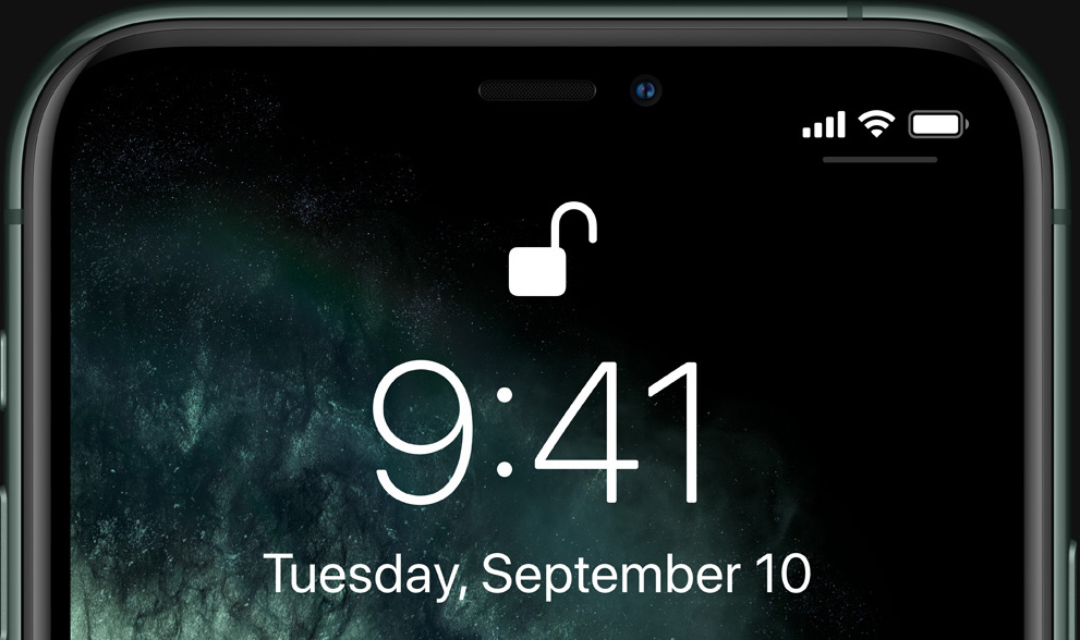
Let’s just get right to why the new iPhones are ugly, front and back. And sideways. We can start with the notch. Obviously it’s not new, but I thought maybe this would be some kind of generational anomaly that we’d all look back and laugh at in a year or two. Apparently it’s sticking around.

I know a lot of people have justified the notch to themselves in various ways — it technically means more raw screen space, it accommodates the carrier and battery icons, it’s necessary for unlocking the phone with your face.

Yeah, but it’s ugly.

If they removed the notch, literally no one would want the version with the notch, because it’s so plainly and universally undesirable. If Apple’s engineers could figure out a way to have no notch, they’d have done it by now, but they can’t and I bet they are extremely frustrated by that. They try to hide it with the special notch-camouflaging wallpaper whenever they can, which is as much as saying, “hey, we hate looking at it too.”

nonotch

You can forget for a few seconds. But in the back of your mind you know it’s there. Everyone knows.

It’s a prominent, ugly compromise (among several) necessitated by a feature no one asked for and people can’t seem to figure out if they even like or not. Notches are horrible and any time you see one, it means a designer cried themselves to sleep. To be fair that probably happens quite a bit. I grew up around designers and they can be pretty sensitive, like me.

I’m not a big fan of the rounded screen corners for a couple reasons, but I’ll let that go because I envision a future where it doesn’t matter. You remember how in Battlestar Galactica the corners were clipped off all the paper? We’re on our way.

Having the screen extend to the very edge of the device on the other hand isn’t exactly ugly, but it’s ugly in spirit. The whole front of the phone is an interface now, which would be fine if it could tell when you were gripping the screen for leverage and not to do something with it. As it is, every side and corner has some kind of dedicated gesture that you have to be wary of activating. It’s so bad people have literally invented a thing that sticks out from the back of your phone so you can hold it that way. Popsockets wouldn’t be necessary if you could safely hold your phone the way you’d hold any other object that shape.


iphone 11 pro

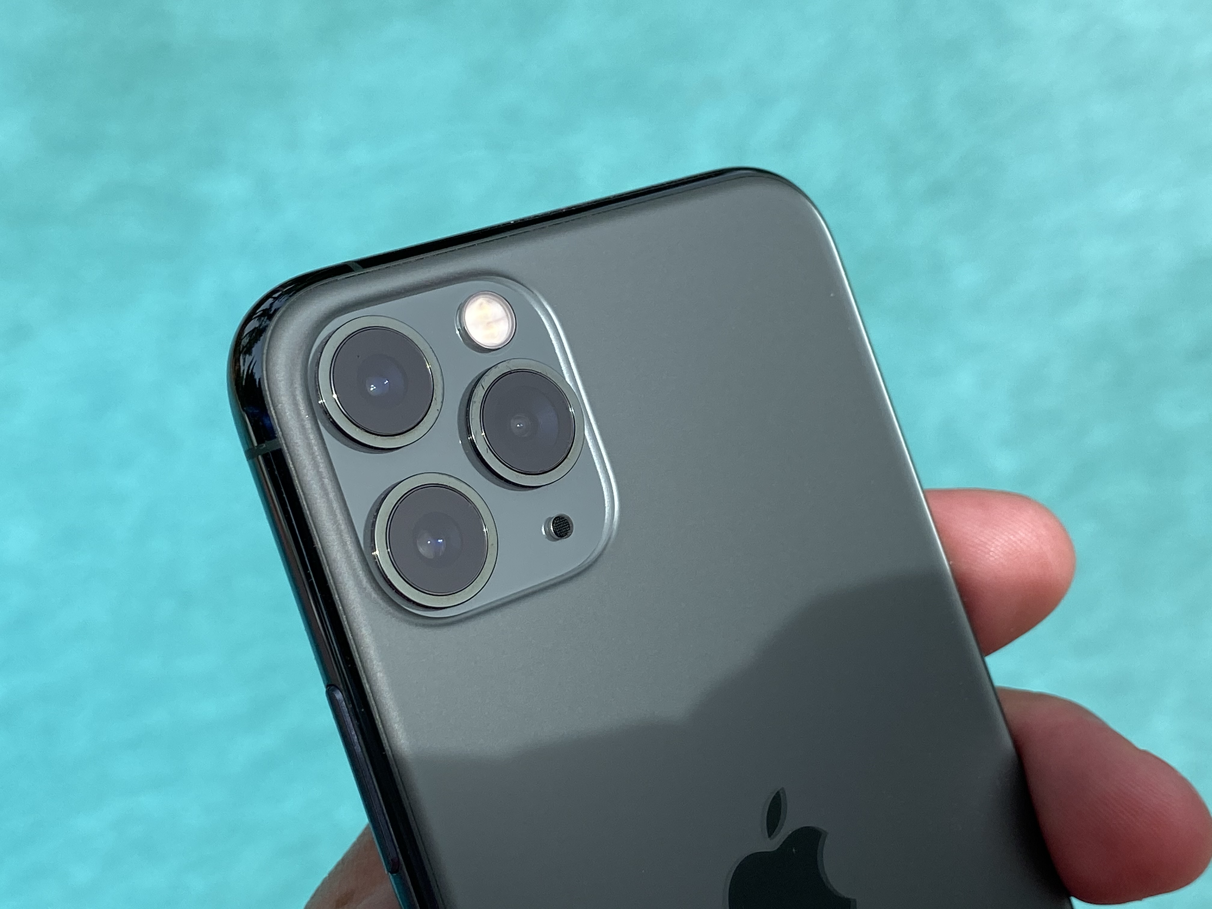
The back is ugly now, too. Man, is that camera bump bad. Bump is really the wrong word. It looks like the iPhone design team took a field trip to a maritime history museum, saw the deep sea diving helmets, and thought, Boom. That’s what we need. Portholes. To make our phone look like it could descend to 4,000 fathoms. Those helmets are actually really cool looking when they’re big and made of strong, weathered brass. Not on a thin, fragile piece of electronics. Here it’s just a huge, chunky combination of soft squares and weirdly arranged circles — five of them! — that completely take over the otherwise featureless rear side of the phone.

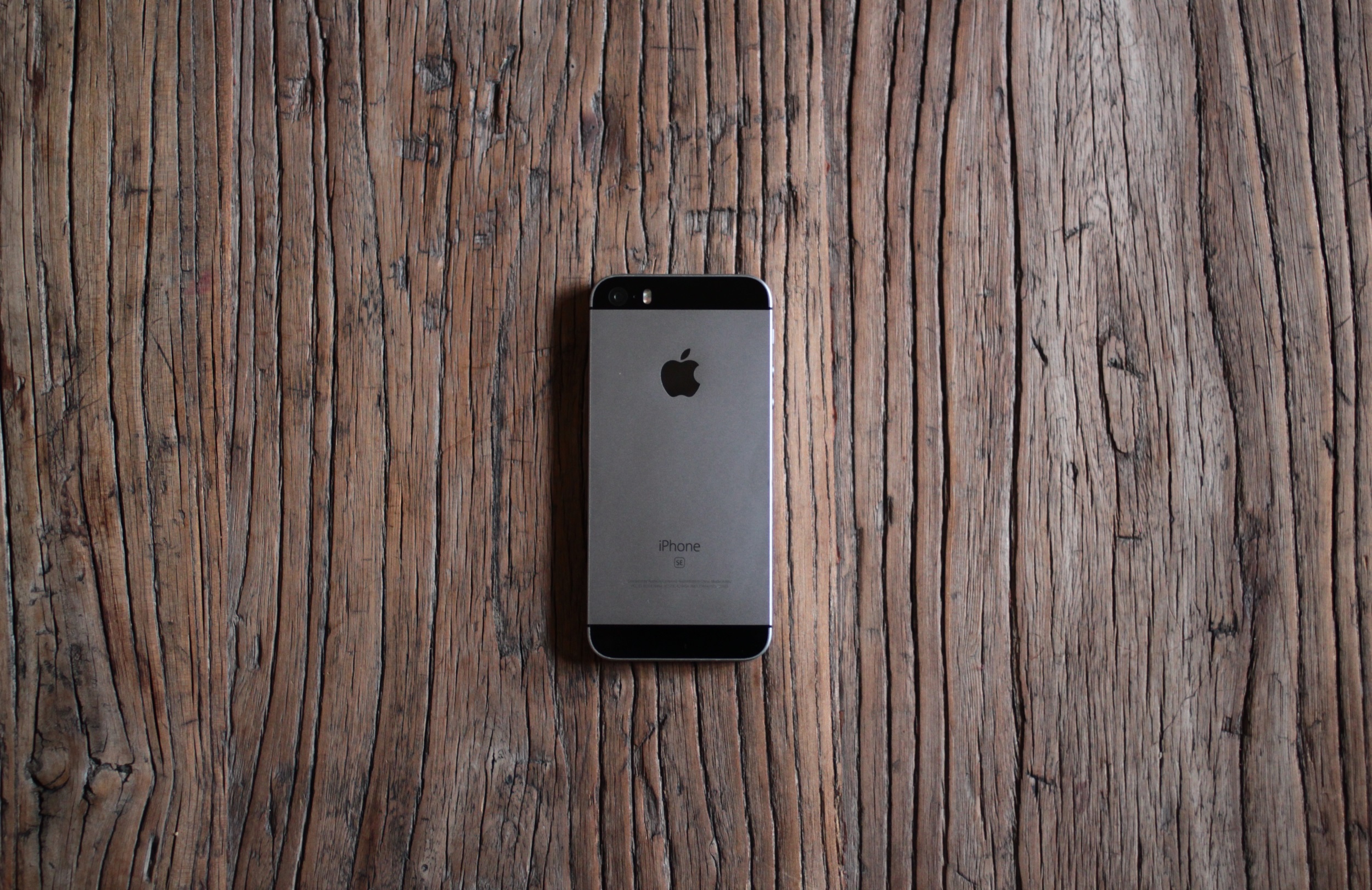
The back of the SE is designed to mirror the front, with a corresponding top and bottom “bezel.” In the best looking SE (mine) the black top bezel almost completely hides the existence of the camera (unfortunately there’s a visible flash unit); it makes the object more like an unbroken solid, its picture-taking abilities more magical. The camera is completely flush with the surface of the back, which is itself completely flush except for texture changes.

The back of the iPhone 11 Pro has a broad plain, upon which sits the slightly higher plateau of the camera assembly. Above that rise the three different little camera volcanoes, and above each of those the little calderas of the lenses. And below them the sunken well of the microphone. Five different height levels, producing a dozen different heights and edges! Admittedly the elevations aren’t so high, but still.

hero gallery color story m6kjl7t4boqm large

If it was a dedicated camera or another device that by design needed and used peaks and valleys for grip or eyes-free navigation, that would be one thing. But the iPhone is meant to be smooth, beautiful, have a nice handfeel. With this topographic map of Hawaii on the back? Have fun cleaning out the grime from in between the volcanoes, then knocking the edge of the lens against a table as you slide the phone into your hand.

Plus it’s ugly.

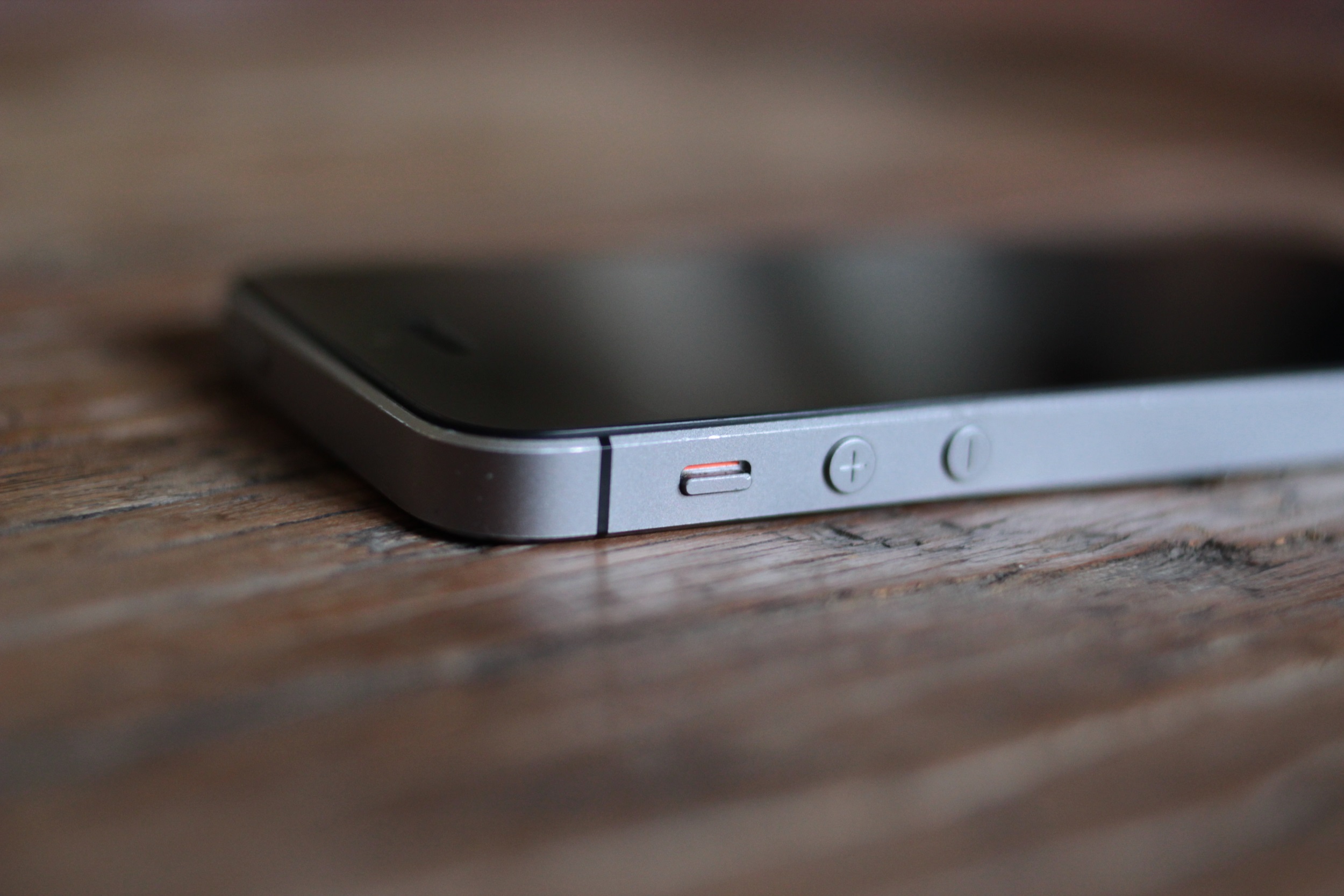
The sides of the phones aren’t as bad as the front and back, but we’ve lost a lot since the days of the SE. The geometric simplicity of the + and – buttons, the hard chamfered edge that gave you a sure grip, the black belts that boldly divided the sides into two strips and two bows. And amazingly, due to being made of actual metal, the more drops an SE survives, the cooler it looks.

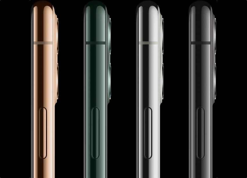
The sides of the new iPhones look like bumpers from cheap model cars. They look like elongated jelly beans, with smaller jelly beans stuck on that you’re supposed to touch. Gross.

That’s probably enough about Apple. They forgot about good design a long time ago, but the latest phones were too ugly not to call out.

Samsung has a lot of the same problems as Apple. Everyone has to have an “edge to edge” display now, and the Galaxy S10 is no exception. But it doesn’t really go to the edge, does it? There’s a little bezel on the top and bottom, but the bottom one is a little bigger. I suppose it reveals the depths of my neurosis to say so, but that would never stop bugging me if I had one. If it was a lot bigger, like HTC’s old “chins,” I’d take it as a deliberate design feature, but just a little bigger? That just means they couldn’t make one small enough.

sung 10

As for the display slipping over the edges, it’s cool looking in product photos, but I’ve never found it attractive in real life. What’s the point? And then from anywhere other than straight on, it makes it look more lopsided, or like you’re missing something on the far side.

Meanwhile it not only has bezels and sometime curves, but a hole punched out of the front. Oh my god!

Here’s the thing about a notch. When you realize as a phone designer that you’re going to have to take over a big piece of the front, you also look at what part of the screen it leaves untouched. In Apple’s case it’s the little horns on either side — great, you can at least put the status info there. There might have been a little bit left above the front camera and Face ID stuff, but what can you do with a handful of vertical pixels? Nothing. It’ll just be a distraction. Usually there was nothing interesting in the middle anyway. So you just cut it all out and go full notch.

Samsung on the other hand decided to put the camera in the top right, and keep a worthless little rind of screen all around it. What good is that part of the display now? It’s too small to show anything useful, yet the hole is too big to ignore while you’re watching full-screen content. If their aim was to make something smaller and yet even more disruptive than a notch, mission accomplished. It’s ugly on all the S10s, but the big wide notch-hole combo on the S10 5G 6.7″ phablet is the ugliest.

galaxy s10 camera

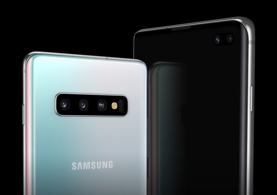
The decision to put all the rear cameras in a long window, like the press box at a hockey game, is a bold one. There’s really not much you can do to hide 3 giant lenses, a flash, and that other thing. Might as well put them front and center, set off with a black background and chrome rim straight out of 2009. Looks like something you’d get pointed at you at the airport. At least the scale matches the big wide “SAMSUNG” on the back. Bold — but ugly.

Google’s Pixel 4 isn’t as bad, but it’s got its share of ugly. I don’t need to spend too much time on it, though, because it’s a lot of the same, except in pumpkin orange for Halloween season. I like the color orange generally, but I’m not sure about this one. Looks like a seasonal special phone you pick up in a blister pack from the clearance shelf at Target, the week before Black Friday — two for $99, on some cut-rate MVNO. Maybe it’s better in person, but I’d be afraid some kid would take a bite out of my phone thinking it’s a creamsicle.

pixel 4

The lopsided bezels on the front are worse than the Samsung’s, but at least it looks deliberate. Like they wanted to imply their phone is smart so they gave it a really prominent forehead.


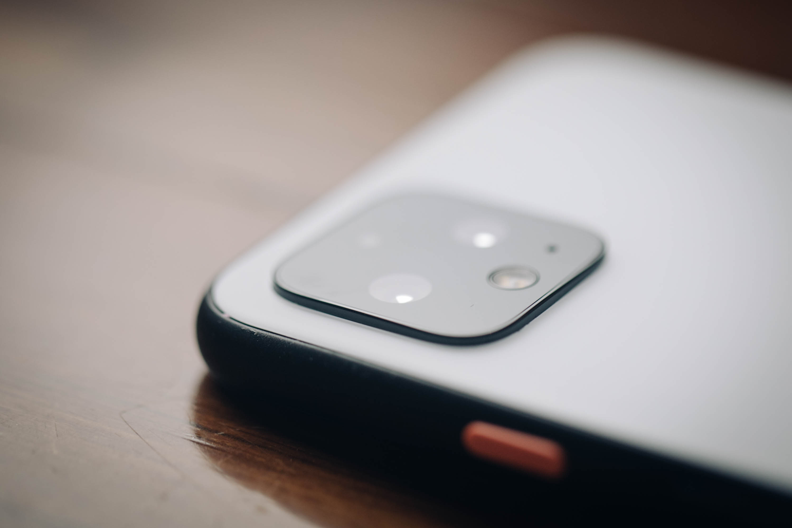
I will say that of the huge, ugly camera assemblies, the Pixel’s is the best. It’s more subtle, like being slapped in the face instead of kicked in the shins so hard you die. And the diamond pattern is more attractive for sure. Given the square (ish) base, I’m surprised someone on the team at Google had the rather unorthodox idea to rotate the cameras 45 degrees. Technically it produces more wasted space, but it looks better than four circles making a square inside a bigger, round square.

And it looks a hell of a lot better than three circles in a triangle, with two smaller circles just kind of hanging out there, inside a bigger, round square. That iPhone is ugly!


Read Full Article

The new iPhone is ugly


I’ll be the first to admit that I’m a bit old-fashioned when it comes to phones. Everyone scoffs at my iPhone SE, but the truth is it’s the best phone Apple ever made — a beautiful, well designed object in just about every way. But damn is the iPhone 11 Pro ugly. And so are the newest phones from Samsung and Google, while we’re at it.

Let’s just get right to why the new iPhones are ugly, front and back. And sideways. We can start with the notch. Obviously it’s not new, but I thought maybe this would be some kind of generational anomaly that we’d all look back and laugh at in a year or two. Apparently it’s sticking around.

I know a lot of people have justified the notch to themselves in various ways — it technically means more raw screen space, it accommodates the carrier and battery icons, it’s necessary for unlocking the phone with your face.

Yeah, but it’s ugly.

If they removed the notch, literally no one would want the version with the notch, because it’s so plainly and universally undesirable. If Apple’s engineers could figure out a way to have no notch, they’d have done it by now, but they can’t and I bet they are extremely frustrated by that. They try to hide it with the special notch-camouflaging wallpaper whenever they can, which is as much as saying, “hey, we hate looking at it too.”

nonotch

You can forget for a few seconds. But in the back of your mind you know it’s there. Everyone knows.

It’s a prominent, ugly compromise (among several) necessitated by a feature no one asked for and people can’t seem to figure out if they even like or not. Notches are horrible and any time you see one, it means a designer cried themselves to sleep. To be fair that probably happens quite a bit. I grew up around designers and they can be pretty sensitive, like me.

I’m not a big fan of the rounded screen corners for a couple reasons, but I’ll let that go because I envision a future where it doesn’t matter. You remember how in Battlestar Galactica the corners were clipped off all the paper? We’re on our way.

Having the screen extend to the very edge of the device on the other hand isn’t exactly ugly, but it’s ugly in spirit. The whole front of the phone is an interface now, which would be fine if it could tell when you were gripping the screen for leverage and not to do something with it. As it is, every side and corner has some kind of dedicated gesture that you have to be wary of activating. It’s so bad people have literally invented a thing that sticks out from the back of your phone so you can hold it that way. Popsockets wouldn’t be necessary if you could safely hold your phone the way you’d hold any other object that shape.


iphone 11 pro

The back is ugly now, too. Man, is that camera bump bad. Bump is really the wrong word. It looks like the iPhone design team took a field trip to a maritime history museum, saw the deep sea diving helmets, and thought, Boom. That’s what we need. Portholes. To make our phone look like it could descend to 4,000 fathoms. Those helmets are actually really cool looking when they’re big and made of strong, weathered brass. Not on a thin, fragile piece of electronics. Here it’s just a huge, chunky combination of soft squares and weirdly arranged circles — five of them! — that completely take over the otherwise featureless rear side of the phone.

The back of the SE is designed to mirror the front, with a corresponding top and bottom “bezel.” In the best looking SE (mine) the black top bezel almost completely hides the existence of the camera (unfortunately there’s a visible flash unit); it makes the object more like an unbroken solid, its picture-taking abilities more magical. The camera is completely flush with the surface of the back, which is itself completely flush except for texture changes.

The back of the iPhone 11 Pro has a broad plain, upon which sits the slightly higher plateau of the camera assembly. Above that rise the three different little camera volcanoes, and above each of those the little calderas of the lenses. And below them the sunken well of the microphone. Five different height levels, producing a dozen different heights and edges! Admittedly the elevations aren’t so high, but still.

hero gallery color story m6kjl7t4boqm large

If it was a dedicated camera or another device that by design needed and used peaks and valleys for grip or eyes-free navigation, that would be one thing. But the iPhone is meant to be smooth, beautiful, have a nice handfeel. With this topographic map of Hawaii on the back? Have fun cleaning out the grime from in between the volcanoes, then knocking the edge of the lens against a table as you slide the phone into your hand.

Plus it’s ugly.

The sides of the phones aren’t as bad as the front and back, but we’ve lost a lot since the days of the SE. The geometric simplicity of the + and – buttons, the hard chamfered edge that gave you a sure grip, the black belts that boldly divided the sides into two strips and two bows. And amazingly, due to being made of actual metal, the more drops an SE survives, the cooler it looks.

The sides of the new iPhones look like bumpers from cheap model cars. They look like elongated jelly beans, with smaller jelly beans stuck on that you’re supposed to touch. Gross.

That’s probably enough about Apple. They forgot about good design a long time ago, but the latest phones were too ugly not to call out.

Samsung has a lot of the same problems as Apple. Everyone has to have an “edge to edge” display now, and the Galaxy S10 is no exception. But it doesn’t really go to the edge, does it? There’s a little bezel on the top and bottom, but the bottom one is a little bigger. I suppose it reveals the depths of my neurosis to say so, but that would never stop bugging me if I had one. If it was a lot bigger, like HTC’s old “chins,” I’d take it as a deliberate design feature, but just a little bigger? That just means they couldn’t make one small enough.

sung 10

As for the display slipping over the edges, it’s cool looking in product photos, but I’ve never found it attractive in real life. What’s the point? And then from anywhere other than straight on, it makes it look more lopsided, or like you’re missing something on the far side.

Meanwhile it not only has bezels and sometime curves, but a hole punched out of the front. Oh my god!

Here’s the thing about a notch. When you realize as a phone designer that you’re going to have to take over a big piece of the front, you also look at what part of the screen it leaves untouched. In Apple’s case it’s the little horns on either side — great, you can at least put the status info there. There might have been a little bit left above the front camera and Face ID stuff, but what can you do with a handful of vertical pixels? Nothing. It’ll just be a distraction. Usually there was nothing interesting in the middle anyway. So you just cut it all out and go full notch.

Samsung on the other hand decided to put the camera in the top right, and keep a worthless little rind of screen all around it. What good is that part of the display now? It’s too small to show anything useful, yet the hole is too big to ignore while you’re watching full-screen content. If their aim was to make something smaller and yet even more disruptive than a notch, mission accomplished. It’s ugly on all the S10s, but the big wide notch-hole combo on the S10 5G 6.7″ phablet is the ugliest.

galaxy s10 camera

The decision to put all the rear cameras in a long window, like the press box at a hockey game, is a bold one. There’s really not much you can do to hide 3 giant lenses, a flash, and that other thing. Might as well put them front and center, set off with a black background and chrome rim straight out of 2009. Looks like something you’d get pointed at you at the airport. At least the scale matches the big wide “SAMSUNG” on the back. Bold — but ugly.

Google’s Pixel 4 isn’t as bad, but it’s got its share of ugly. I don’t need to spend too much time on it, though, because it’s a lot of the same, except in pumpkin orange for Halloween season. I like the color orange generally, but I’m not sure about this one. Looks like a seasonal special phone you pick up in a blister pack from the clearance shelf at Target, the week before Black Friday — two for $99, on some cut-rate MVNO. Maybe it’s better in person, but I’d be afraid some kid would take a bite out of my phone thinking it’s a creamsicle.

pixel 4

The lopsided bezels on the front are worse than the Samsung’s, but at least it looks deliberate. Like they wanted to imply their phone is smart so they gave it a really prominent forehead.


I will say that of the huge, ugly camera assemblies, the Pixel’s is the best. It’s more subtle, like being slapped in the face instead of kicked in the shins so hard you die. And the diamond pattern is more attractive for sure. Given the square (ish) base, I’m surprised someone on the team at Google had the rather unorthodox idea to rotate the cameras 45 degrees. Technically it produces more wasted space, but it looks better than four circles making a square inside a bigger, round square.

And it looks a hell of a lot better than three circles in a triangle, with two smaller circles just kind of hanging out there, inside a bigger, round square. That iPhone is ugly!


Read Full Article