08 September 2015

How to Read your Android Battery Graph


Your Android mobile phone includes a built-in app to help you visually monitor the battery usage pattern. Go to Settings > Battery (the app’s location may vary for your version of Android) and you’ll see a history graph detailing which apps have been consuming the most battery power and how long you can use the device before the battery is completely drained off.

If you observe the Android battery graph more closely, you’ll find some other interesting details as well. For instance, you’ll know the pattern of your mobile signal strength, how often apps running in the background ‘wake up’ your sleeping device and so on.

Android Battery Graph

This is the main battery graph and is easy to interpret. If there are any breaks, it indicates that the device was powered off during that period. If there are any red or yellow lines over the graph, it indicates that the charge was critically low during that period. The gray area represents the approximate remaining charge.

Related Tip: Do not let your phone’s battery charge dip the below the 10% mark as that will affect your phone’s battery life in the long run.

If you tap the battery history graph, it will provide a more detailed breakdown of the battery usage and charge times as shown in the screenshot below.

Android Battery - Signal Colors

The colored bars in the Mobile Network Signal indicate the strength of signal (or number of cellular bars). The dark green bars indicate strong signal (full bars), light green is a good signal, yellow means a weak connection (3 bars or less) while the red bars indicate ‘scanning’ mode meaning the device is searching for a network signal.

If your device is in airplane mode, or when you are out of coverage area, the network signal block will be blank (white or, for some models, black).

The Wi-Fi block indicates the time when the radio was turned on though the device may not be actually connected to a Wi-Fi network. The colored strips for charging indicate the time when your Android phone was connected to the charger. The ascending slopes in the battery graph is also an indicator of the charging time.

The colored blocks in the Awake bar represent background apps that may be running even while the screen is off. For instance, your mail app periodically checks for new email even while the phone is in ‘sleep’ mode. If you notice any extended ‘awake’ blocks, it means that some battery-draining apps are keeping your phone active and should be uninstalled.

The GPS line indicates the duration when the GPS receiver is powered on and some app or system service tried to use GPS to determine your exact location. Finally, the ‘Screen On’ bar indicates the actual usage time when the screen was turned on and not in standby mode.

Also see: How Websites Detect your Battery Level


The story, How to Read your Android Battery Graph, was originally published at Digital Inspiration by Amit Agarwal on 08/09/2015 under Android, Gadgets.

07 September 2015

The Best Google Font Combinations That Look Good Together


Whether you are creating a website, writing your resume or designing a presentation, the kind of fonts or typeface you choose can make a notable difference. The Google Fonts directory offers a myriad of choices but how do you pick the correct font for your digital projects? Should you go for Serif fonts or Sans Serif or a combination of serifs and sans serifs?

Typography is an art and with 100s of fonts available, it is obviously difficult for non-designers to find that perfect font combination. Need help? Here are some useful font pairing websites where type masters have already done the hard work and all you can do is follow their recommendations to pick the most elegant and gorgeous Google fonts for your web and print projects.

1. Beautiful Web Type (hellohappy.org) – Chad Mazzola has created a beautiful showcase of high-quality typefaces from the Google Fonts website. You’ll discover some creative usage of fonts here though they haven’t updated the site for quite some time.

Beautiful Web Type

2. Typ.io (typ.io) – If the body text of my website is set in Roboto, what font should I use for headings? Typ.io offers a visual list of beautiful websites that using similar font families and helps you pick the perfect matching pair based on the typography of other websites.

3. Google Type (femmebot.github.io) – Laurel O’Brien’s typography project uses Google Fonts to stylize tales from Aesop’s Fables. This is a great reference source for finding elegant font pairs and is regularly updated as well.

Google Typography

4. Palet Tab (palettab.com) – A Google Chrome extension that inspires you with a fresh font and color combination from Google Fonts each time you open a new tab in Chrome.

5. 100 Days of Fonts (100daysoffonts.com) – Each single day, for 100 days, designer Do-Hee Kim picked a unique and beautiful Google Fonts pair and all her work in now showcased in this single-page website. If you need inspiration for fonts, look no further.

100 Days of Google Fonts

6. Font Pair (fontpair.co) – Another well-designed resources for finding Google Fonts that go well together. The paired fonts can be downloaded as zip files which is handy in case you want to use the fonts with your PowerPoint presentation on the local computer.

7. Font Blender (http://ift.tt/1JMLOPf) – If you are wondering how a set of Google Fonts will look with your text, Font Blender can help. The web app allows you to preview Google Fonts in the browser and you have the option to experiment with the font size and line height as well.

8. Type Genius (typegenius.com) – Choose a starter web font and Type Genius will recommend a list of other matching fonts that will make a good combination. Like Typ.io, this website too makes suggestions based on font combinations of other beautiful websites. Designed by Waveney Hudlin.

Google Type Genius

9. Type Inspiration (typespiration.com) – A creative showcase of text blocks stylized using Google Fonts. The CSS snippets are included making it easy for you to replicate the style in your web design.

10. Font Face Ninja (fontface.ninja) – A browser extension for Google Chrome and Safari browsers that will help you recognize the font used on any website. You even have the option to download the font files through the Ninja add-on but please check the associated license.

Also see: How to Reduce Google Fonts Size


The story, The Best Google Font Combinations That Look Good Together, was originally published at Digital Inspiration by Amit Agarwal on 07/09/2015 under Fonts, Internet.

04 September 2015

Google Photos and Free Storage


There's something I don't understand about the new Google Photos. The settings page lets you choose between uploading high quality photos and videos for free, at reduced sizes (16MP or less for photos, Full HD or less for videos) or uploading original photos and videos at full resolution, but that counts against your quota.


This doesn't make sense. Google+ Photos had a different policy: "Only photos over 2048x2048 pixels and videos longer than 15 minutes count toward your storage limit." Google+ even had a setting that resized your photos to 2048x2048 or less, so they stayed under the free storage limit.

Google's new policy doesn't seem fair to those who pick the "original" option. If you upload photos that are 16 MP or less or videos that are 1080p or less, you should be able to store them for free, regardless of the Google Photos setting you choose. The distinction between "high quality" and "original" should only be made for photos and videos that don't fall under Google's limitations.

Google Drive Bonus Storage Is Expiring


2 years ago, Google offered 10 GB of free storage for installing the Quickoffice app for Android or iOS. Unfortunately, Google's bonus storage is about to expire.

"We wanted to let you know that you have bonus Google Drive storage expiring on Oct 3 2015. While this bonus period is coming to an end, you can always purchase additional storage," informs Google. "Rest assured that your files in Google Drive remain safe and accessible by you and the people you've shared them with. You just won't be able to add or sync any files unless you are using less than your current available storage or you've purchased additional storage."


Basically, Google won't delete your files, but you'll have to delete some of them or purchase more storage if you actually used the 10 GB bonus storage. Since the storage is shared between Gmail, Google Photos and Google Drive, all of these services are affected and you can also delete Gmail messages with large attachments or photos and videos from Google Photos that use your Google storage. Here's how to find Gmail messages with big attachments and a list of Google Drive files sorted by size.

More About Google's New Visual Identity


Google Design's site has an interesting article about Google's new identity. Google's designers started by "distilling the essence of the brand down to its core" and built 3 elements that work on any platform: a sans serif logotype, the dynamic dots that respond to users and a compact version of the Google logo.


Some people said that Google's new logo is childish and it really is. "The Google logo has always had a simple, friendly, and approachable style. We wanted to retain these qualities by combining the mathematical purity of geometric forms with the childlike simplicity of schoolbook letter printing. Our new logotype is set in a custom, geometric sans-serif typeface and maintains the multi-colored playfulness and rotated ‘e’ of our previous mark—a reminder that we’ll always be a bit unconventional," mention Google's designers.

The dots are an interesting way to convey the full Google logo in a Material Design approach. "The Google dots are a dynamic and perpetually moving state of the logo. They represent Google's intelligence at work and indicate when Google is working for you. We consider these unique, magic moments. A full range of expressions were developed including listening, thinking, replying, incomprehension, and confirmation."


Google now uses pixel-perfect SVGs for base assets and generates thousands of vector-based variants. For example, there's a version of the logo that's optimized for low-bandwidth connections and is only 305 bytes. Google's old approach was to serve a text-based approximation of the logo.

{ Thanks, Brendan Early. }

03 September 2015

Templates, Insights and Dictation in Google Docs


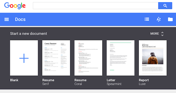
Google's standalone web apps for Docs, Sheets and Slides now show a list of templates you can choose to quickly create a document, spreadsheet or presentation. For example, Google Docs shows templates for resumes, reports, letters and you can expand the list to see even more templates (essays, class notes, project proposals, meeting notes, brochures, newsletters).


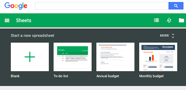
Google Sheets has templates for to-do lists, budgets, calendars, schedules, invoices, time sheets and more.


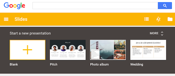
Google Slides also has a few templates for photo albums, pitches, status reports, lesson plans, portfolios, weddings, party invites and more.


Another new feature lets you get insights on a spreadsheet by simply selecting a range of cells and clicking Explore. This feature works in the desktop web app and the Android app and it shows trends, patterns and even charts for the data you've selected. It's surprisingly useful.


Google Docs now shows the new changes in a collaborative document. "If there are new changes, click the New changes button to the right of the Help menu. You can also click the File menu > See new changes."

Voice typing lets you dictate a text in Google Docs for desktop, but only if you use Chrome. Activate this feature from the Tools menu and speak in one of the 40 supported languages. You can say "period", "comma", "question mark", "exclamation mark", "new line", "new paragraph" to add punctuation to your text.


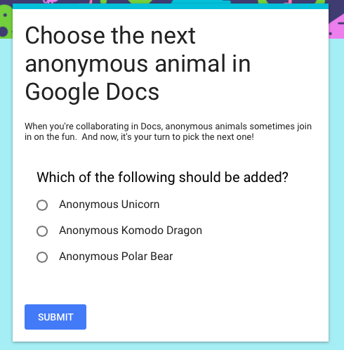
You can customize your forms by picking a theme or adding a photo. Google chooses the right color palette to match your photo. Insert images and YouTube videos to illustrate your questions.


{ Via Google Docs Blog. Thanks, Brendan and Jérôme. }

02 September 2015

Updated Mobile UI for Google's Related Searches


Google Mobile Search has a new interface for related searches. Google usually shows up to 8 related searches at the bottom of the search results pages, but now the list looks different: there's a table with white rows and small arrows next to each related query.


Click a related search and you can see the search results for that query and even more related searches. You can start with a generic query like [nightingale] and create a more specific query by only clicking on related searches. For example, you can find searches like [sound of a nightingale singing], [Yanni nightingale live] or [how do you become a nightingale in Skyrim?].

Google's New Colorful Favicon


Google has a new logo, but it also has a new favicon. It's now a capital G that uses the four Google colors: blue, red, yellow and green.

Here's a screenshot that shows the old favicon launched in 2012 and the new one:

This is the new favicon, which is also used as an icon for Google Search:

You can find it in Google's app launcher and soon in Chrome's app launcher and in Android, as an icon for the Google Search app.

Google Photos, The New Home for Your Private Photos


I've clicked the Photos link from the Google+ navigation menu. The page redirected to Google Photos and it displayed a new message:

"Welcome to Google Photos, the new home for all your private photos. The photos you've shared on Google+ are still available in the photos tab of your Google+ profile."


The message links to http://ift.tt/1O7mMNW, which is the photos tab from your Google Profile. Until now, Google Photos linked to Google+ Photos, bypassing the redirect.

You can still go to Google+ Photos using this link: http://ift.tt/1Q0oZjj, but I don't know for how long. Most likely, Google+ Photos will disappear soon.

New Mobile Google Homepage


Google's mobile homepage looks different. The tabs for web search and image search are now blue and you can finally use the app launcher. Just click the grid icon to see the same app launcher from the desktop site. Many shortcuts will open the corresponding mobile apps instead of the mobile sites.


For now, the app launcher is only available from the Google homepage and from Google Image Search's homepage.


Google has recently changed the color of the tabs from red to blue for both the desktop site and the mobile site. There's now a bigger Google logo at the top of the page and the header uses more space.


The New Google Logo in Google Maps


The new Google logo stands out more. The latest version of the Google Maps app for Android replaced the gray Google logo from the bottom left corner with a bigger logo that's now colorful.

Here's a screenshot from an old version of Google Maps. You need to look carefully to see the logo at the bottom:


This screenshot is from the latest version of the Google Maps app. The new logo doesn't blend in with the map and it's more distracting.


A similar logo was also added to the desktop site:


App Launcher Shortcut for Google Inbox


Ever wanted to quickly switch between Gmail and Inbox? You can add Inbox to Google's app launcher: just go to inbox.google.com, click the grid icon at the top of the page and then click "add a shortcut". Drag and drop the icon to change its position.


I placed the Inbox shortcut next to Gmail's shortcut.


Inbox has a setting that lets you redirect Gmail to inbox.google.com, just in case you want to switch to Inbox.

Smaller Google Search Button


Google has recently changed the search button from the desktop site. It's now much smaller, just like the search button from the mobile UI.


You don't have to click the search button: it's much faster to press Enter, since you're already using the keyboard.

Here's a recent screenshot that shows the bigger button:


A New Google Logo


Google's homepage has a clever animation that announces a new Google logo. "These days, people interact with Google products across many different platforms, apps and devices — sometimes all in a single day. (...) Today we're introducing a new logo and identity family that reflects this reality and shows you when the Google magic is working for you, even on the tiniest screens," informs Google.

It's not just about the Google logo: many other Google icons will change. "New elements like a colorful Google mic help you identify and interact with Google whether you're talking, tapping or typing. Meanwhile, we're bidding adieu to the little blue 'g' icon and replacing it with a four-color 'G' that matches the logo."

The new icons are better suited for small screens and manage to convey the Google identity using colors and playful cues. Google's logo hasn't changed a lot since 1998: it's still simple, colorful, playful and unintimidating.